文字覆盖悬停效果:
transtion 属性可以被指定为一个或是多个CSS属性的过渡效果,多个属性之间用逗号进行分隔。
每个单属性转换都描述了应该用于单个属性的转换(或特殊值 all 和 none)包括:
1、0或1个值,表示转换适用的属性,包括以下几种情况:
- 关键字none
- 关键字all
- 命名CSS属性的 custom-ident(用户自定义的字符串标识符)
2、0或1个过渡的速度曲线值表示要使用的过渡函数
3、0 、1或2个time 时间值。
- 可以解析为时间的第一个值被分配为 transtion-duration(过渡动画所需要的时间)
- 可以解析为时间的第二个值被分配给 transtion-delay(过渡动画开始前的所需的时间,延迟时间)
当鼠标悬停图片上,文字就会上浮到图片上。
HTML 部分
<p>鼠标移动到图片上查看效果</p>

 <div class='container'>
     <img src="11.jpg" alt="spring" class='image'>
     <div class='overlay'>
         <div class='text'>Hello World</div>
     </div>
 </div>
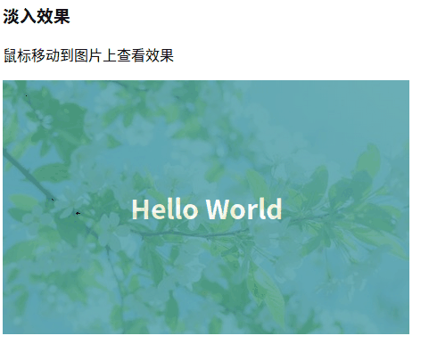
一、文字覆盖图像悬停效果(淡出效果)
CSS代码
在实现淡出效果的时候,遮盖元素相对定位于图像在其正上方,并且与父元素同等大小。
设置透明度为0完全透明,当鼠标移动到图像上,透明度变为 0.7,遮盖元素就会显示出来。
.container{
            position:relative;
            /* 容器盒子相对定位 */
            width:50%
        }
        .image{
            display:block;
            /* 将图片转换为块元素 */
            width:100%;
            height:auto;
            /* 元素高度设置为auto,保持图片原有纵横比 */
        }
        .overlay{
            /* 遮盖元素 */
            position:absolute;
            top:0;
            bottom:0;
            left:0;
            right:0;
            /* 相对父元素,距离上下左右都是0,相对定位在父元素之上 */
            height:100%;
            width:100%;
            /* 宽高100%,和父元素同等大小 */
            opacity:0;
            /* 透明度 */
            transition:1s ease;
            background-color:#2e8e9a;
        }
        .container:hover .overlay{
            opacity:.7;
            /* 透明度 0.7 */
        }

        .text{
            position:absolute;
            top:50%;
            left:50%;
            transform:translate(-50%,-50%);
            /* 绝对定位设置偏移量,将元素居中定位 */
            color:white;
            font-size:20px;
            font-weight:bold;
            font-size:30px;
            /* 文字样式 */
        }
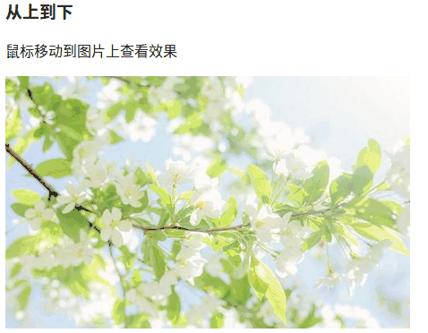
二、文字覆盖图片悬停效果(从上到下)
CSS代码
 .container{
            position:relative;
            width:50%;
        }
        .image{
            display:block;
            width:100%;
            height:auto;
            /* 将图片设置为块元素,保持图片的纵横比 */
        }
        .overlay{
            position:absolute;
            bottom:100%;
            left:0;
            right:0;
            background-color:#2e8e9a;
            overflow:hidden;
            width:100%;
            height:0;
            /* opacity:0.6; */
            transition: .5s ease;
            /* 相对于container定位,距离父元素底面100%,在元素上面,不显示
            过渡使得位移有着时间过渡,而不是突然出现*/
        }
        .container:hover .overlay{
            bottom:0;
            height:100%;
            opacity:0.7;
            /* 鼠标悬浮在元素上时,距离定位底面相距0,高度相对父元素为100%,
            bottom为0 ,所以定位在上面的元素才会改变
            (这些样式的实现,由一个过渡缓冲 transition)
            最终透明度达到 0.7*/
        }
        .text{
            white-space:nowrap;
            color:white;
            font-size:30px;
            position:absolute;
            overflow:hidden;
            top:50%;
            left:50%;
            transform:translate(-50%,-50%);
            font-weight:bold;
            /* 设置覆盖文字的样式:无折行、字体白色加粗30px、绝对定位设置偏移量 */
        }
三、文字覆盖图像悬停效果(从右向左)
CSS代码
.container{
            position: relative;
            width: 50vw;
        }
        .image{
            display: block;
            width: 100%;
            height: auto;
        }
        .overlay{
            position:absolute;
            bottom:0;
            left:100%;
            top:0;
            background-color:#2e8e9a;
            overflow:hidden;
            height:100%;
            width:0;
            transition:.5s ease;
        }
        .container:hover .overlay{
            left:0;
            width:100%;
            opacity:0.7;
        }
        .text{
            white-space:nowrap;
            color:white;
            font-size:30px;
            position:absolute;
            overflow: hidden;
            top:50%;
            left:50%;
            transform:translate(-50%,-50%);
            font-weight: bold;
        }

四、文字覆盖图像悬停效果(淡入透明)
HTML代码
<h3>淡入透明</h3>
<p>鼠标移动到图片上查看效果</p>
    <div class='container'>
        <img src="11.jpg" alt="spring" class='image'>
        <div class='overlay'></div>
            <div class='text'>Hello World</div>
    </div>
CSS代码
.container{
            position:relative;
            width:50%;
        }
        .image{
            display:block;
            width:100%;
            height:auto;
            opacity:1;
            transition:.5s ease;
            backface-visibility:hidden;
            /* 背面隐藏 */
        }
        .overlay{
            transform:.5s ease;
            opacity:0;
            position:absolute;
            top:50%;
            left:50%;
            transform:translate(-50%,-50%);
        }
        .container:hover .image{
            opacity:0.2;
        }
        .container:hover .overlay{
            opacity:1;
        }
        .text{
            white-space:nowrap;
            opacity:0.5;
            background-color:#2e8e9a;
            color:white;
            font-size:30px;
            padding:20px;
            text-align:center;
            vertical-align: middle;
        }

参考资料:

 浙公网安备 33010602011771号