

Matplotlib数据分析基础
-
* 概要-
* matplotlib.pyplot.plot绘制折线图- matplotlib.pyplot.bar绘制条形图
- matplotlib.pyplot.hist绘制直方图
- matplotlib.pyplot.scatter绘制散点图
-
概要
本博客总结了matplotlib常见的数据分析工具使用方法,包括画折线图,柱状图,直方图,散点图等。
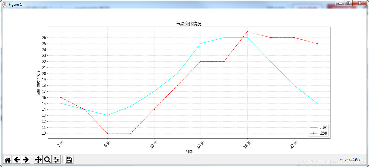
matplotlib.pyplot.plot绘制折线图
    # -*- coding: utf-8 -*-
    from matplotlib import pyplot as plt
    import matplotlib

    # 1. 中文字体设置
    font = {'family': 'Microsoft Yahei', 'size': '14'}
    matplotlib.rc('font', **font)  # 字体设置

    # 2. 设置图片基本情况
    fig = plt.figure(figsize=(20, 8), dpi=60)  # 设置图片size和分辨率
    plt.grid(alpha=0.5, linestyle='--')  # 设置图片网格透明度和线型
    plt.title("气温变化情况")  # 图片标题

    # 3. 给出坐标点并画图线
    x = range(2, 26, 2)  # 横坐标点列
    y = [15, 14, 13, 14.5, 17, 20, 25, 26, 26, 22, 18, 15]  # 纵坐标点列
    y1 = [16, 14, 10, 10, 14, 18, 22, 22, 27, 26, 26, 25]  # 纵坐标点列
    plt.plot(x, y, label='北京',color ="cyan")  # 根据(x,y)画散点图折线图,label为图例显示的字符
    plt.plot(x, y1, label='上海', color="red", marker='*', linestyle='-.')  # 画两个图

    # 4. 设置刻度和标签
    _xtick_labels = ["{} 天".format(i) for i in x]  # 对x轴显示刻度进行修饰,2 day 4 day 6 day
    plt.xticks(x[::2], _xtick_labels[::2], rotation=45)  # plt.xticks(list, list(str), rotation)
    plt.yticks(range(min(y1), max(y1)))  # 设置y轴显示的刻度,表示密集程度
    plt.xlabel("时间")
    plt.ylabel("温度 单位(℃)")

    # 5. 设置图例
    plt.legend(loc=4)  # 显示图例,即plt.plot中的label。loc表示图例的location

    # 6. 保存图片
    plt.savefig("./sig_size.svg")  # 保存图片,给出位置和格式

    # 7. 显示图片
    plt.show()
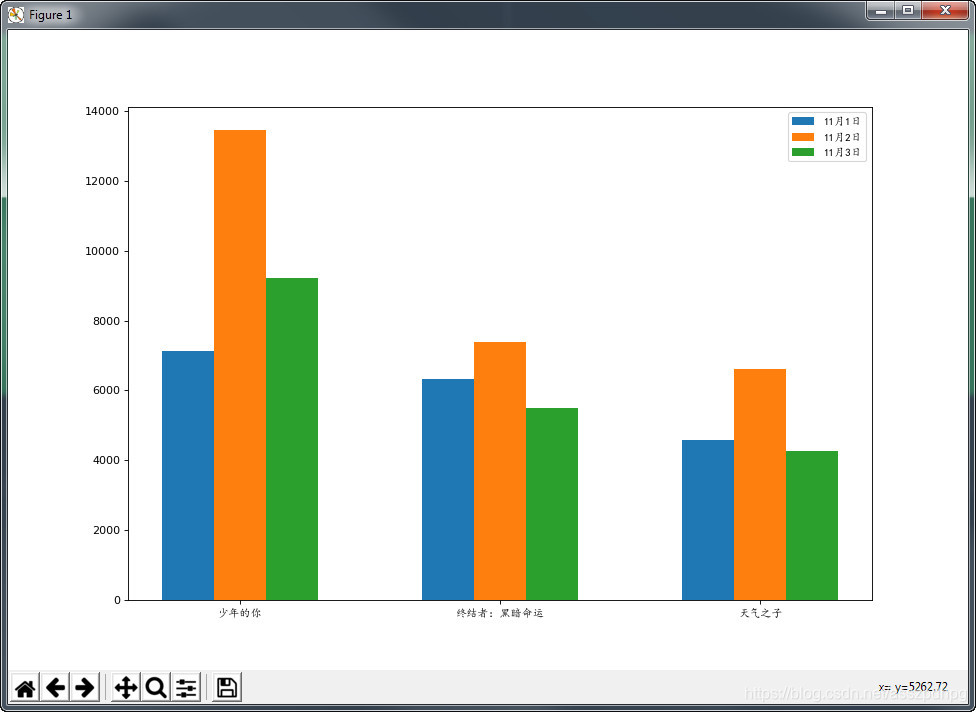
matplotlib.pyplot.bar绘制条形图
    # -*- coding: utf-8 -*-
    from matplotlib import pyplot as plt
    from matplotlib import font_manager

    # 1. 设置字体
    my_font = font_manager.FontProperties(fname='C:\Windows\Fonts\simkai.ttf')

    # 2. 图像大小和分辨率
    plt.figure(figsize=(12, 8), dpi=80)

    # 3. 电影票房数据数组
    x = ['少年的你', '终结者:黑暗命运', '天气之子']  # 电影名称
    bar_width = 0.2  # 条线宽度,即蓝橙绿条都是0.2
    x1 = list(range(len(x)))  # [0, 1, 2, 3]  # 1日
    x2 = [i+bar_width for i in x1]  # [0.2, 1.2, 2.2, 3.2] # 2日
    x3 = [i+bar_width*2 for i in x1]  # [0.4, 1.4, 2.4, 3.4]  # 3日
    y1 = [7131, 6319, 4588]
    y2 = [13453, 7398, 6621]
    y3 = [9213, 5497, 4247]

    # 4. 画图
    plt.bar(x1, y1, width=bar_width, label="11月1日")
    plt.bar(x2, y2, width=bar_width, label='11月2日')
    plt.bar(x3, y3, width=bar_width, label='11月3日')

    # 5. 设置图例
    plt.legend(prop=my_font)

    # 6. 设置刻度
    plt.xticks(x2, x, fontproperties=my_font)  # plt.xticks(刻度,字符,字体)

    # 7. 显示图片
    plt.show()
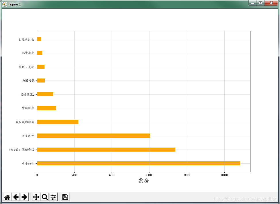
也可绘制水平方向的条形图,使用plt.barh
    # -*- coding: utf-8 -*-
    from matplotlib import pyplot as plt
    from matplotlib import font_manager

    # 1. 设置字体
    my_font = font_manager.FontProperties(fname='C:\Windows\Fonts\simkai.ttf')

    # 2. x和y轴数据
    x = ['少年的你','终结者:黑暗命运', '天气之子', '我和我的祖国', '中国机长', '沉睡魔咒2', '为国而歌', '催眠·裁决', '双子杀手', '打过长江去']
    y = [1084.14, 739.63, 605.48, 221.73, 103.65, 88.02, 43.52, 41.03, 29.35, 25.06]

    # 3. 图片大小和分辨率设置
    plt.figure(figsize=(12, 8), dpi=80)

    # 4. 绘图
    plt.barh(x, y, height=0.3, color='orange', label="票房统计")

    # 5. 设置刻度和坐标轴
    plt.yticks(x, fontproperties=my_font)
    plt.xlabel(xlabel="票房", fontproperties=my_font, fontsize=18)

    # 6. 设置网格
    plt.grid(alpha=0.4)

    # 7. 保存图片
    plt.savefig('./movie.png')

    # 8. 显示图片
    plt.show()
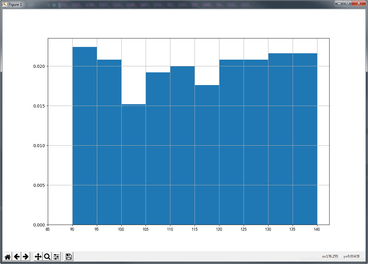
matplotlib.pyplot.hist绘制直方图
    # -*- coding: utf-8 -*-
    from matplotlib import pyplot as plt
    from matplotlib import font_manager
    import matplotlib

    # 1. 设置字体
    my_font = font_manager.FontProperties(fname='C:\Windows\Fonts\simkai.ttf')

    # 2. 数据
    x = [91, 121, 130, 127, 111, 128, 107, 131, 91, 135, 99, 108, 96, 122, 112,
         98, 132, 95, 122, 124, 117, 91, 135, 131, 90, 110, 96, 102, 124, 133,
         97, 106, 110, 94, 93, 134, 129, 120, 111, 110, 92, 101, 129, 124, 137,
         96, 101, 103, 103, 126, 103, 117, 107, 125, 90, 119, 99, 92, 109, 106,
         126, 106, 133, 132, 100, 91, 112, 109, 92, 135, 130, 138, 93, 110, 134,
         90, 132, 102, 92, 123, 100, 126, 130, 95, 107, 120, 97, 123, 132, 131,
         111, 103, 105, 126, 138, 138, 120, 121, 139, 119, 134, 135, 110, 136,
         104, 97, 130, 112, 124, 106, 109, 137, 125, 106, 121, 94, 91, 103, 98,
         134, 135, 130, 109, 128, 96, 118, 92, 92, 128, 92, 124, 115, 130, 138,
         139, 99, 130, 99, 107, 104, 108, 106, 90, 123, 135, 91, 123, 105, 104,
         117, 117, 132, 129, 136, 113, 99, 111, 118, 102, 139, 139, 126, 112, 91,
         123, 97, 137, 129, 107, 126, 122, 93, 128, 91, 110, 128, 114, 115, 98,
         113, 115, 134, 102, 124, 116, 139, 124, 133, 90, 115, 130, 124, 134, 107,
         123, 138, 120, 101, 127, 100, 98, 95, 126, 127, 137, 105, 114, 97, 112,
         95, 135, 139, 107, 98, 127, 113, 93, 136, 99, 118, 117, 119, 95, 91, 112,
         126, 112, 114, 104, 114, 122, 127, 107, 128, 116, 125, 94, 122, 118, 139,
         117, 119, 130, 98, 119, 137, 115, 107, 134, 110
         ]  # 原始数据。hist是拿原始数据绘制成直方图

    # 3. 设计组距和组数
    d = 5  # 组距,每隔5就新统计一组
    num_bins = (max(x) - min(x)) // d + 1  # 组数,必须为int

    # 4. 画图
    plt.figure(figsize=(12, 8), dpi=100)

    # 5. 画直方图
    plt.hist(x, range(min(x), min(x)+d*num_bins+1, d), density=True)  #  hist(list, 组数) 组数必须整除。若hist(list, range()),则不必整除,网格也可以对齐.density=True,则纵坐标显示为比率

    # 6. 设置刻度
    plt.xticks(range(min(x)-d, max(x)+d, d), fontproperties=my_font)  # 每隔d显示一个tick。为了cover从小到大所有x,min-d,max+d

    # 7. 网格显示
    plt.grid()

    # 8. 显示图片
    plt.show()
也可以绘制间隔不同,组距不同的直方图。
matplotlib.pyplot.scatter绘制散点图
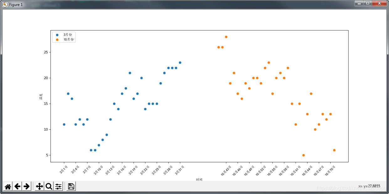
    # -*- coding: utf-8 -*-
    from matplotlib import pyplot as plt
    from matplotlib import font_manager

    # 1. 设置字体
    my_font = font_manager.FontProperties(fname='C:\Windows\Fonts\simkai.ttf')

    # 2. 数据源
    y_3 = [11, 17, 16, 11, 12, 11, 12, 6, 6, 7, 8, 9, 12, 15, 14, 17, 18, 21, 16, 17, 20, 14, 15, 15, 15, 19, 21, 22, 22,
           22, 23]
    y_10 = [26, 26, 28, 19, 21, 17, 16, 19, 18, 20, 20, 19, 22, 23, 17, 20, 21, 20, 22, 15, 11, 15, 5, 13, 17, 10, 11, 13,
            12, 13, 6]
    x_3 = range(1, 32)
    x_10 = range(41, 72)

    # 3. 图片大小和分辨率设置
    plt.figure(figsize=(16, 6), dpi=80)

    # 4. 绘制散点图
    plt.scatter(x_3, y_3, label='3月份')
    plt.scatter(x_10, y_10, label='10月份')
    plt.xlabel('时间', fontproperties=my_font)
    plt.ylabel('温度', fontproperties=my_font)

    # 5. 绘制刻度
    _x = list(x_3)+list(x_10)
    _xtick_labels = ['3月{}日'.format(i) for i in x_3]
    _xtick_labels += ['10月{}日'.format(i) for i in x_10]
    plt.xticks(_x[::3], _xtick_labels[::3], fontproperties=my_font, rotation=45)

    # 6. 绘制图例
    plt.legend(loc='upper left', prop=my_font)

    # 显示图片
    plt.show()


 浙公网安备 33010602011771号