

在数据分析和可视化中最有用的 50 个 Matplotlib 图表。 这些图表列表允许使用 python 的 matplotlib 和 seaborn
库选择要显示的可视化对象。
这里开始第四部分内容:分布(Distribution)
准备工作
在代码运行前先引入下面的设置内容。 当然,单独的图表,可以重新设置显示要素。
    # !pip install brewer2mpl
    import numpy as np
    import pandas as pd
    import matplotlib as mpl
    import matplotlib.pyplot as plt
    import seaborn as sns
    import warnings; warnings.filterwarnings(action='once')

    large = 22; med = 16; small = 12
    params = {'axes.titlesize': large,
              'legend.fontsize': med,
              'figure.figsize': (16, 10),
              'axes.labelsize': med,
              'axes.titlesize': med,
              'xtick.labelsize': med,
              'ytick.labelsize': med,
              'figure.titlesize': large}
    plt.rcParams.update(params)
    plt.style.use('seaborn-whitegrid')
    sns.set_style("white")
    # %matplotlib inline

    # Version
    print(mpl.__version__)  # >> 3.0.2
    print(sns.__version__)  # >> 0.9.0
本节内容
分布(Distribution)
统计分布 (frequency distribution)
亦称“次数(频数)分布(分配)”。在统计分组的基础上,将总体中的所有单位按组归类整理,形成总体单位在各组间的分布。分布在各组中的单位数叫做次数或频数。各组次数与总次数(全部总体单位数)之比,称为比率或频率。将各组别与次数依次编排而成的数列就叫做统计分布数列,简称分布数列或分配数列。它可以反映总体中所有单位在各组间的分布状态和分布特征,研究这种分布特征是统计分析的一项重要内容。统计分布及其分布数列,可以用表格或图形来表示
[1]
。
- 20 连续变量的直方图 (Histogram for Continuous Variable)
- 21 类型变量的直方图 (Histogram for Categorical Variable)
- 22 密度图 (Density Plot)
- 23 直方密度线图 (Density Curves with Histogram)
- 24 分组密度曲线图(Joy Plot)
- 25 分布式包点图 (Distributed Dot Plot)
- 26 箱形图 (Box Plot)
- 27 包点+箱形图 (Dot + Box Plot)
- 28 小提琴图 (Violin Plot)
- 29 人口金字塔 (Population Pyramid)
- 30 分类图 (Categorical Plots)
20 连续变量的直方图 (Histogram for Continuous Variable)
直方图显示给定变量的频率分布。 下面的图表示基于类型变量对频率条进行分组,从而更好地了解连续变量和类型变量。
    # Import Data
    df = pd.read_csv("https://github.com/selva86/datasets/raw/master/mpg_ggplot2.csv")

    # Prepare data
    x_var = 'displ'
    groupby_var = 'class'
    df_agg = df.loc[:, [x_var, groupby_var]].groupby(groupby_var)
    vals = [df[x_var].values.tolist() for i, df in df_agg]

    # Draw
    plt.figure(figsize=(16,9), dpi= 80)
    colors = [plt.cm.Spectral(i/float(len(vals)-1)) for i in range(len(vals))]
    n, bins, patches = plt.hist(vals, 30, stacked=True, density=False, color=colors[:len(vals)])

    # Decoration
    plt.legend({group:col for group, col in zip(np.unique(df[groupby_var]).tolist(), colors[:len(vals)])})
    plt.title(f"Stacked Histogram of ${x_var}$ colored by ${groupby_var}$", fontsize=22)
    plt.xlabel(x_var)
    plt.ylabel("Frequency")
    plt.ylim(0, 25)
    plt.xticks(ticks=bins[::3], labels=[round(b,1) for b in bins[::3]])
    plt.show()

21 类型变量的直方图 (Histogram for Categorical Variable)
类型变量的直方图显示该变量的频率分布。 通过对条形图进行着色,可以将分布与表示颜色的另一个类型变量相关联。
    # Import Data
    df = pd.read_csv("https://github.com/selva86/datasets/raw/master/mpg_ggplot2.csv")

    # Prepare data
    x_var = 'manufacturer'
    groupby_var = 'class'
    df_agg = df.loc[:, [x_var, groupby_var]].groupby(groupby_var)
    vals = [df[x_var].values.tolist() for i, df in df_agg]

    # Draw
    plt.figure(figsize=(16,9), dpi= 80)
    colors = [plt.cm.Spectral(i/float(len(vals)-1)) for i in range(len(vals))]
    n, bins, patches = plt.hist(vals, df[x_var].unique().__len__(), stacked=True, density=False, color=colors[:len(vals)])

    # Decoration
    plt.legend({group:col for group, col in zip(np.unique(df[groupby_var]).tolist(), colors[:len(vals)])})
    plt.title(f"Stacked Histogram of ${x_var}$ colored by ${groupby_var}$", fontsize=22)
    plt.xlabel(x_var)
    plt.ylabel("Frequency")
    plt.ylim(0, 40)
    plt.xticks(ticks=bins, labels=np.unique(df[x_var]).tolist(), rotation=90, horizontalalignment='left')
    plt.show()

22 密度图 (Density Plot)
密度图是一种常用工具,用于可视化连续变量的分布。 通过“响应”变量对它们进行分组,您可以检查 X 和 Y
之间的关系。以下情况用于表示目的,以描述城市里程的分布如何随着汽缸数的变化而变化。
    # Import Data
    df = pd.read_csv("https://github.com/selva86/datasets/raw/master/mpg_ggplot2.csv")

    # Draw Plot
    plt.figure(figsize=(16,10), dpi= 80)
    sns.kdeplot(df.loc[df['cyl'] == 4, "cty"], shade=True, color="g", label="Cyl=4", alpha=.7)
    sns.kdeplot(df.loc[df['cyl'] == 5, "cty"], shade=True, color="deeppink", label="Cyl=5", alpha=.7)
    sns.kdeplot(df.loc[df['cyl'] == 6, "cty"], shade=True, color="dodgerblue", label="Cyl=6", alpha=.7)
    sns.kdeplot(df.loc[df['cyl'] == 8, "cty"], shade=True, color="orange", label="Cyl=8", alpha=.7)

    # Decoration
    plt.title('Density Plot of City Mileage by n_Cylinders', fontsize=22)
    plt.legend()
    plt.show()

23 直方密度线图 (Density Curves with Histogram)
带有直方图的密度曲线汇集了两个图所传达的集体信息,因此可以将它们放在一个图中而不是两个图中。
    # Import Data
    df = pd.read_csv("https://github.com/selva86/datasets/raw/master/mpg_ggplot2.csv")

    # Draw Plot
    plt.figure(figsize=(13,10), dpi= 80)
    sns.distplot(df.loc[df['class'] == 'compact', "cty"], color="dodgerblue", label="Compact", hist_kws={'alpha':.7}, kde_kws={'linewidth':3})
    sns.distplot(df.loc[df['class'] == 'suv', "cty"], color="orange", label="SUV", hist_kws={'alpha':.7}, kde_kws={'linewidth':3})
    sns.distplot(df.loc[df['class'] == 'minivan', "cty"], color="g", label="minivan", hist_kws={'alpha':.7}, kde_kws={'linewidth':3})
    plt.ylim(0, 0.35)

    # Decoration
    plt.title('Density Plot of City Mileage by Vehicle Type', fontsize=22)
    plt.legend()
    plt.show()

24 分组密度曲线图(Joy Plot)
Joy Plot允许不同组的密度曲线重叠,这是一种可视化大量分组数据的彼此关系分布的好方法。 它看起来很悦目,并清楚地传达了正确的信息。 它可以使用基于
matplotlib 的 joypy 包轻松构建。 (注:需要安装 joypy 库)
    # !pip install joypy
    import joypy

    # Import Data
    mpg = pd.read_csv("https://github.com/selva86/datasets/raw/master/mpg_ggplot2.csv")

    # Draw Plot
    plt.figure(figsize=(16,10), dpi= 80)
    fig, axes = joypy.joyplot(mpg, column=['hwy', 'cty'], by="class", ylim='own', figsize=(14,10))

    # Decoration
    plt.title('Joy Plot of City and Highway Mileage by Class', fontsize=22)
    plt.show()

25 分布式包点图 (Distributed Dot Plot)
分布式包点图显示按组分割的点的单变量分布。 点数越暗,该区域的数据点集中度越高。 通过对中位数进行不同着色,组的真实定位立即变得明显。
    import matplotlib.patches as mpatches

    # Prepare Data
    df_raw = pd.read_csv("https://github.com/selva86/datasets/raw/master/mpg_ggplot2.csv")
    cyl_colors = {4:'tab:red', 5:'tab:green', 6:'tab:blue', 8:'tab:orange'}
    df_raw['cyl_color'] = df_raw.cyl.map(cyl_colors)

    # Mean and Median city mileage by make
    df = df_raw[['cty', 'manufacturer']].groupby('manufacturer').apply(lambda x: x.mean())
    df.sort_values('cty', ascending=False, inplace=True)
    df.reset_index(inplace=True)
    df_median = df_raw[['cty', 'manufacturer']].groupby('manufacturer').apply(lambda x: x.median())

    # Draw horizontal lines
    fig, ax = plt.subplots(figsize=(16,10), dpi= 80)
    ax.hlines(y=df.index, xmin=0, xmax=40, color='gray', alpha=0.5, linewidth=.5, linestyles='dashdot')

    # Draw the Dots
    for i, make in enumerate(df.manufacturer):
        df_make = df_raw.loc[df_raw.manufacturer==make, :]
        ax.scatter(y=np.repeat(i, df_make.shape[0]), x='cty', data=df_make, s=75, edgecolors='gray', c='w', alpha=0.5)
        ax.scatter(y=i, x='cty', data=df_median.loc[df_median.index==make, :], s=75, c='firebrick')

    # Annotate
    ax.text(33, 13, "$red \; dots \; are \; the \: median$", fontdict={'size':12}, color='firebrick')

    # Decorations
    red_patch = plt.plot([],[], marker="o", ms=10, ls="", mec=None, color='firebrick', label="Median")
    plt.legend(handles=red_patch)
    ax.set_title('Distribution of City Mileage by Make', fontdict={'size':22})
    ax.set_xlabel('Miles Per Gallon (City)', alpha=0.7)
    ax.set_yticks(df.index)
    ax.set_yticklabels(df.manufacturer.str.title(), fontdict={'horizontalalignment': 'right'}, alpha=0.7)
    ax.set_xlim(1, 40)
    plt.xticks(alpha=0.7)
    plt.gca().spines["top"].set_visible(False)
    plt.gca().spines["bottom"].set_visible(False)
    plt.gca().spines["right"].set_visible(False)
    plt.gca().spines["left"].set_visible(False)
    plt.grid(axis='both', alpha=.4, linewidth=.1)
    plt.show()

26 箱形图 (Box Plot)
箱形图是一种可视化分布的好方法,记住中位数、第25个第45个四分位数和异常值。 但是,您需要注意解释可能会扭曲该组中包含的点数的框的大小。
因此,手动提供每个框中的观察数量可以帮助克服这个缺点。
例如,左边的前两个框具有相同大小的框,即使它们的值分别是5和47。 因此,写入该组中的观察数量是必要的。
    # Import Data
    df = pd.read_csv("https://github.com/selva86/datasets/raw/master/mpg_ggplot2.csv")

    # Draw Plot
    plt.figure(figsize=(13,10), dpi= 80)
    sns.boxplot(x='class', y='hwy', data=df, notch=False)

    # Add N Obs inside boxplot (optional)
    def add_n_obs(df,group_col,y):
        medians_dict = {grp[0]:grp[1][y].median() for grp in df.groupby(group_col)}
        xticklabels = [x.get_text() for x in plt.gca().get_xticklabels()]
        n_obs = df.groupby(group_col)[y].size().values
        for (x, xticklabel), n_ob in zip(enumerate(xticklabels), n_obs):
            plt.text(x, medians_dict[xticklabel]*1.01, "#obs : "+str(n_ob), horizontalalignment='center', fontdict={'size':14}, color='white')

    add_n_obs(df,group_col='class',y='hwy')

    # Decoration
    plt.title('Box Plot of Highway Mileage by Vehicle Class', fontsize=22)
    plt.ylim(10, 40)
    plt.show()

27 包点+箱形图 (Dot + Box Plot)
包点+箱形图 (Dot + Box Plot)传达类似于分组的箱形图信息。 此外,这些点可以了解每组中有多少数据点。
    # Import Data
    df = pd.read_csv("https://github.com/selva86/datasets/raw/master/mpg_ggplot2.csv")

    # Draw Plot
    plt.figure(figsize=(13,10), dpi= 80)
    sns.boxplot(x='class', y='hwy', data=df, hue='cyl')
    sns.stripplot(x='class', y='hwy', data=df, color='black', size=3, jitter=1)

    for i in range(len(df['class'].unique())-1):
        plt.vlines(i+.5, 10, 45, linestyles='solid', colors='gray', alpha=0.2)

    # Decoration
    plt.title('Box Plot of Highway Mileage by Vehicle Class', fontsize=22)
    plt.legend(title='Cylinders')
    plt.show()

28 小提琴图 (Violin Plot)
小提琴图是箱形图在视觉上令人愉悦的替代品。 小提琴的形状或面积取决于它所持有的观察次数。 但是,小提琴图可能更难以阅读,并且在专业设置中不常用。
    # Import Data
    df = pd.read_csv("https://github.com/selva86/datasets/raw/master/mpg_ggplot2.csv")

    # Draw Plot
    plt.figure(figsize=(13,10), dpi= 80)
    sns.violinplot(x='class', y='hwy', data=df, scale='width', inner='quartile')

    # Decoration
    plt.title('Violin Plot of Highway Mileage by Vehicle Class', fontsize=22)
    plt.show()

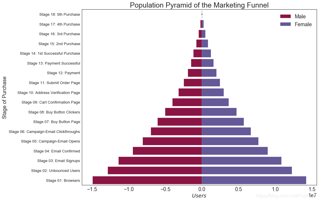
29 人口金字塔 (Population Pyramid)
人口金字塔可用于显示由数量排序的组的分布。 或者它也可以用于显示人口的逐级过滤,因为它在下面用于显示有多少人通过营销渠道的每个阶段。
    # Read data
    df = pd.read_csv("https://raw.githubusercontent.com/selva86/datasets/master/email_campaign_funnel.csv")

    # Draw Plot
    plt.figure(figsize=(13,10), dpi= 80)
    group_col = 'Gender'
    order_of_bars = df.Stage.unique()[::-1]
    colors = [plt.cm.Spectral(i/float(len(df[group_col].unique())-1)) for i in range(len(df[group_col].unique()))]

    for c, group in zip(colors, df[group_col].unique()):
        sns.barplot(x='Users', y='Stage', data=df.loc[df[group_col]==group, :], order=order_of_bars, color=c, label=group)

    # Decorations
    plt.xlabel("$Users$")
    plt.ylabel("Stage of Purchase")
    plt.yticks(fontsize=12)
    plt.title("Population Pyramid of the Marketing Funnel", fontsize=22)
    plt.legend()
    plt.show()
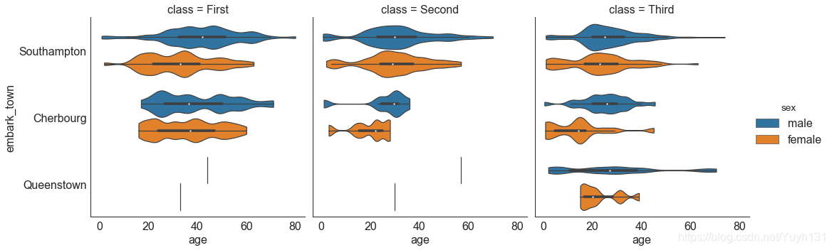
30 分类图 (Categorical Plots)
由 seaborn 库提供的分类图,可用于可视化彼此相关的 2 个或更多分类变量的计数分布。
    # Load Dataset
    titanic = sns.load_dataset("titanic")

    # Plot
    g = sns.catplot("alive", col="deck", col_wrap=4,
                    data=titanic[titanic.deck.notnull()],
                    kind="count", height=3.5, aspect=.8,
                    palette='tab20')

    fig.suptitle('sf')
    plt.show()

    # Load Dataset
    titanic = sns.load_dataset("titanic")

    # Plot
    sns.catplot(x="age", y="embark_town",
                hue="sex", col="class",
                data=titanic[titanic.embark_town.notnull()],
                orient="h", height=5, aspect=1, palette="tab10",
                kind="violin", dodge=True, cut=0, bw=.2)
总结
第四部分【分布】(Distribution) 就到这里结束啦~
传送门
Matplotlib可视化图表——第一部分【关联】(Correlation)
Matplotlib可视化图表——第二部分【偏差】(Deviation)
Matplotlib可视化图表——第三部分【排序】(Ranking)
Matplotlib可视化图表——第四部分【分布】(Distribution)
Matplotlib可视化图表——第五部分【组成】(Composition)
Matplotlib可视化图表——第六部分【变化】(Change)
Matplotlib可视化图表——第七部分【分组】(Groups)
完整版参考
[ 原文地址: Top 50 matplotlib Visualizations – The Master Plots (with full python
code) ](https://www.machinelearningplus.com/plots/top-50-matplotlib-
visualizations-the-master-plots-python/)
中文转载:深度好文 | Matplotlib可视化最有价值的 50 个图表(附完整 Python 源代码)


 浙公网安备 33010602011771号