实现微信聊天的尖角图片样式
参考连接 http://www.jianshu.com/p/f77f54720202,不过我感觉他这里实现的不是很完美,因为三角是继承的整个图片,所以做了一些更改
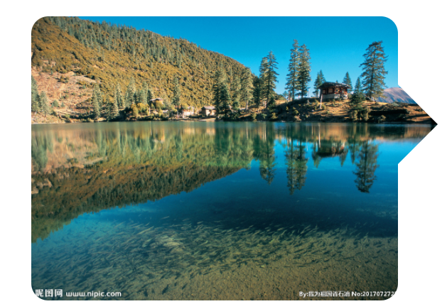
效果如下,哈哈在safari里一放大明显能看出来怎么弄的,不过下面两种方式兼容性都不好,最好让UI出图扣出这个效果

第一种实现方式
如上图,方式是一个透明三角和两个矩形去覆盖图片右侧内容,不过这样会是原本图片右侧的两个border-radius失效,然后再弄两个圆弧盖住右上角和右下角。。感觉有点傻,在android上还有兼容性问题,代码如下,效果如下图
 1 <!doctype html>
 2 <html>
 3 <head>
 4 <meta charset="utf-8">
 5 <style>
 6 .container{
 7     height: 100px;
 8     float: left;
 9     position: relative;
10 }
11 .container img{
12     height: 100px;
13     border-radius: 6px;
14 }
15 .container:after{
16     content: '';
17     position: absolute;
18     top: 24px;
19     right: -14px;
20     border: solid #fff;
21     border-width: 14px;
22     border-left-color: transparent;
23     background: inherit;
24     background-size: auto;
25     background-clip: border-box;
26     background-origin: border-box;
27 }
28 .container .top{
29     width: 14px;
30     height: 24px;
31     position: absolute;
32     top: 0;
33     right: 0;
34     background: #fff;
35 }
36 .container .bottom{
37     position: absolute;
38     width: 14px;
39     height: 62px;
40     top: 52px;
41     right: 0;
42     background: #fff;
43 }
44 .container .top_left_circle{
45     width: 12px;
46     height: 12px;
47     background-color: transparent;
48     border-radius: 50%;
49     border-left: 6px solid transparent;
50     border-right: 6px solid transparent;
51     border-bottom: 6px solid transparent;
52     border-top: 6px solid #fff;
53     position: absolute;
54     top: -6px;
55     right: 8px;
56     transform: rotate(45deg);
57 }
58 .container .bottom_left_circle{
59     width: 12px;
60     height: 12px;
61     background-color: transparent;
62     border-radius: 50%;
63     border-left: 6px solid transparent;
64     border-right: 6px solid transparent;
65     border-bottom: 6px solid #fff;
66     border-top: 6px solid transparent;
67     position: absolute;
68     bottom: -6px;
69     right: 8px;
70     transform: rotate(-45deg);
71 }
72 </style>
73 </head>
74 <body>
75 <div class="container">
76     <img src="http://pic136.nipic.com/file/20170727/18708972_230433430000_2.jpg">
77     <div class="top_left_circle"></div>
78     <div class="top"></div>
79     <div class="bottom_left_circle"></div>
80     <div class="bottom"></div>
81 </div>
82 </body>
83 </html>
然后,就想到了第二种实现方式,
这种方式是放左右两个图片,左边图片有div容器负责border-radius,并且左边图片把右边(三角形高度的)宽度隐藏;右边图片定位到右侧并剪切成(三角形底边的宽,三角形高的长)的矩形,见到那来说就是将两张图片拼成原来的图片,然后裁剪和用三角形遮盖。
这里不用裁剪也行可以把右侧的图片也加div容器,不过好像会麻烦点,图片如下,代码如下
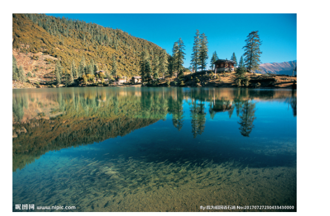
两张图片拼成原图
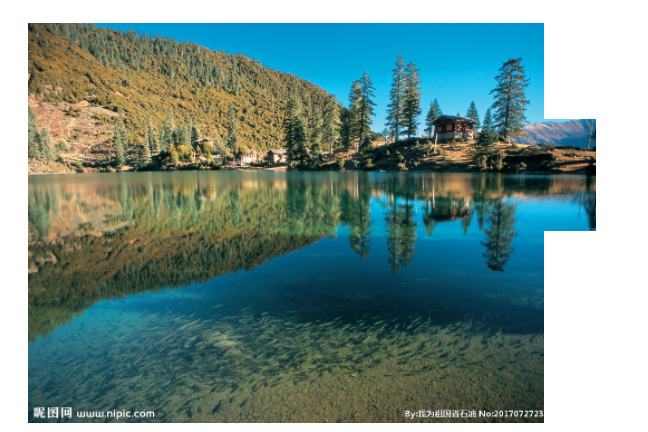
右侧图片裁剪
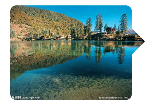
三角形覆盖
 1 <!doctype html>
 2 <html>
 3 <head>
 4 <meta charset="utf-8">
 5 <style>
 6 body{
 7     padding: 20px;
 8 }
 9 .container{
10     height: 100px;
11     float: left;
12     position: relative;
13 }
14 .container img{
15     height: 100px;
16 }
17 .container:after{
18     content: '';
19     position: absolute;
20     top: 24px;
21     right: -14px;
22     border: solid #fff;
23     border-width: 14px;
24     border-left-color: transparent;
25     background: inherit;
26     background-size: auto;
27     background-clip: border-box;
28     background-origin: border-box;
29 }
30 .container .leftDiv{
31     border-radius: 6px;
32     overflow: hidden;
33     height: 100px;
34     width: 129px;
35     margin-right: 14px;
36 }
37 .container .rightImg{
38     -webkit-clip-path: inset(24px 0 48px 128px);
39     clip-path: inset(24px 0 48px 128px);
40     position: absolute;
41     right: 0;
42     top: 0;
43 }
44 </style>
45 </head>
46 <body>
47 <div class="container">
48     <div class="leftDiv">
49         <img src="http://pic136.nipic.com/file/20170727/18708972_230433430000_2.jpg">
50     </div>
51     <img class="rightImg" src="http://pic136.nipic.com/file/20170727/18708972_230433430000_2.jpg">
52 </div>
53 </body>
54 </html>

 浙公网安备 33010602011771号