vue 渐变 进度条 progress
废话 不多少说 ,直接上代码
新建文件 gradual-progress.vue
<!--
 * @Author: gfc
 * @Date: 2019-11-07 14:00:11
 * @LastEditors: gfc
 * @LastEditTime: 2019-11-13 10:24:44
 * @Description: cp 渐变式进度条
 eg:
 <cp-progress :percentage="progressnum" style="width:300px"></cp-progress>
 -->
<template>
  <div class="cp-progress-main">
    <div class="cp-progress-bg" :style="{ 'border-radius': bRadius+'px'}">
      <div class="cp-progress-bar"
        :style="{ width: getPercentage+'%' ,background:getGradient,height:strokeWidth+'px' ,'border-radius': bRadius+'px'}"></div>
    </div>
    <div class="cp-progress-text" :style="{ 'line-height': (strokeWidth+16)+'px'}">{{getPercentage}}%</div>
  </div>
</template>
<script>

export default {
  data () {
    return {

    }
  },
  computed: {
    // 通过比例 获取 百分比
    getPercentage () {
      if (this.percentage < 0) {
        return 0
      } else if (this.percentage > 1) {
        return 100
      } else {
        // console.log(this.percentage)
        return parseInt((this.percentage + 0.000006) * 100)
      }
    },
    // 获取 进度条颜色对象
    getGradient () {
      let linecolor = this.getColorItem(this.percentage)
      if (linecolor) {
        return 'linear-gradient(90deg,' + linecolor.s + ',' + linecolor.e + ')'
      } else {
        return ''
      }
    }
  },
  methods: {
    // 根据进度 获取颜色数组
    getColorItem (p) {
      let mp = this.getPercentage
      for (let sub of this.linearColors) {
        if (!sub.ef && mp <= sub.v) {
          return sub
        } else if (sub.ef && mp < sub.v) {
          return sub
        }
      }
      return null
    }
  },
  props: {
    // 设置 进度条的 弧度
    bRadius: {
      type: Number,
      default: 4
    },
    textInside: {
      type: Number,
      default: 100
    },
    // 进度条的高度 就是粗细度
    strokeWidth: {
      type: Number,
      default: 8
    },
    // 进度条 的百分比 [0-1] 的小数
    percentage: {
      type: Number,
      default: 0
    },
    // 进度条 每个阶段的 颜色组
    linearColors: {
      type: Array,
      default: function () {
        return [{ v: 25, s: '#F7564A', e: '#F7564A' }, { v: 50, s: '#F7564A', e: '#F7E04B' }, { v: 100, s: '#F7E04B', e: '#25CCDB', ef: true }, { v: 100, s: '#25CCDB', e: '#25CCDB' }]
      }
    }
  }
}
</script>
<style lang="scss" scoped>
.cp-progress-main {
  display: flex;
  .cp-progress-bg {
    width: 50px;
    background: #eaedf4;
    flex: 1;
    margin: 8px 0;
    .cp-progress-bar {
      transition: width 1s;
    }
  }
  .cp-progress-text {
    width: 50px;
    font-size: 12px;
    font-weight: 400;
    color: #333333;

    margin-left: 10px;
  }
}
</style>
使用方法:
<cp-progress :percentage="progressnum" style="width:300px"></cp-progress>
progressnum : [0-1]
不同的阶段 不同颜色进行设置:已经默认了一组颜色
linearColors
[{ v: 100, s: '#F7E04B', e: '#25CCDB', ef: true }]
v 标识设置的百分比 s为开始颜色 ,e 为结束颜色 ef:标识 包不包含 v这个值,true 标识不包含,默认false包含
v 的值需要从小到大 范围[0-100]
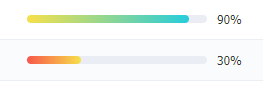
效果: