Plotly数据可视化
参考博文:https://blog.csdn.net/weixin_45826022/category_10578086.html
Js代码
<!DOCTYPE html>
<html>
<script src="https://cdn.plot.ly/plotly-latest.min.js"></script>
<body>
<div id="myPlot" style="width:100%;max-width:700px"></div>
<script>
//设置图像数据
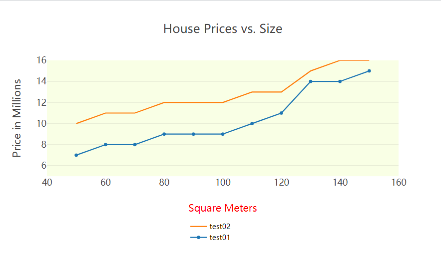
var xArray = [50,60,70,80,90,100,110,120,130,140,150];
var yArray = [7,8,8,9,9,9,10,11,14,14,15];
var xArray1 = [50,60,70,80,90,100,110,120,130,140,150];
var yArray1 = [10,11,11,12,12,12,13,13,15,16,16];
// 定义图像数据
var data = [
//第一个折线名称, X轴数据, Y轴数据, 类型:散布图,
{name: "test01", x: xArray, y: yArray, type: "scatter"},
//第二个折线名称, X轴数据, Y轴数据, 模式仅为线,
{name: "test02", x: xArray1, y: yArray1, mode:"lines"}
];
// 定义图像布局
var layout = {
//图像名称
title: "House Prices vs. Size",
//图像的大小
width: 800,
//hight: 600,
//设置标题字体的属性
font: {family: "Lato",size: 16, color: "black(100,150,200)"},
//设置图像背景
plot_bgcolor: "rgba(200,255,0,0.1)",
//X轴属性 显示范围, X轴标签名称, 设置标签名称字体及颜色, 不显示y轴以外的网格线, 不显示Y轴
xaxis: {range: [40, 160], title: "Square Meters",titlefont: {color: "red",size: 18}, showgrid: false, zeroline: false},
//Y轴属性 显示范围,Y轴标签
yaxis: {range: [5, 16], title: "Price in Millions"},
legend: {
//图例相关属性, 竖直方向定位参考的位置
yref: "paper",
// xanchor: "right",
//默认top
yanchor: "bottom",
//以下的X与Y值可以改变其图列的位置
//图例处于整个图像(水平方向)的位置百分比
x: 0.4,
//注释处于整个图像(竖直方向)的位置百分比,最下方为0,最上方为1
y: -0.6,
//逆序注释排列
traceorder: "reversed",
//设置字体大小及颜色
font: {size: 13,color: 'black'}
//bgcolor:'rgba(254, 237, 224,0)' //透明背景
},
//不显示图例
//showlegend: false,
//注释属性
annotation: [{text: "these are annotations for scatter, you can write what you want to explain.",
//注释放置位置的参考
xref: 'paper', //x轴方向参考的面,可省略
yref: 'paper', //y轴方向参考的面,可省略
x: 0.2, //必须和xref搭配使用
y: -0.15,
xanchor: 'center', //3个取值,left&right¢er,默认left,写其他值都当默认处理
yanchor: 'bottom', //3个取值,top&bottom&middle,默认bottom,写其他值都当默认处理
showarrow:false,
font: {
family: 'Arial',
size: 14,
color: 'rgb(150,150,150)'
}
}
]
};
// 输出图表
Plotly.newPlot("myPlot", data, layout);
</script>
</body>
</html>
效果图

 浙公网安备 33010602011771号