
echarts折柱混合(图表数据与x轴对应显示)
一天24个小时,每个小时不一定都有对应的数据,所以后台给出的数据,只有每个时间点对应的数据,比如4点,给的是112,5点的242,其他时间没有,则只显示4点,5点时候的数据,那么现在
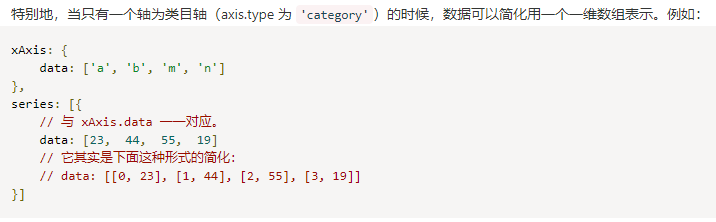
对应的时间点就是后台给的时间点,x轴坐标与该时间点一一对应,按以下数据格式即可。
直接贴代码:
数据格式:{"value":["16", "117"]} //16代表在x轴显示的下标位置,117为数据量
var columns1=[{"value":["16", "117"]},{"value":["15", "17"},{"value":["6", "11"},{"value":["22", "47"},{"value":["16", "27"}];
var columns2= [{"value":["16", "117"]},{"value":["15", "17"},{"value":["6", "11"},{"value":["22", "47"},{"value":["16", "27"}];
var columns3= [{"value":["16", "117"]},{"value":["15", "17"},{"value":["6", "11"},{"value":["22", "47"},{"value":["16", "27"}];
var columns4= [{"value":["16", "117"]},{"value":["15", "17"},{"value":["6", "11"},{"value":["22", "47"},{"value":["16", "27"}];
var theme_style = ["#51DCD1", "red", "#FFD856", "#2E4650"];
var newXtitle = ["00", "01", "02", "03", "04", "05", "06", "07", "08", "09", 10, 11, 12, 13, 14, 15, 16, 17, 18, 19, 20, 21, 22, 23];//x轴
option = {
    legend:{show: true,},
    tooltip: {
        trigger: 'axis',
        axisPointer: {
            type: 'cross'
        }
    },
    grid: {
        left:"13%",
        right:"16%",
    },
    xAxis: [{
        type: 'category',
        //boundaryGap : false,//刻度从0开始
        data: newXtitle,
        axisPointer: {
            type: 'shadow'
        }}
    ],
    yAxis: [
      {
      type: 'value',
      min: 0,
      axisLabel: {
        formatter: '{value}'
        }
      }
    ],
   series: [
      {
        name:'平均延迟',
        type:'bar',
        color: theme_style[0],
        data: columns4,
        yAxisIndex: 0,
        //"connectNulls": true, //将断点链接
        itemStyle : { normal: {label : {show: true}}},//显示数据
      },
      {
        name:'平均延迟(昨日)',
        type:'bar',
        //symbol:"none",//去掉小圆点
        yAxisIndex: 0,
        color: theme_style[2],
        //position:'start',//设置刻度线 是在上面 还是下面
        smooth:0.4,//设置折线图弧度 0-1
        data: columns2,
        // "connectNulls": true, //将断点链接
        itemStyle : { normal: {label : {show: true}}},//在柱状图上显示数据
      },
      {
        name:'信控工单失败量',
        boundaryGap: true,
        type:'line',
        barMinWidth:25,
        color: theme_style[1],
        yAxisIndex: 1,
        smooth:0.4,
        data: columns5,
        itemStyle : { normal: {label : {show: false}}},
      },
        {
        name:'信控工单失败量(昨日)',
        type:'line',
        boundaryGap: true,
        barMinWidth:25,
        color: theme_style[3],
        yAxisIndex: 1,
        data: columns3,
        itemStyle : { normal: {label : {show: false}}},
        },
       ]
    };
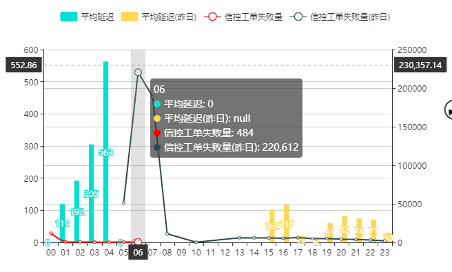
最终显示如下图:
对应的echarts知识点:
PS:很多知识点查api即可找到。

 浙公网安备 33010602011771号