
HTML--比较实用的小例子
常用的前端实例:
1略
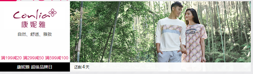
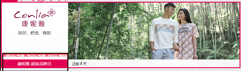
2、在网页商城中的图片当我们把鼠标放上去之后,图片会显示一个有颜色的外边框,图片某一部分的字体的颜色并发生改变
鼠标放上去之前
鼠标放上去之后:
实现的代码:


<!DOCTYPE html>
<html lang="en">
<head>
    <meta charset="UTF-8" content="text/html" http-equiv="Content-Type">
    <title>Title</title>
    <style>
        .ele{
            /*先给图片的变框设置一个有宽度的变框这个鼠标放上去看到的效果就是静态的*/
            border: 1px solid transparent;
            /*加变框是为了不希望看到图片的位置发生改变*/
        }

        .ele:hover{
            /*伪类 :鼠标放上去会出现一个外边框*/
            border: 1px solid gray;
        }
        /*鼠标放上去 一部分的字体颜色发生改变*/
        .ele:hover .ele-item{
            color: red;
        }
    </style>
</head>
<body>
    <div class="ele">
        <div>123</div>
        <div class="ele-item">123</div>
    </div>
</body>
</html>
3、鼠标放到图片上,图片上会显示一些相关的信息:
之前的效果:

设置代码之后的效果:
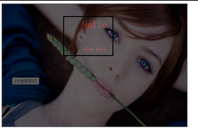
上代码:
<!DOCTYPE html>
<html lang="en">
<head>
    <meta charset="UTF-8" content="text/html" http-equiv="Content-Type">
    <title>隐藏</title>
    <style>
        .touch{
            /*父亲div的position采用relative
            那么在其内部的div只需要使用absolute就可以定位在父div的任意位置*/
            overflow: hidden;
            position: relative;
            width: 600px;
            height: 400px;

        }
        .touch img{
            /*设置图片的宽和高让它在框架的div中铺满*/
            width: 600px;
            height: 400px;

        }
        .touch .content{
            position: absolute;
            top:0;
            left:0;
            right:0;
            bottom:0;
            background-color: black;
            opacity: 0.6;   /*透明度*/
            color: red;
            text-align: center;
            visibility: hidden;
        }
        .touch:hover .content{
            /*内容设置一个伪类 鼠标放上去让其可见*/
            visibility: visible;
        }
        .touch .content .c1{
            font-size: 32px;
            padding: 50px 0;

        }
     </style>
</head>
<body>
    <div class="touch">
        <div><img src="nice.png"></div>
        <div class="content">
            <div class="c1">Hello</div>
            <div class="c2">nice girl</div>
        </div>
    </div>
</body>
</html>
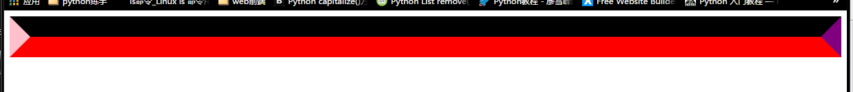
4、画三角形:
4.1、border的特性:拐角处是特殊的样式:
<!DOCTYPE html>
<html lang="en">
<head>
    <meta charset="UTF-8" content="text/html" http-equiv="Content-Type">
    <title>画图</title>
    <style>
        .picture{
            border-top: 30px solid black;
            border-bottom: 30px solid red;
            border-right: 30px solid purple;
            border-left: 30px solid pink;
        }
    </style>
</head>
<body>
<div class="picture"></div>
</body>
</html>
拉长的效果是由于div是块级标签
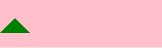
4.2、将图形变成一个正方形:

<!DOCTYPE html>
<html lang="en">
<head>
    <meta charset="UTF-8" content="text/html" http-equiv="Content-Type">
    <title>画图</title>
    <style>
        .picture{
            border-top: 30px solid black;
            border-bottom: 30px solid red;
            border-right: 30px solid purple;
            border-left: 30px solid pink;
            /*将块级变成内联的且可以设置宽度高度*/
            display: inline-block;

        }
    </style>
</head>
<body>
<div class="picture"></div>
</body>
</html>
4.3画一个上三角形
就是把上边的正方的其他边设置成透明色就可以达到设置三角的目的:
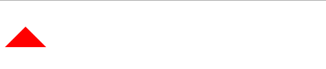
<!DOCTYPE html>
<html lang="en">
<head>
    <meta charset="UTF-8" content="text/html" http-equiv="Content-Type">
    <title>画三角</title>
    <style>
        .up{
            border-top: 30px solid transparent;
            border-bottom: 30px solid red;
            border-right: 30px solid transparent;
            border-left: 30px solid transparent;
            /*将块级变成内联的且可以设置宽度高度*/
            display: inline-block;

        }
    </style>
</head>
<body>
<div class="up"></div>
</body>
</html>
4.4画一个下三角,鼠标放上去变成下三角且颜色不一样:
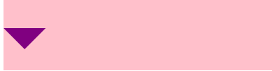
<!DOCTYPE html>
<html lang="en">
<head>
    <meta charset="UTF-8" content="text/html" http-equiv="Content-Type">
    <title>尖角</title>
    <style>
                .c1{
            border: 30px solid transparent;
            border-top: 30px solid purple;

           margin-top: 40px;
            display: inline-block;
        }
        .c1:hover{
            border: 30px solid transparent;
            border-bottom: 30px solid green;
            margin-top: 10px;

        }

           </style>
</head>
<body>

<div style="height: 100px;background-color: pink;">
    <div class="c1"></div>
</div>

</body>
</html>
5、引用特殊的图标:(awesome)

<!DOCTYPE html>
<html lang="en">
<head>
    <meta charset="UTF-8" content="text/html" http-equiv="Content-Type">
    <title>图标</title>
    <link rel="stylesheet" href="font-awesome/css/font-awesome.css">
    <style>
    </style>
</head>
<body>
    <i class="icon-cny"></i>
    <i class="icon-collapse"></i>
    <i class="icon-twitter-sign"></i>
</body>
</html>
6、输入框
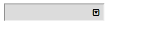
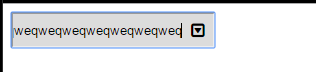
<!DOCTYPE html>
<html lang="en">
<head>
    <meta charset="UTF-8" content="text/html" http-equiv="Content-Type">
    <title>form-input</title>
    <link href="font-awesome/css/font-awesome.css" rel="stylesheet">
    <style>
        .user{
            position: relative;
            /*background-color: purple;*/
            width: 250px;
        }
        .user input{
            height: 30px;
            width: 170px;
            background-color: gainsboro;
            padding-right: 30px;
        }
        .user .ren{
            position: absolute;
            top: 10px;
            left: 180px;
        }
        .icon-collapse{
            cursor: pointer;
        }
    </style>
</head>
<body>

    <div class="user">
        <input type="text">
        <span class="ren icon-collapse"></span>
    </div>

</body>
</html>
7、页面布局:
- 导航栏固定
- 菜单栏如果超出屏幕范围则有下拉框
- 内容部分超出页面也会有下拉框
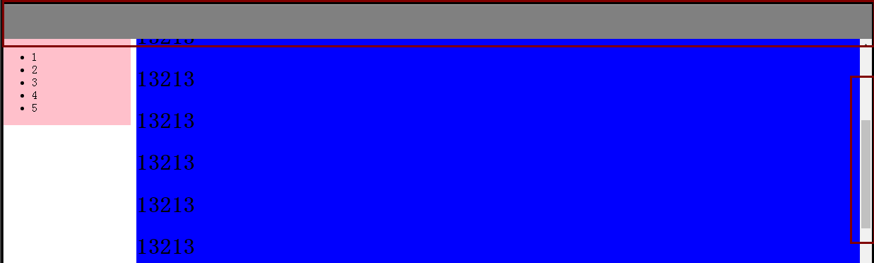
<!DOCTYPE html>
<html lang="en">
<head>
    <meta charset="UTF-8" content="text/html" http-equiv="Content-Type">
    <title>布局页-1</title>
    <style>
        body{
            margin: 0;
        }
        .pg-body{
            height: 48px;
            background-color: gray;
        }
        .pg-body .body-menu{
            top: 48px;
            position: absolute;
            width: 180px;
            background-color: pink;
            left: 0px;
        }
        .pg-body .body-content{
            position:absolute;
            top: 48px;
            left: 188px;
            right:0;
            bottom:0;
            background-color: blue;
            overflow: auto;
        }


    </style>


</head>
<body>
<div class="pg-header">

</div>

<div class="pg-body">
    <div class="body-menu">
        <ul>
            <li>1</li>
            <li>2</li>
            <li>3</li>
            <li>4</li>
            <li>5</li>

        </ul>
    </div>
    <div class="body-content">
        <h1>13213</h1><h1>13213</h1><h1>13213</h1><h1>13213</h1><h1>13213</h1><h1>13213</h1><h1>13213</h1><h1>13213</h1><h1>13213</h1><h1>13213</h1><h1>13213</h1><h1>13213</h1>
        <h1>13213</h1><h1>13213</h1><h1>13213</h1><h1>13213</h1><h1>13213</h1><h1>13213</h1><h1>13213</h1><h1>13213</h1><h1>13213</h1><h1>13213</h1><h1>13213</h1><h1>13213</h1><h1>13213</h1><h1>13213</h1>
        <h1>13213</h1><h1>13213</h1><h1>13213</h1><h1>13213</h1><h1>13213</h1><h1>13213</h1><h1>13213</h1><h1>13213</h1><h1>13213</h1><h1>13213</h1><h1>13213</h1><h1>13213</h1><h1>13213</h1><h1>13213</h1>


    </div>
</div>


<div></div>

</body>
</html>
8、有些页面打开之后我们点击登录,会弹出一个小的文本框,在屏幕的中间让用户登录或者注册,且页面的内容是可见的;
效果如下:
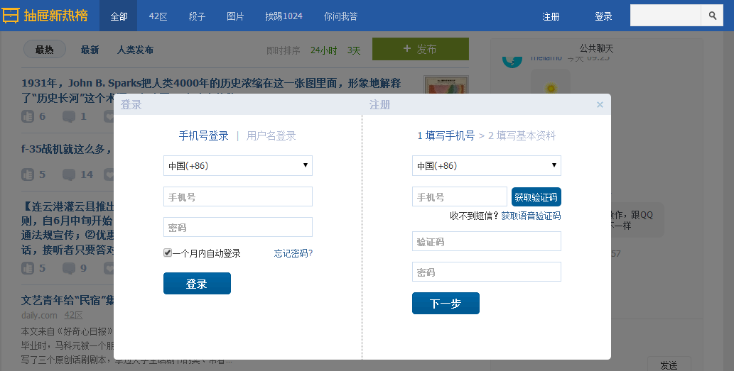
这个画面共有三个层次,最底部是网页,第二层是一个遮罩层(透明的灰色), 第三层就是我们看到的登录注册的页面且在页面偏上的位置:
<!DOCTYPE html>
<html lang="en">
<head>
    <meta charset="UTF-8" content="text/html" http-equiv="Content-Type">
    <title>模态对话框</title>
    <style>
        body{
            margin: 0;
            padding: 0;
        }
        .model{
            position: fixed;
            top:0;
            left:0;
            bottom:0;
            right:0;
            background: rgba(0,0,0,.6);
            z-index: 2;
        }
        .content{
            height: 300px;
            width: 400px;
            background-color: white;
            position: fixed;
            top:50%;
            left: 50%;
            z-index: 3;
            margin-top: -200px;
            margin-left: -200px;
        }


    </style>

</head>
<body>


<div style="height: 2000px;background-color: gainsboro">
    <h1>132</h1><h1>132</h1><h1>132</h1><h1>132</h1><h1>132</h1>
    <h1>132</h1><h1>132</h1><h1>132</h1>


</div>
    <div class="model"></div>
    <div class="content"></div>


</body>
</html>
9、购物的时候可以选择一个或者多个
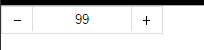
<!DOCTYPE html>
<html lang="en">
<head>
    <meta charset="UTF-8" content="text/html" http-equiv="Content-Type">
    <title>商品数量的加减</title>
    <style>
        body{
            margin: 0;
        }
        .left{
            float: left;
        }
        .center{
            line-height: 26px;
            text-align: center;
        }
        .wrap{
            width: 160px;
            height: 26px;
            border: 1px solid #dddddd;
            /*background-color: gainsboro;*/
        }
        .wrap .minus{
            height: 26px;
            width: 30px;
            cursor: pointer;

        }
        .wrap .plus{
            height: 26px;
            width: 30px;
            cursor: pointer;

        }
        .wrap .count input{
            height: 24px;
            border: 0;
            width: 98px;
            padding: 0;
            border-right: 1px solid #dddddd;
            border-left: 1px solid #dddddd;
            text-align: center;

        }


    </style>


</head>
<body>
<div class="wrap">
    <div class="minus left center" onclick="Minus();">-</div>
    <div class="count left">
        <input id="count" type="text" value="99">
    </div>
    <div class="plus left center" onclick="Plus();">+</div>
</div>

<script type="text/javascript">
    function Plus(){
        var old_str = document.getElementById("count").value;
        var old_int = parseInt(old_str);
        var new_int = old_int + 1;
        document.getElementById('count').value = new_int;
    }
    function Minus(){
        var old_str = document.getElementById("count").value;
        var old_int = parseInt(old_str);
        var new_int = old_int - 1;
        document.getElementById('count').value = new_int;
    }

</script>

</body>
</html>
预习的内容

 浙公网安备 33010602011771号