CSS效果:CSS实用技巧制作三角形以及箭头效果
实现如图所示的三角形图标:

html代码如下:
<div class="arrow-up"></div>
<div class="arrow-down"></div>
<div class="arrow-left"></div>
<div class="arrow-right"></div>
css样式:
body{background:#faf7ef;}
div{margin:20px auto}
div.arrow-up {
  width:0px;
  height:0px;
  border-left:50px solid transparent;
  border-right:50px solid transparent;
  border-bottom:50px solid #ff0000;
  font-size:0px;
  line-height:0px;
}


div.arrow-down {
  width:0px;
  height:0px;
  border-left:50px solid transparent;
  border-right:50px solid transparent;
  border-top:50px solid #0000ff;
  font-size:0px;
  line-height:0px;
}


div.arrow-left {
  width:0px;
  height:0px;
  border-bottom:50px solid transparent;
  border-top:50px solid transparent;
  border-right:50px solid #008000;
  font-size:0px;
  line-height:0px;
}


div.arrow-right {
  width:0px;
  height:0px;
  border-bottom:50px solid transparent;
  border-top:50px solid transparent;
  border-left:50px solid #ffff00;
  font-size:0px;
  line-height:0px;
}
实现箭头效果如下所示:
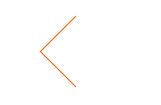
CSS代码:
.arrow{
    display: inline-block;
    border-top: 2px solid;
    border-right: 2px solid;
    width: 100px;
    height: 100px;
    border-color: #EA6000;
    transform: rotate(-135deg);
    margin: 50px auto auto 100px;
}
html代码:
<span class="arrow"></span>

 浙公网安备 33010602011771号