
CSS3 动画 animation
1、CSS3 @keyframes规则
@keyframes myfirst
{
from {background: red;}
to {background: yellow;}
}
@-webkit-keyframes myfirst /* Safari and Chrome */
{
from {background: red;}
to {background: yellow;}
}
@keyframes myfirst
{
0%{background: red;}
25%{background: yellow;}
50%{background: blue;}
100%{background: green;}
}
@-webkit-keyframes myfirst /* Safari and Chrome */
{
0%{background: red;}
25%{background: yellow;}
50%{background: blue;}
100%{background: green;}
}
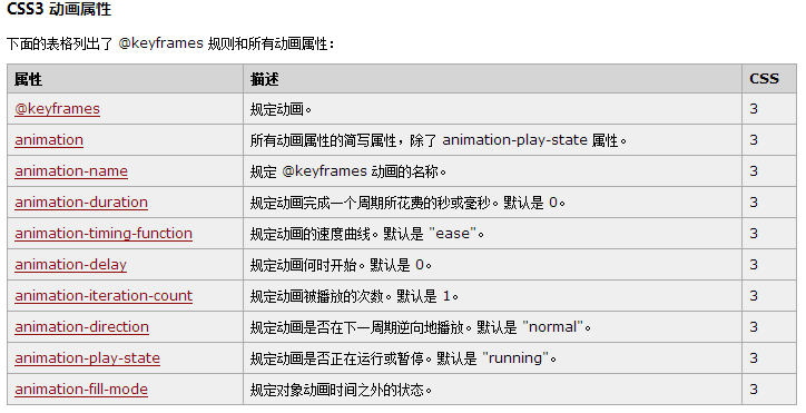
2、CSS3的动画属性
<style>
div
{
animation-name: myfirst;
animation-duration:5s;
animation-timing-function: linear;/*ease*/
animation-delay:2s;/*0*/
animation-iteration-count: infinite;/*1*/
animation-direction: alternate;/*normal*/
animation-play-state: running;
/* Safari and Chrome: */
-webkit-animation-name: myfirst;
-webkit-animation-duration:5s;
-webkit-animation-timing-function: linear;
-webkit-animation-delay:2s;
-webkit-animation-iteration-count: infinite;
-webkit-animation-direction: alternate;
-webkit-animation-play-state: running;
}
</style>
简写的动画 animation 属性:名称持续时间速度开始时间播放次数是否下个周期逆向播放
div
{
animation: myfirst 5s linear 0s infinite normal;
-webkit-animation: myfirst 5s linear 0s infinite normal;
-moz-animation: myfirst 5s linear 0s infinite normal;
-ms-animation: myfirst 5s linear 0s infinite normal;
-o-animation: myfirst 5s linear 0s infinite normal;
}

animation:3s linear 0s normal none infinite rotate;
-webkit-animation:3s linear 0s normal none infinite rotate;
-moz-animation:3s linear 0s normal none infinite rotate;
-ms-animation:3s linear 0s normal none infinite rotate;
-o-animation:3s linear 0s normal none infinite rotate;
@-webkit-keyframes rotate {
from {
-webkit-transform:rotate(0deg);
}
to {
-webkit-transform: rotate(360deg)
}
}
@-moz-keyframes rotate {
from {
-moz-transform:rotate(0deg)
}
to {
-moz-transform: rotate(360deg)
}
}
@-ms-keyframes rotate {
from {
-ms-transform:rotate(0deg)
}
to {
-ms-transform: rotate(360deg)
}
}
@-o-keyframes rotate {
from {
-o-transform:rotate(0deg)
}
to {
-o-transform: rotate(360deg)
}
}
********animation-fill-mode
动画结束以后,会立即从结束状态跳回到起始状态。如果想让动画保持在结束状态,需要使用animation-fill-mode属性。
div:hover {
animation:1s rainbow forwards;
}
forwards表示让动画停留在结束状态

 浙公网安备 33010602011771号