matplotlib创建多个绘图区
这段跟之前的操作单独的一个绘图区的代码整个过程几乎是一致的,区别主要有两点:
- 一是使用索引来确定要操作的是哪个绘图区,比如这里的axes[0]和axes[1]。每一行中定义的绘图区用一个一维数组来表示,如果创建的是两行两列的绘图区,则整个绘图区会保存在一个二维数组里面,表示为axes[0][0]这种格式。
- 二是当我们设置x轴和y轴的值时,原来使用的xticks和yticks方法,但现在使用axes.set_xticks和set_yticks这种更偏向于面向对象的函数调用方法来进行操作,包括像设置x轴和y轴的标签以及设置图形标题等,都是使用set_title,set_label这样的形式。
import matplotlib.pyplot as plt
# %matplotlib inline
from tools.plt_test import weather
weathers = weather.weather_day() # 获取最近七天天气的方法
x = [] # 存放近七天的日期
low = [] # 存放近七天的最低温度
high = [] # 存放近七天的最高温度
diff = [] # 存放近七天的温差
# 获取日期,最高温,最低温,温差
for i in weathers:
print(weathers[i])
x.append(weathers[i]['time'].split('-', 1)[1])
low.append(int(weathers[i]['min_degree']))
high.append(int(weathers[i]['max_degree']))
# 获取温差
for l, h in zip(low, high):
diff.append(h - l)
# 显示中文
plt.rcParams['font.sans-serif'] = ['SimHei']
# 解决无法显示负号
plt.rcParams['axes.unicode_minus'] = False
# 创建一个1行2列的画布
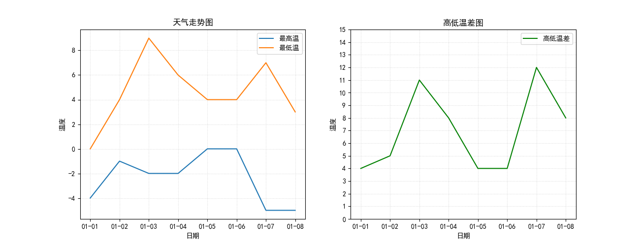
figure, axes = plt.subplots(ncols=2, nrows=1, figsize=(13, 5), dpi=100)
# 绘图对象
ax1 = axes[0]
ax2 = axes[1]
# ax1 config
# 设置标题
ax1.set_title('天气走势图')
# x轴描述
ax1.set_xlabel('日期')
# y轴描述
ax1.set_ylabel('温度')
# 添加网格显示,linestyle网格样式,alpha透明度
ax1.grid(linestyle=':', alpha=0.5)
# 一条折线
ax1.plot(x, low, label='最高温')
# 另一条折线
ax1.plot(x, high, label='最低温')
# 右上角显示图例
ax1.legend()
# ax2 config
# 设置标题
ax2.set_title('高低温差图')
# x轴描述
ax2.set_xlabel('日期')
# y轴描述
ax2.set_ylabel('温度')
# 添加网格显示,linestyle网格样式,alpha透明度
ax2.grid(linestyle=':', alpha=0.5)
# 一条折线
ax2.plot(x, diff, label='高低温差', color='green')
# y轴范围,间距
ax2.set_yticks(range(0, 16, 1))
# 右上角显示图例
ax2.legend()
# 保存图片,显示绘图
plt.savefig('weather_demo.png')
plt.show()

 浙公网安备 33010602011771号