使用css 画三角形的三种方法
使用纯css 绘制三角形
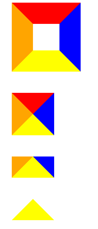
方法一 使用边框实现
- 先实现一个div 四个粗边框 不同颜色 保留左右和下边框 设置左右边框为颜色为 transparent
<body>
    <div class="div1"></div>
    <div class="div2"></div>
    <div class="div3"></div>
    <div class="div4"></div>

</body>
<style>
    .div1{
        border-top: 80px solid red;
        border-right: 80px solid blue;
        border-bottom: 80px solid yellow;
        border-left: 80px solid orange;
        width: 100px;
        height: 100px;
        margin-top: 80px;
    }
    .div2{
        border-top: 80px solid red;
        border-right: 80px solid blue;
        border-bottom: 80px solid yellow;
        border-left: 80px solid orange;
        width: fit-content;
        margin-top: 80px;
    }
    .div3{
        /* border-top: 80px solid red; */
        border-right: 80px solid blue;
        border-bottom: 80px solid yellow;
        border-left: 80px solid orange;
        width: fit-content;
        margin-top: 80px;
    }
    .div4{
        /* border-top: 80px solid red; */
        border-right: 80px solid transparent;
        border-bottom: 80px solid yellow;
        border-left: 80px solid transparent;
        width: fit-content;
        margin-top: 80px;
    }
</style>
方法二 linear-gradient 使用渐变背景
<body>
    <div class="div1"></div>
    <div class="div2"></div>
    <div class="div3"></div>
    <div class="div4"></div>
    <div class="div5"></div>
    <div class="div6"></div>
</body>
<style>
    .div1{
        width: 80px;
        height: 100px;
        background-repeat: no-repeat;
        outline: 1px solid blue;
        margin-top: 40px;
    }
    .div2{
        width: 80px;
        height: 100px;
        background-repeat: no-repeat;
        outline: 1px solid blue;
        background-image: linear-gradient(45deg, red 50%, rgba(255, 255, 255, 0) 50%);
        margin-top: 40px;
    }
    .div3{
        width: 80px;
        height: 100px;
        background-repeat: no-repeat;
        outline: 1px solid blue;
        background-image: linear-gradient(45deg, red 50%, rgba(255, 255, 255, 0) 50%);
        background-size: 100% 50%;
        margin-top: 40px;
    }
    .div4{
        width: 80px;
        height: 100px;
        background-repeat: no-repeat;
        outline: 1px solid blue;
        background-image: linear-gradient(32deg, red 50%, rgba(255, 255, 255, 0) 50%);
        background-size: 100% 50%;
        margin-top: 40px;
    }
    .div5{
        width: 80px;
        height: 100px;
        background-repeat: no-repeat;
        outline: 1px solid blue;
        background-image: linear-gradient(32deg, orangered 50%, rgba(255, 255, 255, 0) 50%), linear-gradient(148deg, orangered 50%, rgba(255, 255, 255, 0) 50%);
        background-size: 100% 50%;
        margin-top: 40px;
    }
    .div6{
        width: 80px;
        height: 100px;
        background-repeat: no-repeat;
        outline: 1px solid blue;
        background-image: linear-gradient(32deg, orangered 50%, rgba(255, 255, 255, 0) 50%), linear-gradient(148deg, orangered 50%, rgba(255, 255, 255, 0) 50%);
        background-position: top left, bottom left;
        background-size: 100% 50%;
        margin-top: 40px;
    }
</style>
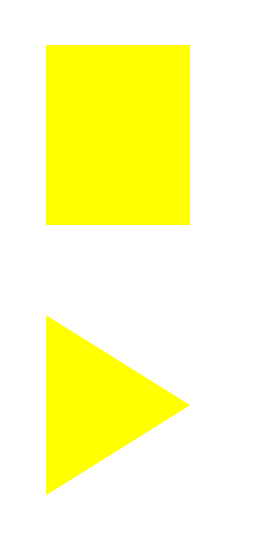
方法三 clip-path 最精简 但有浏览器兼容问题
<body>
    <div class="div1"></div>
    <div class="div2"></div>

</body>
<style>
    .div1{
		margin: 100px;
		width: 160px;
        height: 200px;
        background-color: yellow;
        margin-top: 80px;
    }
    .div2{
		margin: 100px;
		width: 160px;
        height: 200px;
        background-color: yellow;
		clip-path: polygon(0 0, 0% 100%, 100% 50%);
        margin-top: 80px;
    }
</style>

 浙公网安备 33010602011771号