Cys_Control(二) MButton
一、添加自定义Button
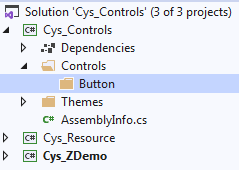
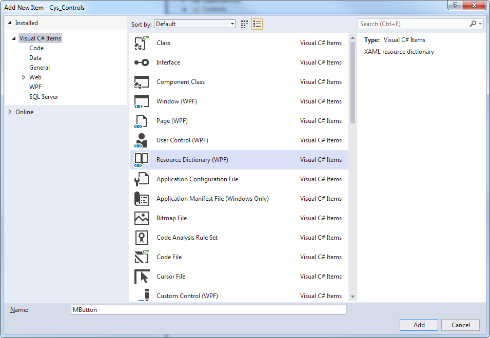
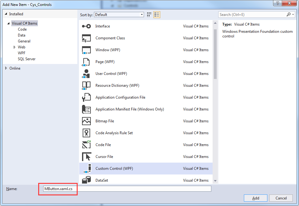
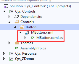
二、Xaml文件自动关联
Custom Control 取名与资源文件相同加.cs文件将自动关联
Themes文件下Generic.xaml引入该控件,用于对外公布样式
<ResourceDictionary
    xmlns="http://schemas.microsoft.com/winfx/2006/xaml/presentation">
    <ResourceDictionary.MergedDictionaries>
        <ResourceDictionary Source="pack://application:,,,/Cys_Controls;component/Controls/Button/MButton.xaml"/>
    </ResourceDictionary.MergedDictionaries>
</ResourceDictionary>
至此第一个控件已关联完毕
三、查看Button原始样式
下面自定义MButton样式
打开Blend新建Wpf程序 Button右键查看原始样式

<Style x:Key="ButtonFocusVisual">
    <Setter Property="Control.Template">
        <Setter.Value>
            <ControlTemplate>
                <Rectangle Margin="2" StrokeDashArray="1 2" SnapsToDevicePixels="true" StrokeThickness="1" Stroke="{DynamicResource {x:Static SystemColors.ControlTextBrushKey}}"/>
            </ControlTemplate>
        </Setter.Value>
    </Setter>
</Style>
<LinearGradientBrush x:Key="ButtonNormalBackground" EndPoint="0,1" StartPoint="0,0">
    <GradientStop Color="#F3F3F3" Offset="0"/>
    <GradientStop Color="#EBEBEB" Offset="0.5"/>
    <GradientStop Color="#DDDDDD" Offset="0.5"/>
    <GradientStop Color="#CDCDCD" Offset="1"/>
</LinearGradientBrush>
<SolidColorBrush x:Key="ButtonNormalBorder" Color="#FF707070"/>
<Style x:Key="ButtonStyle1" TargetType="{x:Type Button}">
    <Setter Property="FocusVisualStyle" Value="{StaticResource ButtonFocusVisual}"/>
    <Setter Property="Background" Value="{StaticResource ButtonNormalBackground}"/>
    <Setter Property="BorderBrush" Value="{StaticResource ButtonNormalBorder}"/>
    <Setter Property="BorderThickness" Value="1"/>
    <Setter Property="Foreground" Value="{DynamicResource {x:Static SystemColors.ControlTextBrushKey}}"/>
    <Setter Property="HorizontalContentAlignment" Value="Center"/>
    <Setter Property="VerticalContentAlignment" Value="Center"/>
    <Setter Property="Padding" Value="1"/>
    <Setter Property="Template">
        <Setter.Value>
            <ControlTemplate TargetType="{x:Type Button}">
                <theme:ButtonChrome x:Name="Chrome" Background="{TemplateBinding Background}" BorderBrush="{TemplateBinding BorderBrush}" RenderMouseOver="{TemplateBinding IsMouseOver}" RenderPressed="{TemplateBinding IsPressed}" RenderDefaulted="{TemplateBinding IsDefaulted}" SnapsToDevicePixels="true">
                    <ContentPresenter HorizontalAlignment="{TemplateBinding HorizontalContentAlignment}" Margin="{TemplateBinding Padding}" RecognizesAccessKey="True" SnapsToDevicePixels="{TemplateBinding SnapsToDevicePixels}" VerticalAlignment="{TemplateBinding VerticalContentAlignment}"/>
                </theme:ButtonChrome>
                <ControlTemplate.Triggers>
                    <Trigger Property="IsKeyboardFocused" Value="true">
                        <Setter Property="RenderDefaulted" TargetName="Chrome" Value="true"/>
                    </Trigger>
                    <Trigger Property="ToggleButton.IsChecked" Value="true">
                        <Setter Property="RenderPressed" TargetName="Chrome" Value="true"/>
                    </Trigger>
                    <Trigger Property="IsEnabled" Value="false">
                        <Setter Property="Foreground" Value="#ADADAD"/>
                    </Trigger>
                </ControlTemplate.Triggers>
            </ControlTemplate>
        </Setter.Value>
    </Setter>
</Style>
ControlTemplate 标签下为控件的展示形式如下
<theme:ButtonChrome x:Name="Chrome" Background="{TemplateBinding Background}" BorderBrush="{TemplateBinding BorderBrush}" RenderMouseOver="{TemplateBinding IsMouseOver}" RenderPressed="{TemplateBinding IsPressed}" RenderDefaulted="{TemplateBinding IsDefaulted}" SnapsToDevicePixels="true">
   <ContentPresenter HorizontalAlignment="{TemplateBinding HorizontalContentAlignment}" Margin="{TemplateBinding Padding}" RecognizesAccessKey="True" SnapsToDevicePixels="{TemplateBinding SnapsToDevicePixels}" VerticalAlignment="{TemplateBinding VerticalContentAlignment}"/>
</theme:ButtonChrome>
四、更改默认样式并添加依赖属性
可替换改部分内容为我们的展示 MButton.xaml具体代码
<ResourceDictionary xmlns="http://schemas.microsoft.com/winfx/2006/xaml/presentation"
                    xmlns:x="http://schemas.microsoft.com/winfx/2006/xaml"
                    xmlns:local="clr-namespace:Cys_Controls.Controls">

    <Style TargetType="{x:Type local:MButton}">
        <Setter Property="Foreground" Value="{DynamicResource ColorBrush.FontDefaultColor}" />
        <Setter Property="Background" Value="{DynamicResource ColorBrush.DefaultBackgroundColor}" />
        <Setter Property="BorderBrush" Value="{DynamicResource ColorBrush.DefaultBorderBrushColor}"/>
        <Setter Property="IsMouseOverBrush" Value="{DynamicResource ColorBrush.DefaultBackgroundOverColor}"/>
        <Setter Property="FocusVisualStyle" Value="{x:Null}"/>
        <Setter Property="BorderThickness" Value="1" />
        <Setter Property="VerticalContentAlignment" Value="Center" />
        <Setter Property="Template">
            <Setter.Value>
                <ControlTemplate TargetType="{x:Type local:MButton}">
                    <Border x:Name="PART_Border" Background="{TemplateBinding Background}" BorderThickness="{TemplateBinding BorderThickness}"
                            BorderBrush="{TemplateBinding BorderBrush}" CornerRadius="4">
                        <Grid>
                            <StackPanel HorizontalAlignment="Center" Orientation="Horizontal" VerticalAlignment="Center">
                                <!--Icon区域-->
                                <Image x:Name="PART_Icon" Width="16" Height="16"
                                       Stretch="Fill" HorizontalAlignment="Center" Source="{TemplateBinding Icon}" VerticalAlignment="Center" Margin="0,0,5,0"/>
                                <!--内容区域-->
                                <TextBlock x:Name="PART_ContentHost" Text="{TemplateBinding Content}" Foreground="{TemplateBinding Foreground}"
                                           FontSize="{TemplateBinding FontSize}" SnapsToDevicePixels="{TemplateBinding SnapsToDevicePixels}"
                                           HorizontalAlignment="Center" VerticalAlignment="Center"/>
                            </StackPanel>
                        </Grid>
                    </Border>
                    <ControlTemplate.Triggers>
                        <Trigger Property="IsMouseOver" Value="True">
                            <Setter TargetName="PART_Border" Property="Background" Value="{Binding RelativeSource={RelativeSource FindAncestor, AncestorType={x:Type local:MButton}},Path=IsMouseOverBrush}" />
                        </Trigger>

                        <Trigger Property="Icon" Value="{x:Null}">
                            <Setter TargetName="PART_Icon" Property="Visibility" Value="Collapsed"/>
                        </Trigger>
                    </ControlTemplate.Triggers>
                </ControlTemplate>
            </Setter.Value>
        </Setter>
    </Style>
</ResourceDictionary>
MButton.xaml.cs具体代码
    public class MButton : System.Windows.Controls.Button
    {
        static MButton()
        {
            DefaultStyleKeyProperty.OverrideMetadata(typeof(MButton), new FrameworkPropertyMetadata(typeof(MButton)));
        }

        #region == StyleType 控件样式==
        /// <summary>
        /// StyleType 控件样式
        /// </summary>
        public static readonly DependencyProperty StyleTypeProperty = DependencyProperty.Register("StyleType", typeof(StyleType), typeof(MButton), new PropertyMetadata(StyleType.Default));
        public StyleType StyleType
        {
            get => (StyleType)GetValue(StyleTypeProperty);
            set => SetValue(StyleTypeProperty, value);
        }
        #endregion == StyleType 控件样式==

        #region == IsMouseOverBrush 鼠标停留背景画刷==
        public static readonly DependencyProperty IsMouseOverBrushProperty = DependencyProperty.Register("IsMouseOverBrush", typeof(Brush), typeof(MButton),
            new PropertyMetadata());


        /// <summary>
        /// 鼠标停留背景画刷
        /// </summary>
        public Brush IsMouseOverBrush
        {
            get => (Brush)GetValue(IsMouseOverBrushProperty);
            set => SetValue(IsMouseOverBrushProperty, value);
        }

        #endregion == IsMouseOverBrush 鼠标停留背景画刷==

        #region == Icon 图标==
        public static readonly DependencyProperty IconProperty = DependencyProperty.Register("Icon", typeof(BitmapImage), typeof(MButton),
            new PropertyMetadata(null));

        /// <summary>
        /// Icon 图标
        /// </summary>
        public BitmapImage Icon
        {
            get => (BitmapImage)GetValue(IconProperty);
            set => SetValue(IconProperty, value);
        }
        #endregion == Icon 图标==


        public override void OnApplyTemplate()
        {
            base.OnApplyTemplate();
            InitResourceData();
        }

        /// <summary>
        /// 建立 DynamicResource 绑定
        /// </summary>
        private void InitResourceData()
        {
            this.SetResourceReference(ForegroundProperty,StyleType == StyleType.Default ? "ColorBrush.FontDefaultColor" : "ColorBrush.FontPrimaryColor");
            this.SetResourceReference(BackgroundProperty,$"ColorBrush.{StyleType}BackgroundColor");
            this.SetResourceReference(BorderBrushProperty,$"ColorBrush.{StyleType}BorderBrushColor");
            this.SetResourceReference(IsMouseOverBrushProperty,$"ColorBrush.{StyleType}BackgroundOverColor");
        }
    }
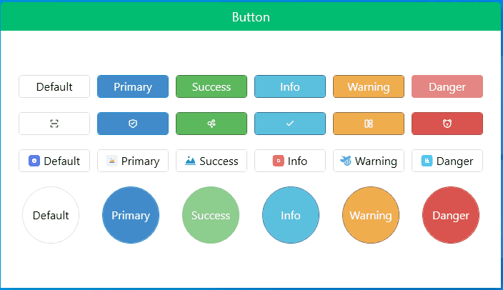
五、效果图
gitee地址:https://gitee.com/sirius_machao/Cys_Controls/tree/dev/
天行健,君子以自强不息;
地势坤,君子以厚德载物;

 浙公网安备 33010602011771号