css各种姿势的水平居中
首先是最常用的,利用margin属性的auto来进行水平居中
margin: 0 auto;
其中0是指上下的margin,auto是左右的margin,margin这个属性的简写是按顺时针走的,也就是上、右、下、左。当参数为两个的时候第一个代表上下,第二个代表左右。
注意容器一定要有宽度才能使用这种方法。
<!DOCTYPE html>
<html>
<head>
    <title></title>
    <style>
        #container{
            width: 960px ;
            height: 500px ;
            background-color: red ;
            margin: 0 auto;
        }
    </style>
</head>
<body>
    <div id="container"></div>
</body>
</html>
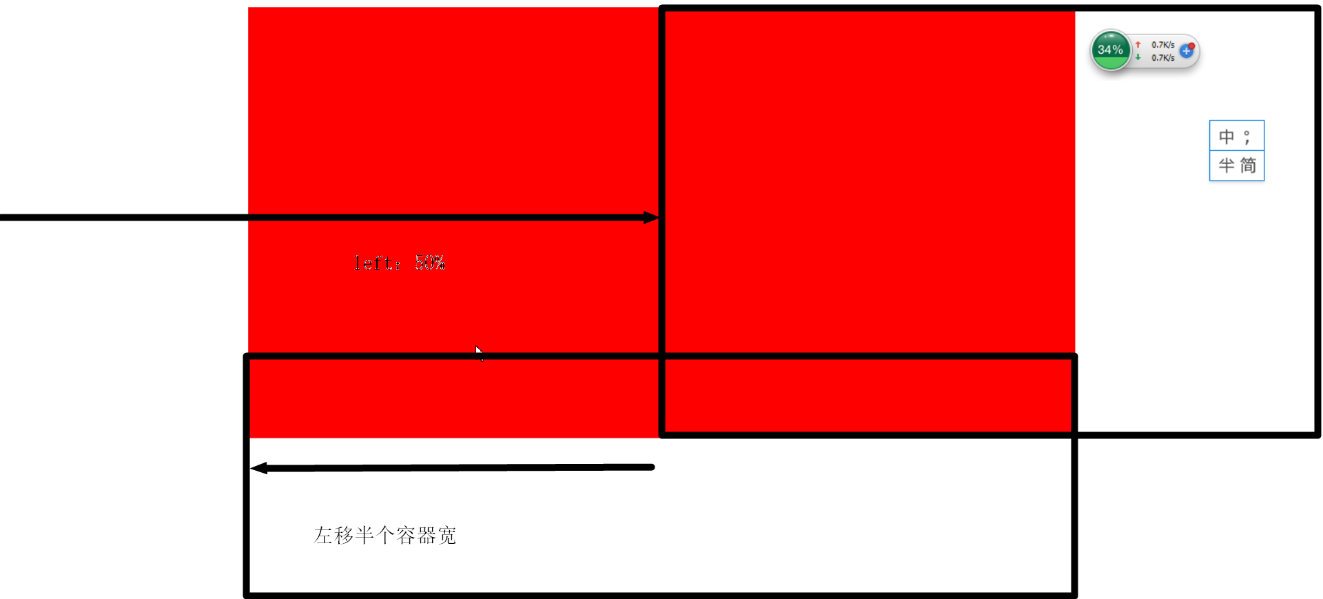
第二种姿势,利用绝对布局和偏移量
position: absolute;
left: 50% ;
margin-left: -480px ;//你的容器宽的一半
在绝对布局下,容器的位置是相对于第一个有定位的父元素,如果没有就到body元素,在绝对布局下可以用left,top,right,bottom来调整位置。
位置可以是px的长度也可以是百分比,当是百分比的时候是表示容器的那一边(比如left就是左边)相对于父元素长度半分比的位置。
所以当设置了left:50%后容器的左边到了父元素中间的位置,那么我们只要再向左平移半个容器的宽度就可以让容器居中。
<!DOCTYPE html>
<html>
<head>
    <title></title>
    <style>
        #container{
            width: 960px ;
            height: 500px ;
            background-color: red ;
            position: absolute;
            left: 50% ;
            margin-left: -480px ;
        }
    </style>
</head>
<body>
    <div id="container"></div>
</body>
</html>
第三种姿势,利用text-algin:center和display:inline-block
text-align: center;
display: inline-block;
注意text-align是父级上面的。
容器内的元素设置了display:inline-block之后,他们的部分表现就和行内元素一样,所以可以利用text-align:center让其居中。
这样就很好的解决了不知道子元素宽度的问题。
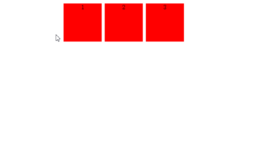
<!DOCTYPE html>
<html>
<head>
    <title></title>
    <style>
        #container{
            text-align: center;
        }
        .block{
            display: inline-block;
            width: 100px ;
            height: 100px ;
            background-color: red ;
        }
    </style>
</head>
<body>
    <div id="container">
        <div class="block">1</div>
        <div class="block">2</div>
        <div class="block">3</div>
    </div>
</body>
</html>
第四种姿势,流布局
如果有三个容器,左右两边的容器没有背景自适应宽度且等宽,那么中间的元素不就相当于居中了么。
用流布局就可以做到这样的效果,给父元素设置display:flex后给两边的子元素设置相同的flex(你可以理解为权重,权重一样平分没有定义的空间)
注意父元素设置display:flex以后子元素的float,vertical-align,clear属性失效。流式布局默认是水平的,可以利用flex-direction来改变方向。
关于flex布局想更深入学习请看右边的链接 http://www.ruanyifeng.com/blog/2015/07/flex-grammar.html?utm_source=tuicool
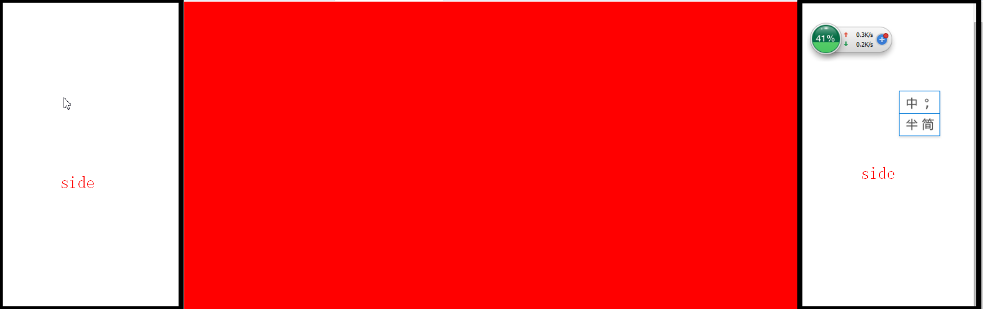
<!DOCTYPE html>
<html>
<head>
    <title></title>
    <style>
        html,body{
            height: 100% ;
            width: 100% ;
        }
        #container{
            display: flex ;
            height: 100% ;
            width: 100% ;
        }
        .side{
            flex:1;
            height: 100% ;
        }
        .center{
            width: 960px ;
            height: 100% ;
            background-color: red ;
        }
    </style>
</head>
<body>
    <div id="container">
        <div class="side"></div>
        <div class="center"></div>
        <div class='side'></div>
    </div>
</body>
</html>
注意在严格模式下这句是不能少的,因为严格模式下容器不知道父元素的长宽是多少,会导致没有高度和宽度。
html,body{
        height: 100% ;
        width: 100% ;
}

 浙公网安备 33010602011771号