
Flutter部件
> 所有的State类型部件都可通过其GlobalKey去调用里面的方法
final GlobalKey<ScaffoldState> _scaffoldKey = GlobalKey<ScaffoldState>();
_scaffoldKey.currentState!.openDrawer();
# animation
1.手动动画
        Animation<Offset> = AnimationController.drive(Animatable);
        Animatable = xxTweet();
        Animation的装饰器,AnimationController.value变化的曲度
        CurvedAnimation(parent: AnimationController, curve: widget.curve);
# cupertino
1.CupertinoActivityIndicator 进度指示器

CupertinoActivityIndicator(radius: 20.0, color: CupertinoColors.activeBlue),
2.CupertinoTabScaffold 底部导航栏
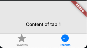
CupertinoTabScaffold(
      tabBar: CupertinoTabBar(
        items: const <BottomNavigationBarItem>[
          BottomNavigationBarItem(icon: Icon(CupertinoIcons.star_fill), label: 'Favorites'),
          BottomNavigationBarItem(icon: Icon(CupertinoIcons.clock_solid), label: 'Recents'),
        ],
      ),
      tabBuilder: (BuildContext context, int index) {
        return CupertinoTabView(
          builder: (BuildContext context) {
            return Center(child: Text('Content of tab $index'));
          },
        );
      },
    )
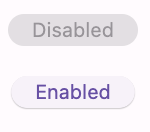
3.Cupertino 按钮:不好设置间距和宽高
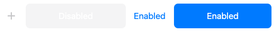
Row(
          mainAxisSize: MainAxisSize.min,
          children: <Widget>[
            const CupertinoButton(onPressed: null, child: Icon(Icons.add)),
            const SizedBox(height: 30),
            const CupertinoButton.filled(onPressed: null, child: Text('Disabled')),
            const SizedBox(height: 30),
            CupertinoButton(onPressed: () {}, child: const Text('Enabled')),
            const SizedBox(height: 30),
            CupertinoButton.filled(onPressed: () {}, child: const Text('Enabled')),
          ],
        )
4.CupertinoCheckbox 单选框:不可自定义选中和未选中图标

CupertinoCheckbox(
      checkColor: CupertinoColors.white,
      value: isChecked,
      onChanged: (bool? value) {
        setState(() {
          isChecked = value;
        });
      },
    )
5.CupertinoContextMenu 长按弹出菜单
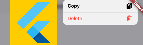
CupertinoContextMenu(
            actions: <Widget>[
              CupertinoContextMenuAction(
                onPressed: () {
                  Navigator.pop(context);
                },
                isDefaultAction: true,
                trailingIcon: CupertinoIcons.doc_on_clipboard_fill,
                child: const Text('Copy'),
              ),
              CupertinoContextMenuAction(
                onPressed: () {
                  Navigator.pop(context);
                },
                isDestructiveAction: true,
                trailingIcon: CupertinoIcons.delete,
                child: const Text('Delete'),
              ),
            ],
            child: const ColoredBox(
              color: CupertinoColors.systemYellow,
              child: FlutterLogo(size: 500.0),
            ),
          ),
6.dialog 弹窗
showCupertinoDialog - CupertinoAlertDialog
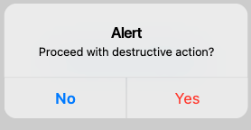
showCupertinoDialog<void>(
      context: context,
      builder: (BuildContext context) => CupertinoAlertDialog(
        title: const Text('Alert'),
        content: const Text('Proceed with destructive action?'),
        actions: <CupertinoDialogAction>[
          CupertinoDialogAction(
            /// This parameter indicates this action is the default,
            /// and turns the action's text to bold text.
            isDefaultAction: true,
            onPressed: () {
              Navigator.pop(context);
            },
            child: const Text('No'),
          ),
          CupertinoDialogAction(
            /// This parameter indicates the action would perform
            /// a destructive action such as deletion, and turns
            /// the action's text color to red.
            isDestructiveAction: true,
            onPressed: () {
              Navigator.pop(context);
            },
            child: const Text('Yes'),
          ),
        ],
      ),
    );
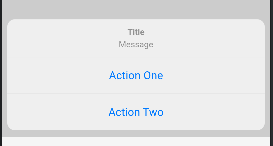
showCupertinoModalPopup - CupertinoActionSheet
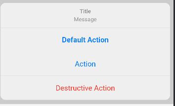
showCupertinoModalPopup<void>(
      context: context,
      builder: (BuildContext context) => CupertinoActionSheet(
        title: const Text('Title'),
        message: const Text('Message'),
        actions: <CupertinoActionSheetAction>[
          CupertinoActionSheetAction(
            /// This parameter indicates the action would be a default
            /// default behavior, turns the action's text to bold text.
            isDefaultAction: true,
            onPressed: () {
              Navigator.pop(context);
            },
            child: const Text('Default Action'),
          ),
          CupertinoActionSheetAction(
            onPressed: () {
              Navigator.pop(context);
            },
            child: const Text('Action'),
          ),
          CupertinoActionSheetAction(
            /// This parameter indicates the action would perform
            /// a destructive action such as delete or exit and turns
            /// the action's text color to red.
            isDestructiveAction: true,
            onPressed: () {
              Navigator.pop(context);
            },
            child: const Text('Destructive Action'),
          ),
        ],
      ),
    );
showCupertinoModalPopup - CupertinoPopupSurface
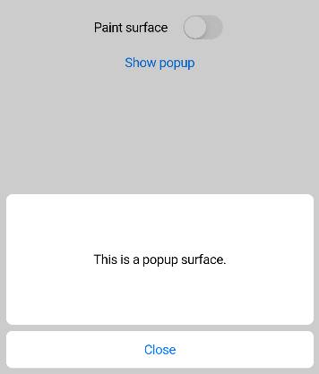
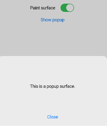
showCupertinoModalPopup<void>(
      context: context,
      builder: (BuildContext context) {
        return CupertinoPopupSurface(
          isSurfacePainted: _shouldPaintSurface,
          child: SafeArea(
            child: Container(
              height: 240,
              padding: const EdgeInsets.all(8.0),
              child: Column(
                children: <Widget>[
                  Expanded(
                    child: Container(
                      alignment: Alignment.center,
                      decoration: _shouldPaintSurface
                          ? null
                          : BoxDecoration(
                        color: CupertinoTheme.of(context).scaffoldBackgroundColor,
                        borderRadius: BorderRadius.circular(8.0),
                      ),
                      child: const Text('This is a popup surface.'),
                    ),
                  ),
                  const SizedBox(height: 8.0),
                  SizedBox(
                    width: double.infinity,
                    child: CupertinoButton(
                      color: _shouldPaintSurface
                          ? null
                          : CupertinoTheme.of(context).scaffoldBackgroundColor,
                      onPressed: () => Navigator.pop(context),
                      child: const Text('Close', style: TextStyle(color: CupertinoColors.systemBlue)),
                    ),
                  ),
                ],
              ),
            ),
          ),
        );
      },
    );
7.CupertinoFormRow 组合部件
CupertinoListSection 组合Listtile
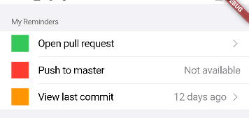
CupertinoListSection(
          header: const Text('My Reminders'),
          children: <CupertinoListTile>[
            CupertinoListTile(
              title: const Text('Open pull request'),
              leading: Container(
                width: double.infinity,
                height: double.infinity,
                color: CupertinoColors.activeGreen,
              ),
              trailing: const CupertinoListTileChevron(),
              onTap: () => Navigator.of(context).push(
                CupertinoPageRoute<void>(
                  builder: (BuildContext context) {
                    return const _SecondPage(text: 'Open pull request');
                  },
                ),
              ),
            ),
            CupertinoListTile(
              title: const Text('Push to master'),
              leading: Container(
                width: double.infinity,
                height: double.infinity,
                color: CupertinoColors.systemRed,
              ),
              additionalInfo: const Text('Not available'),
            ),
            CupertinoListTile(
              title: const Text('View last commit'),
              leading: Container(
                width: double.infinity,
                height: double.infinity,
                color: CupertinoColors.activeOrange,
              ),
              additionalInfo: const Text('12 days ago'),
              trailing: const CupertinoListTileChevron(),
              onTap: () => Navigator.of(context).push(
                CupertinoPageRoute<void>(
                  builder: (BuildContext context) {
                    return const _SecondPage(text: 'Last commit');
                  },
                ),
              ),
            ),
          ],
        ),
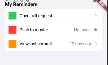
CupertinoListSection.insetGrouped(
        header: const Text('My Reminders'),
        children: <CupertinoListTile>[
          CupertinoListTile.notched(
            title: const Text('Open pull request'),
            leading: Container(
              width: double.infinity,
              height: double.infinity,
              color: CupertinoColors.activeGreen,
            ),
            trailing: const CupertinoListTileChevron(),
            onTap: () => Navigator.of(context).push(
              CupertinoPageRoute<void>(
                builder: (BuildContext context) {
                  return const _SecondPage(text: 'Open pull request');
                },
              ),
            ),
          ),
          CupertinoListTile.notched(
            title: const Text('Push to master'),
            leading: Container(
              width: double.infinity,
              height: double.infinity,
              color: CupertinoColors.systemRed,
            ),
            additionalInfo: const Text('Not available'),
          ),
          CupertinoListTile.notched(
            title: const Text('View last commit'),
            leading: Container(
              width: double.infinity,
              height: double.infinity,
              color: CupertinoColors.activeOrange,
            ),
            additionalInfo: const Text('12 days ago'),
            trailing: const CupertinoListTileChevron(),
            onTap: () => Navigator.of(context).push(
              CupertinoPageRoute<void>(
                builder: (BuildContext context) {
                  return const _SecondPage(text: 'Last commit');
                },
              ),
            ),
          ),
        ],
      ),
CupertinoListTile
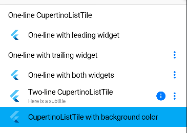
CupertinoListTile(
            leading: FlutterLogo(size: 56.0),
            title: Text('Two-line CupertinoListTile'),
            subtitle: Text('Here is a subtitle'),
            trailing: Icon(Icons.more_vert),
            additionalInfo: Icon(Icons.info),
          ),
8.CupertinoDatePicker 时间选择器
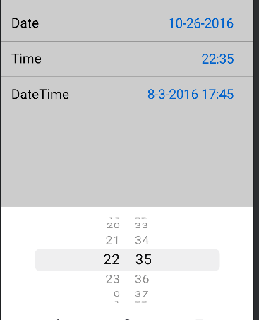
_DatePickerItem(
                children: <Widget>[
                  const Text('Date'),
                  CupertinoButton(
                    // Display a CupertinoDatePicker in date picker mode.
                    onPressed: () => _showDialog(
                      CupertinoDatePicker(
                        initialDateTime: date,
                        mode: CupertinoDatePickerMode.date,
                        use24hFormat: true,
                        // This shows day of week alongside day of month
                        showDayOfWeek: true,
                        // This is called when the user changes the date.
                        onDateTimeChanged: (DateTime newDate) {
                          setState(() => date = newDate);
                        },
                      ),
                    ),
                    // In this example, the date is formatted manually. You can
                    // use the intl package to format the value based on the
                    // user's locale settings.
                    child: Text(
                      '${date.month}-${date.day}-${date.year}',
                      style: const TextStyle(fontSize: 22.0),
                    ),
                  ),
                ],
              ),
              _DatePickerItem(
                children: <Widget>[
                  const Text('Time'),
                  CupertinoButton(
                    // Display a CupertinoDatePicker in time picker mode.
                    onPressed: () => _showDialog(
                      CupertinoDatePicker(
                        initialDateTime: time,
                        mode: CupertinoDatePickerMode.time,
                        use24hFormat: true,
                        // This is called when the user changes the time.
                        onDateTimeChanged: (DateTime newTime) {
                          setState(() => time = newTime);
                        },
                      ),
                    ),
                    // In this example, the time value is formatted manually.
                    // You can use the intl package to format the value based on
                    // the user's locale settings.
                    child: Text(
                      '${time.hour}:${time.minute}',
                      style: const TextStyle(fontSize: 22.0),
                    ),
                  ),
                ],
              ),
              _DatePickerItem(
                children: <Widget>[
                  const Text('DateTime'),
                  CupertinoButton(
                    // Display a CupertinoDatePicker in dateTime picker mode.
                    onPressed: () => _showDialog(
                      CupertinoDatePicker(
                        initialDateTime: dateTime,
                        use24hFormat: true,
                        // This is called when the user changes the dateTime.
                        onDateTimeChanged: (DateTime newDateTime) {
                          setState(() => dateTime = newDateTime);
                        },
                      ),
                    ),
                    // In this example, the time value is formatted manually. You
                    // can use the intl package to format the value based on the
                    // user's locale settings.
                    child: Text(
                      '${dateTime.month}-${dateTime.day}-${dateTime.year} ${dateTime.hour}:${dateTime.minute}',
                      style: const TextStyle(fontSize: 22.0),
                    ),
                  ),
                ],
              ),
9.标题栏导航栏
CupertinoNavigationBar
CupertinoSliverNavigationBar
10.Cupertino风格根目录 CupertinoPageScaffold
11.CupertinoPicker 底部子项获取,常用于自定义条目选择,如时间
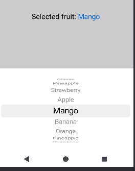
                onPressed: () => showCupertinoModalPopup<void>(
                  context: context,
                  builder: (BuildContext context) => Container(
                    height: 300,
                    padding: const EdgeInsets.only(top: 6.0),
                    // The Bottom margin is provided to align the popup above the system navigation bar.
                    margin: EdgeInsets.only(bottom: MediaQuery.of(context).viewInsets.bottom),
                    // Provide a background color for the popup.
                    color: CupertinoColors.systemBackground.resolveFrom(context),
                    // Use a SafeArea widget to avoid system overlaps.
                    child: SafeArea(top: false, child: CupertinoPicker(
                      magnification: 1.22,
                      squeeze: 1.2,
                      useMagnifier: true,
                      itemExtent: _kItemExtent,
                      // This sets the initial item.
                      scrollController: FixedExtentScrollController(initialItem: _selectedFruit),
                      // This is called when selected item is changed.
                      onSelectedItemChanged: (int selectedItem) {
                        setState(() {
                          _selectedFruit = selectedItem;
                        });
                      },
                      children: List<Widget>.generate(_fruitNames.length, (int index) {
                        return Center(child: Text(_fruitNames[index]));
                      }),
                    ),),
                  ),
                ),
12.CupertinoRadio单选框
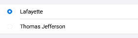
    return CupertinoListSection(
      children: <Widget>[
        CupertinoListTile(
          onTap: (){
            setState(() {
              _character = SingingCharacter.lafayette;
            });
          },
          title: Text('Lafayette'),
          leading: CupertinoRadio<SingingCharacter>(
            value: SingingCharacter.lafayette,
            groupValue: _character,
            onChanged: (SingingCharacter? value) {
              setState(() {
                _character = value;
              });
            },
          ),
        ),
        CupertinoListTile(
          onTap: (){
            setState(() {
              _character = SingingCharacter.jefferson;
            });
          },
          title: Text('Thomas Jefferson'),
          leading: CupertinoRadio<SingingCharacter>(
            value: SingingCharacter.jefferson,
            groupValue: _character,
            onChanged: (SingingCharacter? value) {
              setState(() {
                _character = value;
              });
            },
          ),
        ),
      ],
    );
13.列表刷新指示器
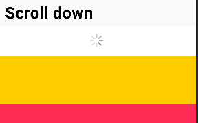
      child: CustomScrollView(
        physics: const BouncingScrollPhysics(parent: AlwaysScrollableScrollPhysics()),
        slivers: <Widget>[
          const CupertinoSliverNavigationBar(largeTitle: Text('Scroll down')),
          CupertinoSliverRefreshControl(
            onRefresh: () async {
              await Future<void>.delayed(const Duration(milliseconds: 1000));
              setState(() {
                items.insert(0, Container(color: colors[items.length % 3], height: 100.0));
              });
            },
          ),
          SliverList(
            delegate: SliverChildBuilderDelegate(
                  (BuildContext context, int index) => items[index],
              childCount: items.length,
            ),
          ),
        ],
      ),
14.使用Route显示dialog和bottomsheet
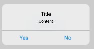
Navigator.of(context).restorablePush(_dialogBuilder);

——————————————————————————————
  @pragma('vm:entry-point')
  static Route<Object?> _dialogBuilder(BuildContext context, Object? arguments) {
    return CupertinoDialogRoute<void>(
      context: context,
      builder: (BuildContext context) {
        return CupertinoAlertDialog(
          title: const Text('Title'),
          content: const Text('Content'),
          actions: <Widget>[
            CupertinoDialogAction(
              onPressed: () {
                Navigator.pop(context);
              },
              child: const Text('Yes'),
            ),
            CupertinoDialogAction(
              onPressed: () {
                Navigator.pop(context);
              },
              child: const Text('No'),
            ),
          ],
        );
      },
    );
  }
————————————————————————————————
  @pragma('vm:entry-point')
  static Route<void> _modalBuilder(BuildContext context, Object? arguments) {
    return CupertinoModalPopupRoute<void>(
      builder: (BuildContext context) {
        return CupertinoActionSheet(
          title: const Text('Title'),
          message: const Text('Message'),
          actions: <CupertinoActionSheetAction>[
            CupertinoActionSheetAction(
              child: const Text('Action One'),
              onPressed: () {
                Navigator.pop(context);
              },
            ),
            CupertinoActionSheetAction(
              child: const Text('Action Two'),
              onPressed: () {
                Navigator.pop(context);
              },
            ),
          ],
        );
      },
    );
  }
15.CupertinoTextField 自带清空按钮的输入框
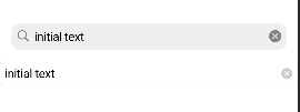
            Padding(
              padding: const EdgeInsets.all(16.0),
              child: CupertinoSearchTextField(
                  controller: textController, placeholder: 'Search'),
            ),
            CupertinoTextField(
              controller: textController,
                            placeholder: 'Search',
              clearButtonMode: OverlayVisibilityMode.editing,
            )
16.CupertinoSlidingSegmentedControl 片段选择器
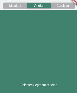
        middle: CupertinoSlidingSegmentedControl<Sky>(
          backgroundColor: CupertinoColors.systemGrey2,
          thumbColor: skyColors[_selectedSegment]!,
          // This represents the currently selected segmented control.
          groupValue: _selectedSegment,
          // Callback that sets the selected segmented control.
          onValueChanged: (Sky? value) {
            if (value != null) {
              setState(() {
                _selectedSegment = value;
              });
            }
          },
          children: const <Sky, Widget>{
            Sky.midnight: Padding(
              padding: EdgeInsets.symmetric(horizontal: 20),
              child: Text('Midnight', style: TextStyle(color: CupertinoColors.white)),
            ),
            Sky.viridian: Padding(
              padding: EdgeInsets.symmetric(horizontal: 20),
              child: Text('Viridian', style: TextStyle(color: CupertinoColors.white)),
            ),
            Sky.cerulean: Padding(
              padding: EdgeInsets.symmetric(horizontal: 20),
              child: Text('Cerulean', style: TextStyle(color: CupertinoColors.white)),
            ),
          },
        ),
17.CupertinoSlider 滑动条
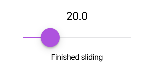
            CupertinoSlider(
              key: const Key('slider'),
              value: _currentSliderValue,
              // This allows the slider to jump between divisions.
              // If null, the slide movement is continuous.
              divisions: 5,
              // The maximum slider value
              max: 100,
              activeColor: CupertinoColors.systemPurple,
              thumbColor: CupertinoColors.systemPurple,
              // This is called when sliding is started.
              onChangeStart: (double value) {
                setState(() {
                  _sliderStatus = 'Sliding';
                });
              },
              // This is called when sliding has ended.
              onChangeEnd: (double value) {
                setState(() {
                  _sliderStatus = 'Finished sliding';
                });
              },
              // This is called when slider value is changed.
              onChanged: (double value) {
                setState(() {
                  _currentSliderValue = value;
                });
              },
            ),
18.CupertinoSwitch 开关

        child: CupertinoSwitch(
          // This bool value toggles the switch.
          value: switchValue,
          activeColor: CupertinoColors.activeBlue,
          onChanged: (bool? value) {
            // This is called when the user toggles the switch.
            setState(() {
              switchValue = value ?? false;
            });
          },
        ),
19.CupertinoTabScaffold 底部导航栏
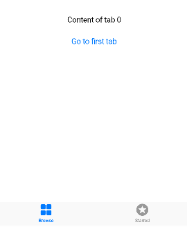
  final CupertinoTabController controller = CupertinoTabController();
————————————————————————————————————
    return CupertinoTabScaffold(
      controller: controller,
      tabBar: CupertinoTabBar(
        items: const <BottomNavigationBarItem>[
          BottomNavigationBarItem(icon: Icon(CupertinoIcons.square_grid_2x2_fill), label: 'Browse'),
          BottomNavigationBarItem(icon: Icon(CupertinoIcons.star_circle_fill), label: 'Starred'),
        ],
      ),
      tabBuilder: (BuildContext context, int index) {
        return Center(
          child: Column(
            mainAxisAlignment: MainAxisAlignment.center,
            children: <Widget>[
              Text('Content of tab $index'),
              const SizedBox(height: 10),
              CupertinoButton(
                onPressed: () => controller.index = 0,
                child: const Text('Go to first tab'),
              ),
            ],
          ),
        );
      },
    );
CupertinoTabScaffold+CupertinoTabView
    return CupertinoTabScaffold(
      tabBar: CupertinoTabBar(
        items: const <BottomNavigationBarItem>[
          BottomNavigationBarItem(icon: Icon(CupertinoIcons.home), label: 'Home'),
          BottomNavigationBarItem(icon: Icon(CupertinoIcons.search_circle_fill), label: 'Explore'),
        ],
      ),
      tabBuilder: (BuildContext context, int index) {
        return CupertinoTabView(
          builder: (BuildContext context) {
            return CupertinoPageScaffold(
              navigationBar: CupertinoNavigationBar(middle: Text('Page 1 of tab $index')),
              child: Center(
                child: CupertinoButton(
                  child: const Text('Next page'),
                  onPressed: () {
                    Navigator.of(context).push(
                      CupertinoPageRoute<void>(
                        builder: (BuildContext context) {
                          return CupertinoPageScaffold(
                            navigationBar: CupertinoNavigationBar(
                              middle: Text('Page 2 of tab $index'),
                            ),
                            child: Center(
                              child: CupertinoButton(
                                child: const Text('Back'),
                                onPressed: () {
                                  Navigator.of(context).pop();
                                },
                              ),
                            ),
                          );
                        },
                      ),
                    );
                  },
                ),
              ),
            );
          },
        );
      },
    );
20.CupertinoFormSection.insetGrouped 组合输入框
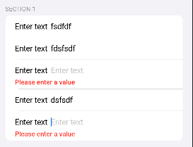
        child: Form(
          autovalidateMode: AutovalidateMode.always,
          onChanged: () {
            Form.maybeOf(primaryFocus!.context!)?.save();
          },
          child: CupertinoFormSection.insetGrouped(
            header: const Text('SECTION 1'),
            children: List<Widget>.generate(5, (int index) {
              return CupertinoTextFormFieldRow(
                prefix: const Text('Enter text'),
                placeholder: 'Enter text',
                validator: (String? value) {
                  if (value == null || value.isEmpty) {
                    return 'Please enter a value';
                  }
                  return null;
                },
              );
            }),
          ),
        ),
# 手势 gestures
1.Listener
Listener(
            onPointerDown: (PointerDownEvent event){
              _leftOrigin = event.localPosition.dx;
              _topOrigin = event.localPosition.dy;
            },
            onPointerMove: (PointerMoveEvent event){
              setState(() {
                var tempLeft  = max(0.0, min(event.position.dx - _leftOrigin, screenWidth - 30));
                var tempTop  = max(0.0, min(event.position.dy - _topOrigin ,screenHeight - 30 ));
                _left = tempLeft;
                _top = tempTop;
              });
            },
            child: const Icon(Icons.circle,color: Colors.red,size: 30,),
          )
2.RawGestureDetector
RawGestureDetector(
      gestures: <Type, GestureRecognizerFactory>{
        TapAndPanGestureRecognizer:
            GestureRecognizerFactoryWithHandlers<TapAndPanGestureRecognizer>(
          () => TapAndPanGestureRecognizer(),
          (TapAndPanGestureRecognizer instance) {
            instance
              ..onTapDown = (TapDragDownDetails details) {
                print('onTapDown ${details.globalPosition}');
              }
              ..onDragStart = (TapDragStartDetails details) {
                print('onDragStart ${details.consecutiveTapCount}. ${details.globalPosition}');
              }
              ..onDragUpdate = (TapDragUpdateDetails details) {
                print('onDragUpdate ${details.consecutiveTapCount}. ${details.globalPosition}');
              }
              ..onDragEnd = (TapDragEndDetails details) {
                print('onDragEnd ${details.consecutiveTapCount}');
              };
          },
        ),
      },
      child: Transform.rotate(angle:2*pi*_currentScale, child: widget.child),
    )
# painting
1.滚动轴的方向
scrollDirection: axisDirectionToAxis(AxisDirection),
2.各种边框,适应于 border 属性
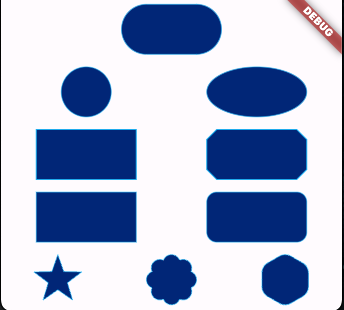
StadiumBorder CircleBorder OvalBorder BeveledRectangleBorder RoundedRectangleBorder StarBorder StarBorder.polygon(
3.渐变色
LinearGradient(
            begin: Alignment.center,
            end: Alignment(0.8, 1),
            colors: <Color>[
              Color(0xff1f005c),
              Color(0xff5b0060),
              Color(0xff870160),
              Color(0xffac255e),
              Color(0xffca485c),
              Color(0xffe16b5c),
              Color(0xfff39060),
              Color(0xffffb56b),
            ], // Gradient from https://learnui.design/tools/gradient-generator.html
            tileMode: TileMode.mirror,
          )
4.图片加载的底层api ImageProvider
@immutable
class CustomNetworkImage extends ImageProvider<Uri> {
  const CustomNetworkImage(this.url);

  final String url;

  @override
  Future<Uri> obtainKey(ImageConfiguration configuration) {
    final Uri result = Uri.parse(url).replace(
      queryParameters: <String, String>{
        'dpr': '${configuration.devicePixelRatio}',
        'locale': '${configuration.locale?.toLanguageTag()}',
        'platform': '${configuration.platform?.name}',
        'width': '${configuration.size?.width}',
        'height': '${configuration.size?.height}',
        'bidi': '${configuration.textDirection?.name}',
      },
    );
    return SynchronousFuture<Uri>(result);
  }

  static HttpClient get _httpClient {
    HttpClient? client;
    assert(() {
      if (debugNetworkImageHttpClientProvider != null) {
        client = debugNetworkImageHttpClientProvider!();
      }
      return true;
    }());
    return client ?? HttpClient()
      ..autoUncompress = false;
  }

  @override
  ImageStreamCompleter loadImage(Uri key, ImageDecoderCallback decode) {
    final StreamController<ImageChunkEvent> chunkEvents = StreamController<ImageChunkEvent>();
    debugPrint('Fetching "$key"...');
    return MultiFrameImageStreamCompleter(
      codec: _httpClient
          .getUrl(key)
          .then<HttpClientResponse>((HttpClientRequest request) => request.close())
          .then<Uint8List>((HttpClientResponse response) {
            return consolidateHttpClientResponseBytes(
              response,
              onBytesReceived: (int cumulative, int? total) {
                chunkEvents.add(
                  ImageChunkEvent(cumulativeBytesLoaded: cumulative, expectedTotalBytes: total),
                );
              },
            );
          })
          .catchError((Object e, StackTrace stack) {
            scheduleMicrotask(() {
              PaintingBinding.instance.imageCache.evict(key);
            });
            return Future<Uint8List>.error(e, stack);
          })
          .whenComplete(chunkEvents.close)
          .then<ui.ImmutableBuffer>(ui.ImmutableBuffer.fromUint8List)
          .then<ui.Codec>(decode),
      chunkEvents: chunkEvents.stream,
      scale: 1.0,
      debugLabel: '"key"',
      informationCollector: () => <DiagnosticsNode>[
        DiagnosticsProperty<ImageProvider>('Image provider', this),
        DiagnosticsProperty<Uri>('URL', key),
      ],
    );
  }

  @override
  String toString() => '${objectRuntimeType(this, 'CustomNetworkImage')}("$url")';
}
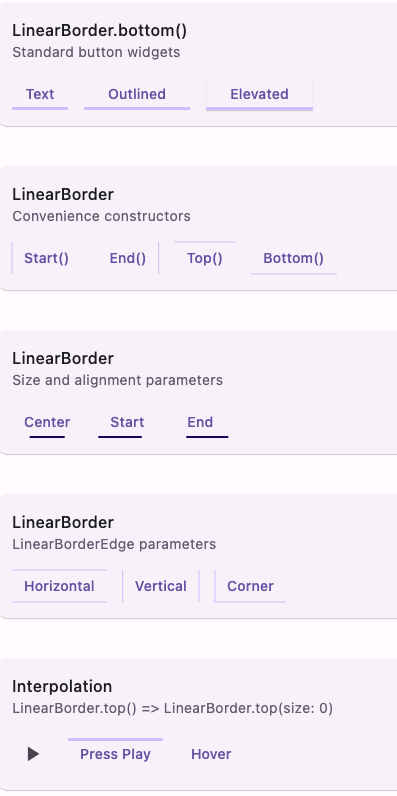
5.线性边框:自定义各种样式的边框,如tab指示器
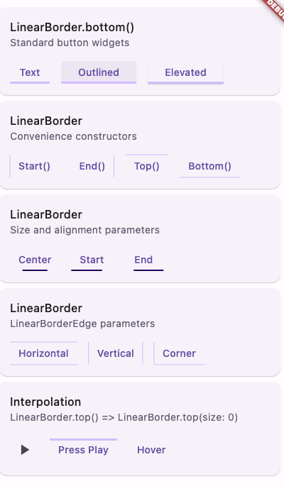
//shape和外部side相结合
OutlinedButton(
                    style: OutlinedButton.styleFrom(
                      side: primarySide3,
                      shape: LinearBorder.bottom(),
                    ),
                    onPressed: () {},
                    child: const Text('Outlined'),
                  )
//设计多个边框
TextButton(
                    style: TextButton.styleFrom(
                      side: primarySide0,
                      shape: const LinearBorder(
                          start: LinearBorderEdge(), end: LinearBorderEdge()),
                    ),
                    onPressed: () {},
                    child: const Text('Vertical'),
                  )
//配合状态改变
TextButton(
                    style: ButtonStyle(
                      side: MaterialStateProperty.resolveWith<BorderSide?>(
                          (Set<MaterialState> states) {
                        return states.contains(MaterialState.hovered)
                            ? primarySide3
                            : null;
                      }),
                      shape: MaterialStateProperty.resolveWith<OutlinedBorder>((
                        Set<MaterialState> states,
                      ) {
                        return states.contains(MaterialState.hovered)
                            ? shape0
                            : shape1;
                      }),
                    ),
                    onPressed: () {},
                    child: const Text('Hover'),
                  )
6.对边框更多的形状设置 star_border
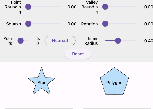
//第一种
Container(
  decoration: ShapeDecoration(
    shape: StarBorder(
      points: 5.00,
      rotation: 0.00,
      innerRadiusRatio: 0.40,
      pointRounding: 0.00,
      valleyRounding: 0.00,
      squash: 0.00,
    ),
  ),
);

//第二种
Container(
  decoration: ShapeDecoration(
    shape: StarBorder.polygon(
      sides: 5.00,
      rotation: 0.00,
      cornerRounding: 0.00,
      squash: 0.00,
    ),
  ),
);
# rendering
1.parent_data 看不懂
2.growth_direction 列表的滚动方向和排列方向相关
3.scroll_direction 列表的滚动方向相关
4.sliver_grid:gridview的使用
GridView(
      gridDelegate: const SliverGridDelegateWithFixedCrossAxisCount(
        crossAxisCount: 4,
        childAspectRatio: 2,
       //mainAxisExtent: 100.0,
      ),
      children: List<Widget>.generate(20, (int i) {
        return Builder(
          builder: (BuildContext context) {
            return Text('$i');
          },
        );
      }),
    )
# services
1.杀掉app进程
class _BodyState extends State<Body> with WidgetsBindingObserver {
  bool _shouldExit = false;

  @override
  void initState() {
    super.initState();
    WidgetsBinding.instance.addObserver(this);
  }

  @override
  void dispose() {
    WidgetsBinding.instance.removeObserver(this);
    super.dispose();
  }

  Future<void> _quit() async {
    final AppExitType exitType = _shouldExit ? AppExitType.required : AppExitType.cancelable;
    await ServicesBinding.instance.exitApplication(exitType);
  }

  @override
  Future<AppExitResponse> didRequestAppExit() async {
    final AppExitResponse response = _shouldExit ? AppExitResponse.exit : AppExitResponse.cancel;
    return response;
  }


  @override
  Widget build(BuildContext context) {
    return Container();
  }
}
2.键盘处理
class _MyKeyExampleState extends State<MyKeyExample> {
  // The node used to request the keyboard focus.
  final FocusNode _focusNode = FocusNode();
  // The message to display.
  String? _message;

  // Focus nodes need to be disposed.
  @override
  void dispose() {
    _focusNode.dispose();
    super.dispose();
  }

  // Handles the key events from the Focus widget and updates the
  // _message.
  KeyEventResult _handleKeyEvent(FocusNode node, KeyEvent event) {
    setState(() {
      if (event.logicalKey == LogicalKeyboardKey.keyQ) {
        _message = 'Pressed the "Q" key!';
      } else {
        if (kReleaseMode) {
          _message = 'Not a Q: Pressed 0x${event.logicalKey.keyId.toRadixString(16)}';
        } else {
          _message = 'Not a Q: Pressed ${event.logicalKey.debugName}';
        }
      }
    });
    return event.logicalKey == LogicalKeyboardKey.keyQ
        ? KeyEventResult.handled //键入有效
        : KeyEventResult.ignored; //键入无效
  }

  @override
  Widget build(BuildContext context) {
    final TextTheme textTheme = Theme.of(context).textTheme;
    return Container(
      color: Colors.white,
      alignment: Alignment.center,
      child: DefaultTextStyle(
        style: textTheme.headlineMedium!,
        child: Focus(
          focusNode: _focusNode,
          onKeyEvent: _handleKeyEvent,
          child: ListenableBuilder(
            listenable: _focusNode,
            builder: (BuildContext context, Widget? child) {
              if (!_focusNode.hasFocus) {
                return GestureDetector(
                  onTap: () {
                    FocusScope.of(context).requestFocus(_focusNode);//获取焦点
                  },
                  child: const Text('Click to focus'),
                );
              }
              return Text(_message ?? 'Press a key');
            },
          ),
        ),
      ),
    );
  }
}
3.鼠标监听
MouseRegion(
        cursor: SystemMouseCursors.forbidden,
        child: Container(
          width: 200,
          height: 100,
          decoration: BoxDecoration(
            color: Colors.blue,
            border: Border.all(color: Colors.yellow),
          ),
        ),
      )
4.系统栏的样式更改:主要是 systemOverlayStyle 属性
//第一种
SystemUiOverlayStyle.dark.copyWith(
        statusBarColor: color,
        systemNavigationBarColor: color,
      )

//第二种
AnnotatedRegion<SystemUiOverlayStyle>(
  value: _currentStyle,
  child: Scaffold(
    body: Column(
      crossAxisAlignment: CrossAxisAlignment.start,
      children: <Widget>[
        Padding(
          padding: const EdgeInsets.all(16.0),
          child: Text(
            'SystemUiOverlayStyle Sample',
            style: Theme.of(context).textTheme.titleLarge,
          ),
        ),
        Expanded(
          child: Center(
            child: ElevatedButton(onPressed: _changeColor, child: const Text('Change Color')),
          ),
        ),
      ],
    ),
  ),
)
5. text_input 独立于TextField之外输入内容,适合自定义键盘
class MyTextInputControl with TextInputControl {
  TextEditingValue _editingState = TextEditingValue.empty;
  final ValueNotifier<bool> _visible = ValueNotifier<bool>(false);

  /// The input control's visibility state for updating the visual presentation.
  ValueListenable<bool> get visible => _visible;

  /// Register the input control.
  void register() => TextInput.setInputControl(this);

  /// Restore the original platform input control.
  void unregister() => TextInput.restorePlatformInputControl();

  @override
  void show() => _visible.value = true;

  @override
  void hide() => _visible.value = false;

  @override
  void setEditingState(TextEditingValue value) => _editingState = value;

  /// Process user input.
  ///
  /// Updates the internal editing state by inserting the input text,
  /// and by replacing the current selection if any.
  void processUserInput(String input) {
    _editingState = _editingState.copyWith(
      text: _insertText(input),
      selection: _replaceSelection(input),
    );

    // Request the attached client to update accordingly.
    TextInput.updateEditingValue(_editingState);
  }

  String _insertText(String input) {
    final String text = _editingState.text;
    final TextSelection selection = _editingState.selection;
    return text.replaceRange(selection.start, selection.end, input);
  }

  TextSelection _replaceSelection(String input) {
    final TextSelection selection = _editingState.selection;
    return TextSelection.collapsed(offset: selection.start + input.length);
  }
}
# ui/text 字体相关
# material
1. about_list_tile 关于界面,自己写的app用还差不多
AboutListTile(
              icon: const Icon(Icons.info),
              applicationIcon: const FlutterLogo(),
              applicationName: 'Show About Example',
              applicationVersion: 'August 2019',
              applicationLegalese: '\u{a9} 2014 The Flutter Authors',
              aboutBoxChildren: aboutBoxChildren,
            )

showAboutDialog(
              context: context,
              applicationIcon: const FlutterLogo(),
              applicationName: 'Show About Example',
              applicationVersion: 'August 2019',
              applicationLegalese: '\u{a9} 2014 The Flutter Authors',
              children: aboutBoxChildren,
            )
2. ActionIconTheme
Scaffold(
      appBar: AppBar(title: const Text('Second page')),
      endDrawer: const Drawer(),
      drawer: const Drawer(),
    )

//设置展开的图标
MaterialApp(
      debugShowCheckedModeBanner: false,
      theme: ThemeData(
        actionIconTheme: ActionIconThemeData(
          backButtonIconBuilder: (BuildContext context) {
            return const Icon(Icons.arrow_back_ios_new_rounded);
          },
          drawerButtonIconBuilder: (BuildContext context) {
            return const _CustomDrawerIcon();
          },
          endDrawerButtonIconBuilder: (BuildContext context) {
            return const _CustomEndDrawerIcon();
          },
        ),
      ),
      home: const MyHomePage(title: 'Flutter Demo Home Page'),
    )
3. action_chip 左边图标,右边文本的点击部件
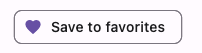

ActionChip(
  avatar: Icon(favorite ? Icons.favorite : Icons.favorite_border),
  label: const Text('Save to favorites'),
  onPressed: () {
    setState(() {
      favorite = !favorite;
    });
  },
)
//延伸
ActionChip(
            labelPadding: EdgeInsets.all(0),
            padding: EdgeInsets.all(0),
            side: BorderSide(width: 0,color: Colors.transparent),
            label: Icon(favorite ? Icons.check_circle : Icons.check_outlined),
            materialTapTargetSize: MaterialTapTargetSize.shrinkWrap,
            onPressed: () {
              setState(() {
                favorite = !favorite;
              });
            },
          )
4. animated_icon 动画图标
    AnimationController controller = AnimationController(vsync: this, duration: const Duration(seconds: 2))
      ..forward()
      ..repeat(reverse: true);
    Animation<double> animation = Tween<double>(begin: 0.0, end: 1.0).animate(controller);

AnimatedIcon(
          icon: AnimatedIcons.menu_arrow,
          progress: animation,
          size: 72.0,
          semanticLabel: 'Show menu',
        )
5. app :明亮和暗黑主题,主题变换样式
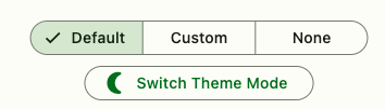 MaterialApp(
      themeAnimationStyle: _animationStyle, //主题变换动画
      themeMode: isDarkTheme ? ThemeMode.dark : ThemeMode.light, //明亮或者暗黑主题
      theme: ThemeData(colorSchemeSeed: Colors.green),
      darkTheme: ThemeData(colorSchemeSeed: Colors.green, brightness: Brightness.dark),
      home: Scaffold(
        body: Center(
          child: Column(
            mainAxisAlignment: MainAxisAlignment.center,
            children: <Widget>[
              //单选按钮
              SegmentedButton<AnimationStyles>(
                selected: _animationStyleSelection,
                onSelectionChanged: (Set<AnimationStyles> styles) {
                  setState(() {
                    _animationStyleSelection = styles;
                    switch (styles.first) {
                      case AnimationStyles.defaultStyle:
                        _animationStyle = null;
                      case AnimationStyles.custom:
                        _animationStyle = AnimationStyle(
                          curve: Easing.emphasizedAccelerate,
                          duration: Duration(seconds: 1),
                        );
                      case AnimationStyles.none:
                        _animationStyle = AnimationStyle.noAnimation;
                    }
                  });
                },
                segments: animationStyleSegments.map<ButtonSegment<AnimationStyles>>((
                    (AnimationStyles, String) shirt,
                    ) {
                  return ButtonSegment<AnimationStyles>(value: shirt.$1, label: Text(shirt.$2));
                }).toList(),
              ),
            ],
          ),
        ),
      ),
    )
6. app_bar
//可自定义大小的IconButton
IconButton(
            color: Colors.green,
            hoverColor: Colors.black,
            padding: EdgeInsets.all(0.0),
            constraints: BoxConstraints(minHeight: 30,minWidth: 30),
            iconSize: 20,
            icon: const Icon(Icons.add_alert),
            tooltip: 'Show Snackbar',
            onPressed: () {},
          )
//标题栏的阴影设置
AppBar(
        title: const Text('AppBar Demo'),
        scrolledUnderElevation: scrolledUnderElevation,
        shadowColor: shadowColor ? Theme.of(context).colorScheme.shadow : null,
      )
TextButton.styleFrom(
      foregroundColor: Theme.of(context).colorScheme.onSecondary,
    )
viewpager-可在statelesswidget下使用,必须和appbar的bottom联动
class AppBarExample extends StatelessWidget {
  const AppBarExample({super.key});

  @override
  Widget build(BuildContext context) {
    final ColorScheme colorScheme = Theme.of(context).colorScheme;
    final Color oddItemColor = colorScheme.primary.withOpacity(0.05);
    final Color evenItemColor = colorScheme.primary.withOpacity(0.15);
    const int tabsCount = 2;
    //可在stateless部件下使用的viewpager
    return DefaultTabController(
      initialIndex: 1,
      length: tabsCount,
      child: Scaffold(
        appBar: AppBar(
          title: const Text('AppBar Sample'),
          //指定哪个子部件滚动时响应监听
          notificationPredicate: (ScrollNotification notification) {
            return notification.depth == 1;
          },
          scrolledUnderElevation: 4.0,
          shadowColor: Theme.of(context).shadowColor,
          bottom: TabBar(
            tabs: <Widget>[
              Tab(icon: const Icon(Icons.cloud_outlined), text: titles[0]),
              Tab(icon: const Icon(Icons.beach_access_sharp), text: titles[1]),
            ],
          ),
        ),
        body: TabBarView(
          children: <Widget>[
            ListView.builder(
              itemCount: 25,
              itemBuilder: (BuildContext context, int index) {
                return ListTile(
                  tileColor: index.isOdd ? oddItemColor : evenItemColor,
                  title: Text('${titles[0]} $index'),
                );
              },
            ),
            ListView.builder(
              itemCount: 25,
              itemBuilder: (BuildContext context, int index) {
                return ListTile(
                  tileColor: index.isOdd ? oddItemColor : evenItemColor,
                  title: Text('${titles[1]} $index'),
                );
              },
            ),
          ],
        ),
      ),
    );
  }
}
PreferredSize - 可修改父布局高度的部件
appBar: AppBar(
        shape: const CustomAppBarShape(),
        backgroundColor: colorScheme.primaryContainer,
        title: const Text('AppBar Sample'),
        bottom: PreferredSize(
          preferredSize: const Size.fromHeight(64.0),
          child: Padding(
            padding: const EdgeInsets.symmetric(horizontal: 16.0),
            child: TextField(
              ),
            ),
          ),
        ),
可伸缩的标题栏
CustomScrollView(
        slivers: <Widget>[
          SliverAppBar(
            pinned: _pinned,
            snap: _snap,
            floating: _floating,
            expandedHeight: 160.0,
            collapsedHeight: 56,
            flexibleSpace:  FlexibleSpaceBar(
              title: Text('SliverAppBar'),
              background: Container(color: Colors.red,child: Container(color: Colors.blue,margin: EdgeInsets.only(bottom: 160-56),),),
            ),
          ),
           SliverToBoxAdapter(
            child: Container(
              color: Colors.black,
              child: SizedBox(
                height: 20,
                child: Center(child: Text('Scroll to see the SliverAppBar in effect.')),
              ),
            ),
          ),
        ],
      )
stretch - 滑动到顶继续滑动到一定位置触发回调
SliverAppBar(
              stretch: _stretch,
              onStretchTrigger: () async {
                print('300');
              },
              stretchTriggerOffset: 300.0,
              expandedHeight: 200.0,
              flexibleSpace: const FlexibleSpaceBar(
                title: Text('SliverAppBar'),
                background: FlutterLogo(),
              ),
            )
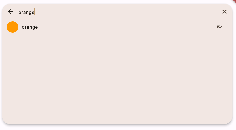
7. autocomplete
输入框自动填充
Autocomplete<String>(
      optionsBuilder: (TextEditingValue textEditingValue) {
        if (textEditingValue.text == '') {
          return const Iterable<String>.empty();
        }
        return _kOptions.where((String option) {
          return option.contains(textEditingValue.text.toLowerCase());
        });
      },
      onSelected: (String selection) {
        debugPrint('You just selected $selection');
      },
    )

//带网络请求的
Autocomplete<String>(
  optionsBuilder: (TextEditingValue textEditingValue) async {
    _searchingWithQuery = textEditingValue.text;
    final Iterable<String> options = await _FakeAPI.search(_searchingWithQuery!);

    // If another search happened after this one, throw away these options.
    // Use the previous options instead and wait for the newer request to
    // finish.
    if (_searchingWithQuery != textEditingValue.text) {
      return _lastOptions;
    }

    _lastOptions = options;
    return options;
  },
  onSelected: (String selection) {
    debugPrint('You just selected $selection');
  },
)

//带防抖的
8. badge 右上角小提示
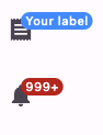
IconButton(
            icon: const Badge(
              label: Text('Your label'),
              backgroundColor: Colors.blueAccent,
              child: Icon(Icons.receipt),
            ),
            onPressed: () {},
          ),
          const SizedBox(height: 20),
          IconButton(
            icon: Badge.count(count: 9999, child: const Icon(Icons.notifications)),
            onPressed: () {},
          )
9.banner 从顶部往下滑的部件
ElevatedButton(
          child: const Text('Show MaterialBanner'),
          onPressed: () => ScaffoldMessenger.of(context).showMaterialBanner(
             MaterialBanner(
              padding: EdgeInsets.all(20),
              content: Text('Hello, I am a Material Banner'),
              leading: Icon(Icons.agriculture_outlined),
              backgroundColor: Colors.green,
              actions: <Widget>[TextButton(onPressed: (){
                ScaffoldMessenger.of(context).removeCurrentMaterialBanner();
              }, child: Text('DISMISS'))],
            ),
          ),
        ),
10.bottomNavigationBar 底部导航栏
BottomNavigationBar(
        items: const <BottomNavigationBarItem>[
          BottomNavigationBarItem(icon: Icon(Icons.home), label: 'Home'),
          BottomNavigationBarItem(icon: Icon(Icons.business), label: 'Business'),
          BottomNavigationBarItem(icon: Icon(Icons.school), label: 'School'),
        ],
        currentIndex: _selectedIndex,
        selectedItemColor: Colors.amber[800],
        onTap: _onItemTapped,
      )
11.单选tab
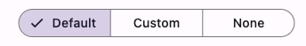
SegmentedButton<AnimationStyles>(
            selected: _animationStyleSelection,
            onSelectionChanged: (Set<AnimationStyles> styles) {
              setState(() {
                _animationStyle = switch (styles.first) {
                  AnimationStyles.defaultStyle => null,
                  AnimationStyles.custom =>  AnimationStyle(
                    duration: Duration(seconds: 3),
                    reverseDuration: Duration(seconds: 1),
                  ),
                  AnimationStyles.none => AnimationStyle.noAnimation,
                };
                _animationStyleSelection = styles;
              });
            },
            segments: animationStyleSegments.map<ButtonSegment<AnimationStyles>>((
                (AnimationStyles, String) shirt,
                ) {
              return ButtonSegment<AnimationStyles>(value: shirt.$1, label: Text(shirt.$2));
            }).toList(),
          ),
12.从底部往上的弹窗
showBottomSheet,showModalBottomSheet
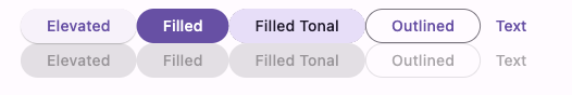
13.各种的样式的button:自动圆角

[
          ElevatedButton(onPressed: onPressed, child: const Text('Elevated')),
          FilledButton(onPressed: onPressed, child: const Text('Filled')),
          FilledButton.tonal(onPressed: onPressed, child: const Text('Filled Tonal')),
          OutlinedButton(onPressed: onPressed, child: const Text('Outlined')),
          TextButton(onPressed: onPressed, child: const Text('Text')),
        ]

//前面带图标,可以用Directionality来指定图标在前还是在后
[
  ElevatedButton.icon(
    onPressed: () {},
    icon: const Icon(Icons.sunny),
    label: const Text('ElevatedButton'),
  ),
  FilledButton.icon(
    onPressed: () {},
    icon: const Icon(Icons.beach_access),
    label: const Text('FilledButton'),
  ),
  FilledButton.tonalIcon(
    onPressed: () {},
    icon: const Icon(Icons.cloud),
    label: const Text('FilledButton Tonal'),
  ),
  OutlinedButton.icon(
    onPressed: () {},
    icon: const Icon(Icons.light),
    label: const Text('OutlinedButton'),
  ),
  TextButton.icon(
    onPressed: () {},
    icon: const Icon(Icons.flight_takeoff),
    label: const Text('TextButton'),
  ),
]
14. card部件设置点击事件时,为了让阴影也是圆角需要设置clipBehavior
Card(
        clipBehavior: Clip.hardEdge,
        child: InkWell(
          splashColor: Colors.blue.withAlpha(30),
          onTap: () {
            debugPrint('Card tapped.');
          },
          child: const SizedBox(width: 300, height: 100, child: Text('A card that can be tapped')),
        ),
      )

//其他加了外边框的card
[
  Card(child: _SampleCard(cardName: 'Elevated Card')),
  Card.filled(child: _SampleCard(cardName: 'Filled Card')),
  Card.outlined(child: _SampleCard(cardName: 'Outlined Card')),
]
15. timeDilation 降低动画的执行时间
16. 富文本点击事件
RichText(
              text: TextSpan(
                text: label,
                style: const TextStyle(
                  color: Colors.blueAccent,
                  decoration: TextDecoration.underline,
                ),
                recognizer: TapGestureRecognizer()
                  ..onTap = () {
                    debugPrint('Label has been tapped.');
                  },
              ),
            )
17. 文本前面和后面图标 RawChip. Chip,ChoiceChip,FilterChip,InputChip
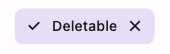
FilterChip.elevated(
                  selected: showDeleteIcon,
                  onDeleted: showDeleteIcon ? () {} : null,
                  onSelected: (bool value) {},
                  label: Text(showDeleteIcon ? 'Deletable' : 'Undeletable'),
                )
18.上下文菜单
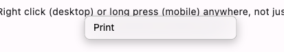
final ContextMenuController _contextMenuController = ContextMenuController();

_contextMenuController.show(
      context: context,
      contextMenuBuilder: (BuildContext context) {
        return widget.contextMenuBuilder(context, position);
      },
    );

_contextMenuController.remove();

// ContextMenuController.removeAny();
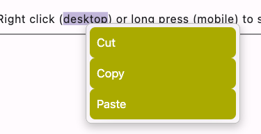
TextField(
                controller: _controller,
                contextMenuBuilder: (BuildContext context, EditableTextState editableTextState) {
                  return AdaptiveTextSelectionToolbar(
                    anchors: editableTextState.contextMenuAnchors,
                    // Build the default buttons, but make them look custom.
                    // In a real project you may want to build different
                    // buttons depending on the platform.
                    children: editableTextState.contextMenuButtonItems.map((
                        ContextMenuButtonItem buttonItem,
                        ) {
                      return CupertinoButton(
                        color: const Color(0xffaaaa00),
                        disabledColor: const Color(0xffaaaaff),
                        onPressed: buttonItem.onPressed,
                        padding: const EdgeInsets.all(10.0),
                        pressedOpacity: 0.7,
                        child: SizedBox(
                          width: 200.0,
                          child: Text(
                            CupertinoTextSelectionToolbarButton.getButtonLabel(context, buttonItem),
                          ),
                        ),
                      );
                    }).toList(),
                  );
                },
              )
19.表格
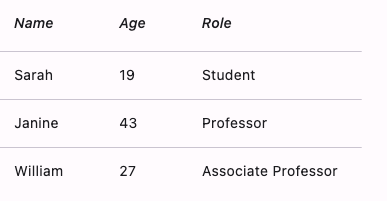
DataTable(
      columns: const <DataColumn>[
        DataColumn(
          label: Expanded(
            child: Text('Name', style: TextStyle(fontStyle: FontStyle.italic)),
          ),
        ),
        DataColumn(
          label: Expanded(
            child: Text('Age', style: TextStyle(fontStyle: FontStyle.italic)),
          ),
        ),
        DataColumn(
          label: Expanded(
            child: Text('Role', style: TextStyle(fontStyle: FontStyle.italic)),
          ),
        ),
      ],
      rows: const <DataRow>[
        DataRow(
          cells: <DataCell>[
            DataCell(Text('Sarah')),
            DataCell(Text('19')),
            DataCell(Text('Student')),
          ],
        ),
        DataRow(
          cells: <DataCell>[
            DataCell(Text('Janine')),
            DataCell(Text('43')),
            DataCell(Text('Professor')),
          ],
        ),
        DataRow(
          cells: <DataCell>[
            DataCell(Text('William')),
            DataCell(Text('27')),
            DataCell(Text('Associate Professor')),
          ],
        ),
      ],
    )
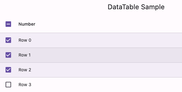
DataTable(
        columns: const <DataColumn>[DataColumn(label: Text('Number'))],
        rows: List<DataRow>.generate(
          numItems,
              (int index) => DataRow(
            color: MaterialStateProperty.resolveWith<Color?>((Set<MaterialState> states) {
              // All rows will have the same selected color.
              if (states.contains(MaterialState.selected)) {
                return Theme.of(context).colorScheme.primary.withOpacity(0.08);
              }
              // Even rows will have a grey color.
              if (index.isEven) {
                return Colors.grey.withOpacity(0.3);
              }
              return null; // Use default value for other states and odd rows.
            }),
            cells: <DataCell>[DataCell(Text('Row $index'))],
            selected: selected[index],
            onSelectChanged: (bool? value) {
              setState(() {
                selected[index] = value!;
              });
            },
          ),
        ),
      )
20.dialog
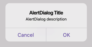
showAdaptiveDialog<String>(
        context: context,
        builder: (BuildContext context) => AlertDialog.adaptive(
          title: const Text('AlertDialog Title'),
          content: const Text('AlertDialog description'),
          actions: <Widget>[
            adaptiveAction(
              context: context,
              onPressed: () => Navigator.pop(context, 'Cancel'),
              child: const Text('Cancel'),
            ),
            adaptiveAction(
              context: context,
              onPressed: () => Navigator.pop(context, 'OK'),
              child: const Text('OK'),
            ),
          ],
        ),
      )
AlertDialog
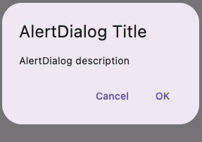
showDialog<String>(
        context: context,
        builder: (BuildContext context) => AlertDialog(
          title: const Text('AlertDialog Title'),
          content: const Text('AlertDialog description'),
          actions: <Widget>[
            TextButton(
              onPressed: () => Navigator.pop(context, 'Cancel'),
              child: const Text('Cancel'),
            ),
            TextButton(onPressed: () => Navigator.pop(context, 'OK'), child: const Text('OK')),
          ],
        ),
      )
Dialog
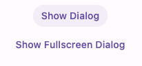
TextButton(
          onPressed: () => showDialog<String>(
            context: context,
            builder: (BuildContext context) => Dialog(
              child: Padding(
                padding: const EdgeInsets.all(8.0),
                child: Column(
                  mainAxisSize: MainAxisSize.min,
                  mainAxisAlignment: MainAxisAlignment.center,
                  children: <Widget>[
                    const Text('This is a typical dialog.'),
                    const SizedBox(height: 15),
                    TextButton(
                      onPressed: () {
                        Navigator.pop(context);
                      },
                      child: const Text('Close'),
                    ),
                  ],
                ),
              ),
            ),
          ),
          child: const Text('Show Dialog'),
        ),
        const SizedBox(height: 10),
        TextButton(
          onPressed: () => showDialog<String>(
            context: context,
            builder: (BuildContext context) => Dialog.fullscreen(
              child: Column(
                mainAxisSize: MainAxisSize.min,
                mainAxisAlignment: MainAxisAlignment.center,
                children: <Widget>[
                  const Text('This is a fullscreen dialog.'),
                  const SizedBox(height: 15),
                  TextButton(
                    onPressed: () {
                      Navigator.pop(context);
                    },
                    child: const Text('Close'),
                  ),
                ],
              ),
            ),
          ),
          child: const Text('Show Fullscreen Dialog'),
        )
DialogRoute
Navigator.of(context).restorablePush(_dialogBuilder);

@pragma('vm:entry-point')
  static Route<Object?> _dialogBuilder(BuildContext context, Object? arguments) {
    return DialogRoute<void>(
      context: context,
      builder: (BuildContext context) {
        return AlertDialog(
          title: const Text('Basic dialog title'),
          content: const Text(
            'A dialog is a type of modal window that\n'
                'appears in front of app content to\n'
                'provide critical information, or prompt\n'
                'for a decision to be made.',
          ),
          actions: <Widget>[
            TextButton(
              style: TextButton.styleFrom(textStyle: Theme.of(context).textTheme.labelLarge),
              child: const Text('Disable'),
              onPressed: () {
                Navigator.of(context).pop();
              },
            ),
            TextButton(
              style: TextButton.styleFrom(textStyle: Theme.of(context).textTheme.labelLarge),
              child: const Text('Enable'),
              onPressed: () {
                Navigator.of(context).pop();
              },
            ),
          ],
        );
      },
    );
  }
21.分割线 Divider和VerticalDivider
22.抽屉布局 Drawer
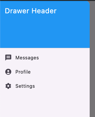
Drawer(
        child: ListView(
          padding: EdgeInsets.zero,
          children: <Widget>[
            const DrawerHeader(
              decoration: BoxDecoration(color: Colors.blue),
              child: Text('Drawer Header', style: TextStyle(color: Colors.white, fontSize: 24)),
            ),
            ListTile(
              leading: const Icon(Icons.message),
              title: const Text('Messages'),
              onTap: () {
                setState(() {
                  selectedPage = 'Messages';
                });
              },
            ),
          ],
        ),
      )
23.下拉框
DropdownButton<String>(
      value: dropdownValue,
      icon: const Icon(Icons.arrow_downward),
      elevation: 16,
      style: const TextStyle(color: Colors.deepPurple),
      underline: Container(height: 2, color: Colors.deepPurpleAccent),
      onChanged: (String? value) {
        // This is called when the user selects an item.
        setState(() {
          dropdownValue = value!;
        });
      },
      items: list.map<DropdownMenuItem<String>>((String value) {
        return DropdownMenuItem<String>(value: value, child: Text(value));
      }).toList(),
    )
带输入的下拉框
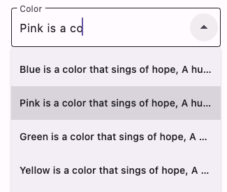
DropdownMenu<ColorItem>(
          width: 300,
          controller: controller,
          initialSelection: ColorItem.green,
          label: const Text('Color'),
          onSelected: (ColorItem? color) {
            print('Selected $color');
          },
          dropdownMenuEntries: ColorItem.values.map<DropdownMenuEntry<ColorItem>>((ColorItem item) {
            final String labelText = '${item.label} $longText\n';
            return DropdownMenuEntry<ColorItem>(
              value: item,
              label: labelText,
              // Try commenting the labelWidget out or changing
              // the labelWidget's Text parameters.
              labelWidget: Text(labelText, maxLines: 1, overflow: TextOverflow.ellipsis),
            );
          }).toList(),
        )
24.两边圆形的按钮
          ElevatedButton(style: ElevatedButton.styleFrom(textStyle: const TextStyle(fontSize: 20)), onPressed: null, child: const Text('Disabled')),
          const SizedBox(height: 30),
          ElevatedButton(style: ElevatedButton.styleFrom(textStyle: const TextStyle(fontSize: 20)), onPressed: () {}, child: const Text('Enabled')),
25.可折叠的列表
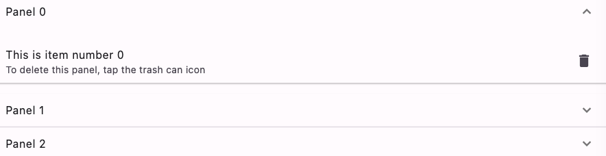
ExpansionPanelList.radio();//仅扩展单个
ExpansionPanelList(
      expansionCallback: (int index, bool isExpanded) {
        setState(() {
          _data[index].isExpanded = isExpanded;
        });
      },
      children: _data.map<ExpansionPanel>((Item item) {
        return ExpansionPanel(
          headerBuilder: (BuildContext context, bool isExpanded) {
            return ListTile(title: Text(item.headerValue));
          },
          body: ListTile(
            title: Text(item.expandedValue),
            subtitle: const Text('To delete this panel, tap the trash can icon'),
            trailing: const Icon(Icons.delete),
            onTap: () {
              setState(() {
                _data.removeWhere((Item currentItem) => item == currentItem);
              });
            },
          ),
          isExpanded: item.isExpanded,
        );
      }).toList(),
    )
可单独使用的,比如放在Column中 ExpansionTile
手动打开或关闭ExpansionTile--》ExpansionTileController
26.CustomScrollView中有回弹效果的部件 FlexibleSpaceBar
27.设置 FloatingActionButton 的位置 -》floatingActionButtonLocation
class AlmostEndFloatFabLocation extends StandardFabLocation with FabEndOffsetX, FabFloatOffsetY {
  @override
  double getOffsetX(ScaffoldPrelayoutGeometry scaffoldGeometry, double adjustment) {
    final double directionalAdjustment = 0;
    return super.getOffsetX(scaffoldGeometry, adjustment) + directionalAdjustment;
  }

  @override
  double getOffsetY(ScaffoldPrelayoutGeometry scaffoldGeometry, double adjustment) {
    final double directionalAdjustment = -200;
    return super.getOffsetY(scaffoldGeometry, adjustment) + directionalAdjustment;
  }
}
28.图标按钮 (还有isSelected属性哦)
Column(
        mainAxisAlignment: MainAxisAlignment.center,
        children: <Widget>[
          Container(
              color: Colors.redAccent,
              child: IconButton(
                iconSize: 15,
                icon: const Icon(Icons.add_alarm_rounded),
                onPressed: onPressed,
                padding: EdgeInsets.zero,
                visualDensity: VisualDensity(
                    horizontal: VisualDensity.minimumDensity,
                    vertical: VisualDensity.minimumDensity),
              )),

          // Filled icon button
          Container(
            color: Colors.redAccent,
            child: IconButton.filled(
              onPressed: onPressed,
              icon: const Icon(Icons.add_alarm_rounded),
              iconSize: 30,
              padding: EdgeInsets.zero,
              constraints: BoxConstraints.tightFor(width: 50,height: 50),
            ),
          ),

          // Filled tonal icon button
          IconButton.filledTonal(
              onPressed: onPressed, icon: const Icon(Icons.filter_drama)),

          // Outlined icon button
          IconButton.outlined(
              onPressed: onPressed, icon: const Icon(Icons.filter_drama)),
        ],
      )
29.输入框装饰 InputDecoration
InputDecoration() //常规

InputDecoration.collapsed() //去掉自带padding,对自定义高度很有用
30.通过部件不同的状态改变装饰
MaterialStateProperty. (MaterialStatePropertyAll)
MaterialStateProperty.resolveWith((Set<MaterialState> states) {
        const Set<MaterialState> interactiveStates = <MaterialState>{
          MaterialState.pressed,
          MaterialState.hovered,
          MaterialState.focused,
        };
        if (states.any(interactiveStates.contains)) {
          return Colors.blue;
        }
        return Colors.red;
      }
MaterialStateColor
MaterialStateColor.resolveWith((states) {
          const Set<MaterialState> interactiveStates = <MaterialState>{
            MaterialState.pressed,
            MaterialState.hovered,
            MaterialState.focused,
          };
          print(states);
          if (states.any(interactiveStates.contains) ||
              states.contains(MaterialState.hovered)) {
            return Colors.blue;
          }
          return Colors.red;
        }
31.垂直出现在部件下方的下拉框 MenuBar
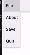
MenuBar(
                children: <Widget>[
                  SubmenuButton(
                    menuChildren: <Widget>[
                      MenuItemButton(
                        onPressed: () {
                          showAboutDialog(
                            context: context,
                            applicationName: 'MenuBar Sample',
                            applicationVersion: '1.0.0',
                          );
                        },
                        child: const MenuAcceleratorLabel('&About'),
                      ),
                      MenuItemButton(
                        onPressed: () {
                          ScaffoldMessenger.of(
                            context,
                          ).showSnackBar(const SnackBar(content: Text('Saved!')));
                        },
                        child: const MenuAcceleratorLabel('&Save'),
                      ),
                    ],
                    child: const MenuAcceleratorLabel('&File'),
                  ),
                ],
              )
多个层级 MenuAnchor
32.导航栏

NavigationBar(
        onDestinationSelected: (int index) {
          setState(() {
            currentPageIndex = index;
          });
        },
        indicatorColor: Colors.amber,
        selectedIndex: currentPageIndex,
        destinations: const <Widget>[
          NavigationDestination(
            selectedIcon: Icon(Icons.home),
            icon: Icon(Icons.home_outlined),
            label: 'Home',
          ),
          NavigationDestination(
            icon: Badge(child: Icon(Icons.notifications_sharp)),
            label: 'Notifications',
          ),
          NavigationDestination(
            icon: Badge(label: Text('2'), child: Icon(Icons.messenger_sharp)),
            label: 'Messages',
          ),
        ],
      )
导航栏带动画,带返回监听
NavigatorPopHandler(
      onPop: () {
        final NavigatorState navigator = navigatorKeys[selectedIndex].currentState!;
        navigator.pop();
      },
      child: Scaffold(
        body: SafeArea(
          top: false,
          child: Stack(
            fit: StackFit.expand,
            children: allDestinations.map((Destination destination) {
              final int index = destination.index;
              final Widget view = destinationViews[index];
              if (index == selectedIndex) {
                destinationFaders[index].forward();
                return Offstage(offstage: false, child: view);
              } else {
                destinationFaders[index].reverse();
                if (destinationFaders[index].isAnimating) {
                  return IgnorePointer(child: view);
                }
                return Offstage(child: view);
              }
            }).toList(),
          ),
        ),
        bottomNavigationBar: NavigationBar(
          selectedIndex: selectedIndex,
          onDestinationSelected: (int index) {
            setState(() {
              selectedIndex = index;
            });
          },
          destinations: allDestinations.map<NavigationDestination>((Destination destination) {
            return NavigationDestination(
              icon: Icon(destination.icon, color: destination.color),
              label: destination.title,
            );
          }).toList(),
        ),
      ),
    )
33.抽屉部件
final GlobalKey<ScaffoldState> scaffoldKey = GlobalKey<ScaffoldState>();
scaffoldKey.currentState!.openEndDrawer();

NavigationDrawer(
        onDestinationSelected: handleScreenChanged,
        selectedIndex: screenIndex,
        children: <Widget>[
          Padding(
            padding: const EdgeInsets.fromLTRB(28, 16, 16, 10),
            child: Text('Header', style: Theme.of(context).textTheme.titleSmall),
          ),
          ...destinations.map((ExampleDestination destination) {
            return NavigationDrawerDestination(
              label: Text(destination.label),
              icon: destination.icon,
              selectedIcon: destination.selectedIcon,
            );
          }),
          const Padding(padding: EdgeInsets.fromLTRB(28, 16, 28, 10), child: Divider()),
        ],
      )
34.侧边导航栏
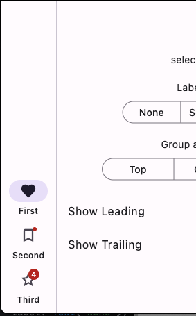
NavigationRail(
              selectedIndex: _selectedIndex,
              groupAlignment: groupAlignment,
              onDestinationSelected: (int index) {
                setState(() {
                  _selectedIndex = index;
                });
              },
              labelType: labelType,
              leading: showLeading
                  ? FloatingActionButton(
                elevation: 0,
                onPressed: () {
                  // Add your onPressed code here!
                },
                child: const Icon(Icons.add),
              )
                  : const SizedBox(),
              trailing: showTrailing
                  ? IconButton(
                onPressed: () {
                  // Add your onPressed code here!
                },
                icon: const Icon(Icons.more_horiz_rounded),
              )
                  : const SizedBox(),
              destinations: const <NavigationRailDestination>[
                NavigationRailDestination(
                  icon: Icon(Icons.favorite_border),
                  selectedIcon: Icon(Icons.favorite),
                  label: Text('First'),
                ),
                NavigationRailDestination(
                  icon: Badge(child: Icon(Icons.bookmark_border)),
                  selectedIcon: Badge(child: Icon(Icons.book)),
                  label: Text('Second'),
                ),
                NavigationRailDestination(
                  icon: Badge(label: Text('4'), child: Icon(Icons.star_border)),
                  selectedIcon: Badge(label: Text('4'), child: Icon(Icons.star)),
                  label: Text('Third'),
                ),
              ],
            )
35.右上角小红点
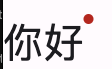
Badge(
                  alignment: Alignment.topRight,
                  smallSize: 10,
                  padding: EdgeInsets.all(10),
                  offset: Offset(100, -10),
                  child: Padding(
                    padding: EdgeInsets.only(right: 10),
                    child: Text(
                      '你好',
                      style: TextStyle(fontSize: 40),
                    ),
                  ),
                )
36.页面导航动画
MaterialApp(
      theme: ThemeData(
        // Defines the page transition animations used by MaterialPageRoute
        // for different target platforms.
        // Non-specified target platforms will default to
        // ZoomPageTransitionsBuilder().
        pageTransitionsTheme: const PageTransitionsTheme(
          builders: <TargetPlatform, PageTransitionsBuilder>{
            TargetPlatform.iOS: CupertinoPageTransitionsBuilder(),
            TargetPlatform.linux: OpenUpwardsPageTransitionsBuilder(),
            TargetPlatform.macOS: FadeUpwardsPageTransitionsBuilder(),
       TargetPlatform.android: ZoomPageTransitionsBuilder(allowSnapshotting: false),
}, ), ), home: const HomePage(), )
37.表格。PaginatedDataTable 还有排序功能
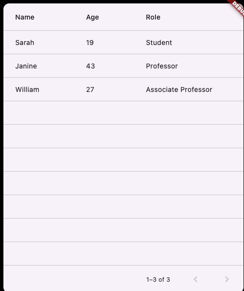
PaginatedDataTable(
      columns: const <DataColumn>[
        DataColumn(label: Text('Name')),
        DataColumn(label: Text('Age')),
        DataColumn(label: Text('Role')),
      ],
      source: dataSource,
    )


class MyDataSource extends DataTableSource {
  @override
  int get rowCount => 3;

  @override
  DataRow? getRow(int index) {
    switch (index) {
      case 0:
        return const DataRow(
          cells: <DataCell>[
            DataCell(Text('Sarah')),
            DataCell(Text('19')),
            DataCell(Text('Student')),
          ],
        );
      case 1:
        return const DataRow(
          cells: <DataCell>[
            DataCell(Text('Janine')),
            DataCell(Text('43')),
            DataCell(Text('Professor')),
          ],
        );
      case 2:
        return const DataRow(
          cells: <DataCell>[
            DataCell(Text('William')),
            DataCell(Text('27')),
            DataCell(Text('Associate Professor')),
          ],
        );
      default:
        return null;
    }
  }

  @override
  bool get isRowCountApproximate => false;

  @override
  int get selectedRowCount => 1;
}
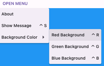
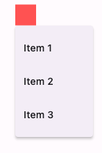
38.经典的弹出菜单PopupMenuButton
enum SampleItem { itemOne, itemTwo, itemThree }
PopupMenuButton<SampleItem>(
      popUpAnimationStyle: AnimationStyle.noAnimation,//动画
          child: Container(width: 30,height: 30,color: Colors.redAccent,),
          useRootNavigator: true,
          padding: EdgeInsets.zero,
          position: PopupMenuPosition.over,
          offset: Offset(0, 30),
          onSelected: (SampleItem item) {
            setState(() {
              selectedItem = item;
            });
          },
          itemBuilder: (BuildContext context) => <PopupMenuEntry<SampleItem>>[
            const PopupMenuItem<SampleItem>(value: SampleItem.itemOne, child: Text('Item 1')),
            const PopupMenuItem<SampleItem>(value: SampleItem.itemTwo, child: Text('Item 2')),
            const PopupMenuItem<SampleItem>(value: SampleItem.itemThree, child: Text('Item 3')),
          ],
        )
39.进度
(圆形)CircularProgressIndicator
(条形)LinearProgressIndicator
40.单选条目
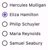
Radio<int>(
                  value: index,
                  // TRY THIS: Try setting the toggleable value to false and
                  // see how that changes the behavior of the widget.
                  toggleable: true, groupValue: groupValue, onChanged: (int? value) { setState(() {
                    groupValue = value;
                  }); },
                )
41.范围取值滑动条
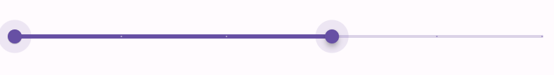
RangeSlider(
      values: _currentRangeValues,
      max: 100,
      divisions: 5,
      labels: RangeLabels(
        _currentRangeValues.start.round().toString(),
        _currentRangeValues.end.round().toString(),
      ),
      onChanged: (RangeValues values) {
        setState(() {
          _currentRangeValues = values;
        });
      },
    )
42.下拉刷新指示器
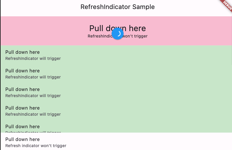
RefreshIndicator(
        color: Colors.white,
        backgroundColor: Colors.blue,
        onRefresh: () async {
          return Future<void>.delayed(const Duration(seconds: 3));
        },
        notificationPredicate: (ScrollNotification notification) {
          return notification.depth == 0;//控制哪个地方能响应下拉刷新
        },
        child: CustomScrollView(
          slivers: <Widget>[
            SliverToBoxAdapter(
              child: Container(
                height: 100,
                alignment: Alignment.center,
                color: Colors.pink[100],
                child: Column(
                  mainAxisAlignment: MainAxisAlignment.center,
                  children: <Widget>[
                    Text('Pull down here', style: Theme.of(context).textTheme.headlineMedium),
                    const Text("RefreshIndicator won't trigger"),
                  ],
                ),
              ),
            ),
            SliverToBoxAdapter(
              child: Container(
                color: Colors.green[100],
                height: 300,
                child: ListView.builder(
                  itemCount: 25,
                  itemBuilder: (BuildContext context, int index) {
                    return const ListTile(
                      title: Text('Pull down here'),
                      subtitle: Text('RefreshIndicator will trigger'),
                    );
                  },
                ),
              ),
            ),
            SliverList.builder(
              itemCount: 20,
              itemBuilder: (BuildContext context, int index) {
                return const ListTile(
                  title: Text('Pull down here'),
                  subtitle: Text("Refresh indicator won't trigger"),
                );
              },
            ),
          ],
        ),
      )
有些设备不加这个无法进行下拉刷新
MaterialApp(
      scrollBehavior: const MaterialScrollBehavior().copyWith(
        dragDevices: PointerDeviceKind.values.toSet(),
      ),
      home: const RefreshIndicatorExample(),
    )
43.拖拽排序
class _ReorderableExampleState extends State<ReorderableExample> {
  final List<int> _items = List<int>.generate(50, (int index) => index);

  @override
  Widget build(BuildContext context) {
    final Color oddItemColor = Colors.lime.shade100;
    final Color evenItemColor = Colors.deepPurple.shade100;

    final List<Card> cards = <Card>[
      for (int index = 0; index < _items.length; index += 1)
        Card(
          key: Key('$index'),
          color: _items[index].isOdd ? oddItemColor : evenItemColor,
          child: SizedBox(height: 80, child: Center(child: Text('Card ${_items[index]}'))),
        ),
    ];

    Widget proxyDecorator(Widget child, int index, Animation<double> animation) {
      return AnimatedBuilder(
        animation: animation,
        builder: (BuildContext context, Widget? child) {
          final double animValue = Curves.easeInOut.transform(animation.value);
          final double elevation = lerpDouble(1, 6, animValue)!;
          final double scale = lerpDouble(1, 1.02, animValue)!;
          return Transform.scale(
            scale: scale,
            // Create a Card based on the color and the content of the dragged one
            // and set its elevation to the animated value.
            child: Card(elevation: elevation, color: cards[index].color, child: cards[index].child),
          );
        },
        child: child,
      );
    }

    return ReorderableListView(
      padding: const EdgeInsets.symmetric(horizontal: 40),
      proxyDecorator: proxyDecorator,
      onReorder: (int oldIndex, int newIndex) {
        setState(() {
          if (oldIndex < newIndex) {
            newIndex -= 1;
          }
          final int item = _items.removeAt(oldIndex);
          _items.insert(newIndex, item);
        });
      },
      children: cards,
    );
  }
自定义可拖拽区域
ReorderableListView(
      buildDefaultDragHandles: false,
      children: <Widget>[
        for (int index = 0; index < _items.length; index++)
          ColoredBox(
            key: Key('$index'),
            color: _items[index].isOdd ? oddItemColor : evenItemColor,
            child: Row(
              children: <Widget>[
                Container(
                  width: 64,
                  height: 64,
                  padding: const EdgeInsets.all(8),
                  child: ReorderableDragStartListener(
                    index: index,
                    child: Card(color: colorScheme.primary, elevation: 2),
                  ),
                ),
                Text('Item ${_items[index]}'),
              ],
            ),
          ),
      ],
      onReorder: (int oldIndex, int newIndex) {
        setState(() {
          if (oldIndex < newIndex) {
            newIndex -= 1;
          }
          final int item = _items.removeAt(oldIndex);
          _items.insert(newIndex, item);
        });
      },
    )
44.ScaffoldMessenger的用法
//顶部的弹窗
ScaffoldMessenger.of(context).showMaterialBanner(
          const MaterialBanner(
            content: Text('This is a MaterialBanner'),
            actions: <Widget>[TextButton(onPressed: null, child: Text('DISMISS'))],
          ),
        )

//底部的弹窗
ScaffoldMessenger.of(
  context,
).showSnackBar(const SnackBar(content: Text('A SnackBar has been shown.')));
Scaffold.of(context).showBottomSheet((BuildContext context) {
  return Container(
    height: 200,
    color: Colors.amber,
    child: Center(
      child: Column(
        mainAxisAlignment: MainAxisAlignment.center,
        mainAxisSize: MainAxisSize.min,
        children: <Widget>[
          const Text('BottomSheet'),
          ElevatedButton(
            child: const Text('Close BottomSheet'),
            onPressed: () {
              Navigator.pop(context);
            },
          ),
        ],
      ),
    ),
  );
});
45.搜索与搜索历史
class _SearchBarAppState extends State<SearchBarApp> {
  Color? selectedColorSeed;
  List<ColorLabel> searchHistory = <ColorLabel>[];

  Iterable<Widget> getHistoryList(SearchController controller) {
    return searchHistory.map(
          (ColorLabel color) => ListTile(
        leading: const Icon(Icons.history),
        title: Text(color.label),
        trailing: IconButton(
          icon: const Icon(Icons.call_missed),
          onPressed: () {
            controller.text = color.label;
            controller.selection = TextSelection.collapsed(offset: controller.text.length);
          },
        ),
      ),
    );
  }

  Iterable<Widget> getSuggestions(SearchController controller) {
    final String input = controller.value.text;
    return ColorLabel.values
        .where((ColorLabel color) => color.label.contains(input))
        .map(
          (ColorLabel filteredColor) => ListTile(
        leading: CircleAvatar(backgroundColor: filteredColor.color),
        title: Text(filteredColor.label),
        trailing: IconButton(
          icon: const Icon(Icons.call_missed),
          onPressed: () {
            controller.text = filteredColor.label;
            controller.selection = TextSelection.collapsed(offset: controller.text.length);
          },
        ),
        onTap: () {
          controller.closeView(filteredColor.label);
          handleSelection(filteredColor);
        },
      ),
    );
  }

  void handleSelection(ColorLabel selectedColor) {
    setState(() {
      selectedColorSeed = selectedColor.color;
      if (searchHistory.length >= 5) {
        searchHistory.removeLast();
      }
      searchHistory.insert(0, selectedColor);
    });
  }

  @override
  Widget build(BuildContext context) {
    final ThemeData themeData = ThemeData(colorSchemeSeed: selectedColorSeed);
    final ColorScheme colors = themeData.colorScheme;

    return MaterialApp(
      theme: themeData,
      home: Scaffold(
        appBar: AppBar(title: const Text('Search Bar Sample')),
        body: Align(
          alignment: Alignment.topCenter,
          child: Column(
            children: <Widget>[
              SearchAnchor.bar(
                barHintText: 'Search colors',
                suggestionsBuilder: (BuildContext context, SearchController controller) {
                  if (controller.text.isEmpty) {
                    if (searchHistory.isNotEmpty) {
                      return getHistoryList(controller);
                    }
                    return <Widget>[
                      Center(
                        child: Text('No search history.', style: TextStyle(color: colors.outline)),
                      ),
                    ];
                  }
                  return getSuggestions(controller);
                },
              ),
            ],
          ),
        ),
      ),
    );
  }
}
46.选择项
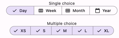
SegmentedButton<Sizes>(
style: SegmentedButton.styleFrom(
  backgroundColor: Colors.grey[200],
  foregroundColor: Colors.red,
  selectedForegroundColor: Colors.white,
  selectedBackgroundColor: Colors.green,
),
     segments: const <ButtonSegment<Sizes>>[
        ButtonSegment<Sizes>(value: Sizes.extraSmall, label: Text('XS')),
        ButtonSegment<Sizes>(value: Sizes.small, label: Text('S')),
        ButtonSegment<Sizes>(value: Sizes.medium, label: Text('M')),
        ButtonSegment<Sizes>(value: Sizes.large, label: Text('L')),
        ButtonSegment<Sizes>(value: Sizes.extraLarge, label: Text('XL')),
      ],
      selected: selection,
      onSelectionChanged: (Set<Sizes> newSelection) {
        setState(() {
          selection = newSelection;
        });
      },
      multiSelectionEnabled: true,
    )
47.可选择复制区域
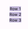
SelectionArea(
        child: Scaffold(
          appBar: AppBar(title: const Text('SelectionArea Sample')),
          body: const Center(
            child: Column(
              mainAxisAlignment: MainAxisAlignment.center,
              children: <Widget>[Text('Row 1'), Text('Row 2'), Text('Row 3'),
],
            ),
          ),
        ),
      )
48.滑动条
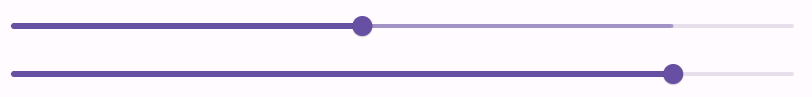
Slider(
            value: _currentSliderPrimaryValue,
            secondaryTrackValue: _currentSliderSecondaryValue,
            label: _currentSliderPrimaryValue.round().toString(),
            onChanged: (double value) {
              setState(() {
                _currentSliderPrimaryValue = value;
              });
            },
          ),
          Slider(
            value: _currentSliderSecondaryValue,
            label: _currentSliderSecondaryValue.round().toString(),
            onChanged: (double value) {
              setState(() {
                _currentSliderSecondaryValue = value;
              });
            },
          ),
49.步骤
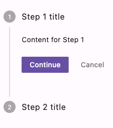
Stepper(
      currentStep: _index,
      onStepCancel: () {
        if (_index > 0) {
          setState(() {
            _index -= 1;
          });
        }
      },
      onStepContinue: () {
        if (_index <= 0) {
          setState(() {
            _index += 1;
          });
        }
      },
      onStepTapped: (int index) {
        setState(() {
          _index = index;
        });
      },
      steps: <Step>[
        Step(
          title: const Text('Step 1 title'),
          content: Container(
            alignment: Alignment.centerLeft,
            child: const Text('Content for Step 1'),
          ),
        ),
        const Step(title: Text('Step 2 title'), content: Text('Content for Step 2')),
      ],
    )
50.开关
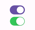
Switch(
          value: light,
          onChanged: (bool value) {
            setState(() {
              light = value;
            });
          },
        ),
        Switch.adaptive(
          // Don't use the ambient CupertinoThemeData to style this switch.
          applyCupertinoTheme: false,
          value: light,
          onChanged: (bool value) {
            setState(() {
              light = value;
            });
          },
        ),
51.顶部导航栏TabBar
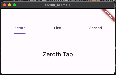
class TabControllerExample extends StatelessWidget {
  const TabControllerExample({required this.tabs, super.key});

  final List<Tab> tabs;

  @override
  Widget build(BuildContext context) {
    return DefaultTabController(
      length: tabs.length,
      child: DefaultTabControllerListener(
        onTabChanged: (int index) {
          debugPrint('tab changed: $index');
        },
        child: Scaffold(
          appBar: AppBar(bottom: TabBar(tabs: tabs)),
          body: TabBarView(
            children: tabs.map((Tab tab) {
              return Center(
                child: Text('${tab.text!} Tab', style: Theme.of(context).textTheme.headlineSmall),
              );
            }).toList(),
          ),
        ),
      ),
    );
  }
}

class DefaultTabControllerListener extends StatefulWidget {
  const DefaultTabControllerListener({required this.onTabChanged, required this.child, super.key});

  final ValueChanged<int> onTabChanged;

  final Widget child;

  @override
  State<DefaultTabControllerListener> createState() => _DefaultTabControllerListenerState();
}

class _DefaultTabControllerListenerState extends State<DefaultTabControllerListener> {
  TabController? _controller;

  @override
  void didChangeDependencies() {
    super.didChangeDependencies();

    final TabController? defaultTabController = DefaultTabController.maybeOf(context);

    assert(() {
      if (defaultTabController == null) {
        throw FlutterError(
          'No DefaultTabController for ${widget.runtimeType}.\n'
              'When creating a ${widget.runtimeType}, you must ensure that there '
              'is a DefaultTabController above the ${widget.runtimeType}.',
        );
      }
      return true;
    }());

    if (defaultTabController != _controller) {
      _controller?.removeListener(_listener);
      _controller = defaultTabController;
      _controller?.addListener(_listener);
    }
  }

  void _listener() {
    final TabController? controller = _controller;

    if (controller == null || controller.indexIsChanging) {
      return;
    }

    widget.onTabChanged(controller.index);
  }

  @override
  void dispose() {
    _controller?.removeListener(_listener);
    super.dispose();
  }

  @override
  Widget build(BuildContext context) {
    return widget.child;
  }
}
自定义TabController
class _TabBarExampleState extends State<TabBarExample> with TickerProviderStateMixin {
  late final TabController _tabController;

  @override
  void initState() {
    super.initState();
    _tabController = TabController(length: 3, vsync: this);
  }

  @override
  void dispose() {
    _tabController.dispose();
    super.dispose();
  }

  @override
  Widget build(BuildContext context) {
    return Scaffold(
      appBar: AppBar(
        title: const Text('TabBar Sample'),
        bottom: TabBar(
          controller: _tabController,
          tabs: const <Widget>[
            Tab(icon: Icon(Icons.cloud_outlined)),
            Tab(icon: Icon(Icons.beach_access_sharp)),
            Tab(icon: Icon(Icons.brightness_5_sharp)),
          ],
        ),
      ),
      body: TabBarView(
        controller: _tabController,
        children: const <Widget>[
          Center(child: Text("It's cloudy here")),
          Center(child: Text("It's rainy here")),
          Center(child: Text("It's sunny here")),
        ],
      ),
    );
  }
}
52.TextButton
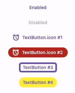
[
      TextButton(onPressed: () {}, child: const Text('Enabled')),

      const TextButton(onPressed: null, child: Text('Disabled')),

      TextButton.icon(
        onPressed: () {},
        icon: const Icon(Icons.access_alarm),
        label: const Text('TextButton.icon #1'),
      ),

      TextButton.icon(
        style: TextButton.styleFrom(
          foregroundColor: colorScheme.onError,
          backgroundColor: colorScheme.error,
        ),
        onPressed: () {},
        icon: const Icon(Icons.access_alarm),
        label: const Text('TextButton.icon #2'),
      ),

      TextButton(
        style: TextButton.styleFrom(
          shape: RoundedRectangleBorder(
            borderRadius: const BorderRadius.all(Radius.circular(8)),
            side: BorderSide(color: colorScheme.primary, width: 5),
          ),
        ),
        onPressed: () {},
        child: const Text('TextButton #3'),
      ),

      TextButton(
        style: TextButton.styleFrom(backgroundColor: Colors.yellow),
        onPressed: () {},
        child: const Text('TextButton #4'),
      ),
    ]
53.输入框
TextField(
        obscureText: true, //是否明文
        decoration: InputDecoration(border: OutlineInputBorder(), labelText: 'Password'),
      )
54.自定义主题,扩展主题
@immutable
class MyColors extends ThemeExtension<MyColors> {
  const MyColors({required this.brandColor, required this.danger});

  final Color? brandColor;
  final Color? danger;

  @override
  MyColors copyWith({Color? brandColor, Color? danger}) {
    return MyColors(brandColor: brandColor ?? this.brandColor, danger: danger ?? this.danger);
  }

  @override
  MyColors lerp(MyColors? other, double t) {
    if (other is! MyColors) {
      return this;
    }
    return MyColors(
      brandColor: Color.lerp(brandColor, other.brandColor, t),
      danger: Color.lerp(danger, other.danger, t),
    );
  }

  // Optional
  @override
  String toString() => 'MyColors(brandColor: $brandColor, danger: $danger)';
}
MaterialApp(
  theme: ThemeData(
    extensions: const <ThemeExtension<dynamic>>[
      MyColors(brandColor: Color(0xFF1E88E5), danger: Color(0xFFE53935)),
    ],
  ),
  darkTheme: ThemeData.dark().copyWith(
    extensions: <ThemeExtension<dynamic>>[
      const MyColors(brandColor: Color(0xFF90CAF9), danger: Color(0xFFEF9A9A)),
    ],
  ),
  themeMode: isLightTheme ? ThemeMode.light : ThemeMode.dark,
  home: Home(isLightTheme: isLightTheme, toggleTheme: toggleTheme),
)
final MyColors myColors = Theme.of(context).extension<MyColors>()!;
55.ColorScheme
final ColorScheme colorScheme = ColorScheme.fromSeed(
      brightness: MediaQuery.platformBrightnessOf(context),
      seedColor: Colors.indigo,
    );
    return MaterialApp(
      title: 'ThemeData Demo',
      theme: ThemeData(
        colorScheme: colorScheme,
        floatingActionButtonTheme: FloatingActionButtonThemeData(
          backgroundColor: colorScheme.tertiary,
          foregroundColor: colorScheme.onTertiary,
        ),
      ),
      home: const Home(),
    );
56.切换按钮
ToggleButtons(
                direction: vertical ? Axis.vertical : Axis.horizontal,
                onPressed: (int index) {
                  setState(() {
                    // The button that is tapped is set to true, and the others to false.
                    for (int i = 0; i < _selectedFruits.length; i++) {
                      _selectedFruits[i] = i == index;
                    }
                  });
                },
                borderRadius: const BorderRadius.all(Radius.circular(8)),
                selectedBorderColor: Colors.red[700],
                selectedColor: Colors.white,
                fillColor: Colors.red[200],
                color: Colors.red[400],
                constraints: const BoxConstraints(minHeight: 40.0, minWidth: 80.0),
                isSelected: _selectedFruits,
                children: fruits,
              )
57.提示语
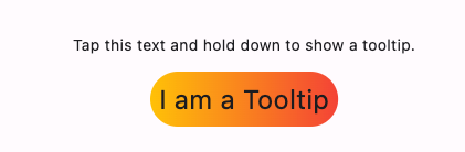
Tooltip(
      message: 'I am a Tooltip',
      decoration: BoxDecoration(
        borderRadius: BorderRadius.circular(25),
        gradient: const LinearGradient(colors: <Color>[Colors.amber, Colors.red]),
      ),
      padding: const EdgeInsets.all(8.0),
      preferBelow: true,
      textStyle: const TextStyle(fontSize: 24),
      showDuration: const Duration(seconds: 2),
      waitDuration: const Duration(seconds: 1),
      child: const Text('Tap this text and hold down to show a tooltip.'),
    )
58.CustomScrollView的列表展示和滚动方向
CustomScrollView(
        // This method is available to conveniently determine if an scroll
        // view is reversed by its AxisDirection.
      //AxisDirection
        reverse: axisDirectionIsReversed(_axisDirection),
        // This method is available to conveniently convert an AxisDirection
        // into its Axis.
        scrollDirection: axisDirectionToAxis(_axisDirection),
        slivers: <Widget>[
          SliverList.builder(
            itemCount: 27,
            itemBuilder: (BuildContext context, int index) {
              final Widget child;
              if (index == 0) {
                child = _getLeading();
              } else {
                child = Container(
                  color: index.isEven ? Colors.amber[100] : Colors.amberAccent,
                  padding: const EdgeInsets.all(8.0),
                  child: Center(child: Text(_alphabet[index - 1])),
                );
              }
              return Padding(padding: const EdgeInsets.all(8.0), child: child);
            },
          ),
        ],
      )
59.shape属性 ShapeBorder 实现类大全
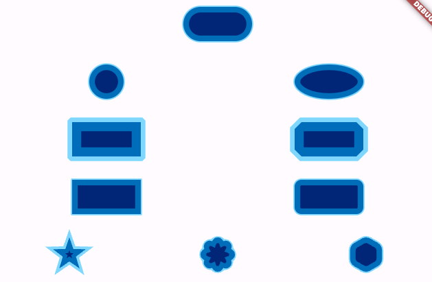
Column(
          mainAxisAlignment: MainAxisAlignment.spaceAround,
          children: <Widget>[
            BorderedBox(
              shape: StadiumBorder(
                side: BorderSide(
                  color: borderColor,
                  width: borderWidth,
                  strokeAlign: (animation.value * 2) - 1,
                ),
              ),
            ),
            Row(
              mainAxisAlignment: MainAxisAlignment.spaceAround,
              children: <Widget>[
                BorderedBox(
                  shape: CircleBorder(
                    side: BorderSide(
                      color: borderColor,
                      width: borderWidth,
                      strokeAlign: (animation.value * 2) - 1,
                    ),
                  ),
                ),
                BorderedBox(
                  shape: OvalBorder(
                    side: BorderSide(
                      color: borderColor,
                      width: borderWidth,
                      strokeAlign: (animation.value * 2) - 1,
                    ),
                  ),
                ),
              ],
            ),
            Row(
              mainAxisAlignment: MainAxisAlignment.spaceAround,
              children: <Widget>[
                BorderedBox(
                  shape: BeveledRectangleBorder(
                    side: BorderSide(
                      color: borderColor,
                      width: borderWidth,
                      strokeAlign: (animation.value * 2) - 1,
                    ),
                  ),
                ),
                BorderedBox(
                  shape: BeveledRectangleBorder(
                    borderRadius: BorderRadius.circular(cornerRadius),
                    side: BorderSide(
                      color: borderColor,
                      width: borderWidth,
                      strokeAlign: (animation.value * 2) - 1,
                    ),
                  ),
                ),
              ],
            ),
            Row(
              mainAxisAlignment: MainAxisAlignment.spaceAround,
              children: <Widget>[
                BorderedBox(
                  shape: RoundedRectangleBorder(
                    side: BorderSide(
                      color: borderColor,
                      width: borderWidth,
                      strokeAlign: (animation.value * 2) - 1,
                    ),
                  ),
                ),
                BorderedBox(
                  shape: RoundedRectangleBorder(
                    borderRadius: BorderRadius.circular(cornerRadius),
                    side: BorderSide(
                      color: borderColor,
                      width: borderWidth,
                      strokeAlign: (animation.value * 2) - 1,
                    ),
                  ),
                ),
              ],
            ),
            Row(
              mainAxisAlignment: MainAxisAlignment.spaceAround,
              children: <Widget>[
                BorderedBox(
                  shape: StarBorder(
                    side: BorderSide(
                      color: borderColor,
                      width: borderWidth,
                      strokeAlign: (animation.value * 2) - 1,
                    ),
                  ),
                ),
                BorderedBox(
                  shape: StarBorder(
                    pointRounding: 1,
                    innerRadiusRatio: 0.5,
                    points: 8,
                    side: BorderSide(
                      color: borderColor,
                      width: borderWidth,
                      strokeAlign: (animation.value * 2) - 1,
                    ),
                  ),
                ),
                BorderedBox(
                  shape: StarBorder.polygon(
                    sides: 6,
                    pointRounding: 0.5,
                    side: BorderSide(
                      color: borderColor,
                      width: borderWidth,
                      strokeAlign: (animation.value * 2) - 1,
                    ),
                  ),
                ),
              ],
            ),
          ],
        )
60.渐变色 Gradient
LinearGradient(
            begin: Alignment.topLeft,
            end: Alignment(0.8, 1),
            colors: <Color>[
              Color(0xff1f005c),
              Color(0xff5b0060),
              Color(0xff870160),
              Color(0xffac255e),
              Color(0xffca485c),
              Color(0xffe16b5c),
              Color(0xfff39060),
              Color(0xffffb56b),
            ], // Gradient from https://learnui.design/tools/gradient-generator.html
            tileMode: TileMode.mirror,
          )
61.OutlinedBorder 的应用类 LinearBorder
62.GridView
GridView(
      gridDelegate: const SliverGridDelegateWithFixedCrossAxisCount(
        crossAxisCount: 4,
        mainAxisExtent: 150.0,
      ),
      children: List<Widget>.generate(20, (int i) {
        return Builder(
          builder: (BuildContext context) {
            return Text('$i');
          },
        );
      }),
    )
63.退出应用逻辑
class _BodyState extends State<Body> with WidgetsBindingObserver {
  bool _shouldExit = false;
  String lastResponse = 'No exit requested yet';

  @override
  void initState() {
    super.initState();
    WidgetsBinding.instance.addObserver(this);
  }

  @override
  void dispose() {
    WidgetsBinding.instance.removeObserver(this);
    super.dispose();
  }

  Future<void> _quit() async {
    final AppExitType exitType = _shouldExit ? AppExitType.required : AppExitType.cancelable;
    setState(() {
      lastResponse = 'App requesting ${exitType.name} exit';
    });
    await ServicesBinding.instance.exitApplication(exitType);
  }

  @override
  Future<AppExitResponse> didRequestAppExit() async {
    final AppExitResponse response = _shouldExit ? AppExitResponse.exit : AppExitResponse.cancel;
    setState(() {
      lastResponse = 'App responded ${response.name} to exit request';
    });
    return response;
  }

  void _radioChanged(bool? value) {
    value ??= true;
    if (_shouldExit == value) {
      return;
    }
    setState(() {
      _shouldExit = value!;
    });
  }

  @override
  Widget build(BuildContext context) {
    return Center(
      child: SizedBox(
        width: 300,
        child: Column(
          mainAxisSize: MainAxisSize.min,
          children: <Widget>[
            RadioListTile<bool>(
              title: const Text('Do Not Allow Exit'),
              groupValue: _shouldExit,
              value: false,
              onChanged: _radioChanged,
            ),
            RadioListTile<bool>(
              title: const Text('Allow Exit'),
              groupValue: _shouldExit,
              value: true,
              onChanged: _radioChanged,
            ),
            const SizedBox(height: 30),
            ElevatedButton(onPressed: _quit, child: const Text('Quit')),
            const SizedBox(height: 30),
            Text(lastResponse),
          ],
        ),
      ),
    );
  }
}
64.监听键盘
Focus(
          focusNode: _focusNode,
          onKeyEvent: _handleKeyEvent,
          child: ListenableBuilder(
            listenable: _focusNode,
            builder: (BuildContext context, Widget? child) {
              if (!_focusNode.hasFocus) {
                return GestureDetector(
                  onTap: () {
                    FocusScope.of(context).requestFocus(_focusNode);
                  },
                  child: const Text('Click to focus'),
                );
              }
              return Text(_message ?? 'Press a key');
            },
          ),
        )
65.状态栏颜色
AppBar(
        title: const Text('SystemUiOverlayStyle Sample'),
        systemOverlayStyle: SystemUiOverlayStyle.dark.copyWith(
          statusBarColor: Colors.redAccent,
          systemNavigationBarColor: Colors.redAccent,
        ),
      )
可以向下传递设置项的方式
AnnotatedRegion<SystemUiOverlayStyle>(
      value: _currentStyle,
      child: Scaffold(
        body: Column(
          crossAxisAlignment: CrossAxisAlignment.start,
          children: <Widget>[
            Padding(
              padding: const EdgeInsets.all(16.0),
              child: Text(
                'SystemUiOverlayStyle Sample',
                style: Theme.of(context).textTheme.titleLarge,
              ),
            ),
            Expanded(
              child: Center(
                child: ElevatedButton(onPressed: _changeColor, child: const Text('Change Color')),
              ),
            ),
          ],
        ),
      ),
    )
66.以动画形式在ListView中添加和删除条目
void main() {
  runApp(const AnimatedListSample());
}

class AnimatedListSample extends StatefulWidget {
  const AnimatedListSample({super.key});

  @override
  State<AnimatedListSample> createState() => _AnimatedListSampleState();
}

class _AnimatedListSampleState extends State<AnimatedListSample> {
  final GlobalKey<AnimatedListState> _listKey = GlobalKey<AnimatedListState>();
  late ListModel<int> _list;
  int? _selectedItem;
  late int _nextItem; // The next item inserted when the user presses the '+' button.

  @override
  void initState() {
    super.initState();
    _list = ListModel<int>(
      listKey: _listKey,
      initialItems: <int>[0, 1, 2],
      removedItemBuilder: _buildRemovedItem,
    );
    _nextItem = 3;
  }

  // Used to build list items that haven't been removed.
  Widget _buildItem(BuildContext context, int index, Animation<double> animation) {
    return CardItem(
      animation: animation,
      item: _list[index],
      selected: _selectedItem == _list[index],
      onTap: () {
        setState(() {
          _selectedItem = _selectedItem == _list[index] ? null : _list[index];
        });
      },
    );
  }

  /// The builder function used to build items that have been removed.
  ///
  /// Used to build an item after it has been removed from the list. This method
  /// is needed because a removed item remains visible until its animation has
  /// completed (even though it's gone as far as this ListModel is concerned).
  /// The widget will be used by the [AnimatedListState.removeItem] method's
  /// [AnimatedRemovedItemBuilder] parameter.
  Widget _buildRemovedItem(int item, BuildContext context, Animation<double> animation) {
    return CardItem(
      animation: animation,
      item: item,
      // No gesture detector here: we don't want removed items to be interactive.
    );
  }

  // Insert the "next item" into the list model.
  void _insert() {
    final int index = _selectedItem == null ? _list.length : _list.indexOf(_selectedItem!);
    _list.insert(index, _nextItem);
    _nextItem++;
  }

  // Remove the selected item from the list model.
  void _remove() {
    if (_selectedItem != null) {
      _list.removeAt(_list.indexOf(_selectedItem!));
      setState(() {
        _selectedItem = null;
      });
    }
  }

  @override
  Widget build(BuildContext context) {
    return MaterialApp(
      home: Scaffold(
        appBar: AppBar(
          title: const Text('AnimatedList'),
          actions: <Widget>[
            IconButton(
              icon: const Icon(Icons.add_circle),
              onPressed: _insert,
              tooltip: 'insert a new item',
            ),
            IconButton(
              icon: const Icon(Icons.remove_circle),
              onPressed: _remove,
              tooltip: 'remove the selected item',
            ),
          ],
        ),
        body: Padding(
          padding: const EdgeInsets.all(16.0),
          child: AnimatedList(
            key: _listKey,
            initialItemCount: _list.length,
            itemBuilder: _buildItem,
          ),
        ),
      ),
    );
  }
}

typedef RemovedItemBuilder<T> =
Widget Function(T item, BuildContext context, Animation<double> animation);

/// Keeps a Dart [List] in sync with an [AnimatedList].
///
/// The [insert] and [removeAt] methods apply to both the internal list and
/// the animated list that belongs to [listKey].
///
/// This class only exposes as much of the Dart List API as is needed by the
/// sample app. More list methods are easily added, however methods that
/// mutate the list must make the same changes to the animated list in terms
/// of [AnimatedListState.insertItem] and [AnimatedListState.removeItem].
class ListModel<E> {
  ListModel({required this.listKey, required this.removedItemBuilder, Iterable<E>? initialItems})
      : _items = List<E>.from(initialItems ?? <E>[]);

  final GlobalKey<AnimatedListState> listKey;
  final RemovedItemBuilder<E> removedItemBuilder;
  final List<E> _items;

  AnimatedListState? get _animatedList => listKey.currentState;

  void insert(int index, E item) {
    _items.insert(index, item);
    _animatedList!.insertItem(index);
  }

  E removeAt(int index) {
    final E removedItem = _items.removeAt(index);
    if (removedItem != null) {
      _animatedList!.removeItem(index, (BuildContext context, Animation<double> animation) {
        return removedItemBuilder(removedItem, context, animation);
      });
    }
    return removedItem;
  }

  int get length => _items.length;

  E operator [](int index) => _items[index];

  int indexOf(E item) => _items.indexOf(item);
}

/// Displays its integer item as 'item N' on a Card whose color is based on
/// the item's value.
///
/// The text is displayed in bright green if [selected] is
/// true. This widget's height is based on the [animation] parameter, it
/// varies from 0 to 128 as the animation varies from 0.0 to 1.0.
class CardItem extends StatelessWidget {
  const CardItem({
    super.key,
    this.onTap,
    this.selected = false,
    required this.animation,
    required this.item,
  }) : assert(item >= 0);

  final Animation<double> animation;
  final VoidCallback? onTap;
  final int item;
  final bool selected;

  @override
  Widget build(BuildContext context) {
    TextStyle textStyle = Theme.of(context).textTheme.headlineMedium!;
    if (selected) {
      textStyle = textStyle.copyWith(color: Colors.lightGreenAccent[400]);
    }
    return Padding(
      padding: const EdgeInsets.all(2.0),
      child: SizeTransition(
        sizeFactor: animation,
        child: GestureDetector(
          behavior: HitTestBehavior.opaque,
          onTap: onTap,
          child: SizedBox(
            height: 80.0,
            child: Card(
              color: Colors.primaries[item % Colors.primaries.length],
              child: Center(child: Text('Item $item', style: textStyle)),
            ),
          ),
        ),
      ),
    );
  }
}
67.退出应用逻辑2
class _ApplicationExitControlState extends State<ApplicationExitControl> {
  late final AppLifecycleListener _listener;
  bool _shouldExit = false;
  String _lastExitResponse = 'No exit requested yet';

  @override
  void initState() {
    super.initState();
    _listener = AppLifecycleListener(onExitRequested: _handleExitRequest);
  }

  @override
  void dispose() {
    _listener.dispose();
    super.dispose();
  }

  Future<void> _quit() async {
    final AppExitType exitType = _shouldExit ? AppExitType.required : AppExitType.cancelable;
    await ServicesBinding.instance.exitApplication(exitType);
  }

  Future<AppExitResponse> _handleExitRequest() async {
    final AppExitResponse response = _shouldExit ? AppExitResponse.exit : AppExitResponse.cancel;
    setState(() {
      _lastExitResponse = 'App responded ${response.name} to exit request';
    });
    return response;
  }

  @override
  Widget build(BuildContext context) {
    return Center();
  }
}
68.部件大小变化动画
AnimatedSize(
          duration: widget.duration,
          curve: widget.curve,
          child: SizedBox.square(
            dimension: _isSelected ? 250.0 : 100.0,
            child: const Center(child: FlutterLogo(size: 75.0)),
          ),
        )
部件形态变化动画
AnimatedSwitcher(
            duration: const Duration(milliseconds: 500),
            transitionBuilder: (Widget child, Animation<double> animation) {
              return ScaleTransition(scale: animation, child: child);
            },
            child: Text(
              '$_count',
              // This key causes the AnimatedSwitcher to interpret this as a "new"
              // child each time the count changes, so that it will begin its animation
              // when the count changes.
              key: ValueKey<int>(_count),
              style: Theme.of(context).textTheme.headlineMedium,
            ),
          )
69.FutureBuild
FutureBuilder<String>(
        future: _calculation, // a previously-obtained Future<String> or null
        builder: (BuildContext context, AsyncSnapshot<String> snapshot) {
          List<Widget> children;
          if (snapshot.hasData) {
            children = <Widget>[
              const Icon(Icons.check_circle_outline, color: Colors.green, size: 60),
              Padding(
                padding: const EdgeInsets.only(top: 16),
                child: Text('Result: ${snapshot.data}'),
              ),
            ];
          } else if (snapshot.hasError) {
            children = <Widget>[
              const Icon(Icons.error_outline, color: Colors.red, size: 60),
              Padding(
                padding: const EdgeInsets.only(top: 16),
                child: Text('Error: ${snapshot.error}'),
              ),
            ];
          } else {
            children = const <Widget>[
              SizedBox(width: 60, height: 60, child: CircularProgressIndicator()),
              Padding(padding: EdgeInsets.only(top: 16), child: Text('Awaiting result...')),
            ];
          }
          return Center(
            child: Column(mainAxisAlignment: MainAxisAlignment.center, children: children),
          );
        },
      )
StreamBuild
class _StreamBuilderExampleState extends State<StreamBuilderExample> {
  late final StreamController<int> _controller = StreamController<int>(
    onListen: () async {
      await Future<void>.delayed(widget.delay);

      if (!_controller.isClosed) {
        _controller.add(1);
      }

      await Future<void>.delayed(widget.delay);

      if (!_controller.isClosed) {
        _controller.close();
      }
    },
  );

  Stream<int> get _bids => _controller.stream;

  @override
  void dispose() {
    if (!_controller.isClosed) {
      _controller.close();
    }
    super.dispose();
  }

  @override
  Widget build(BuildContext context) {
    return DefaultTextStyle(
      style: Theme.of(context).textTheme.displayMedium!,
      textAlign: TextAlign.center,
      child: Container(
        alignment: FractionalOffset.center,
        color: Colors.white,
        child: BidsStatus(bids: _bids),
      ),
    );
  }
}

class BidsStatus extends StatelessWidget {
  const BidsStatus({required this.bids, super.key});

  final Stream<int>? bids;

  @override
  Widget build(BuildContext context) {
    return StreamBuilder<int>(
      stream: bids,
      builder: (BuildContext context, AsyncSnapshot<int> snapshot) {
        List<Widget> children;
        if (snapshot.hasError) {
          children = <Widget>[
            const Icon(Icons.error_outline, color: Colors.red, size: 60),
            Padding(
              padding: const EdgeInsets.only(top: 16),
              child: Text('Error: ${snapshot.error}'),
            ),
            Padding(
              padding: const EdgeInsets.only(top: 8),
              child: Text(
                'Stack trace: ${snapshot.stackTrace}',
                maxLines: 1,
                overflow: TextOverflow.ellipsis,
              ),
            ),
          ];
        } else {
          switch (snapshot.connectionState) {
            case ConnectionState.none:
              children = const <Widget>[
                Icon(Icons.info, color: Colors.blue, size: 60),
                Padding(padding: EdgeInsets.only(top: 16), child: Text('Select a lot')),
              ];
            case ConnectionState.waiting:
              children = const <Widget>[
                SizedBox(width: 60, height: 60, child: CircularProgressIndicator()),
                Padding(padding: EdgeInsets.only(top: 16), child: Text('Awaiting bids...')),
              ];
            case ConnectionState.active:
              children = <Widget>[
                const Icon(Icons.check_circle_outline, color: Colors.green, size: 60),
                Padding(padding: const EdgeInsets.only(top: 16), child: Text('\$${snapshot.data}')),
              ];
            case ConnectionState.done:
              children = <Widget>[
                const Icon(Icons.info, color: Colors.blue, size: 60),
                Padding(
                  padding: const EdgeInsets.only(top: 16),
                  child: Text(snapshot.hasData ? '\$${snapshot.data} (closed)' : '(closed)'),
                ),
              ];
          }
        }

        return Column(mainAxisAlignment: MainAxisAlignment.center, children: children);
      },
    );
  }
}
70.自动填充
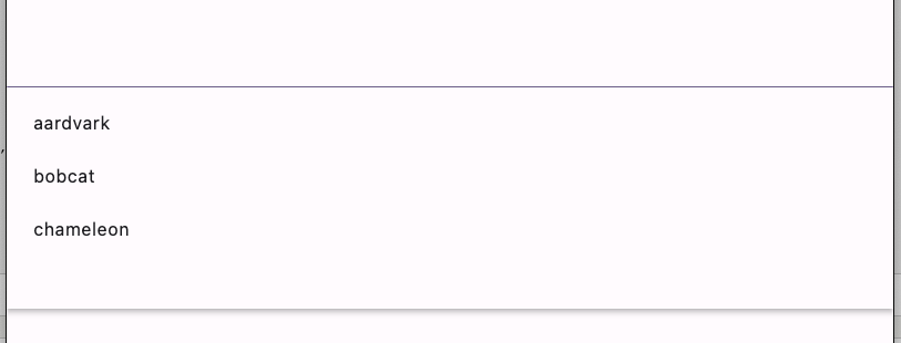
RawAutocomplete<String>(
      optionsBuilder: (TextEditingValue textEditingValue) {
        return _options.where((String option) {
          return option.contains(textEditingValue.text.toLowerCase());
        });
      },
      fieldViewBuilder:
          (
          BuildContext context,
          TextEditingController textEditingController,
          FocusNode focusNode,
          VoidCallback onFieldSubmitted,
          ) {
        return TextFormField(
          controller: textEditingController,
          focusNode: focusNode,
          onFieldSubmitted: (String value) {
            onFieldSubmitted();
          },
        );
      },
      optionsViewBuilder:
          (
          BuildContext context,
          AutocompleteOnSelected<String> onSelected,
          Iterable<String> options,
          ) {
        return Align(
          alignment: Alignment.topLeft,
          child: Material(
            elevation: 4.0,
            child: SizedBox(
              height: 200.0,
              child: ListView.builder(
                padding: const EdgeInsets.all(8.0),
                itemCount: options.length,
                itemBuilder: (BuildContext context, int index) {
                  final String option = options.elementAt(index);
                  return GestureDetector(
                    onTap: () {
                      onSelected(option);
                    },
                    child: ListTile(title: Text(option)),
                  );
                },
              ),
            ),
          ),
        );
      },
    )
71.屏蔽触摸事件
AbsorbPointer(
            child: ElevatedButton(
              style: ElevatedButton.styleFrom(backgroundColor: Colors.blue.shade200),
              onPressed: () {},
              child: null,
            ),
          )
宽高比
AspectRatio(
        aspectRatio: 16 / 9,
        child: Container(color: Colors.green),
      )
裁剪部件为圆角
ClipRRect(
            borderRadius: BorderRadius.circular(30.0),
            child: Container(
              alignment: Alignment.center,
              constraints: const BoxConstraints(maxWidth: 300, maxHeight: 100),
              color: Colors.green,
              child: const Text('ClipRRect', style: style),
            ),
          ),
          ClipRRect(
            borderRadius: const BorderRadius.only(
              topLeft: Radius.circular(10.0),
              topRight: Radius.circular(20.0),
              bottomRight: Radius.circular(30.0),
              bottomLeft: Radius.circular(40.0),
            ),
            child: Container(
              alignment: Alignment.center,
              constraints: const BoxConstraints(maxWidth: 300, maxHeight: 100),
              color: Colors.purple,
              child: const Text('ClipRRect', style: style),
            ),
          )
给子部件自定义布局
class _CascadeLayoutDelegate extends MultiChildLayoutDelegate {
  _CascadeLayoutDelegate({
    required this.colors,
    required this.overlap,
    required this.textDirection,
  });

  final Map<String, Color> colors;
  final double overlap;
  final TextDirection textDirection;

  // Perform layout will be called when re-layout is needed.
  @override
  void performLayout(Size size) {
    print("$size");
    final double columnWidth = size.width / colors.length;
    Offset childPosition = Offset.zero;
    switch (textDirection) {
      case TextDirection.rtl:
        childPosition += Offset(size.width, 0);
      case TextDirection.ltr:
        break;
    }
    for (final String color in colors.keys) {
      // layoutChild must be called exactly once for each child.
      final Size currentSize = layoutChild(
        color,
        BoxConstraints(maxHeight: size.height, maxWidth: columnWidth),
      );
      // positionChild must be called to change the position of a child from
      // what it was in the previous layout. Each child starts at (0, 0) for the
      // first layout.
      switch (textDirection) {
        case TextDirection.rtl:
          positionChild(color, childPosition - Offset(currentSize.width, 0));
          childPosition += Offset(-currentSize.width, currentSize.height - overlap);
        case TextDirection.ltr:
          positionChild(color, childPosition);
          childPosition += Offset(currentSize.width, currentSize.height - overlap);
      }
    }
  }

  // shouldRelayout is called to see if the delegate has changed and requires a
  // layout to occur. Should only return true if the delegate state itself
  // changes: changes in the CustomMultiChildLayout attributes will
  // automatically cause a relayout, like any other widget.
  @override
  bool shouldRelayout(_CascadeLayoutDelegate oldDelegate) {
    return oldDelegate.textDirection != textDirection || oldDelegate.overlap != overlap;
  }
}

class CustomMultiChildLayoutExample extends StatelessWidget {
  const CustomMultiChildLayoutExample({super.key});

  static const Map<String, Color> _colors = <String, Color>{
    'Red': Colors.red,
    'Green': Colors.green,
    'Blue': Colors.blue,
    'Cyan': Colors.cyan,
  };

  @override
  Widget build(BuildContext context) {
    return CustomMultiChildLayout(
      delegate: _CascadeLayoutDelegate(
        colors: _colors,
        overlap: 30.0,
        textDirection: Directionality.of(context),
      ),
      children: <Widget>[
        // Create all of the colored boxes in the colors map.
        for (final MapEntry<String, Color> entry in _colors.entries)
        // The "id" can be any Object, not just a String.
          LayoutId(
            id: entry.key,
            child: Container(
              color: entry.value,
              width: 100.0,
              height: 100.0,
              alignment: Alignment.center,
              child: Text(entry.key),
            ),
          ),
      ],
    );
  }
}
悬浮条
class _FlowMenuState extends State<FlowMenu> with SingleTickerProviderStateMixin {
  late AnimationController menuAnimation;
  IconData lastTapped = Icons.notifications;
  final List<IconData> menuItems = <IconData>[
    Icons.home,
    Icons.new_releases,
    Icons.notifications,
    Icons.settings,
    Icons.menu,
  ];

  void _updateMenu(IconData icon) {
    if (icon != Icons.menu) {
      setState(() => lastTapped = icon);
    }
  }

  @override
  void initState() {
    super.initState();
    menuAnimation = AnimationController(duration: const Duration(milliseconds: 250), vsync: this);
  }

  Widget flowMenuItem(IconData icon) {
    final double buttonDiameter = MediaQuery.of(context).size.width / menuItems.length;
    return Padding(
      padding: const EdgeInsets.symmetric(vertical: 8.0),
      child: RawMaterialButton(
        fillColor: lastTapped == icon ? Colors.amber[700] : Colors.blue,
        splashColor: Colors.amber[100],
        shape: const CircleBorder(),
        constraints: BoxConstraints.tight(Size(buttonDiameter, buttonDiameter)),
        onPressed: () {
          _updateMenu(icon);
          menuAnimation.status == AnimationStatus.completed
              ? menuAnimation.reverse()
              : menuAnimation.forward();
        },
        child: Icon(icon, color: Colors.white, size: 45.0),
      ),
    );
  }

  @override
  Widget build(BuildContext context) {
    return Flow(
      delegate: FlowMenuDelegate(menuAnimation: menuAnimation),
      children: menuItems.map<Widget>((IconData icon) => flowMenuItem(icon)).toList(),
    );
  }
}

class FlowMenuDelegate extends FlowDelegate {
  FlowMenuDelegate({required this.menuAnimation}) : super(repaint: menuAnimation);

  final Animation<double> menuAnimation;

  @override
  bool shouldRepaint(FlowMenuDelegate oldDelegate) {
    print('object');
    return menuAnimation != oldDelegate.menuAnimation;
  }

  @override
  void paintChildren(FlowPaintingContext context) {
    print('${menuAnimation.value}');
    double dx = 0.0;
    for (int i = 0; i < context.childCount; ++i) {
      dx = context.getChildSize(i)!.width * i;
      context.paintChild(i, transform: Matrix4.translationValues(dx * menuAnimation.value, 0, 0));
    }
  }
}
用比例扩充父布局
FractionallySizedBox(
        widthFactor: 0.5,
        heightFactor: 0.5,
        alignment: FractionalOffset.center,
        child: DecoratedBox(
          decoration: BoxDecoration(border: Border.all(color: Colors.blue, width: 4)),
        ),
      )
不响应点击事件,但是会让事件向下传递
IgnorePointer(
          ignoring: ignoring,
          child: ElevatedButton(
            style: ElevatedButton.styleFrom(padding: const EdgeInsets.all(24.0)),
            onPressed: () {},
            child: const Text('Click me!'),
          ),
        )
帧布局(每次只绘制一个子布局)
IndexedStack(
                  index: index,
                  children: <Widget>[for (final String name in names) PersonTracker(name: name)],
                )
获取触摸坐标
class _ListenerExampleState extends State<ListenerExample> {
  int _downCounter = 0;
  int _upCounter = 0;
  double x = 0.0;
  double y = 0.0;

  void _incrementDown(PointerEvent details) {
    _updateLocation(details);
    setState(() {
      _downCounter++;
    });
  }

  void _incrementUp(PointerEvent details) {
    _updateLocation(details);
    setState(() {
      _upCounter++;
    });
  }

  void _updateLocation(PointerEvent details) {
    setState(() {
      x = details.localPosition.dx;
      y = details.localPosition.dy;

    });
  }

  @override
  Widget build(BuildContext context) {
    return ConstrainedBox(
      constraints: BoxConstraints.tight(const Size(300.0, 200.0)),
      child: Listener(
        onPointerDown: _incrementDown,
        onPointerMove: _updateLocation,
        onPointerUp: _incrementUp,
        child: ColoredBox(
          color: Colors.lightBlueAccent,
          child: Column(
            mainAxisAlignment: MainAxisAlignment.start,
            children: <Widget>[
              const Text('You have pressed or released in this area this many times:'),
              Text(
                '$_downCounter presses\n$_upCounter releases',
                style: Theme.of(context).textTheme.headlineMedium,
              ),
              Text('The cursor is here: (${x.toStringAsFixed(2)}, ${y.toStringAsFixed(2)})'),
            ],
          ),
        ),
      ),
    );
  }
}
监听鼠标进入退出移动
MouseRegion(
        onEnter: _incrementEnter,
        onHover: _updateLocation,
        onExit: _incrementExit,
        child: ColoredBox(
          color: Colors.lightBlueAccent,
          child: Column(
            mainAxisAlignment: MainAxisAlignment.center,
            children: <Widget>[
              const Text('You have entered or exited this box this many times:'),
              Text(
                '$_enterCounter Entries\n$_exitCounter Exits',
                style: Theme.of(context).textTheme.headlineMedium,
              ),
              Text('The cursor is here: (${x.toStringAsFixed(2)}, ${y.toStringAsFixed(2)})'),
            ],
          ),
        ),
      )
控制部件显示隐藏 Offstage和Visibility,后者选择性强
Offstage(
          offstage: _offstage,
          child: FlutterLogo(key: _key, size: 150.0),
        )
允许子部件溢出父部件
Container(
          width: 100,
          height: 100,
          color: Theme.of(context).colorScheme.secondaryContainer,
          child: const OverflowBox(
            maxWidth: 200,
            maxHeight: 200,
            child: FlutterLogo(size: 200),
          ),
        )
自定义裁剪子部件
PhysicalShape(
      elevation: 5.0,
      clipper: ShapeBorderClipper(
        shape: RoundedRectangleBorder(borderRadius: BorderRadius.circular(10.0)),
      ),
      color: Colors.orange,
      child: const SizedBox(
        height: 200.0,
        width: 200.0,
        child: Center(
          child: Text('Hello, World!', style: TextStyle(color: Colors.white, fontSize: 20.0)),
        ),
      ),
    )
72.监听应用周期
class _WidgetBindingsObserverSampleState extends State<WidgetBindingsObserverSample>
    with WidgetsBindingObserver {
  final List<AppLifecycleState> _stateHistoryList = <AppLifecycleState>[];

  @override
  void initState() {
    super.initState();
    WidgetsBinding.instance.addObserver(this);
    if (WidgetsBinding.instance.lifecycleState != null) {
      _stateHistoryList.add(WidgetsBinding.instance.lifecycleState!);
    }
  }

  @override
  void didChangeAppLifecycleState(AppLifecycleState state) {
    setState(() {
      _stateHistoryList.add(state);
    });
  }

  @override
  void dispose() {
    WidgetsBinding.instance.removeObserver(this);
    super.dispose();
  }

  @override
  Widget build(BuildContext context) {
    if (_stateHistoryList.isNotEmpty) {
      return ListView.builder(
        key: const ValueKey<String>('stateHistoryList'),
        itemCount: _stateHistoryList.length,
        itemBuilder: (BuildContext context, int index) {
          return Text('state is: ${_stateHistoryList[index]}');
        },
      );
    }

    return const Center(child: Text('There are no AppLifecycleStates to show.'));
  }
}
73.颜色过滤效果(部件本身,覆盖。。。)
ColorFiltered(
            colorFilter: const ColorFilter.mode(Colors.red, BlendMode.modulate),
            child: Image.network(
              'https://flutter.github.io/assets-for-api-docs/assets/widgets/owl-2.jpg',
            ),
          ),
          ColorFiltered(
            colorFilter: const ColorFilter.mode(Colors.grey, BlendMode.saturation),
            child: Image.network(
              'https://flutter.github.io/assets-for-api-docs/assets/widgets/owl.jpg',
            ),
          ),
74.左滑右滑删除
Dismissible(
          background: Container(color: Colors.green),
          key: ValueKey<int>(items[index]),
          onDismissed: (DismissDirection direction) {
            setState(() {
              items.removeAt(index);
            });
          },
          child: ListTile(title: Text('Item ${items[index]}')),
        )
75.拖拽部件到目标位置及过程监听
Draggable<int>(
          // Data is the value this Draggable stores.
          data: 10,
          feedback: Container(
            color: Colors.deepOrange,
            height: 100,
            width: 100,
            child: const Icon(Icons.directions_run),
          ),
          childWhenDragging: Container(
            height: 100.0,
            width: 100.0,
            color: Colors.pinkAccent,
            child: const Center(child: Text('Child When Dragging')),
          ),
          child: Container(
            height: 100.0,
            width: 100.0,
            color: Colors.lightGreenAccent,
            child: const Center(child: Text('Draggable')),
          ),
        ),
        DragTarget<int>(
          builder: (BuildContext context, List<dynamic> accepted, List<dynamic> rejected) {
            return Container(
              height: 100.0,
              width: 100.0,
              color: Colors.cyan,
              child: Center(child: Text('Value is updated to: $acceptedData')),
            );
          },
          onAcceptWithDetails: (DragTargetDetails<int> details) {
            setState(() {
              acceptedData += details.data;
            });
          },
        ),
76.可拖拽调整大小的布局
DraggableScrollableSheet(
      initialChildSize: _sheetPosition,
      builder: (BuildContext context, ScrollController scrollController) {
        return ColoredBox(
          color: colorScheme.primary,
          child: Column(
            children: <Widget>[
              Grabber(
                onVerticalDragUpdate: (DragUpdateDetails details) {
                  setState(() {
                    _sheetPosition -= details.delta.dy / _dragSensitivity;
                    if (_sheetPosition < 0.25) {
                      _sheetPosition = 0.25;
                    }
                    if (_sheetPosition > 1.0) {
                      _sheetPosition = 1.0;
                    }
                  });
                },
                isOnDesktopAndWeb: _isOnDesktopAndWeb,
              ),
              Flexible(
                child: ListView.builder(
                  controller: _isOnDesktopAndWeb ? null : scrollController,
                  itemCount: 25,
                  itemBuilder: (BuildContext context, int index) {
                    return ListTile(
                      title: Text('Item $index', style: TextStyle(color: colorScheme.surface)),
                    );
                  },
                ),
              ),
            ],
          ),
        );
      },
    )
77.TextField
TextField(
            controller: _controller,
      ///监听文本内容变化
            onChanged: (String value) async {
              if (value != '13') {
                return;
              }
              await showDialog<void>(
                context: context,
                builder: (BuildContext context) {
                  return AlertDialog(
                    title: const Text('That is correct!'),
                    content: const Text('13 is the right answer.'),
                    actions: <Widget>[
                      TextButton(
                        onPressed: () {
                          Navigator.pop(context);
                        },
                        child: const Text('OK'),
                      ),
                    ],
                  );
                },
              );
            },
          )
///内容变化,或获取焦点都会调用
_controller.addListener(() {
      final String text = _controller.text.toLowerCase();
      _controller.value = _controller.value.copyWith(
        text: text,
        selection: TextSelection(baseOffset: text.length, extentOffset: text.length),
        composing: TextRange.empty,
      );
    });
final TextEditingController _controller = TextEditingController.fromValue(
    const TextEditingValue(
        text: 'Flutter',
        selection: TextSelection.collapsed(offset: 1),///获取焦点时鼠标的位置
        composing: TextRange(start: 0, end: 7)),///可让内容可编辑的同时全选内容
  );
78.焦点控制
class _ColorfulButtonState extends State<ColorfulButton> {
  late FocusNode _node;
  bool _focused = false;
  late FocusAttachment _nodeAttachment;
  Color _color = Colors.white;

  @override
  void initState() {
    super.initState();
    _node = FocusNode(debugLabel: 'Button');///获取焦点
    _node.addListener(_handleFocusChange);///焦点变化监听
    _nodeAttachment = _node.attach(context, onKeyEvent: _handleKeyPress);///获取焦点后对键盘的监听
  }
}
79.管理部件是否能获取焦点
///焦点组
FocusScope(
          canRequestFocus: backdropIsVisible,
          child: Pane(
            icon: const Icon(Icons.close),
            focusNode: backdropNode,
            backgroundColor: Colors.lightBlue,
            onPressed: () => setState(() => backdropIsVisible = false),
            child: Column(
              mainAxisAlignment: MainAxisAlignment.center,
              children: <Widget>[
                // This button would be not visible, but still focusable from
                // the foreground pane without the FocusScope.
                ElevatedButton(
                  onPressed: () => debugPrint('You pressed the other button!'),
                  child: const Text('ANOTHER BUTTON TO FOCUS'),
                ),
                DefaultTextStyle(
                  style: Theme.of(context).textTheme.displayMedium!,
                  child: const Text('BACKDROP'),
                ),
              ],
            ),
          ),
        )

///控制单个焦点
Focus(
  onKeyEvent: _handleKeyPress,
  debugLabel: 'Button',
  child: Builder(
    builder: (BuildContext context) {
      final FocusNode focusNode = Focus.of(context);
      final bool hasFocus = focusNode.hasFocus;
      return GestureDetector(
        onTap: () {
          if (hasFocus) {
            focusNode.unfocus();
          } else {
            focusNode.requestFocus();
          }
        },
        child: Center(
          child: Container(
            width: 400,
            height: 100,
            alignment: Alignment.center,
            color: hasFocus ? _color : Colors.white,
            child: Text(hasFocus ? "I'm in color! Press R,G,B!" : 'Press to focus'),
          ),
        ),
      );
    },
  ),
)
某个部件是否有焦点,配合Build部件使用
Focus(
      autofocus: autofocus,
      child: Builder(
        builder: (BuildContext context) {
          return Container(
            padding: const EdgeInsets.all(8.0),
            color: Focus.of(context).hasPrimaryFocus ? Colors.red : Colors.white,
            child: Text(data),
          );
        },
      ),
    )
80.可对输入进行校验的部件
Form(
      key: _formKey,
      child: Column(
        crossAxisAlignment: CrossAxisAlignment.start,
        children: <Widget>[
          TextFormField(
            decoration: const InputDecoration(hintText: 'Enter your email'),
            validator: (String? value) {
              if (value == null || value.isEmpty) {
                return 'Please enter some text';
              }
              return null;
            },
          ),
          Padding(
            padding: const EdgeInsets.symmetric(vertical: 16.0),
            child: ElevatedButton(
              onPressed: () {
                // Validate will return true if the form is valid, or false if
                // the form is invalid.
                if (_formKey.currentState!.validate()) {
                  // Process data.
                }
              },
              child: const Text('Submit'),
            ),
          ),
        ],
      ),
    )
81.抛出异常时的部件
//可全局设置
ErrorWidget.builder = (FlutterErrorDetails details) {
    // If we're in debug mode, use the normal error widget which shows the error
    // message:
    if (kDebugMode) {
      return ErrorWidget(details.exception);
    }
    // In release builds, show a yellow-on-blue message instead:
    return ReleaseModeErrorWidget(details: details);
  };

//Build部件
Builder(
  builder: (BuildContext context) {
    throw Exception('oh no, an error');
  },
);
82.手势处理 GestureDetector
GestureDetector(
                      behavior: HitTestBehavior.translucent,
                      onPanStart: (DragStartDetails details) {
                        print(details.localPosition);
                      },
                      onPanUpdate: (DragUpdateDetails details) {
                        print(details.localPosition);
                      },
                      child: Container(
                        width: _boxSize.width,
                        height: _boxSize.height,
                        color: Colors.red,
                      ),
                    )
83.将部件以动画形式在两个界面跳转
//两个界面的tag相同
Hero(
                  tag: 'hero-custom-tween',
                  createRectTween: (Rect? begin, Rect? end) {
                    return MaterialRectCenterArcTween(begin: begin, end: end);
                  },
                    child: Icon(Icons.add_alarm_rounded),
                )
84.Image部件
Image.network(
        'https://example.does.not.exist/image.jpg',
        errorBuilder: (BuildContext context, Object exception, StackTrace? stackTrace) {
          return const Text('😢');
        },
      )
///动画形式
Image.network(
  'https://www.baidu.com/img/flexible/logo/pc/result.png',
  frameBuilder:
      (BuildContext context, Widget child, int? frame, bool wasSynchronouslyLoaded) {
    if (wasSynchronouslyLoaded) {
      return child;
    }
    return AnimatedOpacity(
      opacity: frame == null ? 0 : 1,
      duration: const Duration(seconds: 1),
      curve: Curves.easeOut,
      child: child,
    );
  },
)
///带进度
Image.network(
  'https://www.keaitupian.cn/cjpic/frombd/1/253/2032688566/3458490751.jpg',
  loadingBuilder: (BuildContext context, Widget child, ImageChunkEvent? loadingProgress) {
    if (loadingProgress == null) {
      return child;
    }
    return Center(
      child: CircularProgressIndicator(
        value: loadingProgress.expectedTotalBytes != null
            ? loadingProgress.cumulativeBytesLoaded / loadingProgress.expectedTotalBytes!
            : null,
      ),
    );
  },
)
85.隐式动画
AnimatedAlign(
            alignment: selected ? Alignment.topRight : Alignment.bottomLeft,
            duration: widget.duration,
            curve: widget.curve,
            child: const FlutterLogo(size: 50.0),
          )
AnimatedContainer(
  width: selected ? 200.0 : 100.0,
  height: selected ? 100.0 : 200.0,
  color: selected ? Colors.red : Colors.blue,
  alignment: selected ? Alignment.center : AlignmentDirectional.topCenter,
  duration: const Duration(seconds: 2),
  curve: Curves.fastOutSlowIn,
  child: const FlutterLogo(size: 75),
)
AnimatedFractionallySizedBox(
  widthFactor: selected ? 0.25 : 0.75,
  heightFactor: selected ? 0.75 : 0.25,
  alignment: selected ? Alignment.topLeft : Alignment.bottomRight,
  duration: widget.duration,
  curve: widget.curve,
  child: const ColoredBox(color: Colors.blue, child: FlutterLogo(size: 75)),
)
AnimatedPadding(
  padding: EdgeInsets.all(padValue),
  duration: const Duration(seconds: 2),
  curve: Curves.easeInOut,
  child: Container(
    width: MediaQuery.of(context).size.width,
    height: MediaQuery.of(context).size.height / 5,
    color: Colors.blue,
  ),
)
AnimatedPositioned(
  width: 50,
  height: 50,
  top: selected ? 50.0 : 150.0,
  duration: widget.duration,
  curve: widget.curve,
  child: GestureDetector(
    onTap: () {
      setState(() {
        selected = !selected;
      });
    },
    child: const ColoredBox(
      color: Colors.blue,
      child: Center(child: Text('Tap me')),
    ),
  ),
)
AnimatedSlide(
  offset: offset,
  duration: const Duration(milliseconds: 500),
  curve: Curves.easeInOut,
  child: const FlutterLogo(size: 50.0),
)
SliverAnimatedOpacity(
  opacity: _visible ? 1.0 : 0.0,
  duration: widget.duration,
  curve: widget.curve,
  sliver: SliverFixedExtentList(
    itemExtent: 100.0,
    delegate: SliverChildBuilderDelegate((BuildContext context, int index) {
      return Container(color: index.isEven ? Colors.indigo[200] : Colors.orange[200]);
    }, childCount: 5),
  ),
)
86.父部件的数据变更改变子部件的状态。
InheritedModel
class LogoModel extends InheritedModel<LogoAspect> {
  const LogoModel({super.key, this.backgroundColor, this.large, required super.child});

  final Color? backgroundColor;
  final bool? large;

  static Color? backgroundColorOf(BuildContext context) {
    return InheritedModel.inheritFrom<LogoModel>(
      context,
      aspect: LogoAspect.backgroundColor,
    )?.backgroundColor;
  }

  static bool sizeOf(BuildContext context) {
    return InheritedModel.inheritFrom<LogoModel>(context, aspect: LogoAspect.large)?.large ?? false;
  }

  @override
  bool updateShouldNotify(LogoModel oldWidget) {
    return backgroundColor != oldWidget.backgroundColor || large != oldWidget.large;
  }

  @override
  bool updateShouldNotifyDependent(LogoModel oldWidget, Set<LogoAspect> dependencies) {
    if (backgroundColor != oldWidget.backgroundColor &&
        dependencies.contains(LogoAspect.backgroundColor)) {
      return true;
    }
    if (large != oldWidget.large && dependencies.contains(LogoAspect.large)) {
      return true;
    }
    return false;
  }
}
LogoModel(
              backgroundColor: color,
              large: large,
              child: const BackgroundWidget(child: LogoWidget()),
            )
class LogoWidget extends StatelessWidget {
  const LogoWidget({super.key});

  @override
  Widget build(BuildContext context) {
    final bool largeLogo = LogoModel.sizeOf(context);

    return AnimatedContainer(
      padding: const EdgeInsets.all(20.0),
      duration: const Duration(seconds: 2),
      curve: Curves.fastLinearToSlowEaseIn,
      alignment: Alignment.center,
      child: FlutterLogo(size: largeLogo ? 200.0 : 100.0),
    );
  }
}
InheritedNotifier
class SpinModel extends InheritedNotifier<AnimationController> {
  const SpinModel({super.key, super.notifier, required super.child});

  static double of(BuildContext context) {
    return context.dependOnInheritedWidgetOfExactType<SpinModel>()!.notifier!.value;
  }
}
SpinModel(
  notifier: _controller,
  child: const Row(
    mainAxisAlignment: MainAxisAlignment.spaceAround,
    children: <Widget>[Spinner(), Spinner(), Spinner()],
  ),
)
87.图片查看器
InteractiveViewer(
        boundaryMargin: const EdgeInsets.all(0.0),
        minScale: 0.1,
        maxScale: 1.6,
        child: Image.network('https://tse2.mm.bing.net/th/id/OIP.rEWSK4biQIXJSIi6pJrxLQHaNK?cb=12&rs=1&pid=ImgDetMain&o=7&rm=3'),
      )
88.将部件的状态持久化
第一种方式
class _KeepAliveItemState extends State<_KeepAliveItem>
    with AutomaticKeepAliveClientMixin<_KeepAliveItem> {
  int _counter = 0;

  @override
  void didUpdateWidget(_KeepAliveItem oldWidget) {
    super.didUpdateWidget(oldWidget);
    if (oldWidget.keepAlive != widget.keepAlive) {
      updateKeepAlive();
    }
  }

  @override
  bool get wantKeepAlive => widget.keepAlive;

  @override
  Widget build(BuildContext context) {
    super.build(context);

    return ListTile(
      title: Text('Item ${widget.index}: $_counter'),
      trailing: IconButton(
        icon: const Icon(Icons.add),
        onPressed: () {
          setState(() {
            _counter++;
          });
        },
      ),
    );
  }
}
第二种方式
KeepAlive(
              keepAlive: index.isEven,
              child: _KeepAliveItem(index: index),
            )
89.通过给予的布局约束 BoxConstraints 来调整部件
LayoutBuilder(
        builder: (BuildContext context, BoxConstraints constraints) {
          if (constraints.maxWidth > 600) {
            return _buildWideContainers();
          } else {
            return _buildNormalContainer();
          }
        },
      )
90.放大镜
RepaintBoundary(
                child: Stack(
                  children: <Widget>[
                    GestureDetector(
                      onPanUpdate: (DragUpdateDetails details) => setState(() {
                        dragGesturePosition = details.localPosition;
                      }),
                      onPanDown: (DragDownDetails details) => setState(() {
                        dragGesturePosition = details.localPosition;
                      }),
                      child: const FlutterLogo(size: 200),
                    ),
                    Positioned(
                      left: dragGesturePosition.dx - magnifierRadius,
                      top: dragGesturePosition.dy - magnifierRadius,
                      child: const RawMagnifier(
                        decoration: MagnifierDecoration(
                          shape: CircleBorder(side: BorderSide(color: Colors.pink, width: 3)),
                        ),
                        size: Size(magnifierRadius * 2, magnifierRadius * 2),
                        magnificationScale: 2,
                      ),
                    ),
                  ],
                ),
              )
91.滑动嵌套
class NestedScrollViewStateExample extends StatelessWidget {
  const NestedScrollViewStateExample({super.key});

  @override
  Widget build(BuildContext context) {
    return NestedScrollView(
      key: globalKey,
      headerSliverBuilder: (BuildContext context, bool innerBoxIsScrolled) {
        return const <Widget>[SliverAppBar(title: Text('NestedScrollViewState Demo!'))];
      },
      body: const CustomScrollView(
        // Body slivers go here!
      ),
    );
  }

  ScrollController get outerController {
    return globalKey.currentState!.outerController;
  }

  ScrollController get innerController {
    return globalKey.currentState!.innerController;
  }
}
92.滑动开始和停止监听
DefaultTabController(
      length: _tabs.length,
      child: Scaffold(
        // Listens to the scroll events and returns the current position.
        body: NotificationListener<ScrollNotification>(
          onNotification: (ScrollNotification scrollNotification) {
            if (scrollNotification is ScrollStartNotification) {
              debugPrint('Scrolling has started');
            } else if (scrollNotification is ScrollEndNotification) {
              debugPrint('Scrolling has ended');
            }
            // Return true to cancel the notification bubbling.
            return true;
          },
          child: NestedScrollView(
            headerSliverBuilder: (BuildContext context, bool innerBoxIsScrolled) {
              return <Widget>[
                SliverAppBar(
                  title: const Text('Notification Sample'),
                  pinned: true,
                  floating: true,
                  bottom: TabBar(tabs: _tabs.map((String name) => Tab(text: name)).toList()),
                ),
              ];
            },
            body: TabBarView(
              children: <Widget>[
                ListView.builder(
                  itemCount: _months.length,
                  itemBuilder: (BuildContext context, int index) {
                    return ListTile(title: Text(_months[index]));
                  },
                ),
                ListView.builder(
                  itemCount: _days.length,
                  itemBuilder: (BuildContext context, int index) {
                    return ListTile(title: Text(_days[index]));
                  },
                ),
              ],
            ),
          ),
        ),
      ),
    )
93.覆盖层,可做弹窗使用
OverlayPortal(
          controller: _tooltipController,
          overlayChildBuilder: (BuildContext context) {
            return const Positioned(
              right: 50,
              bottom: 50,
              child: ColoredBox(color: Colors.amberAccent, child: Text('tooltip')),
            );
          },
          child: const Text('Press to show/hide tooltip'),
        )
94.手动添加和移除覆盖层
///创建
OverlayEntry overlayEntry = OverlayEntry(
      // Create a new OverlayEntry.
      builder: (BuildContext context) {
        // Align is used to position the highlight overlay
        // relative to the NavigationBar destination.
        return SafeArea(
          child: Align(
            alignment: alignment,
            heightFactor: 1.0,
            child: DefaultTextStyle(
              style: const TextStyle(
                color: Colors.blue,
                fontWeight: FontWeight.bold,
                fontSize: 14.0,
              ),
              child: Column(
                mainAxisSize: MainAxisSize.min,
                children: <Widget>[
                  const Text('Tap here for'),
                  Builder(builder: builder),
                  SizedBox(
                    width: MediaQuery.of(context).size.width / 3,
                    height: 80.0,
                    child: Center(
                      child: Container(
                        decoration: BoxDecoration(
                          border: Border.all(color: borderColor, width: 4.0),
                        ),
                      ),
                    ),
                  ),
                ],
              ),
            ),
          ),
        );
      },
    );

    // Add the OverlayEntry to the Overlay.添加
    Overlay.of(context, debugRequiredFor: widget).insert(overlayEntry!);

///移除
void removeHighlightOverlay() {
  overlayEntry?.remove();
  overlayEntry?.dispose();
  overlayEntry = null;
}
95.保存页面状态 PageStorage - 基本上用于保持列表的滚动位置
class _MyHomePageState extends State<MyHomePage> {
  final List<Widget> pages = const <Widget>[
    ColorBoxPage(key: PageStorageKey<String>('pageOne')),
    ColorBoxPage(key: PageStorageKey<String>('pageTwo')),
  ];
  int currentTab = 0;
  final PageStorageBucket _bucket = PageStorageBucket();

  @override
  Widget build(BuildContext context) {
    return Scaffold(
      appBar: AppBar(title: const Text('Persistence Example')),
      body: PageStorage(bucket: _bucket, child: pages[currentTab]),
      bottomNavigationBar: BottomNavigationBar(
        currentIndex: currentTab,
        onTap: (int index) {
          setState(() {
            currentTab = index;
          });
        },
        items: const <BottomNavigationBarItem>[
          BottomNavigationBarItem(icon: Icon(Icons.home), label: 'page 1'),
          BottomNavigationBarItem(icon: Icon(Icons.settings), label: 'page2'),
        ],
      ),
    );
  }
}
96.viewpager之PageView--保持页面状态 AutomaticKeepAliveClientMixin (保持整个页面状态)
class _PageViewExampleState extends State<PageViewExample> with TickerProviderStateMixin {
  late PageController _pageViewController;
  late TabController _tabController;
  int _currentPageIndex = 0;

  @override
  void initState() {
    super.initState();
    _pageViewController = PageController();
    _tabController = TabController(length: 3, vsync: this);
  }

  @override
  void dispose() {
    super.dispose();
    _pageViewController.dispose();
    _tabController.dispose();
  }

  @override
  Widget build(BuildContext context) {
    final TextTheme textTheme = Theme.of(context).textTheme;

    return Stack(
      alignment: Alignment.bottomCenter,
      children: <Widget>[
        PageView(
          /// [PageView.scrollDirection] defaults to [Axis.horizontal].
          /// Use [Axis.vertical] to scroll vertically.
          controller: _pageViewController,
          onPageChanged: _handlePageViewChanged,
          children: <Widget>[
            Center(child: Text('First Page', style: textTheme.titleLarge)),
            Center(child: Text('Second Page', style: textTheme.titleLarge)),
            Center(child: Text('Third Page', style: textTheme.titleLarge)),
          ],
        ),
        PageIndicator(
          tabController: _tabController,
          currentPageIndex: _currentPageIndex,
          onUpdateCurrentPageIndex: _updateCurrentPageIndex,
          isOnDesktopAndWeb: _isOnDesktopAndWeb,
        ),
      ],
    );
  }

  void _handlePageViewChanged(int currentPageIndex) {
    if (!_isOnDesktopAndWeb) {
      return;
    }
    _tabController.index = currentPageIndex;
    setState(() {
      _currentPageIndex = currentPageIndex;
    });
  }

  void _updateCurrentPageIndex(int index) {
    _tabController.index = index;
    _pageViewController.animateToPage(
      index,
      duration: const Duration(milliseconds: 400),
      curve: Curves.easeInOut,
    );
  }

  bool get _isOnDesktopAndWeb =>
      kIsWeb ||
          switch (defaultTargetPlatform) {
            TargetPlatform.macOS || TargetPlatform.linux || TargetPlatform.windows => true,
            TargetPlatform.android || TargetPlatform.iOS || TargetPlatform.fuchsia => false,
          };
}


------------------------------------------——————————

class PageIndicator extends StatelessWidget {
  const PageIndicator({
    super.key,
    required this.tabController,
    required this.currentPageIndex,
    required this.onUpdateCurrentPageIndex,
    required this.isOnDesktopAndWeb,
  });

  final int currentPageIndex;
  final TabController tabController;
  final void Function(int) onUpdateCurrentPageIndex;
  final bool isOnDesktopAndWeb;

  @override
  Widget build(BuildContext context) {
    if (!isOnDesktopAndWeb) {
      return const SizedBox.shrink();
    }
    final ColorScheme colorScheme = Theme.of(context).colorScheme;

    return Padding(
      padding: const EdgeInsets.all(8.0),
      child: Row(
        mainAxisAlignment: MainAxisAlignment.center,
        children: <Widget>[
          IconButton(
            splashRadius: 16.0,
            padding: EdgeInsets.zero,
            onPressed: () {
              if (currentPageIndex == 0) {
                return;
              }
              onUpdateCurrentPageIndex(currentPageIndex - 1);
            },
            icon: const Icon(Icons.arrow_left_rounded, size: 32.0),
          ),
          TabPageSelector(
            controller: tabController,
            color: colorScheme.surface,
            selectedColor: colorScheme.primary,
          ),
          IconButton(
            splashRadius: 16.0,
            padding: EdgeInsets.zero,
            onPressed: () {
              if (currentPageIndex == 2) {
                return;
              }
              onUpdateCurrentPageIndex(currentPageIndex + 1);
            },
            icon: const Icon(Icons.arrow_right_rounded, size: 32.0),
          ),
        ],
      ),
    );
  }
}
97.监听系统返回键 PopScope
PopScope(
              canPop: false,
              onPopInvoked: (bool didPop) async {
                if (didPop) {
                  return;
                }
                final bool shouldPop = await _showBackDialog() ?? false;
                if (context.mounted && shouldPop) {
                  Navigator.pop(context);
                }
              },
              child: TextButton(
                onPressed: () async {
                  final bool shouldPop = await _showBackDialog() ?? false;
                  if (context.mounted && shouldPop) {
                    Navigator.pop(context);
                  }
                },
                child: const Text('Go back'),
              ),
            ),
98.PreferredSize主要用于自定义的Appbar,Scaffold.bottom
      appBar: PreferredSize(
        preferredSize: const Size.fromHeight(80.0),
        child: Container(
          decoration: const BoxDecoration(
            gradient: LinearGradient(colors: <Color>[Colors.blue, Colors.pink]),
          ),
          child: const AppBarContent(),
        ),
      ),
99.恢复系统回收的数据-RestorationMixin
class _RestorableCounterState extends State<RestorableCounter> with RestorationMixin {

  final RestorableInt _counter = RestorableInt(0);

  @override
  String? get restorationId => widget.restorationId;

  @override
  void restoreState(RestorationBucket? oldBucket, bool initialRestore) {

    registerForRestoration(_counter, 'count');
  }

  void _incrementCounter() {
    setState(() {
      _counter.value++;
    });
  }

  @override
  void dispose() {
    _counter.dispose();
    super.dispose();
  }

  @override
  Widget build(BuildContext context) {
    return Scaffold(
      appBar: AppBar(title: const Text('Restorable Counter')),
      body: Center(
        child: Column(
          mainAxisAlignment: MainAxisAlignment.center,
          children: <Widget>[
            const Text('You have pushed the button this many times:'),
            Text('${_counter.value}', style: Theme.of(context).textTheme.headlineMedium),
          ],
        ),
      ),
      floatingActionButton: FloatingActionButton(
        onPressed: _incrementCounter,
        tooltip: 'Increment',
        child: const Icon(Icons.add),
      ),
    );
  }
}
100.自定义导航过程(动画等)
class _VerticalTransitionPageRoute<T> extends PageRoute<T> {
  _VerticalTransitionPageRoute({required this.builder});

  final WidgetBuilder builder;

  @override
  Color? get barrierColor => const Color(0x00000000);

  @override
  bool get barrierDismissible => false;

  @override
  String? get barrierLabel => 'Should be no visible barrier...';

  @override
  bool get maintainState => true;

  @override
  bool get opaque => false;

  @override
  Duration get transitionDuration => const Duration(milliseconds: 2000);

  @override
  Widget buildPage(
      BuildContext context,
      Animation<double> animation,
      Animation<double> secondaryAnimation,
      ) {
    return builder(context);
  }

  @override
  Widget buildTransitions(
      BuildContext context,
      Animation<double> animation,
      Animation<double> secondaryAnimation,
      Widget child,
      ) {
    return _VerticalPageTransition(
      primaryRouteAnimation: animation,
      secondaryRouteAnimation: secondaryAnimation,
      child: child,
    );
  }
}

// A page transition that slides off the screen vertically, and uses
// delegatedTransition to ensure that the outgoing route slides with it.
class _VerticalPageTransition extends StatelessWidget {
  _VerticalPageTransition({
    required Animation<double> primaryRouteAnimation,
    required this.secondaryRouteAnimation,
    required this.child,
  }) : _primaryPositionAnimation = CurvedAnimation(
    parent: primaryRouteAnimation,
    curve: _curve,
    reverseCurve: _curve,
  ).drive(_kBottomUpTween),
        _secondaryPositionAnimation = CurvedAnimation(
          parent: secondaryRouteAnimation,
          curve: _curve,
          reverseCurve: _curve,
        ).drive(_kTopDownTween);

  final Animation<Offset> _primaryPositionAnimation;

  final Animation<Offset> _secondaryPositionAnimation;

  final Animation<double> secondaryRouteAnimation;

  final Widget child;

  static const Curve _curve = Curves.decelerate;

  static final Animatable<Offset> _kBottomUpTween = Tween<Offset>(
    begin: const Offset(0.0, 1.0),
    end: Offset.zero,
  );

  static final Animatable<Offset> _kTopDownTween = Tween<Offset>(
    begin: Offset.zero,
    end: const Offset(0.0, -1.0),
  );

  // When the _VerticalTransitionPageRoute animates onto or off of the navigation
  // stack, this transition is given to the route below it so that they animate in
  // sync.
  /*static Widget _delegatedTransitionBuilder(
      BuildContext context,
      Animation<double> animation,
      Animation<double> secondaryAnimation,
      bool allowSnapshotting,
      Widget? child,
      ) {
    final Animatable<Offset> tween = Tween<Offset>(
      begin: Offset.zero,
      end: const Offset(0.0, -1.0),
    ).chain(CurveTween(curve: _curve));

    return SlideTransition(position: secondaryAnimation.drive(tween), child: child);
  }*/

  @override
  Widget build(BuildContext context) {
    assert(debugCheckHasDirectionality(context));
    final TextDirection textDirection = Directionality.of(context);
    return SlideTransition(
      position: _secondaryPositionAnimation,
      textDirection: textDirection,
      transformHitTests: false,
      child: SlideTransition(
        position: _primaryPositionAnimation,
        textDirection: textDirection,
        child: ClipRRect(
          borderRadius: const BorderRadius.vertical(top: Radius.circular(12)),
          child: child,
        ),
      ),
    );
  }
}
101.把PageRoute当dialog用
class DismissibleDialog<T> extends PopupRoute<T> {
  @override
  Color? get barrierColor => Colors.black.withAlpha(0x50);

  // This allows the popup to be dismissed by tapping the scrim or by pressing
  // the escape key on the keyboard.
  @override
  bool get barrierDismissible => true;

  @override
  String? get barrierLabel => 'Dismissible Dialog';

  @override
  Duration get transitionDuration => const Duration(milliseconds: 300);

  @override
  Widget buildPage(
      BuildContext context,
      Animation<double> animation,
      Animation<double> secondaryAnimation,
      ) {
    return Center(
      // Provide DefaultTextStyle to ensure that the dialog's text style
      // matches the rest of the text in the app.
      child: DefaultTextStyle(
        style: Theme.of(context).textTheme.bodyMedium!,
        // UnconstrainedBox is used to make the dialog size itself
        // to fit to the size of the content.
        child: UnconstrainedBox(
          child: Container(
            padding: const EdgeInsets.all(20.0),
            decoration: BoxDecoration(borderRadius: BorderRadius.circular(10), color: Colors.white),
            child: Column(
              children: <Widget>[
                Text('Dismissible Dialog', style: Theme.of(context).textTheme.headlineSmall),
                const SizedBox(height: 20),
                const Text('Tap in the scrim or press escape key to dismiss.'),
              ],
            ),
          ),
        ),
      ),
    );
  }
}
102.路由监听
final RouteObserver<ModalRoute<void>> routeObserver = RouteObserver<ModalRoute<void>>();

void main() {
  runApp(const RouteObserverApp());
}

class RouteObserverApp extends StatelessWidget {
  const RouteObserverApp({super.key});

  @override
  Widget build(BuildContext context) {
    return MaterialApp(
      navigatorObservers: <NavigatorObserver>[routeObserver],
      home: const RouteObserverExample(),
    );
  }
}

class RouteObserverExample extends StatefulWidget {
  const RouteObserverExample({super.key});

  @override
  State<RouteObserverExample> createState() => _RouteObserverExampleState();
}

class _RouteObserverExampleState extends State<RouteObserverExample> with RouteAware {

  @override
  void didChangeDependencies() {
    super.didChangeDependencies();
    routeObserver.subscribe(this, ModalRoute.of(context)!);
  }

  @override
  void dispose() {
    routeObserver.unsubscribe(this);
    super.dispose();
  }

  @override
  void didPush() {
    // Route was pushed onto navigator and is now the topmost route.
    print('didPush 相当于 onCreate');
  }

  @override
  void didPopNext() {
    // Covering route was popped off the navigator.
    print('didPopNext 相当于 onResume');
  }

  @override
  void didPop() {
    print('didPop 相当于 onDestroy');
  }

  @override
  void didPushNext() {
    print('didPushNext 相当于 onPause');
  }

  @override
  Widget build(BuildContext context) {
    return Scaffold(
      body: Center(
        child: Column(
          mainAxisSize: MainAxisSize.min,
          children: <Widget>[
            OutlinedButton(
              onPressed: () {
                // Navigator.of(context).push<void>(
                //   MaterialPageRoute<void>(builder: (BuildContext context) => const NextPage()),
                // );
                showDialog(context: context, builder: (_){
                  return Row(children: [Container(width: 100,height: 100,color: Colors.red,)]);
                });
              },
              child: const Text('Go to next page'),
            ),
          ],
        ),
      ),
    );
  }
}
103.showGeneralDialog--dialog的高级版,可自定义对话框动画和样式
//1.第一种写法
  showGeneralDialog(
      context: context,
      barrierDismissible: true,
      barrierLabel: '',
      pageBuilder: (
          BuildContext context,
          Animation<double> animation,
          Animation<double> secondaryAnimation,
          ) {
        return const AlertDialog(title: Text('Alert!'));
      });

//第二种写法
class GeneralDialogExample extends StatelessWidget {
  const GeneralDialogExample({super.key});

  @override
  Widget build(BuildContext context) {
    return Scaffold(
      body: Center(
        child: OutlinedButton(
          onPressed: () {
            /// This shows an alert dialog.
            Navigator.of(context).restorablePush(_dialogBuilder);
          },
          child: const Text('Open Dialog'),
        ),
      ),
    );
  }

  @pragma('vm:entry-point')
  static Route<Object?> _dialogBuilder(BuildContext context, Object? arguments) {
    return RawDialogRoute<void>(
      pageBuilder:
          (
          BuildContext context,
          Animation<double> animation,
          Animation<double> secondaryAnimation,
          ) {
        return const AlertDialog(title: Text('Alert!'));
      },
    );
  }
}
104.SafeArea - 用于处理内容区域不被系统栏覆盖,注意最好包裹body,也可自定义使用media.padding设置间距实现
105.可滑动列表滚动监听
child: NotificationListener<ScrollNotification>( onNotification: handleScrollNotification, child: CustomScrollView( controller: scrollController, slivers: <Widget>[ SliverFixedExtentList( itemExtent: itemExtent, delegate: SliverChildBuilderDelegate((BuildContext context, int index) { return Item( title: 'Item $index', color: Color.lerp(Colors.red, Colors.blue, index / itemCount)!, ); }, childCount: itemCount), ), ], ), ),
____________________________
bool handleScrollNotification(ScrollNotification notification) {
if (notification is ScrollStartNotification) {
print('ScrollStartNotification');
lastScrollOffset = scrollController.position.pixels;
}
if (notification is ScrollEndNotification) {
print('ScrollEndNotification');
final ScrollMetrics m = notification.metrics;
final int lastIndex = ((m.extentBefore + m.extentInside) ~/ itemExtent).clamp(
0,
itemCount - 1,
);
final double alignedScrollOffset = itemExtent * (lastIndex + 1) - m.extentInside;
final double scrollOffset = scrollController.position.pixels;
if (scrollOffset > 0 && (scrollOffset - lastScrollOffset).abs() > itemExtent) {
SchedulerBinding.instance.addPostFrameCallback((Duration duration) {
scrollController.animateTo(
alignedScrollOffset,
duration: const Duration(milliseconds: 400),
curve: Curves.fastOutSlowIn,
);
});
}
}
return true;
}
106.滑动列表监听2-滚动到顶部按钮
class _ScrollNotificationObserverExampleState extends State<ScrollNotificationObserverExample> { ScrollNotificationObserverState? _scrollNotificationObserver; ScrollController controller = ScrollController(); bool _scrolledDown = false; @override void didChangeDependencies() { super.didChangeDependencies(); // Remove any previous listener. _scrollNotificationObserver?.removeListener(_handleScrollNotification); // Get the ScrollNotificationObserverState from the Scaffold widget. _scrollNotificationObserver = ScrollNotificationObserver.maybeOf(context); // Add a new listener. _scrollNotificationObserver?.addListener(_handleScrollNotification); } @override void dispose() { if (_scrollNotificationObserver != null) { _scrollNotificationObserver!.removeListener(_handleScrollNotification); _scrollNotificationObserver = null; } controller.dispose(); super.dispose(); } void _handleScrollNotification(ScrollNotification notification) { // Check if the notification is a scroll update notification and if the // `notification.depth` is 0. This way we only listen to the scroll // notifications from the closest scrollable, instead of those that may be nested. if (notification is ScrollUpdateNotification && defaultScrollNotificationPredicate(notification)) { final ScrollMetrics metrics = notification.metrics; // Check if the user scrolled down. if (_scrolledDown != metrics.extentBefore > 0) { setState(() { _scrolledDown = metrics.extentBefore > 0; }); } } } @override Widget build(BuildContext context) { return Stack( children: <Widget>[ SampleList(controller: controller), // Show the button only if the user scrolled down. if (_scrolledDown) Positioned( right: 25, bottom: 20, child: Center( child: GestureDetector( onTap: () { // Scroll to the top when the user taps the button. controller.animateTo( 0, duration: const Duration(milliseconds: 200), curve: Curves.fastOutSlowIn, ); }, child: const Card( child: Padding( padding: EdgeInsets.all(8.0), child: Column( children: <Widget>[Icon(Icons.arrow_upward_rounded), Text('Scroll to top')], ), ), ), ), ), ), ], ); } }
当最后一个条目一半可见时,自动滑动使其完全可见
scrollController = ScrollController( onAttach: (ScrollPosition position) { position.isScrollingNotifier.addListener(handleScrollChange); }, onDetach: (ScrollPosition position) { position.isScrollingNotifier.removeListener(handleScrollChange); }, ); —————————————————————— void handleScrollChange() { final bool isScrollingNow = scrollController.position.isScrollingNotifier.value; if (isScrolling == isScrollingNow) { return; } isScrolling = isScrollingNow; if (isScrolling) { // scroll-start lastScrollOffset = scrollController.position.pixels; } else { // scroll-end final ScrollPosition p = scrollController.position; final int lastIndex = ((p.extentBefore + p.extentInside) ~/ itemExtent).clamp( 0, itemCount - 1, ); final double alignedScrollOffset = itemExtent * (lastIndex + 1) - p.extentInside; final double scrollOffset = scrollController.position.pixels; if (scrollOffset > 0 && (scrollOffset - lastScrollOffset).abs() > itemExtent) { SchedulerBinding.instance.addPostFrameCallback((Duration duration) { scrollController.animateTo( alignedScrollOffset, duration: const Duration(milliseconds: 400), curve: Curves.fastOutSlowIn, ); }); } } }
107.滚动条
Scrollbar和RawScrollbar
108.状态管理之内存key,value存储
SharedAppData.setValue<String, String?>( context, 'bar', 'BAR $_barVersion', ); final String value = SharedAppData.getValue<String, String>( context, appDataKey, () => 'initial', );
______________________________
//封装,此对象应用内可用
class SharedObject {
SharedObject._();
static final Object _sharedObjectKey = Object();
@override
String toString() => describeIdentity(this);
static void reset(BuildContext context) {
// Calling SharedAppData.setValue() causes dependent widgets to be rebuilt.
SharedAppData.setValue<Object, SharedObject>(context, _sharedObjectKey, SharedObject._());
}
static SharedObject of(BuildContext context) {
// If a value for _sharedObjectKey has never been set then the third
// callback parameter is used to generate an initial value.
return SharedAppData.getValue<Object, SharedObject>(
context,
_sharedObjectKey,
() => SharedObject._(),
);
}
}
109.监听键盘特定的按键
CallbackShortcuts( bindings: <ShortcutActivator, VoidCallback>{ const SingleActivator(LogicalKeyboardKey.arrowUp): () { setState(() => count = count + 1); }, const SingleActivator(LogicalKeyboardKey.arrowDown): () { setState(() => count = count - 1); }, }, child: Focus( autofocus: true, child: Column( children: <Widget>[ const Text('Press the up arrow key to add to the counter'), const Text('Press the down arrow key to subtract from the counter'), Text('count: $count'), ], ), ), )
Shortcuts( shortcuts: <ShortcutActivator, Intent>{ LogicalKeySet(LogicalKeyboardKey.keyC, LogicalKeyboardKey.controlLeft): const IncrementIntent(), }, child: Actions( actions: <Type, Action<Intent>>{ IncrementIntent: CallbackAction<IncrementIntent>( onInvoke: (IncrementIntent intent) => setState(() { count = count + 1; }), ), }, child: Focus( autofocus: true, child: Column( children: <Widget>[ const Text('Add to the counter by pressing Ctrl+C'), Text('count: $count'), ], ), ), ), )
110.可滚动的部件
CustomScrollView , ListView , GridView , SingleChildScrollView
111.CustomScrollView中的子部件
DecoratedSliver:渐变色背景
SliverConstrainedCrossAxis:限制交叉轴的最大宽度(可让GridView变成单行和多行)
SliverCrossAxisGroup:相当于Row,里面可以装其他的SliverCrossAxis部件
SliverMainAxisGroup:相当于Column,里面可以装其他的SliverCrossAxis部件
SliverOpacity:透明度
SliverList
SliverCrossAxisExpanded
SliverToBoxAdapter:将其他组件转换成Sliver属性
SliverFillRemaining:填充剩余空间(注意其hasScrollBody属性可以决定其的宽高是否占据整个屏幕;而fillOverscroll属性则需要设置physics才会生效)
112.Table部件
Table( border: TableBorder.all(), columnWidths: const <int, TableColumnWidth>{ 0: IntrinsicColumnWidth(), 1: FlexColumnWidth(), 2: FixedColumnWidth(64), }, defaultVerticalAlignment: TableCellVerticalAlignment.middle, children: <TableRow>[ TableRow( children: <Widget>[ Container(height: 32, color: Colors.green), TableCell( verticalAlignment: TableCellVerticalAlignment.top, child: Container(height: 32, width: 32, color: Colors.red), ), Container(height: 64, color: Colors.blue), ], ), TableRow( decoration: const BoxDecoration(color: Colors.grey), children: <Widget>[ Container(height: 64, width: 128, color: Colors.purple), Container(height: 32, color: Colors.yellow), Center(child: Container(height: 32, width: 32, color: Colors.orange)), ], ), ], )
113.TextFieldTapRegion 非手机平台点击其他区域也能保持焦点
114.Text
富文本
Text.rich( TextSpan( text: 'Please open the ', children: <InlineSpan>[ const TextSpan( text: 'product 2', ), const TextSpan( text: '\nto access this app.', ), TextSpan( text: ' Find out more', style: const TextStyle(color: Colors.blue), recognizer: TapGestureRecognizer() ..onTap = () { print('Learn more'); }, ), ], ), textAlign: TextAlign.center, )
115.过渡动画
AlignTransition 对齐方式
AlignTransition( alignment: _animation, child: const Padding(padding: EdgeInsets.all(8.0), child: FlutterLogo(size: 150.0)), ) —————————————————————————————————— late final AnimationController _controller = AnimationController( duration: const Duration(seconds: 2), vsync: this, )..repeat(reverse: true); late final Animation<AlignmentGeometry> _animation = Tween<AlignmentGeometry>( begin: Alignment.bottomLeft, end: Alignment.center, ).animate(CurvedAnimation(parent: _controller, curve: Curves.decelerate));
AnimatedBuilder 旋转
AnimatedBuilder( animation: _controller, child: Container( width: 200.0, height: 200.0, color: Colors.green, child: const Center(child: Text('Whee!')), ), builder: (BuildContext context, Widget? child) { return Transform.rotate(angle: _controller.value * 2.0 * math.pi, child: child); }, ) —————————————————————— late final AnimationController _controller = AnimationController( duration: const Duration(seconds: 10), vsync: this, )..repeat();
AnimatedWidget 旋转
class SpinningContainer extends AnimatedWidget { const SpinningContainer({super.key, required AnimationController controller}) : super(listenable: controller); Animation<double> get _progress => listenable as Animation<double>; @override Widget build(BuildContext context) { return Transform.rotate( angle: _progress.value * 2.0 * math.pi, child: Container(width: 200.0, height: 200.0, color: Colors.green), ); } }
——————————————————————————————————————————
late final AnimationController _controller = AnimationController(
duration: const Duration(seconds: 10),
vsync: this,
)..repeat();
DecoratedBoxTransition 边框装饰
DecoratedBoxTransition( decoration: decorationTween.animate(_controller), child: Container( width: 200, height: 200, padding: const EdgeInsets.all(10), child: const FlutterLogo(), ), ) ————————————————————
final DecorationTween decorationTween = DecorationTween(
begin: BoxDecoration(
color: const Color(0xFFFFFFFF),
border: Border.all(style: BorderStyle.none),
borderRadius: BorderRadius.circular(60.0),
boxShadow: const <BoxShadow>[
BoxShadow(
color: Color(0x66666666),
blurRadius: 10.0,
spreadRadius: 3.0,
offset: Offset(0, 6.0),
),
],
),
end: BoxDecoration(
color: const Color(0xFFFFFFFF),
border: Border.all(style: BorderStyle.none),
borderRadius: BorderRadius.zero,
// No shadow.
),
);
late final AnimationController _controller = AnimationController(
vsync: this,
duration: const Duration(seconds: 3),
)..repeat(reverse: true);
DefaultTextStyleTransition 文本样式
DefaultTextStyleTransition( style: _styleTween.animate(_curvedAnimation), child: const Text('Flutter'), )
——————————————————————————————
_controller = AnimationController(duration: const Duration(seconds: 2), vsync: this)
..repeat(reverse: true);
_styleTween = TextStyleTween(
begin: const TextStyle(fontSize: 50, color: Colors.blue, fontWeight: FontWeight.w900),
end: const TextStyle(fontSize: 50, color: Colors.red, fontWeight: FontWeight.w100),
);
_curvedAnimation = CurvedAnimation(parent: _controller, curve: Curves.elasticInOut);
FadeTransition 淡入淡出
FadeTransition( opacity: _animation, child: const Padding(padding: EdgeInsets.all(8), child: FlutterLogo()), )
——————————————————————————————
late final AnimationController _controller = AnimationController(
duration: widget.duration,
vsync: this,
)..repeat(reverse: true);
late final CurvedAnimation _animation = CurvedAnimation(parent: _controller, curve: widget.curve);
ListenableBuilder:监听listenable的属性值
ListenableBuilder( listenable: _focusNode, child: Focus( focusNode: _focusNode, skipTraversal: true, canRequestFocus: false, child: widget.child, ), builder: (BuildContext context, Widget? child) { return Container( padding: widget.padding, decoration: ShapeDecoration( color: _focusNode.hasFocus ? widget.focusedColor : null, shape: effectiveBorder.copyWith(side: _focusNode.hasFocus ? widget.focusedSide : null), ), child: child, ); }, )
——————————————————————————————————
final FocusNode _focusNode = FocusNode();
///配合ValueNotifier进行状态管理,无需setState ListenableBuilder( listenable: counterValueNotifier, builder: (BuildContext context, Widget? child) { return Text('${counterValueNotifier.value}'); }, )
——————————————————————————————————
final ValueNotifier<int> _counter = ValueNotifier<int>(0);
@override
Widget build(BuildContext context) {
return MaterialApp(
home: Scaffold(
appBar: AppBar(title: const Text('ListenableBuilder Example')),
body: CounterBody(counterValueNotifier: _counter),
floatingActionButton: FloatingActionButton(
onPressed: () => _counter.value++,
child: const Icon(Icons.add),
),
),
);
}
///配合ChangeNotifier进行状态管理
ListenableBuilder( listenable: counterNotifier, builder: (BuildContext context, Widget? child) { return Text('${counterNotifier.count}'); }, ) ————————————————————
final CounterModel _counter = CounterModel();
@override
Widget build(BuildContext context) {
return MaterialApp(
home: Scaffold(
appBar: AppBar(title: const Text('ListenableBuilder Example')),
body: CounterBody(counterNotifier: _counter),
floatingActionButton: FloatingActionButton(
onPressed: _counter.increment,
child: const Icon(Icons.add),
),
),
);
}
————————————————————————————
class CounterModel with ChangeNotifier {
int _count = 0;
int get count => _count;
void increment() {
_count += 1;
notifyListeners();
}
}
///List类型管理 ListenableBuilder( listenable: listNotifier, builder: (BuildContext context, Widget? child) { final List<int> values = listNotifier.values; // copy the list return ListView.builder( itemBuilder: (BuildContext context, int index) => ListTile(title: Text('${values[index]}')), itemCount: values.length, ); }, )
——————————————————————————————
class ListModel with ChangeNotifier {
final List<int> _values = <int>[];
List<int> get values => _values.toList(); // O(N), makes a new copy each time.
void add(int value) {
_values.add(value);
notifyListeners();
}
}
MatrixTransition 矩阵变换,由内而外旋转
MatrixTransition( animation: _animation, child: const Padding(padding: EdgeInsets.all(8.0), child: FlutterLogo(size: 150.0)), onTransform: (double value) { return Matrix4.identity() ..setEntry(3, 2, 0.004) ..rotateY(pi * 2.0 * value); }, ) ————————————————————————
_controller = AnimationController(duration: const Duration(seconds: 2), vsync: this)..repeat();
_animation = CurvedAnimation(parent: _controller, curve: Curves.linear);
PositionedTransition 位置变换,以左上为标准的矩形框
PositionedTransition( rect: RelativeRectTween( begin: RelativeRect.fromSize( const Rect.fromLTWH(0, 0, smallLogo, smallLogo), biggest, ), end: RelativeRect.fromSize( Rect.fromLTWH( biggest.width - bigLogo, biggest.height - bigLogo, bigLogo, bigLogo, ), biggest, ), ).animate(CurvedAnimation(parent: _controller, curve: Curves.elasticInOut)), child: const Padding(padding: EdgeInsets.all(8), child: FlutterLogo()), ) __________________________ late final AnimationController _controller = AnimationController( duration: const Duration(seconds: 2), vsync: this, )..repeat(reverse: true);
RelativePositionedTransition 类似 PositionedTransition
LayoutBuilder( builder: (BuildContext context, BoxConstraints constraints) { final Size biggest = constraints.biggest; return Stack( children: <Widget>[ RelativePositionedTransition( size: biggest,//这个很关键 rect: RectTween( begin: const Rect.fromLTWH(0, 0, bigLogo, bigLogo), end: Rect.fromLTWH( biggest.width - smallLogo, biggest.height - smallLogo, smallLogo, smallLogo, ), ).animate(CurvedAnimation(parent: _controller, curve: Curves.elasticInOut)), child: const Padding(padding: EdgeInsets.all(8), child: FlutterLogo()), ), ], ); }, ) —————————————————————— late final AnimationController _controller = AnimationController( duration: const Duration(seconds: 2), vsync: this, )..repeat(reverse: true);
RotationTransition 旋转动画
RotationTransition( turns: _animation, child: const Padding(padding: EdgeInsets.all(8.0), child: FlutterLogo(size: 150.0)), ) ———————————————————— late final AnimationController _controller = AnimationController( duration: const Duration(seconds: 2), vsync: this, )..repeat(reverse: true); late final Animation<double> _animation = CurvedAnimation( parent: _controller, curve: Curves.elasticOut, );
ScaleTransition 缩放动画
ScaleTransition( scale: _animation, child: const Padding(padding: EdgeInsets.all(8.0), child: FlutterLogo(size: 150.0)), ) ———————————————————————— late final AnimationController _controller = AnimationController( duration: const Duration(seconds: 2), vsync: this, )..repeat(reverse: true); late final Animation<double> _animation = CurvedAnimation( parent: _controller, curve: Curves.fastOutSlowIn, );
SizeTransition 大小size动画
SizeTransition( sizeFactor: _animation, axis: Axis.horizontal, axisAlignment: -1, child: const Center(child: FlutterLogo(size: 200.0)), )
——————————————————————————————
late final AnimationController _controller = AnimationController(
duration: const Duration(seconds: 3),
vsync: this,
)..repeat();
late final Animation<double> _animation = CurvedAnimation(
parent: _controller,
curve: Curves.fastOutSlowIn,
);
SlideTransition :平移动画
SlideTransition( position: _offsetAnimation, child: const Padding(padding: EdgeInsets.all(8.0), child: FlutterLogo(size: 150.0)), ) —————————————————— late final AnimationController _controller = AnimationController( duration: const Duration(seconds: 2), vsync: this, )..repeat(reverse: true); late final Animation<Offset> _offsetAnimation = Tween<Offset>( begin: Offset.zero, end: const Offset(1.5, 0.0), ).animate(CurvedAnimation(parent: _controller, curve: Curves.elasticIn));
SliverFadeTransition :sliver类型的淡入淡出
SliverFadeTransition( opacity: animation, sliver: SliverFixedExtentList( itemExtent: 100.0, delegate: SliverChildBuilderDelegate((BuildContext context, int index) { return Container( color: index.isEven ? Colors.indigo[200] : Colors.orange[200]); }, childCount: 5), ), ) ———————————————————————————— late final AnimationController controller = AnimationController( duration: const Duration(milliseconds: 1000), vsync: this, ); late final Animation<double> animation = CurvedAnimation( parent: controller, curve: Curves.easeIn, ); —————————————————————————————— animation.addStatusListener((AnimationStatus status) { if (status == AnimationStatus.completed) { controller.reverse(); } else if (status == AnimationStatus.dismissed) { controller.forward(); } }); controller.forward();TweenAnimationBuilder:自定义开TweenAnimationBuilder<double>(
tween: Tween<double>(begin: 0, end: _targetValue), duration: const Duration(seconds: 1), builder: (BuildContext context, double size, Widget? child) { return IconButton( iconSize: size, color: Colors.blue, icon: child!, onPressed: () { setState(() { _targetValue = _targetValue == 24.0 ? 48.0 : 24.0; }); }, ); }, child: const Icon(Icons.aspect_ratio), )
TextField( maxLines: 4, controller: _controller, focusNode: _focusNode, undoController: _undoController, ), ValueListenableBuilder<UndoHistoryValue>( valueListenable: _undoController, builder: (BuildContext context, UndoHistoryValue value, Widget? child) { return Row( children: <Widget>[ TextButton( child: Text('Undo', style: value.canUndo ? enabledStyle : disabledStyle), onPressed: () { _undoController.undo(); }, ), TextButton( child: Text('Redo', style: value.canRedo ? enabledStyle : disabledStyle), onPressed: () { _undoController.redo(); }, ), ], ); }, ),
117.ValueListenableBuilder 状态管理部件
ValueListenableBuilder<int>( builder: (BuildContext context, int value, Widget? child) { // This builder will only get called when the _counter // is updated. return Row( mainAxisAlignment: MainAxisAlignment.center, crossAxisAlignment: CrossAxisAlignment.start, children: <Widget>[ CountDisplay(count: value), child!, ], ); }, valueListenable: _counter, // The child parameter is most helpful if the child is // expensive to build and does not depend on the value from // the notifier. child: const Padding( padding: EdgeInsets.all(10.0), child: SizedBox(width: 40, height: 40, child: FlutterLogo(size: 40)), ), ), ———————————————————————————————————————————————————— final ValueNotifier<int> _counter = ValueNotifier<int>(0);

 浙公网安备 33010602011771号