flex布局
        /* 设置主轴方向 */
            flex-direction: column;
            /* 设置主轴子元素排列方式 */
            justify-content: start;
            /* 设置侧轴子元素排列方式(单行) */
            align-items: baseline;
            /* 设置是否换行 */
            flex-wrap: wrap;
            /* 设置侧轴子元素排列方式(多行) */
            align-content: start;
            /* 设置合并写法 设置主轴方向+设置是否换行 */
            flex-flow: column wrap;
flex属性 定义子项目分配剩余空间 用flex来表示占多数份数
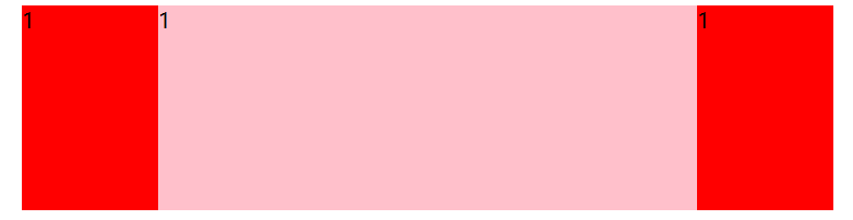
两边不变中间随屏幕大小变化
<section>
        <div>1</div>
        <div>1</div>
        <div>1</div>
    </section>
section{
            width: 60%;
            height: 150px;
            background-color: pink;
            margin: 0 auto;
            display: flex;
        }
        section div:nth-child(1){
            width: 100px;
            height: 150px;
            background-color: red;
        }
        section div:nth-child(2){
            flex: 1;
        }
        section div:nth-child(3){
            width: 100px;
            height: 150px;
            background-color: red;
        }
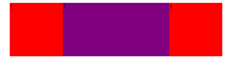
三个盒子都随屏幕变化 中间占份数大
<p>
        <span>1</span>
        <span>1</span>
        <span>1</span>
    </p>
p{
            width: 60%;
            height: 150px;
            background-color: pink;
            margin: 100px auto;
            display: flex;
        }
        p span{
            flex: 1;
            background-color: red;
        }
        p span:nth-child(2){
            flex: 2;
            background-color: purple;
        }

 浙公网安备 33010602011771号