


ArkUI 学习之图形展示 Image, Shape, Canvas
一. Image
在应用中显示图片需要使用Image组件实现,Image支持多种图片格式,包括png、jpg、bmp、svg和gif,具体用法请参考Image组件。
Image通过调用接口来创建,接口调用形式如下:
Image(src: string | Resource | media.PixelMap)
该接口通过图片数据源获取图片,支持本地图片和网络图片的渲染展示。
1. 加载图片资源
Image支持加载存档图、多媒体像素图两种类型。存档图类型的数据源可以分为本地资源、网络资源、Resource资源、媒体库资源和base64。
-
1. 本地资源
创建文件夹,将本地图片放入ets文件夹下的任意位置。Image组件引入本地图片路径,即可显示图片(根目录为ets文件夹)。
![]()
![]()
@Entry
@Component
struct Index {

  build() {
    Row() {
      Column({space:20}) {
        Image('/Images/可怜的小鸟.png').width(100).height(100)
        Image('/Images/戴眼镜的小鸟.png').width(100).height(100)
        Image('/Images/时尚小鸟.png').width(100).height(100)
        Image('/Images/可怜的小鸟.png').width(100).height(100)
      }.width('100%')
    }.height('100%')
  }
}
-
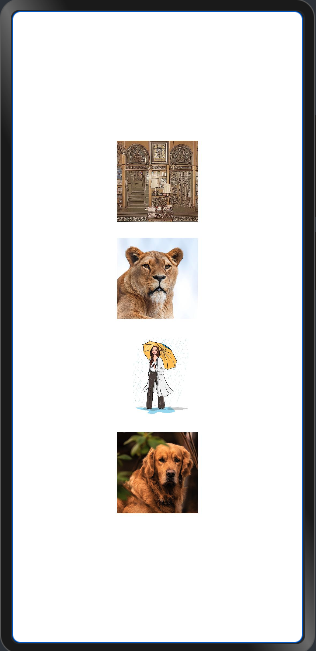
2. 网络资源
引入网络图片需申请权限ohos.permission.INTERNET,具体申请方式请参考权限申请声明。此时,Image组件的src参数为网络图片的链接。
@Entry
@Component
struct Index {

  build() {
    Row() {
      Column({space:20}) {
        Image('https://cdn.pixabay.com/photo/2024/06/06/06/58/pharmacy-8812002_1280.jpg').width(100).height(100)
        Image('https://cdn.pixabay.com/photo/2024/05/08/17/45/animal-8748794_1280.jpg').width(100).height(100)
        Image('https://cdn.pixabay.com/photo/2024/06/12/11/11/sketch-8825072_1280.jpg').width(100).height(100)
        Image('https://cdn.pixabay.com/photo/2022/02/06/14/06/dog-6997211_1280.jpg').width(100).height(100)
      }.width('100%')
    }.height('100%')
  }
}
![]()

-
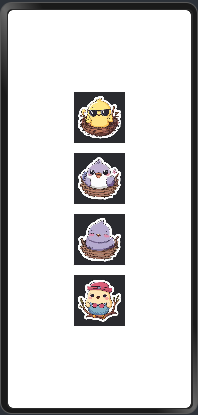
3. Resource资源
使用资源格式可以跨包/跨模块引入图片,resources文件夹下的图片都可以通过$r资源接口读取到并转换到Resource格式。
![]()
![]()
@Entry
@Component
struct Index {

  build() {
    Row() {
      Column({space:20}) {
        Image($r('app.media.1')).width(100).height(100)
        Image($r('app.media.2')).width(100).height(100)
        Image($r('app.media.3')).width(100).height(100)
        Image($r('app.media.4')).width(100).height(100)
      }.width('100%')
    }.height('100%')
  }
}
还可以将图片放在rawfile文件夹下。
![]()
![]()
@Entry
@Component
struct Index {

  build() {
    Row() {
      Column({space:20}) {
        Image($rawfile('1.png')).width(100).height(100)
        Image($rawfile('2.png')).width(100).height(100)
        Image($rawfile('3.png')).width(100).height(100)
        Image($rawfile('4.png')).width(100).height(100)
      }.width('100%')
    }.height('100%')
  }
}
-
4. 媒体库file://data/storage
支持file://路径前缀的字符串,用于访问通过媒体库提供的图片路径。调用接口获取图库的照片url。
import picker from '@ohos.file.picker';

@Entry
@Component
struct Index {

  @State imgDatas: string[] = [];

  // 获取照片url集
  getAllImg() {
    let result = new Array<string>();
    try {
      let PhotoSelectOptions = new picker.PhotoSelectOptions();
      PhotoSelectOptions.MIMEType = picker.PhotoViewMIMETypes.IMAGE_TYPE;
      PhotoSelectOptions.maxSelectNumber = 5;
      let photoPicker = new picker.PhotoViewPicker();
      photoPicker.select(PhotoSelectOptions).then((PhotoSelectResult) => {
        this.imgDatas = PhotoSelectResult.photoUris;
        console.info('PhotoViewPicker.select successfully, PhotoSelectResult uri: ' + JSON.stringify(PhotoSelectResult));
      }).catch((err) => {
        console.error(`PhotoViewPicker.select failed with. Code: ${err.code}, message: ${err.message}`);
      });
    } catch (err) {
      console.error(`PhotoViewPicker failed with. Code: ${err.code}, message: ${err.message}`);
    }
  }

  // aboutToAppear中调用上述函数,获取图库的所有图片url,存在imgDatas中
  async aboutToAppear() {
    this.getAllImg();
  }

  // 使用imgDatas的url加载图片。
  build() {
    Column() {
      Grid() {
        ForEach(this.imgDatas, item => {
          GridItem() {
            Image(item).width(200)
          }
        },(item:string) => JSON.stringify(item))
      }
    }.width('100%').height('100%')
  }
}
从媒体库获取的url格式通常如下。
Image('file://media/Photos/5').width(200)
-
5. base64
路径格式为data:image/[png|jpeg|bmp|webp];base64,[base64 data],其中[base64 data]为Base64字符串数据。Base64格式字符串可用于存储图片的像素数据,在网页上使用较为广泛。


2. 多媒体像素图
PixelMap是图片解码后的像素图,具体用法请参考 图片开发指导。以下示例将加载的网络图片返回的数据解码成PixelMap格式,再显示在Image组件上,
-
1. 请求网络图片请求,解码编码PixelMap。
-
2. 填写网络图片地址。
import http from '@ohos.net.http';
import ResponseCode from '@ohos.net.http';
import image from '@ohos.multimedia.image';

@State image: PixelMap = undefined;

http.createHttp().request("https://www.example.com/xxx.png",(error, data) => {
      if (error){
          console.error(`http reqeust failed with. Code: ${error.code}, message: ${error.message}`);
        } else {
        }
    }
)
-
将网络地址成功返回的数据,编码转码成pixelMap的图片格式。
let code = data.responseCode;
if (ResponseCode.ResponseCode.OK === code) {
  let res: any = data.result
  let imageSource = image.createImageSource(res);
  let options = {
      alphaType: 0,                     // 透明度
      editable: false,                  // 是否可编辑
      pixelFormat: 3,                   // 像素格式
      scaleMode: 1,                     // 缩略值
      size: { height: 100, width: 100}
  }
  // 创建图片大小
  imageSource.createPixelMap(options).then((pixelMap) => {
      this.image = pixelMap
  })
}
-
显示图片。
Button("获取网络图片").onClick(() => {
    this.httpRequest()
})
Image(this.image).height(100).width(100)
3. 显示矢量图
Image组件可显示矢量图(svg格式的图片),支持的svg标签为:svg、rect、circle、ellipse、path、line、polyline、polygon和animate。

svg格式的图片可以使用fillColor属性改变图片的绘制颜色。
@Entry
@Component
struct Index {

  build() {
    Row() {
      Column({space:20}) {
        Image($r('app.media.1')).width(100).height(100).fillColor(Color.Brown)
        Image($r('app.media.2')).width(100).height(100).fillColor(Color.Blue)
        Image($r('app.media.3')).width(100).height(100)
        Image($r('app.media.4')).width(100).height(100)
      }.width('100%')
    }.height('100%')
  }
}
设置绘制颜色后的svg图片
4. 属性设置
给Image组件设置属性可以使图片显示更灵活,达到一些自定义的效果。
-
1. objectFit 设置图片缩放类型
// 保持宽高比进行缩小或者放大,使得图片完全显示在显示边界内。
.objectFit(ImageFit.Contain).margin(15)

// 保持宽高比进行缩小或者放大,使得图片两边都大于或等于显示边界。
.objectFit(ImageFit.Cover).margin(15)

// 自适应显示。
.objectFit(ImageFit.Auto).margin(15)

// 不保持宽高比进行放大缩小,使得图片充满显示边界。
.objectFit(ImageFit.Fill).margin(15)

// 保持宽高比显示,图片缩小或者保持不变。
.objectFit(ImageFit.ScaleDown).margin(15)

// 保持原有尺寸显示。
.objectFit(ImageFit.None).margin(15)
通过objectFit属性使图片缩放到高度和宽度确定的框内。
@Entry
@Component
struct Index {
  build() {
    Row({ space: 10 }) {
      Column({ space: 10 }) {
        Image($r('app.media.1'))
          .width(150)
          .height(100)
          .border({ width: 1, color: Color.Blue })
          .objectFit(ImageFit.Contain)// 保持宽高比进行缩小或者放大,使得图片完全显示在显示边界内。
          .margin(15)
          .overlay('Contain', { align: Alignment.Bottom, offset: { x: 0, y: 20 } })
        Image($r('app.media.1'))
          .width(150)
          .height(100)
          .border({ width: 1, color: Color.Blue })
          .objectFit(ImageFit.Cover)// 保持宽高比进行缩小或者放大,使得图片两边都大于或等于显示边界。
          .margin(15)
          .overlay('Cover', { align: Alignment.Bottom, offset: { x: 0, y: 20 } })
        Image($r('app.media.1'))
          .width(150)
          .height(100)
          .border({ width: 1, color: Color.Blue })
          .objectFit(ImageFit.Auto)// 自适应显示。
          .margin(15)
          .overlay('Auto', { align: Alignment.Bottom, offset: { x: 0, y: 20 } })
      }

      Column({ space: 10 }) {
        Image($r('app.media.1'))
          .width(150)
          .height(100)
          .border({ width: 1, color: Color.Blue })
          .objectFit(ImageFit.Fill)// 不保持宽高比进行放大缩小,使得图片充满显示边界。
          .margin(15)
          .overlay('Fill', { align: Alignment.Bottom, offset: { x: 0, y: 20 } })
        Image($r('app.media.1'))
          .width(150)
          .height(100)
          .border({ width: 1, color: Color.Blue })
          .objectFit(ImageFit.ScaleDown)// 保持宽高比显示,图片缩小或者保持不变。
          .margin(15)
          .overlay('ScaleDown', { align: Alignment.Bottom, offset: { x: 0, y: 20 } })
        Image($r('app.media.1'))
          .width(150)
          .height(100)
          .border({ width: 1, color: Color.Blue })
          .objectFit(ImageFit.None)// 保持原有尺寸显示。
          .margin(15)
          .overlay('None', { align: Alignment.Bottom, offset: { x: 0, y: 20 } })
      }
    }.width('100%').height('100%').justifyContent(FlexAlign.Center)
  }
}
![]()
-
2. interpolation 图片插值
当原图分辨率较低并且放大显示时,图片会模糊出现锯齿。这时可以使用interpolation属性对图片进行插值,使图片显示得更清晰。
.interpolation(ImageInterpolation.None)

.interpolation(ImageInterpolation.Low)

.interpolation(ImageInterpolation.Medium)

.interpolation(ImageInterpolation.High)
代码示例
@Entry
@Component
struct Index {
  build() {
    Column({space:20}) {
      Row() {
        Image($r('app.media.1'))
          .width('40%')
          .interpolation(ImageInterpolation.None)
          .borderWidth(1)
          .overlay("Interpolation.None", { align: Alignment.Bottom, offset: { x: 0, y: 20 } })
          .margin(10)
        Image($r('app.media.1'))
          .width('40%')
          .interpolation(ImageInterpolation.Low)
          .borderWidth(1)
          .overlay("Interpolation.Low", { align: Alignment.Bottom, offset: { x: 0, y: 20 } })
          .margin(10)
      }.width('100%').justifyContent(FlexAlign.Center)

      Row() {
        Image($r('app.media.1'))
          .width('40%')
          .interpolation(ImageInterpolation.Medium)
          .borderWidth(1)
          .overlay("Interpolation.Medium", { align: Alignment.Bottom, offset: { x: 0, y: 20 } })
          .margin(10)
        Image($r('app.media.1'))
          .width('40%')
          .interpolation(ImageInterpolation.High)
          .borderWidth(1)
          .overlay("Interpolation.High", { align: Alignment.Bottom, offset: { x: 0, y: 20 } })
          .margin(10)
      }.width('100%').justifyContent(FlexAlign.Center)
    }.height('100%')
  }
}
![]()
-
3. 设置图片重复样式
通过objectRepeat属性设置图片的重复样式方式,重复样式请参考ImageRepeat枚举说明。
// 在水平轴和竖直轴上同时重复绘制图片
.objectRepeat(ImageRepeat.XY)
// overlay是通用属性,用于在组件上显示说明文字
.overlay('ImageRepeat.XY', { align: Alignment.Bottom, offset: { x: 0, y: 20 } })

// 只在竖直轴上重复绘制图片
.objectRepeat(ImageRepeat.Y)
.overlay('ImageRepeat.Y', { align: Alignment.Bottom, offset: { x: 0, y: 20 } })

// 只在水平轴上重复绘制图片
.objectRepeat(ImageRepeat.X)
.overlay('ImageRepeat.X', { align: Alignment.Bottom, offset: { x: 0, y: 20 } })

// 不重复绘制
.objectRepeat(ImageRepeat.NoRepeat)
代码示例
@Entry
@Component
struct MyComponent {
  build() {
    Column({ space: 10 }) {
      Row({ space: 5 }) {
        Image($r('app.media.startIcon'))
          .width(110)
          .height(115)
          .border({ width: 1 })
          .objectRepeat(ImageRepeat.XY)// 在水平轴和竖直轴上同时重复绘制图片
          .objectFit(ImageFit.ScaleDown)
          .overlay('ImageRepeat.XY', { align: Alignment.Bottom, offset: { x: 0, y: 20 } })
        Image($r('app.media.startIcon'))
          .width(110)
          .height(115)
          .border({ width: 1 })
          .objectRepeat(ImageRepeat.Y)// 只在竖直轴上重复绘制图片
          .objectFit(ImageFit.ScaleDown)
          .overlay('ImageRepeat.Y', { align: Alignment.Bottom, offset: { x: 0, y: 20 } })
        Image($r('app.media.startIcon'))
          .width(110)
          .height(115)
          .border({ width: 1 })
          .objectRepeat(ImageRepeat.X) // 只在水平轴上重复绘制图片
          .objectFit(ImageFit.ScaleDown)
          .overlay('ImageRepeat.X', { align: Alignment.Bottom, offset: { x: 0, y: 20 } })
      }
    }.height(150).width('100%').padding(8)
  }
}
![]()
-
4. 设置图片渲染模式
通过renderMode属性设置图片的渲染模式为原色或黑白。
// 设置图片的渲染模式为原色
.renderMode(ImageRenderMode.Original)
// overlay是通用属性,用于在组件上显示说明文字
.overlay('Original', { align: Alignment.Bottom, offset: { x: 0, y: 20 } })

// 设置图片的渲染模式为黑白
.renderMode(ImageRenderMode.Template)
.overlay('Template', { align: Alignment.Bottom, offset: { x: 0, y: 20 } })
代码示例
@Entry
@Component
struct MyComponent {
  build() {
    Column({ space: 10 }) {
      Row({ space: 50 }) {
        Image($r('app.media.startIcon'))
          .width(100)
          .height(100)
          .border({ width: 1 })
          .renderMode(ImageRenderMode.Original)// 设置图片的渲染模式为原色
          .overlay('Original', { align: Alignment.Bottom, offset: { x: 0, y: 20 } })// overlay是通用属性,用于在组件上显示说明文字

        Image($r('app.media.startIcon'))
          .width(100)
          .height(100)
          .border({ width: 1 })
          .renderMode(ImageRenderMode.Template)// 设置图片的渲染模式为黑白
          .overlay('Template', { align: Alignment.Bottom, offset: { x: 0, y: 20 } })// overlay是通用属性,用于在组件上显示说明文字
      }
    }.height(150).width('100%').padding({ top: 20, right: 10 })
  }
}
![]()
-
5. 设置图片解码尺寸
通过sourceSize属性设置图片解码尺寸,降低图片的分辨率。原图尺寸为1280*960,该示例将图片解码为150*150和400*400。
@Entry
@Component
struct Index {
  build() {
    Column() {
      Row({ space: 20 }) {
        Image($r('app.media.startIcon'))
          .sourceSize({
            width: 150,
            height: 150
          })
          .objectFit(ImageFit.ScaleDown)
          .width('25%')
          .aspectRatio(1)
          .border({ width: 1 })
          .overlay('width:150 height:150', { align: Alignment.Bottom, offset: { x: 0, y: 40 } })

        Image($r('app.media.startIcon'))
          .sourceSize({
            width: 400,
            height: 400
          })
          .objectFit(ImageFit.ScaleDown)
          .width('25%')
          .aspectRatio(1)
          .border({ width: 1 })
          .overlay('width:400 height:400', { align: Alignment.Bottom, offset: { x: 0, y: 40 } })
      }.height(150).width('100%').padding(20)
    }
  }
}
![]()
-
6. 为图片添加滤镜效果
通过colorFilter修改图片的像素颜色,为图片添加滤镜。
.colorFilter(
  [
    1, 1, 0, 0, 0,
    0, 1, 0, 0, 0,
    0, 0, 1, 0, 0,
    0, 0, 0, 1, 0
  ]
)
代理示例
@Entry
@Component
struct Index {
  build() {
    Column() {
      Row() {
        Image($r('app.media.1'))
          .width('40%')
          .margin(10)

        Image($r('app.media.1'))
          .width('40%')
          .colorFilter(
            [
              1, 1, 0, 0, 0,
              0, 1, 0, 0, 0,
              0, 0, 1, 0, 0,
              0, 0, 0, 1, 0
            ]
          ).margin(10)
      }.width('100%').justifyContent(FlexAlign.Center)
    }
  }
}
![]()
-
7. 同步加载图片
一般情况下,图片加载流程会异步进行,以避免阻塞主线程,影响UI交互。但是特定情况下,图片刷新时会出现闪烁,这时可以使用syncLoad属性,使图片同步加载,从而避免出现闪烁。不建议图片加载较长时间时使用,会导致页面无法响应。
Image($r('app.media.startIcon')).syncLoad(true)


5. 事件调用
通过在Image组件上绑定onComplete事件,图片加载成功后可以获取图片的必要信息。如果图片加载失败,也可以通过绑定onError回调来获得结果。
@Entry
@Component
struct MyComponent {
  @State widthValue: number = 0
  @State heightValue: number = 0
  @State componentWidth: number = 0
  @State componentHeight: number = 0

  build() {
    Column() {
      Row() {
        Image($r('app.media.1'))
          .width(200)
          .height(150)
          .margin(15)
          .overlay('\nwidth: ' + String(this.widthValue) + ', height: ' + String(this.heightValue) + '\ncomponentWidth: ' + String(this.componentWidth) + '\ncomponentHeight: ' + String(this.componentHeight), {
            align: Alignment.Bottom,
            offset: { x: 0, y: 60 }
          })
          .onComplete(msg => {
            if (msg) {
              this.widthValue = msg.width
              this.heightValue = msg.height
              this.componentWidth = msg.componentWidth
              this.componentHeight = msg.componentHeight
            }
          })
          .onError(() => { // 图片获取失败,打印结果
            console.info('load image fail')
          })
      }
    }
  }
}

6. overlay方法配合文本使用
图片组件下面搭配文字说明是UI中很常见的一种组合,Image组件可以通过overlay的方式来实现这个组合
@Entry
@Component
struct MyComponent {

  build() {
    Column() {
      Image($r('app.media.1'))
        .width(110).height(110).margin(15)
        .overlay('label 文本说明', { align: Alignment.Bottom, offset: { x: 0, y: 20 } })
    }
  }
}

二. Shape
绘制组件用于在页面绘制图形,Shape组件是绘制组件的父组件,父组件中会描述所有绘制组件均支持的通用属性。具体用法请参考 Shape。
子组件包含Rect、Path、Circle、Ellipse、Polyline、Polygon、Image、Text、Column、Row子组件。
1. 创建绘制组件
绘制组件可以由以下两种形式创建:
- 第一种:绘制组件使用Shape作为父组件,实现类似SVG的效果。接口调用为以下形式:
Shape(value?: PixelMap)
该接口用于创建带有父组件的绘制组件,其中value用于设置绘制目标,可将图形绘制在指定的PixelMap对象中,若未设置,则在当前绘制目标中进行绘制。
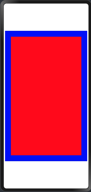
@Entry
@Component
struct Index {
  @State message: string = 'Hello World';

  build() {
    Row() {
      Column() {
        Shape(){
          Rect().width(300).height(500).fill(Color.Red).position({x:25,y:25})
        }.backgroundColor(Color.Blue).size({width:350,height:550})
      }
      .width('100%')
    }
    .height('100%')
  }
}
![]()
-
第二种:绘制组件单独使用,用于在页面上绘制指定的图形。有7种绘制类型,分别为Circle(圆形)、Ellipse(椭圆形)、Line(直线)、Polyline(折线)、Polygon(多边形)、Path(路径)、Rect(矩形)。以Circle的接口调用为例:
Circle(options?: {width?: string | number, height?: string | number}
该接口用于在页面绘制圆形,其中width用于设置圆形的宽度,height用于设置圆形的高度,圆形直径由宽高最小值确定。
@Entry
@Component
struct Index {
  build() {
    Row() {
      Column() {
        Circle({width:50,height:50}).fill(Color.Red) //画圆并填充为红色
      }
      .width('100%')
    }
    .height('100%')
  }
}
2. 形状视口viewport
viewPort{ x?: number | string, y?: number | string, width?: number | string, height?: number | string }形状视口viewport指定用户空间中的一个矩形,该矩形映射到为关联的 SVG 元素建立的视区边界。viewport属性的值包含x、y、width和height四个可选参数,x 和 y 表示视区的左上角坐标,width和height表示其尺寸。
以下3个示例讲解Viewport具体用法:
-
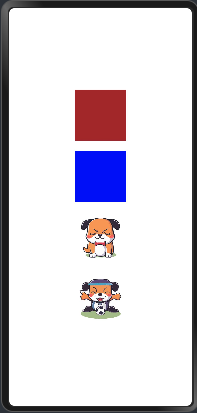
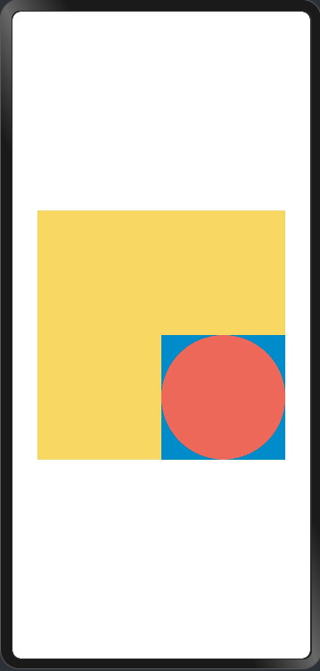
第一个:通过形状视口对图形进行放大与缩小。
@Entry
@Component
struct Index {
  build() {
    Row() {
      Column({ space: 20 }) {
        // 画一个宽高都为150的圆
        Column({ space: 10 }) {
          Text('原始尺寸Circle组件').TextFontSize()
          Circle({ width: 75, height: 75 }).fill('#E87361')
        }

        Row({ space: 10 }) {
          Column({ space: 10 }) {
            Text('shape内放大的Circle组件').TextFontSize()

            // 创建一个宽高都为150的shape组件,背景色为黄色,一个宽高都为75的viewport。用一个蓝色的矩形来填充viewport,在viewport中绘制一个直径为75的圆。
            // 绘制结束,viewport会根据组件宽高放大两倍
            Shape() {
              Rect().width('100%').height('100%').fill('#0097D4')
              Circle({ width: 75, height: 75 }).fill('#E87361')
            }
            .viewPort({ x: 0, y: 0, width: 75, height: 75 })
            .width(150)
            .height(150)
            .backgroundColor('#F5DC62')
          }

          Column({ space: 10 }) {
            Text('Shape内缩小的Circle组件').TextFontSize()

            // 创建一个宽高都为150的shape组件,背景色为黄色,一个宽高都为300的viewport。用一个绿色的矩形来填充viewport,在viewport中绘制一个直径为75的圆。
            // 绘制结束,viewport会根据组件宽高缩小两倍。
            Shape() {
              Rect().width('100%').height('100%').fill('#BDDB69')
              Circle({ width: 75, height: 75 }).fill('#E87361')
            }
            .viewPort({ x: 0, y: 0, width: 300, height: 300 })
            .width(150)
            .height(150)
            .backgroundColor('#F5DC62')
          }
        }
      }.width('100%')
    }.height('100%')
  }
}


@Extend(Text)
function TextFontSize() {
  .fontSize(14)
  .fontWeight(FontWeight.Bold)
}
![]()

- 第二个: 创建一个宽高都为300的shape组件,背景色为黄色,一个宽高都为300的viewport。用一个蓝色的矩形来填充viewport,在viewport中绘制一个半径为75的圆。
@Entry
@Component
struct Index {
  build() {
    Row() {
      Column({ space: 20 }) {
        //创建一个宽高都为300的shape组件,背景色为黄色,一个宽高都为300的viewport。用一个蓝色的矩形来填充viewport,在viewport中绘制一个半径为75的圆。
        Shape() {
          Rect().width("100%").height("100%").fill("#0097D4")
          Circle({ width: 150, height: 150 }).fill("#E87361")
        }
        .viewPort({ x: 0, y: 0, width: 300, height: 300 })
        .width(300)
        .height(300)
        .backgroundColor("#F5DC62")
      }.width('100%')
    }.height('100%')
  }
}
![]()
- 第三个. 创建一个宽高都为300的shape组件,背景色为黄色,创建一个宽高都为300的viewport。用一个蓝色的矩形来填充viewport,在viewport中绘制一个半径为75的圆,将viewport向右方和下方各平移150。
@Entry
@Component
struct Index {
  build() {
    Row() {
      Column({ space: 20 }) {
        //创建一个宽高都为300的shape组件,背景色为黄色,创建一个宽高都为300的viewport。用一个蓝色的矩形来填充viewport,在viewport中绘制一个半径为75的圆,将viewport向右方和下方各平移150。
        Shape() {
          Rect().width("100%").height("100%").fill("#0097D4")
          Circle({ width: 150, height: 150 }).fill("#E87361")
        }
        .viewPort({ x: -150, y: -150, width: 300, height: 300 })
        .width(300)
        .height(300)
        .backgroundColor("#F5DC62")
      }.width('100%')
    }.height('100%')
  }
}
![]()

3. 自定义样式
绘制组件支持通过各种属性对组件样式进行更改。
-
通过fill可以设置组件填充区域颜色。
@Entry
@Component
struct Index {
  build() {
    Row() {
      Column({ space: 20 }) {
        Path().width(100).height(100).commands('M150 0 L300 300 L0 300 Z').fill('#E87361')
      }.width('100%')
    }.height('100%')
  }
}
![]()
-
通过stroke可以设置组件边框颜色
@Entry
@Component
struct Index {
  build() {
    Row() {
      Column({ space: 20 }) {
        Path()
          .width(100).height(100).fillOpacity(0).commands('M150 0 L300 300 L0 300 Z').stroke(Color.Red)
      }.width('100%')
    }.height('100%')
  }
}
![]()
-
通过strokeOpacity可以设置边框透明度。
通过strokeLineJoin可以设置线条拐角绘制样式。拐角绘制样式分为Bevel(使用斜角连接路径段)、Miter(使用尖角连接路径段)、Round(使用圆角连接路径段)。
@Entry
@Component
struct Index {
  build() {
    Row() {
      Column({ space: 20 }) {
        Polyline()
          .width(100)
          .height(100)
          .fillOpacity(0)
          .stroke(Color.Red)
          .strokeWidth(8)
          .points([[20, 0], [0, 100], [100, 90]])// 设置折线拐角处为圆弧
          .strokeLineJoin(LineJoinStyle.Round)
      }.width('100%')
    }.height('100%')
  }
}
![]()
-
通过strokeMiterLimit设置斜接长度与边框宽度比值的极限值。
斜接长度表示外边框外边交点到内边交点的距离,边框宽度即strokeWidth属性的值。strokeMiterLimit取值需大于等于1,且在strokeLineJoin属性取值LineJoinStyle.Miter时生效。
@Entry
@Component
struct Index {
  build() {
    Row() {
      Column({ space: 20 }) {
        Polyline()
          .width(100)
          .height(100)
          .fillOpacity(0)
          .stroke(Color.Red)
          .strokeWidth(10)
          .points([[20, 0], [20, 100], [100, 100]])// 设置折线拐角处为尖角
          .strokeLineJoin(LineJoinStyle.Miter)// 设置斜接长度与线宽的比值
          .strokeMiterLimit(1 / Math.sin(45))

        Polyline()
          .width(100)
          .height(100)
          .fillOpacity(0)
          .stroke(Color.Red)
          .strokeWidth(10)
          .points([[20, 0], [20, 100], [100, 100]])
          .strokeLineJoin(LineJoinStyle.Miter)
          .strokeMiterLimit(1.42)
      }.width('100%')
    }.height('100%')
  }
}
![]()
-
通过antiAlias设置是否开启抗锯齿,默认值为true(开启抗锯齿)。
@Entry
@Component
struct Index {
  build() {
    Row() {
      Column({ space: 20 }) {
        //1. 开启抗锯齿
        Circle()
          .width(150)
          .height(200)
          .fillOpacity(0)
          .strokeWidth(5)
          .stroke(Color.Black)
        //2. 关闭抗锯齿
        Circle()
          .width(150)
          .height(200)
          .fillOpacity(0)
          .strokeWidth(5)
          .stroke(Color.Black)
          .antiAlias(false)
      }.width('100%')
    }.height('100%')
  }
}
![]()


三. Canvas
Canvas提供画布组件,用于自定义绘制图形,开发者使用CanvasRenderingContext2D对象和OffscreenCanvasRenderingContext2D对象在Canvas组件上进行绘制,绘制对象可以是基础形状、文本、图片等。
1. 使用画布组件绘制自定义图形
可以由以下三种形式在画布绘制自定义图形:
-
第一种:使用CanvasRenderingContext2D对象在Canvas画布上绘制。
@Entry
@Component
struct CanvasExample1 {
  //用来配置CanvasRenderingContext2D对象的参数,包括是否开启抗锯齿,true表明开启抗锯齿。
  private settings: RenderingContextSettings = new RenderingContextSettings(true)
  //用来创建CanvasRenderingContext2D对象,通过在canvas中调用CanvasRenderingContext2D对象来绘制。
  private context: CanvasRenderingContext2D = new CanvasRenderingContext2D(this.settings)

  build() {
    Flex({ direction: FlexDirection.Column, alignItems: ItemAlign.Center, justifyContent: FlexAlign.Center }) {
      //在canvas中调用CanvasRenderingContext2D对象。
      Canvas(this.context)
        .width('100%')
        .height('100%')
        .backgroundColor('#F5DC62')
        .onReady(() => {
          //可以在这里绘制内容。
          this.context.strokeRect(50, 50, 200, 150);
        })
    }
    .width('100%')
    .height('100%')
  }
}
![]()

-
第二种: 离屏绘制是指将需要绘制的内容先绘制在缓存区,再将其转换成图片,一次性绘制到Canvas上,加快了绘制速度。
过程为:
a. 通过transferToImageBitmap方法将离屏画布最近渲染的图像创建为一个ImageBitmap对象。
b. 通过CanvasRenderingContext2D对象的transferFromImageBitmap方法显示给定的ImageBitmap对象。具体使用参考 OffscreenCanvasRenderingContext2D对象。
@Entry
@Component
struct CanvasExample2 {
  //用来配置CanvasRenderingContext2D对象和OffscreenCanvasRenderingContext2D对象的参数,包括是否开启抗锯齿。true表明开启抗锯齿
  private settings: RenderingContextSettings = new RenderingContextSettings(true)
  private context: CanvasRenderingContext2D = new CanvasRenderingContext2D(this.settings)
  //用来创建OffscreenCanvasRenderingContext2D对象,width为离屏画布的宽度,height为离屏画布的高度。通过在canvas中调用OffscreenCanvasRenderingContext2D对象来绘制。
  private offContext: OffscreenCanvasRenderingContext2D = new OffscreenCanvasRenderingContext2D(600, 600, this.settings)

  build() {
    Flex({ direction: FlexDirection.Column, alignItems: ItemAlign.Center, justifyContent: FlexAlign.Center }) {
      Canvas(this.context)
        .width('100%')
        .height('100%')
        .backgroundColor('#F5DC62')
        .onReady(() =>{
          //可以在这里绘制内容
          this.offContext.strokeRect(50, 50, 200, 150);
          //将离屏绘值渲染的图像在普通画布上显示
          let image = this.offContext.transferToImageBitmap();
          this.context.transferFromImageBitmap(image);
        })
    }
    .width('100%')
    .height('100%')
  }
}
![]()
在画布组件中,通过CanvasRenderingContext2D对象和OffscreenCanvasRenderingContext2D对象在Canvas组件上进行绘制时调用的接口相同,另接口参数如无特别说明,单位均为vp。
-
第三种:在Canvas上加载Lottie动画
具体接口和示例请参考 Lottie。

2. 初始化画布组件
onReady(event: () => void)是Canvas组件初始化完成时的事件回调,调用该事件后,可获取Canvas组件的确定宽高,进一步使用CanvasRenderingContext2D对象和OffscreenCanvasRenderingContext2D对象调用相关API进行图形绘制。
Canvas(this.context)
  .width('100%')
  .height('100%')
  .backgroundColor('#F5DC62')
  .onReady(() => {
    this.context.fillStyle = '#0097D4';
    this.context.fillRect(50, 50, 100, 100);
  })

3. 画布组件绘制方式
在Canvas组件生命周期接口onReady()调用之后,开发者可以直接使用canvas组件进行绘制。或者可以脱离Canvas组件和onready生命周期,单独定义Path2d对象构造理想的路径,并在onready调用之后使用Canvas组件进行绘制。
- 通过CanvasRenderingContext2D对象和OffscreenCanvasRenderingContext2D对象直接调用相关API进行绘制。
Canvas(this.context)
  .width('100%')
  .height('100%')
  .backgroundColor('#F5DC62')
  .onReady(() => {
    this.context.beginPath();
    this.context.moveTo(50, 50);
    this.context.lineTo(280, 160);
    this.context.stroke();
  })
![]()
- 先单独定义path2d对象构造理想的路径,再通过调用CanvasRenderingContext2D对象和OffscreenCanvasRenderingContext2D对象的stroke接口或者fill接口进行绘制,具体使用可以参考 Path2D对象。
Canvas(this.context)
  .width('100%')
  .height('100%')
  .backgroundColor('#F5DC62')
  .onReady(() => {
    let region = new Path2D();
    region.arc(100, 75, 50, 0, 6.28);
    this.context.stroke(region);
  })
![]()


4. 画布组件常用方法
OffscreenCanvasRenderingContext2D对象和CanvasRenderingContext2D对象提供了大量的属性和方法,可以用来绘制文本、图形,处理像素等,是Canvas组件的核心。常用接口有fill(对封闭路径进行填充)、clip(设置当前路径为剪切路径)、stroke(进行边框绘制操作)等等,同时提供了fillStyle(指定绘制的填充色)、globalAlpha(设置透明度)与strokeStyle(设置描边的颜色)等属性修改绘制内容的样式。将通过以下几个方面简单介绍画布组件常见使用方法:
-
基础形状绘制
可以通过arc(绘制弧线路径)、 ellipse(绘制一个椭圆)、rect(创建矩形路径)等接口绘制基础形状。
Canvas(this.context)
  .width('100%')
  .height('100%')
  .backgroundColor('#F5DC62')
  .onReady(() => {
    //绘制矩形
    this.context.beginPath();
    this.context.rect(100, 50, 100, 100);
    this.context.stroke();
    //绘制圆形
    this.context.beginPath();
    this.context.arc(150, 250, 50, 0, 6.28);
    this.context.stroke();
    //绘制椭圆
    this.context.beginPath();
    this.context.ellipse(150, 450, 50, 100, Math.PI * 0.25, Math.PI * 0, Math.PI * 2);
    this.context.stroke();
  })
-
文本绘制
可以通过fillText(绘制填充类文本)、strokeText(绘制描边类文本)等接口进行文本绘制。
Canvas(this.context)
  .width('100%')
  .height('100%')
  .backgroundColor('#F5DC62')
  .onReady(() => {
    //绘制填充类文本
    this.context.font = '50px sans-serif';
    this.context.fillText("Hello World!", 50, 100);
    //绘制描边类文本
    this.context.font = '55px sans-serif';
    this.context.strokeText("Hello World!", 50, 150);
  })
![]()
-
绘制图片和图像像素信息处理
可以通过drawImage(图像绘制)、putImageData(使用ImageData数据填充新的矩形区域)等接口绘制图片,通过createImageData(创建新的ImageData 对象)、getPixelMap(以当前canvas指定区域内的像素创建PixelMap对象)、getImageData(以当前canvas指定区域内的像素创建ImageData对象)等接口进行图像像素信息处理。
@Entry
@Component
struct GetImageData {
  private settings: RenderingContextSettings = new RenderingContextSettings(true)
  private context: CanvasRenderingContext2D = new CanvasRenderingContext2D(this.settings)
  private offContext: OffscreenCanvasRenderingContext2D = new OffscreenCanvasRenderingContext2D(600, 600, this.settings)
  private img: ImageBitmap = new ImageBitmap("/common/images/1234.png")

  build() {
    Flex({ direction: FlexDirection.Column, alignItems: ItemAlign.Center, justifyContent: FlexAlign.Center }) {
      Canvas(this.context)
        .width('100%')
        .height('100%')
        .backgroundColor('#F5DC62')
        .onReady(() => {
          // 使用drawImage接口将图片画在(0,0)为起点,宽高130的区域
          this.offContext.drawImage(this.img, 0, 0, 130, 130);
          // 使用getImageData接口,获得canvas组件区域中,(50,50)为起点,宽高130范围内的绘制内容
          let imagedata = this.offContext.getImageData(50, 50, 130, 130);
          // 使用putImageData接口将得到的ImageData画在起点为(150, 150)的区域中
          this.offContext.putImageData(imagedata, 150, 150);
          // 将离屏绘制的内容画到canvas组件上
          let image = this.offContext.transferToImageBitmap();
          this.context.transferFromImageBitmap(image);
        })
    }
    .width('100%')
    .height('100%')
  }
}
![]()
-
其他方法。
Canvas中还提供其他类型的方法。渐变(CanvasGradient对象)相关的方法:createLinearGradient(创建一个线性渐变色)、createRadialGradient(创建一个径向渐变色)等。
Canvas(this.context)
.width('100%')
  .height('100%')
  .backgroundColor('#F5DC62')
  .onReady(() => {
    //创建一个径向渐变色的CanvasGradient对象
    let grad = this.context.createRadialGradient(200, 200, 50, 200, 200, 200)
    //为CanvasGradient对象设置渐变断点值,包括偏移和颜色
    grad.addColorStop(0.0, '#E87361');
    grad.addColorStop(0.5, '#FFFFF0');
    grad.addColorStop(1.0, '#BDDB69');
    //用CanvasGradient对象填充矩形
    this.context.fillStyle = grad;
    this.context.fillRect(0, 0, 400, 400);
  })
![]()


5. 场景示例
-
规则基础形状绘制:
@Entry
@Component
struct ClearRect {
  private settings: RenderingContextSettings = new RenderingContextSettings(true);
  private context: CanvasRenderingContext2D = new CanvasRenderingContext2D(this.settings);

  build() {
    Flex({ direction: FlexDirection.Column, alignItems: ItemAlign.Center, justifyContent: FlexAlign.Center }) {
      Canvas(this.context)
        .width('100%')
        .height('100%')
        .backgroundColor('#F5DC62')
        .onReady(() => {
          // 设定填充样式,填充颜色设为蓝色
          this.context.fillStyle = '#0097D4';
          // 以(50, 50)为左上顶点,画一个宽高200的矩形
          this.context.fillRect(50, 50, 200, 200);
          // 以(70, 70)为左上顶点,清除宽150高100的区域
          this.context.clearRect(70, 70, 150, 100);
        })
    }
    .width('100%')
    .height('100%')
  }
}
-
不规则图形绘制
@Entry
@Component
struct Path2d {
  private settings: RenderingContextSettings = new RenderingContextSettings(true);
  private context: CanvasRenderingContext2D = new CanvasRenderingContext2D(this.settings);

  build() {
    Row() {
      Column() {
        Canvas(this.context)
          .width('100%')
          .height('100%')
          .backgroundColor('#F5DC62')
          .onReady(() => {
            // 使用Path2D的接口构造一个五边形
            let path = new Path2D();
            path.moveTo(150, 50);
            path.lineTo(50, 150);
            path.lineTo(100, 250);
            path.lineTo(200, 250);
            path.lineTo(250, 150);
            path.closePath();
            // 设定填充色为蓝色
            this.context.fillStyle = '#0097D4';
            // 使用填充的方式,将Path2D描述的五边形绘制在canvas组件内部
            this.context.fill(path);
          })
      }
      .width('100%')
    }
    .height('100%')
  }
}


 浙公网安备 33010602011771号