


ArkUI 常用布局容器之网格布局(Grid/GridItem)
一. 网格布局概述
网格布局是由“行”和“列”分割的单元格所组成,是一种自适应布局。
ArkUI 提供了 Grid 容器组件和子组件 GridItem,用于构建网格布局。
Grid 容器组件默认占满父容器。
二. Grid的使用
1、设置网格布局的行列数量与占比
Grid 组件提供了 rowsTemplate 和 columnsTemplate 属性用于设置网格布局行列数量与尺寸占比。
@Entry
@Component
struct GridLayout {
  build() {
    Grid() {}
    // 垂直方向分成3份,每行占一份
    .rowsTemplate("1fr 1fr 1fr")
    // 水平方向分成4份,第一列占1份,第二列占2份,第三列占1份
    .columnsTemplate("1fr 2fr 1fr")
  }
}
2、设置网格布局的行列间距
Grid 组件通过 rowsGap 和 columnsGap 属性设置网格布局的行列间距。
@Entry
@Component
struct GridLayout {
  build() {
    Grid() {}
    // 垂直方向分成3份,每行占一份
    .rowsTemplate("1fr 1fr 1fr")
    // 水平方向分成4份,第一列占1份,第二列占2份,第三列占1份
    .columnsTemplate("1fr 2fr 1fr")
    // 行间距
    .rowsGap(10)
    // 列间距
    .columnsGap(10)
  }
}
三、GridItem的使用
-
设置GridItem所占行列数
GridItem 组件通过设置 rowStart(起始行号)、rowEnd(终点行号)、columnStart(起始列号)和 columnEnd(终点列号)属性,表示子组件所占行列数。
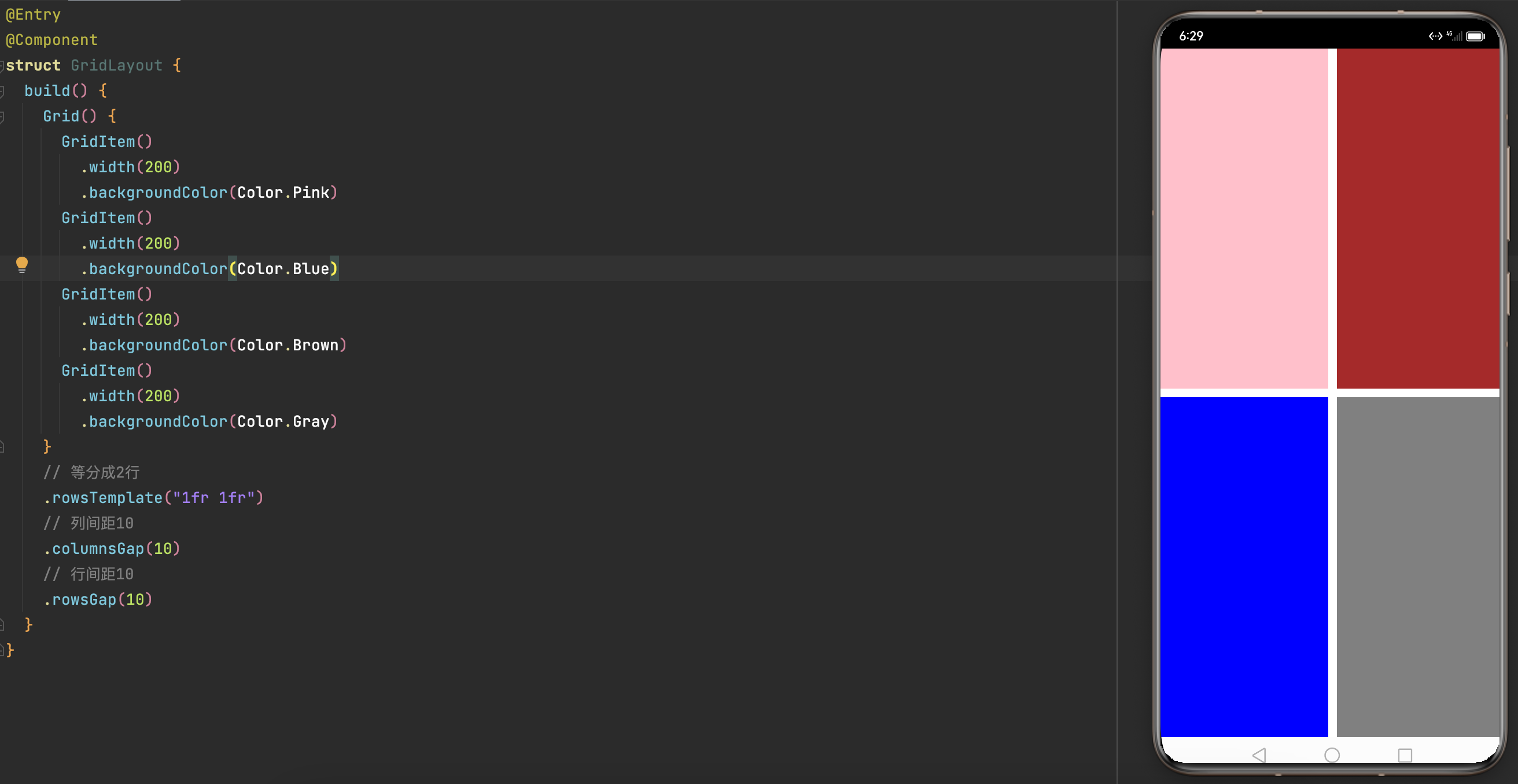
@Entry
@Component
struct GridLayout {
  build() {
    Grid() {
      GridItem()
        .rowStart(0)
        .rowEnd(0)
        .columnStart(0)
        .columnEnd(1)
        .backgroundColor(Color.Red)

      GridItem()
        .rowStart(0)
        .rowEnd(1)
        .columnStart(2)
        .columnEnd(1)
        .backgroundColor(Color.Orange)

      GridItem()
        .rowStart(1)
        .rowEnd(2)
        .columnStart(0)
        .columnEnd(0)
        .backgroundColor(Color.Blue)

      GridItem()
        .rowStart(1)
        .rowEnd(1)
        .columnStart(1)
        .columnEnd(1)
        .backgroundColor(Color.Pink)

      GridItem()
        .rowStart(2)
        .rowEnd(3)
        .columnStart(1)
        .columnEnd(2)
        .backgroundColor(Color.Yellow)
    }
    // 分成3行,每行等分高度
    .rowsTemplate("1fr 1fr 1fr")
    // 分成3列,每列等分宽度
    .columnsTemplate("1fr 1fr 1fr")
  }
}
-
效果
![]()
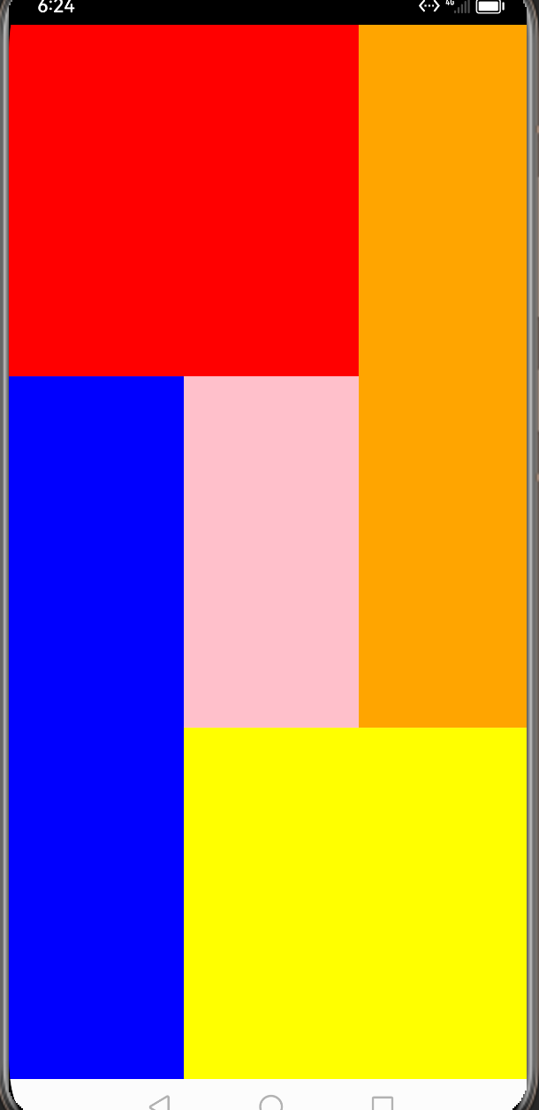
❗️行号和列号的起始序号都是0。
四、绘画一个计算机界面
-
代码
@Entry
@Component
struct GridLayout {
  build() {
    Grid() {
      // 第一行内容
      GridItem() {
        Text("0")
          .fontSize(50)
      }
      .rowStart(0)
      .rowEnd(0)
      .columnStart(0)
      .columnEnd(3)
      .backgroundColor(Color.Pink)
      // 设置子元素水平尾部、垂直居中对齐
      .align(Alignment.End)

      // 第二行内容
      GridItem() {
        Text("CE")
      }
      .rowStart(1)
      .rowEnd(1)
      .columnStart(0)
      .columnEnd(0)
      .backgroundColor(Color.Pink)

      GridItem() {
        Text("C")
      }
      .rowStart(1)
      .rowEnd(1)
      .columnStart(1)
      .columnEnd(1)
      .backgroundColor(Color.Pink)

      GridItem() {
        Text("/")
      }
      .rowStart(1)
      .rowEnd(1)
      .columnStart(2)
      .columnEnd(2)
      .backgroundColor(Color.Pink)

      GridItem() {
        Text("*")
      }
      .rowStart(1)
      .rowEnd(1)
      .columnStart(3)
      .columnEnd(3)
      .backgroundColor(Color.Pink)

      // 第三行内容
      GridItem() {
        Text("7")
      }
      .rowStart(2)
      .rowEnd(2)
      .columnStart(0)
      .columnEnd(0)
      .backgroundColor(Color.Pink)

      GridItem() {
        Text("8")
      }
      .rowStart(2)
      .rowEnd(2)
      .columnStart(1)
      .columnEnd(1)
      .backgroundColor(Color.Pink)

      GridItem() {
        Text("9")
      }
      .rowStart(2)
      .rowEnd(2)
      .columnStart(2)
      .columnEnd(2)
      .backgroundColor(Color.Pink)

      GridItem() {
        Text("-")
      }
      .rowStart(2)
      .rowEnd(2)
      .columnStart(3)
      .columnEnd(3)
      .backgroundColor(Color.Pink)

      // 第四行内容
      GridItem() {
        Text("4")
      }
      .rowStart(3)
      .rowEnd(3)
      .columnStart(0)
      .columnEnd(0)
      .backgroundColor(Color.Pink)

      GridItem() {
        Text("5")
      }
      .rowStart(3)
      .rowEnd(3)
      .columnStart(1)
      .columnEnd(1)
      .backgroundColor(Color.Pink)

      GridItem() {
        Text("6")
      }
      .rowStart(3)
      .rowEnd(3)
      .columnStart(2)
      .columnEnd(2)
      .backgroundColor(Color.Pink)

      GridItem() {
        Text("+")
      }
      .rowStart(2)
      .rowEnd(2)
      .columnStart(3)
      .columnEnd(3)
      .backgroundColor(Color.Pink)

      // 第五行内容
      GridItem() {
        Text("1")
      }
      .rowStart(4)
      .rowEnd(4)
      .columnStart(0)
      .columnEnd(0)
      .backgroundColor(Color.Pink)

      GridItem() {
        Text("2")
      }
      .rowStart(4)
      .rowEnd(4)
      .columnStart(1)
      .columnEnd(1)
      .backgroundColor(Color.Pink)

      GridItem() {
        Text("3")
      }
      .rowStart(4)
      .rowEnd(4)
      .columnStart(2)
      .columnEnd(2)
      .backgroundColor(Color.Pink)

      // 第六行内容
      GridItem() {
        Text("0")
      }
      .rowStart(5)
      .rowEnd(5)
      .columnStart(0)
      .columnEnd(1)
      .backgroundColor(Color.Pink)

      GridItem() {
        Text(".")
      }
      .rowStart(5)
      .rowEnd(5)
      .columnStart(2)
      .columnEnd(2)
      .backgroundColor(Color.Pink)

      GridItem() {
        Text("=")
      }
      .rowStart(4)
      .rowEnd(5)
      .columnStart(3)
      .columnEnd(3)
      .backgroundColor(Color.Pink)
    }
    // 分成6行,第一行是其他行的高度两倍
    .rowsTemplate("2fr 1fr 1fr 1fr 1fr 1fr")
    // 分成4列,每列等宽
    .columnsTemplate("1fr 1fr 1fr 1fr")
    // 列间距10
    .columnsGap(10)
    // 行间距10
    .rowsGap(10)
  }
}
- 效果
![]()

❗️为了便于初学者理解,上面代码没有采用ForEach的方式创建子组件
五、可滚动的网格布局
在设置Grid的行列数量与占比时,仅设置rowsTemplate或仅设置columnsTemplate属性,网格单元按照设置的方向排列,超出Grid显示区域后,Grid拥有可滚动能力。
仅设置rowsTemplate属性,在水平方向可滚动
仅设置columnsTemplate属性,在垂直方向可滚动


 浙公网安备 33010602011771号