Bootstrap布局之Flex
概述:bootstrap的flex布局基于Direction相关的两个css flex-row 和 flex-column,flex-row是默认样式。基于这两个样式,应用justify-content,align-items等样式进行水平,垂直方向的对齐。
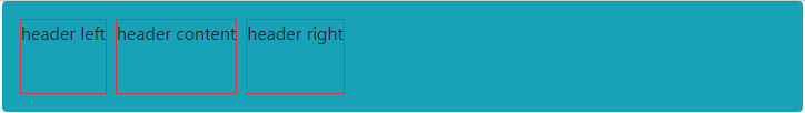
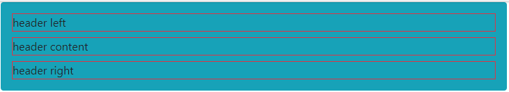
Direction: flex-row 和 flex-column确定了元素排列的方向,实验如下:
.flex-row:让元素水平排列

效果如下:
.flex-column:让元素垂直排列
效果如下:
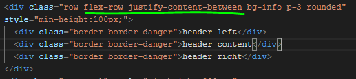
当Direction设置为 .flex-row 时
justify-content(内容整理):设置元素在水平方向上 (X轴) 的分布
.justify-content-start:靠左排列
.justify-content-end:靠右排列
.justify-content-center:居中排列
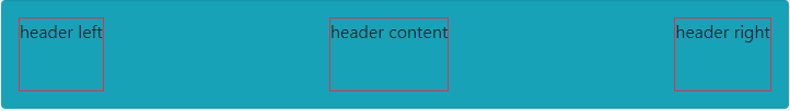
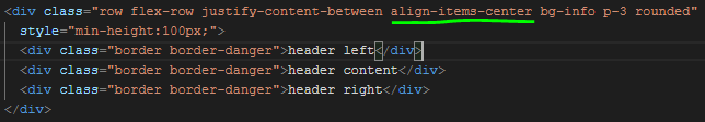
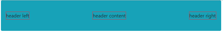
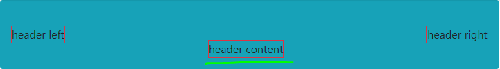
.justify-content-between:中间元素平均分布
.justify-content-around:所有元素平均分布
效果如下:
align-items :设置元素在垂直方向的(Y轴)定位
.align-items-start:靠顶部排列
.align-items-end:靠底部排列
.align-items-center:居中排列
.align-items-baseline:
.align-items-stretch:垂直拉伸布满父容器
效果如下:
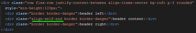
align-self:单独设置某个元素的垂直定位
效果如下:
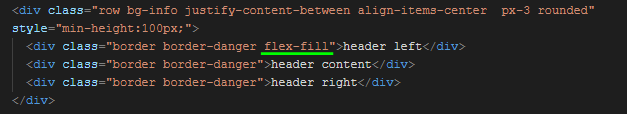
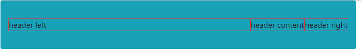
flex-fill:设置元素 水平拉伸
效果如下:
当Direction设置为 .flex-column 时,以上反之。

 浙公网安备 33010602011771号