两,三栏布局,(双飞翼,圣杯布局)
两,三栏布局
两栏布局–左边定宽,右边自适应:
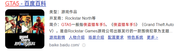
主要用于 我放一张图你们就明白了
两栏布局代码实现
1.第一种使用margin和浮动实现 代码如下>>
<<<html:部分
 <div>
    <h3>宋希</h3>
    <div class="box">
      <div class="left">
        <img src="../../assets/logo.png" alt="">
      </div>
      <div class="right">
        ,1987年2月2日出生于山东省青岛市,中国内地女演员、歌手,亚洲多栖发展女艺人。2008年,宋茜作为演员、广告模特在亚洲地区正式开始演艺活动。2009年,担任女子流行演唱组合f(x)队长,以歌手身份正式出道。2012年,主演都市爱情剧《爱情闯进门》,并凭借该剧获得国剧盛典年度最佳新人女演员奖。2015年12月,主演都市励志剧《美丽的秘密》 。2020年1月23日,参加湖南卫视亲情观察成长节目《我家那闺女2》的录制 ;1月26日,宋茜与宋威龙合作主演的都市情感剧《下一站是幸福》在湖南卫视播出,饰演职场女强人贺繁星;宋茜出生在山东省青岛市,是家,
      </div>
    </div>
  </div>
<<<css:部分
.box {
  width: 375px;
}
.left {
  float: left;
  background: red;
  width: 150px;
}
.left img {
  width: 150px;
  height: 150px;
}
.right {
  margin-left: 170px;
}
三栏布局:
可以用到的地方一张图片就能搞定
我的首页完美诠释
1.左边左浮动,右边右浮动,中间自适应,
<<<html:部分
 <div>

    <div class="left">目录</div>

    <div class="right">粉丝</div>
     <div class="center"></div>
  </div>
<<<css:部分
.left {
  float: left;
  width: 50px;
  height: 200px;
  background: red;
}
.right {
  float: right;
  width: 80px;
  height: 200px;
  background: rgb(243, 162, 162);
}
.center{
  height: 200px;
  background: lemonchiffon;
  margin:  0 90px  0 60px ;
}
2.双飞翼
<<<html:部分
 <div class="center">
 <div class="main"></div>
 </div>
 <div class="left">目录</div>
 <div class="right">粉丝</div>
<<<css:部分
.left {
  float: left;
  width: 50px;
  height: 200px;
  margin-left:-100%;

  background: red;
}
.right {
  float: right;
  width: 80px;

  height: 200px;
  margin-left:-80px;
  background: rgb(243, 162, 162);
}
.center {

  float:left;
  height: 200px;
  background: green;
  width: 100%;
}
.main{
  height: 200px;
  background: lemonchiffon;
  margin:  0 90px  0 60px ;
}
注意这个 中间的要放到最上面 要不然左边 和 右边 覆盖不上
center 中间 需要加一个div 主要是为了 设置左右 margin
3.圣杯布局
<<<html:部分
<header>
    <h4>Header内容区</h4>
</header>
<div class="container">
    <div class="middle">
        <h4>中间弹性区</h4>
    </div>
    <div class="left">
        <h4>左边栏</h4>
    </div>
    <div class="right">
        <h4>右边栏</h4>
    </div>
</div>
<footer>
    <h4>Footer内容区</h4>
</footer>
有人可能会有疑惑,为什么中间的主体部分要写在最前面。因为中间盒子是要被优先渲染嘛~并且设置其自适应,也就是width:100%。
<<<js:部分
header{
    width: 100%;
    height: 40px;
    background-color: #8ecfd4;
}
.container{
    overflow:hidden;
    padding: 0 200px;
}
.middle{
     width: 100%;
    height: 200px;
    background-color: #f7f537;
    float:left;
}
.left{
    width: 200px;
    height: 200px;
    position: relative;
    left: -200px;
    background-color: #37f7c8;
    float:left;
    margin-left:-100%;
}
.right{
    width: 200px;
    height: 200px;
    position: relative;
    right: -200px;
    background-color: #eb6100;
    float:left;
    margin-left:-200px;
}
footer{
    width: 100%;
    height: 30px;
    background-color: #8ecfd4;
}

 浙公网安备 33010602011771号