R绘图 第四篇:绘制箱图(ggplot2)
箱线图通过绘制观测数据的五数总括,即最小值、下四分位数、中位数、上四分位数以及最大值,描述了变量值的分布情况。箱线图能够显示出离群点(outlier),离群点也叫做异常值,通过箱线图能够很容易识别出数据中的异常值。
箱线图提供了识别异常值的一个标准:
异常值通常被定义为小于 QL - l.5 IQR 或者 大于 Qu + 1.5 IQR的值,QL称为下四分位数, Qu称为上四分位数,IQR称为四分位数间距,是Qu上四分位数和QL下四分位数之差,其间包括了全部观察值的一半。
箱线图的各个组成部分的名称及其位置如下图所示:
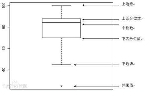
箱线图可以直观地看出数据集的以下重要性值:
中心位置:中位数所在的位置就是数据集的中心;
散布程度:箱线图分为多个区间,区间较短时,表示落在该区间的点较集中;
对称性:如果中位数位于箱子的中间位置,那么数据分布较为对称;如果极值离中位数的距离较大,那么表示数据分布倾斜
一,绘制箱线图
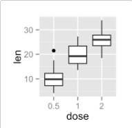
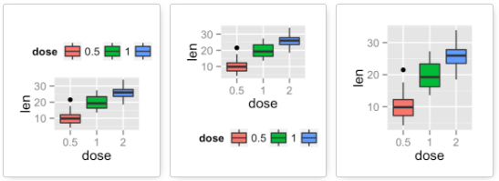
绘制箱线图比较简单,通常情况下,我们使用ggplot和geom_boxplot绘制箱线图,在下面的小节中,我们使用ToothGrowth作为示例数据:
ToothGrowth$dose <- as.factor(ToothGrowth$dose)
head(ToothGrowth)

   len supp dose
1  4.2   VC  0.5
2 11.5   VC  0.5
3  7.3   VC  0.5
4  5.8   VC  0.5
5  6.4   VC  0.5
6 10.0   VC  0.5
1,绘制基本的箱线图
使用geom_boxplot绘制基本的箱线图:
library(ggplot2)

ggplot(ToothGrowth, aes(x=dose, y=len)) +
  geom_boxplot()
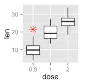
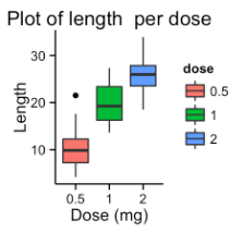
2,设置离群点(outlier)
geom_boxplot函数中有outlier开头的多个参数,用于修改离群点的属性:
- outlier.colour:离群点的颜色
- outlier.fill:离群点的填充色
- outlier.shape:离群点的形状
- outlier.size:离群点的大小
- outlier.alpha:离群点的透明度
示例代码如下:
ggplot(ToothGrowth, aes(x=dose, y=len)) +
  geom_boxplot(outlier.colour="red", outlier.shape=8, outlier.size=4)
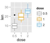
3,设置箱线图的颜色
通过aes(color=)函数可以为每个箱线图设置一个颜色,而箱线图的划分是通过 aes(color=)函数的color参数来划分的,划分箱线图之后,scale_color_*()函数才会起作用,该函数用于为每个箱线图设置前景色和填充色,颜色是自定义的:
scale_fill_manual() #for box plot, bar plot, violin plot, etc
scale_color_manual() #for lines and points
以下代码设置箱线图的前景色:
ggplot(ToothGrowth, aes(x=dose, y=len,color=dose)) +
  geom_boxplot()+
  scale_color_manual(values=c("#999999", "#E69F00", "#56B4E9"))
4,设置Legend 的位置
说明(Legend)是对箱线图的解释性描述,默认的位置是在画布的右侧中间位置,可以通过theme()函数修改Legend的位置,lengend.position的有效值是top、right、left、bottom和none,默认值是right:
p <- ggplot(ToothGrowth, aes(x=dose, y=len,color=dose)) +
  geom_boxplot()+
  scale_color_manual(values=c("#999999", "#E69F00", "#56B4E9"))

p + theme(legend.position="top")
p + theme(legend.position="bottom")
p + theme(legend.position="none") # Remove legend
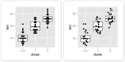
5,设置箱线图的标题和坐标轴的名称
通过labs设置箱线图的标题和坐标的名称,参数title用于设置标题,x和y用于设置x轴和y轴的标签:
ggplot(ToothGrowth, aes(x=dose, y=len,color=dose)) +
  geom_boxplot()+
  scale_color_manual(values=c("#999999", "#E69F00", "#56B4E9"))+
  theme(legend.position="right")+
  labs(title="Plot of length  per dose",x="Dose (mg)", y = "Length")
6,绘制箱线图的散点
通过geom_point函数,向箱线图中添加点,geom_jitter()函数是geom_point(position = "jitter")的包装,binaxis="y"是指沿着y轴进行分箱:
# Box plot with dot plot
p + geom_dotplot(binaxis='y', stackdir='center', dotsize=1)
# Box plot with jittered points
# 0.2 : degree of jitter in x direction
p + geom_jitter(shape=16, position=position_jitter(0.2))
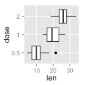
7,旋转箱线图
函数coord_flip()用于翻转笛卡尔坐标系,使水平变为垂直,垂直变为水平,主要用于把显示y条件x的geoms和统计信息转换为x条件y。
p <- ggplot(ToothGrowth, aes(x=dose, y=len)) +
  geom_boxplot() +
  coord_flip()
二,异常值检测
绘制散点图,并标记异常值:
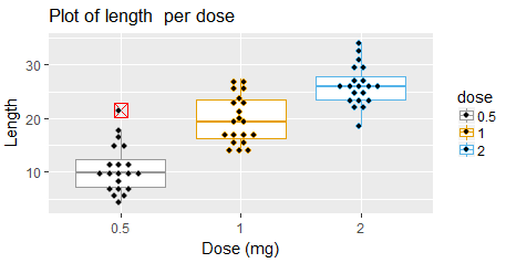
ggplot(ToothGrowth, aes(x=dose, y=len,color=dose)) +
  geom_boxplot(outlier.colour="red", outlier.shape=7,outlier.size=4)+
  scale_color_manual(values=c("#999999", "#E69F00", "#56B4E9"))+
  theme(legend.position="right")+
  labs(title="Plot of length  per dose",x="Dose (mg)", y = "Length")+
  geom_dotplot(binaxis='y', stackdir='center', stackratio=1.5, dotsize=1.2)
当箱线图中的异常值过多时,绘制的图中,箱子被压成一条线,无法观察到数据的分布,这就需要移除异常值,只保留适量的离群点,常见的做法是改变ylim的范围,代码是:
# compute lower and upper whiskers
ylim1 = boxplot.stats(df$y)$stats[c(1, 5)]

# scale y limits based on ylim1
ggplot() + gemo_box() + coord_cartesian(ylim = ylim1*1.05)
三,箱图的排序
对箱图的排序,实际上,是对箱图的x轴因子进行排序,而因子的顺序是由因子水平决定的。在对箱图进行排序时,可以按照数据的均值对x轴因子水平进行排序,重置数据框x轴的因子水平,就可以实现箱图的排序:
x_order <- df %>%
  group_by(x_factor) %>%
  summarize(mean_y=mean(y_value))%>%
  ungroup()%>%
  arrange(desc(mean_y))%>%
  select(x_factor);

df$x_factor<-factor(df$x_factor,levels=as.character(x_order$x_factor),ordered = TRUE)
参考文档:
ggplot2 box plot : Quick start guide - R software and data visualization

 浙公网安备 33010602011771号