

WPF创建自定义控件并运用
此项目源码:https://github.com/lizhiqiang0204/WpfCustomControlLibrary1
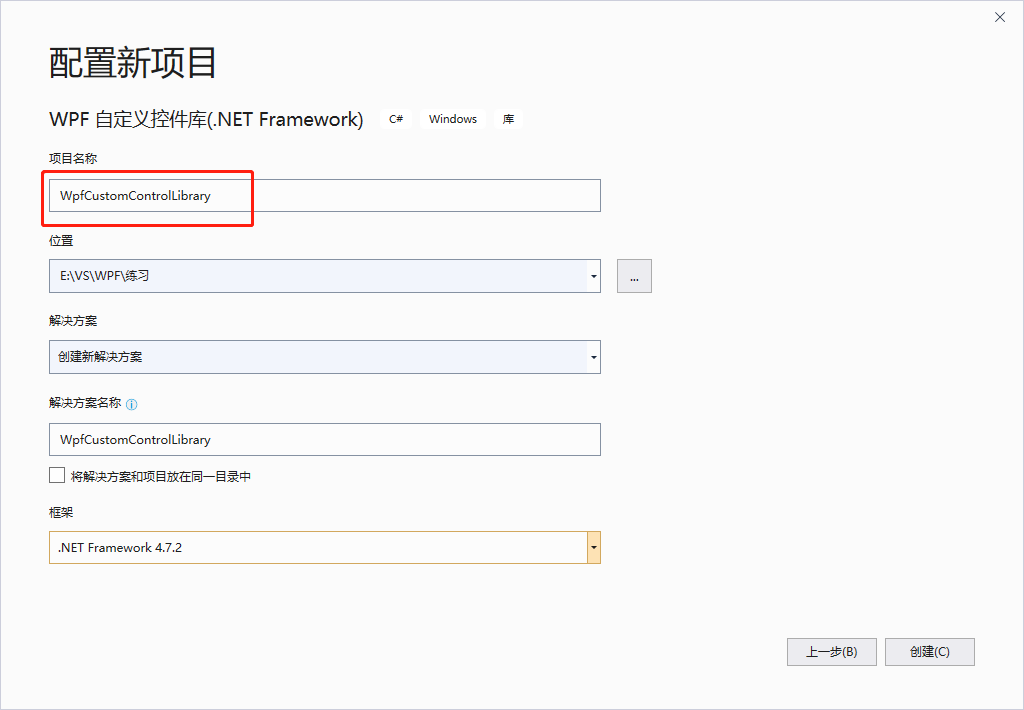
首先创建自定义控件库项目

项目名称命名为:WpfCustomControlLibrary
在CustomControl1.cs文件中添加新控件类BulletCheckBox
/// <summary>
    /// BulletCheckBox.xaml 的交互逻辑
    /// </summary>
    public class BulletCheckBox : CheckBox
    {
        public static readonly DependencyProperty TextProperty = DependencyProperty.Register(
            "Text", typeof(string), typeof(BulletCheckBox), new PropertyMetadata("Off"));
        /// <summary>
        /// 默认文本(未选中)
        /// </summary>
        public string Text
        {
            get { return (string)GetValue(TextProperty); }
            set { SetValue(TextProperty, value); }
        }

        public static readonly DependencyProperty CheckedTextProperty = DependencyProperty.Register(
            "CheckedText", typeof(string), typeof(BulletCheckBox), new PropertyMetadata("On"));
        /// <summary>
        /// 选中状态文本
        /// </summary>
        public string CheckedText
        {
            get { return (string)GetValue(CheckedTextProperty); }
            set { SetValue(CheckedTextProperty, value); }
        }

        public static readonly DependencyProperty CheckedForegroundProperty =
            DependencyProperty.Register("CheckedForeground", typeof(Brush), typeof(BulletCheckBox), new PropertyMetadata(Brushes.WhiteSmoke));
        /// <summary>
        /// 选中状态前景样式
        /// </summary>
        public Brush CheckedForeground
        {
            get { return (Brush)GetValue(CheckedForegroundProperty); }
            set { SetValue(CheckedForegroundProperty, value); }
        }

        public static readonly DependencyProperty CheckedBackgroundProperty =
            DependencyProperty.Register("CheckedBackground", typeof(Brush), typeof(BulletCheckBox), new PropertyMetadata(Brushes.LimeGreen));
        /// <summary>
        /// 选中状态背景色
        /// </summary>
        public Brush CheckedBackground
        {
            get { return (Brush)GetValue(CheckedBackgroundProperty); }
            set { SetValue(CheckedBackgroundProperty, value); }
        }

        static BulletCheckBox()
        {
            DefaultStyleKeyProperty.OverrideMetadata(typeof(BulletCheckBox), new FrameworkPropertyMetadata(typeof(BulletCheckBox)));
        }
    }
为BulletCheckBox这个控件增加样式
    <Style TargetType="{x:Type local:BulletCheckBox}">
        <Setter Property="Background" Value="#FF4A9E4A"></Setter>
        <Setter Property="Foreground" Value="#DDE8E1"></Setter>
        <Setter Property="CheckedForeground" Value="White"></Setter>
        <Setter Property="CheckedBackground" Value="#FF0CC50C"></Setter>
        <Setter Property="FontSize" Value="13"></Setter>
        <Setter Property="Cursor" Value="Hand"></Setter>
        <Setter Property="Width" Value="750"></Setter>
        <Setter Property="Height" Value="280"></Setter>
        <Setter Property="Margin" Value="1"></Setter>
        <Setter Property="Template">
            <Setter.Value>
                <!--控件模板-->
                <ControlTemplate TargetType="{x:Type local:BulletCheckBox}">
                    <Viewbox Stretch="Uniform"  VerticalAlignment="Center" HorizontalAlignment="Center">
                        <Border x:Name="border" Width="75" Height="28" Background="{TemplateBinding Background}" SnapsToDevicePixels="True"
                                Margin="{TemplateBinding Margin}" CornerRadius="14">
                            <StackPanel Orientation="Horizontal">
                                <!--状态球-->
                                <Border x:Name="state" Width="24" Height="24" Margin="3,2,1,2" CornerRadius="12" SnapsToDevicePixels="True"
                                    Background="{TemplateBinding Foreground}">
                                    <Border.RenderTransform>
                                        <TranslateTransform x:Name="transState" X="0"></TranslateTransform>
                                    </Border.RenderTransform>
                                </Border>
                                <!--文本框-->
                                <TextBlock Width="40" Foreground="{TemplateBinding Foreground}" x:Name="txt" Text="{TemplateBinding Text}" VerticalAlignment="Center" TextAlignment="Center">
                                    <TextBlock.RenderTransform>
                                        <TranslateTransform x:Name="transTxt" X="0"></TranslateTransform>
                                    </TextBlock.RenderTransform>
                                </TextBlock>
                            </StackPanel>
                        </Border>
                    </Viewbox>

                    <!--触发器:设置选中状态符号-->
                    <ControlTemplate.Triggers>
                        <Trigger Property="IsChecked" Value="True">
                            <Setter Property="Text" Value="{Binding RelativeSource={RelativeSource Mode=TemplatedParent}, Path=CheckedText}" TargetName="txt"/>
                            <Setter Property="Background" Value="{Binding RelativeSource={RelativeSource Mode=TemplatedParent}, Path=CheckedForeground}" TargetName="state"/>
                            <Setter Property="Foreground" Value="{Binding RelativeSource={RelativeSource Mode=TemplatedParent}, Path=CheckedForeground}" TargetName="txt"/>
                            <Setter Property="Background" Value="{Binding RelativeSource={RelativeSource Mode=TemplatedParent}, Path=CheckedBackground}" TargetName="border"/>
                            <Trigger.EnterActions>
                                <BeginStoryboard>
                                    <Storyboard>
                                        <DoubleAnimation Storyboard.TargetName="transState" Storyboard.TargetProperty="X" To="45" Duration="0:0:0.2" />
                                        <DoubleAnimation Storyboard.TargetName="transTxt" Storyboard.TargetProperty="X" To="-24" Duration="0:0:0.2" />
                                    </Storyboard>
                                </BeginStoryboard>
                            </Trigger.EnterActions>
                            <Trigger.ExitActions>
                                <BeginStoryboard>
                                    <Storyboard>
                                        <DoubleAnimation Storyboard.TargetName="transState" Storyboard.TargetProperty="X" To="0" Duration="0:0:0.2" />
                                        <DoubleAnimation Storyboard.TargetName="transTxt" Storyboard.TargetProperty="X" To="0" Duration="0:0:0.2" />
                                    </Storyboard>
                                </BeginStoryboard>
                            </Trigger.ExitActions>
                        </Trigger>

                        <Trigger Property="IsEnabled" Value="false">
                            <Setter Property="Opacity" Value="{StaticResource DisableOpacity}" TargetName="border"/>
                        </Trigger>
                    </ControlTemplate.Triggers>
                </ControlTemplate>
            </Setter.Value>
        </Setter>
    </Style>
编译项目得到DLL控件库文件

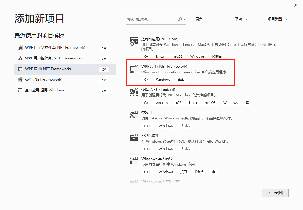
自定义控件库生成完后,就可以创建WPF应用程序来调用它了,右击解决方案->添加->新建项目->WPF应用
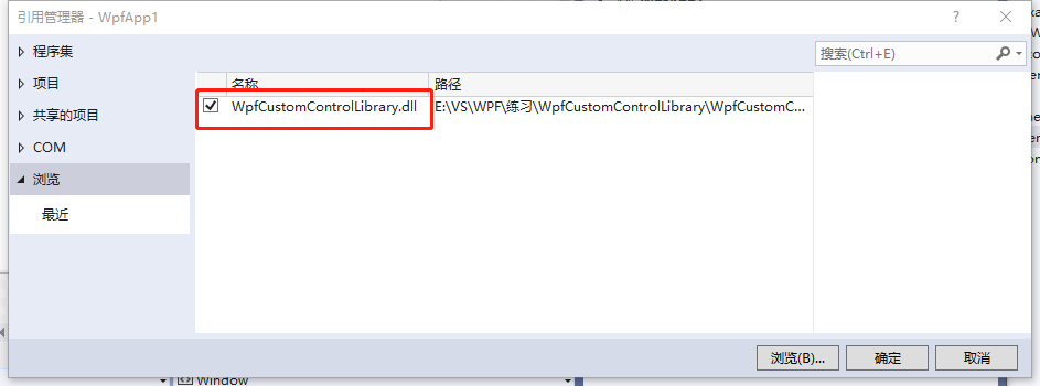
右击WpfApp1项目设为启动项目,右击该项目下的引用,添加引用

从浏览中找到我们刚才生成的DLL控件库文件
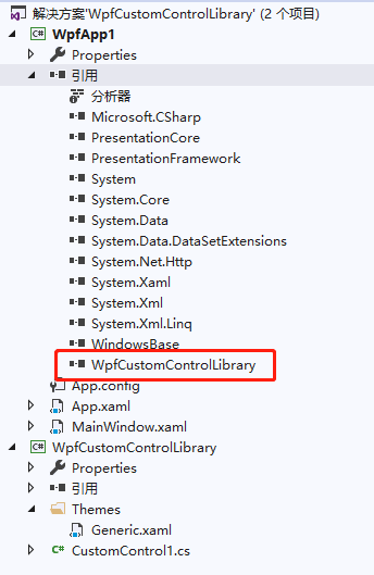
此时展开引用就可以看到刚才生成的控件库已经加载进来了
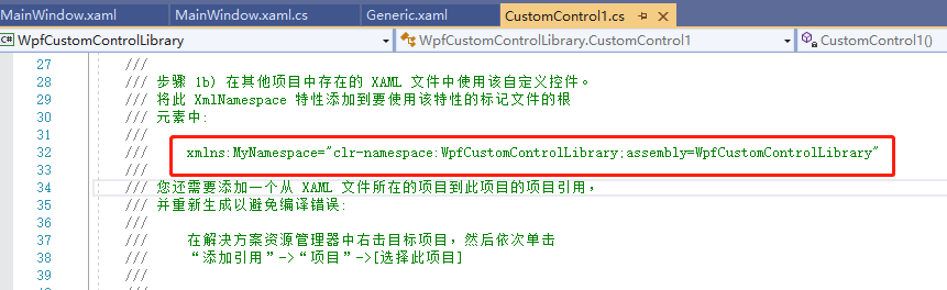
打开MainWindow.xaml,添加引用xmlns:MyNamespace="clr-namespace:WpfCustomControlLibrary;assembly=WpfCustomControlLibrary"
这句引用是在CustomControl1.cs文件中复制而来的,其中xmlns:MyNamespace是可以更改的
后台文件不用改动,整个MainWindow.xaml文件如下:
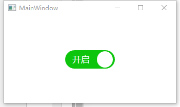
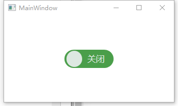
<Window x:Class="WpfApp1.MainWindow"
xmlns="http://schemas.microsoft.com/winfx/2006/xaml/presentation"
xmlns:x="http://schemas.microsoft.com/winfx/2006/xaml"
xmlns:d="http://schemas.microsoft.com/expression/blend/2008"
xmlns:mc="http://schemas.openxmlformats.org/markup-compatibility/2006"
xmlns:MyNamespace="clr-namespace:WpfCustomControlLibrary;assembly=WpfCustomControlLibrary"
xmlns:local="clr-namespace:WpfApp1"
mc:Ignorable="d"
Title="MainWindow" Height="450" Width="800">
<Grid>
<MyNamespace:BulletCheckBox Text="关闭" CheckedText="开启" IsChecked="True" Width="100" Height="100" />
</Grid>
</Window>
最后运行程序:

 浙公网安备 33010602011771号