移动端屏幕适配
方法一:
媒体查询:
比如说我们设置了 html{ font-size: 16px },然后给具体的DOM设置 p{ font-size: 2rem; height: 4rem; },其实就相当于设置了 p{ font-size: 2*16px; height: 4*16px; },也就是 1rem = 1*(html的fontSize),2.5rem=2.5*(html的fontSize)
html{font-size: 18px}
@media only screen and (min-width:360px){html{font-size: 20px!important}}
@media only screen and (min-width:375px){html{font-size: 21px!important}}
@media only screen and (min-width:400px){html{font-size: 22px!important}}
@media only screen and (min-width:414px){html{font-size: 23px!important}}
@media only screen and (min-width:480px){html{font-size: 24px!important}}
@media only screen and (min-width:540px){html{font-size: 26px!important}}
@media only screen and (min-width:640px){html{font-size: 28px!important}}
@media only screen and (min-width:768px){html{font-size: 32px!important}}
@media only screen and (min-width:960px){html{font-size: 36px!important}}
@media only screen and (min-width:1024px){html{font-size: 46px!important}}
方法二:
响应式布局:
简而言之,就是页面元素的位置随着屏幕尺寸的变化而变化,通常会用百分比来定位,而在设计上需要预留一些可被“压缩”的空间。
方法三:
样式缩放:
最省事的适配方法,直接用px为单位按视觉进行开发,然后通过计算屏幕与网页的宽高比,用transform:scale来对网页进行全局缩放。
不过此方法会有一个小问题,就是如果网页内有动画的话,缩放后会稍微降低页面性能,在低配的安卓机器上表现的比较明显,iOS上没发现有性能问题。
方法四:
流式布局:高度用px,宽度用百分比来写,可以固定一部分(比较重要的)为固定宽度,另一部分宽度自适应。
方法五:
弹性布局(css3):
父级标签中{display:-webkit-box;}
*firefox 前缀:-moz-
*opera 前缀:-o-
子级标签中{-webkit-box-flex:1;}
子级固定宽度 {width:200px;}
子元素会按比例平分父级内容部分剩下的宽度
注:移动端切图中能用弹性布局则不要用float
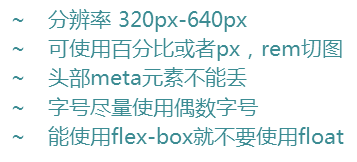
移动端注意的规则:

 浙公网安备 33010602011771号