绘图
1.饼状图
这个是plt.pie()
这个是数据:
    菜品ID  菜品名    盈利
0  17148   A1  9173
1  17154   A2  5729
2    109   A3  4811
3    117   A4  3594
4  17151   A5  3195
5     14   A6  3026
6   2868   A7  2378
7    397   A8  1970
8     88   A9  1877
9    426  A10  1782

这个是代码:

x = data['盈利']
labels = data['菜品名']
plt.figure(figsize = (8, 6))  # 设置画布大小
plt.pie(x,labels=labels)  # 绘制饼图
plt.rcParams['font.sans-serif'] = 'SimHei'
plt.title('菜品销售量分布(饼图)')  # 设置标题
plt.show()
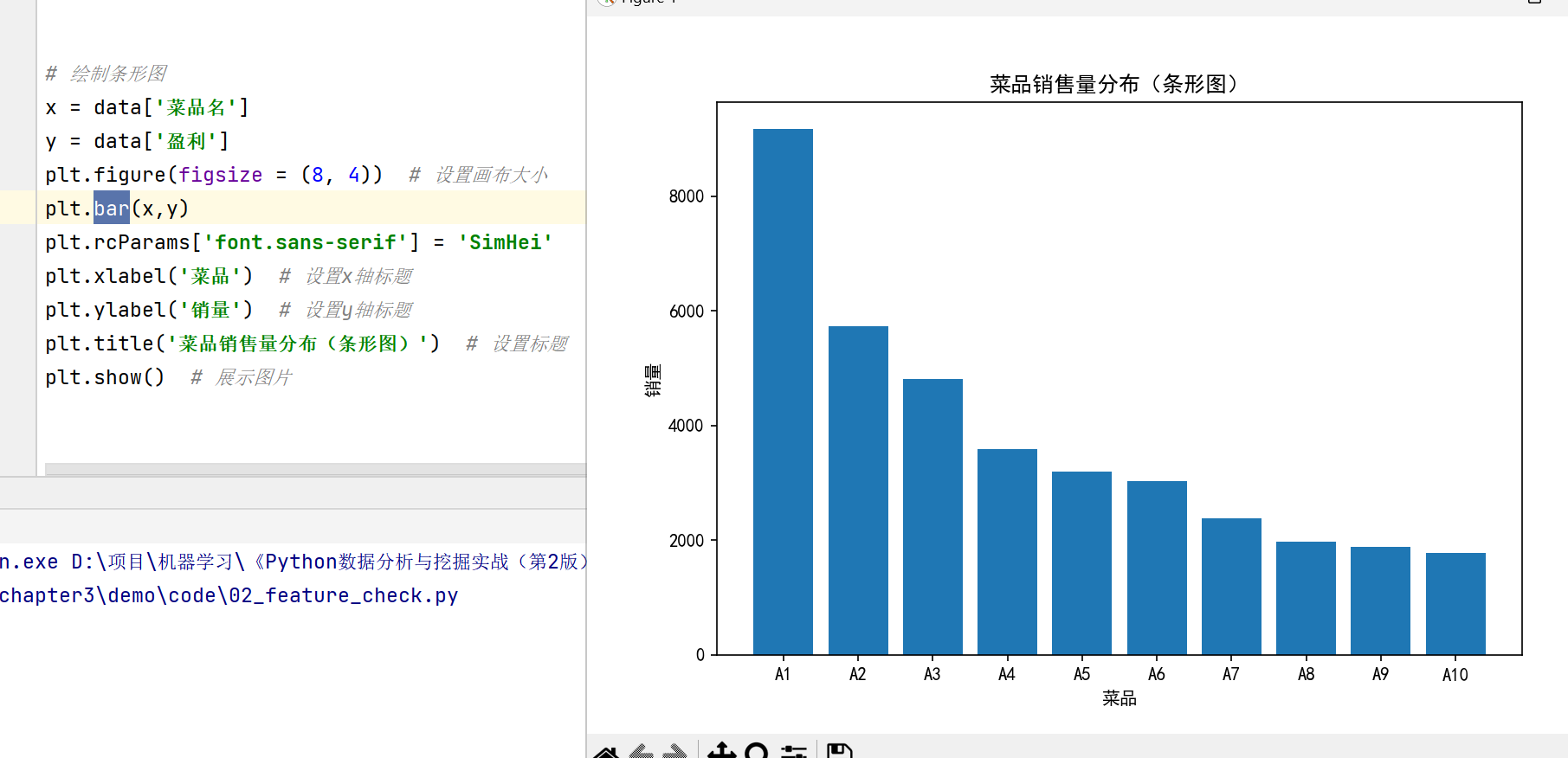
2. 条形图
    菜品ID  菜品名    盈利
0  17148   A1  9173
1  17154   A2  5729
2    109   A3  4811
3    117   A4  3594
4  17151   A5  3195
5     14   A6  3026
6   2868   A7  2378
7    397   A8  1970
8     88   A9  1877
9    426  A10  1782
plt.bar()
# 绘制条形图
x = data['菜品名']
y = data['盈利']
plt.figure(figsize = (8, 4))  # 设置画布大小
plt.bar(x,y)
plt.rcParams['font.sans-serif'] = 'SimHei'
plt.xlabel('菜品')  # 设置x轴标题
plt.ylabel('销量')  # 设置y轴标题
plt.title('菜品销售量分布(条形图)')  # 设置标题
plt.show()  # 展示图片
3.折线图
按部门
数据:
月份   A部门   B部门  C部门
0    1月  8.00  7.70  5.3
1    2月  6.00  6.50  5.2
2    3月  6.89  7.90  5.8
3    4月  6.10  7.50  6.2
4    5月  6.05  8.00  5.9
5    6月  6.01  7.40  5.5
6    7月  6.60  7.50  6.1
7    8月  6.40  7.00  5.7
8    9月  5.80  7.20  5.4
9   10月  6.70  6.60  5.5
10  11月  6.60  6.65  5.6
11  12月  5.30  5.40  5.2
# 部门之间销售金额比较
import pandas as pd
import matplotlib.pyplot as plt
data=pd.read_excel("../data/dish_sale.xls")
plt.figure(figsize=(8, 4))
plt.plot(data['月份'], data['A部门'], color='green', label='A部门',marker='o')
plt.plot(data['月份'], data['B部门'], color='red', label='B部门',marker='s')
plt.plot(data['月份'], data['C部门'],  color='skyblue', label='C部门',marker='x')
plt.legend() # 显示图例
plt.ylabel('销售额(万元)')
plt.show()

按照年份
数据:
月份  2014年  2013年  2012年
0    1月   7.90   7.70    5.3
1    2月   6.00   6.50    5.2
2    3月   6.89   7.90    5.8
3    4月   7.30   7.50    6.2
4    5月   7.60   8.00    5.9
5    6月   7.20   7.40    5.5
6    7月   7.40   7.50    6.1
7    8月   7.80   7.00    5.7
8    9月   7.00   7.20    5.4
9   10月   6.70   6.60    5.5
10  11月   6.60   6.65    5.6
11  12月   6.30   6.40    5.2

折线图
数据
日期            销量
2015-02-28  2618.2
2015-02-27  2608.4
2015-02-26  2651.9
2015-02-25  3442.1
2015-02-24  3393.1
...            ...
2014-08-06  2915.8
2014-08-05  2618.1
2014-08-04  2993.0
2014-08-03  3436.4
2014-08-02  2261.7

df_normal = pd.read_csv("../data/user.csv")
plt.figure(figsize=(8,4))
plt.plot(df_normal["Date"],df_normal["Eletricity"])
plt.xlabel("日期")
plt.ylabel("每日电量")
# 设置x轴刻度间隔
x_major_locator = plt.MultipleLocator(7)
ax = plt.gca()
ax.xaxis.set_major_locator(x_major_locator)
plt.title("正常用户电量趋势")
plt.rcParams['font.sans-serif'] = ['SimHei']  # 用来正常显示中文标签
plt.show()  # 展示图片
数据:
Date  Eletricity
0    2012/2/1        6100
1    2012/2/2        6312
2    2012/2/3        6240
3    2012/2/4        4293
4    2012/2/5        3346
5    2012/2/6        6390
6    2012/2/7        6170
7    2012/2/8        6720
8    2012/2/9        6850
9   2012/2/10        7000
10  2012/2/11        2123
11  2012/2/12        1344
12  2012/2/13        5680
13  2012/2/14        5910
14  2012/2/15        5950
15  2012/2/16        6000
16  2012/2/17        5681
17  2012/2/18        3743
18  2012/2/19         660
19  2012/2/20        5530
20  2012/2/21        5070
21  2012/2/22        4810
22  2012/2/23        4880
23  2012/2/24        4790
24  2012/2/25        4078
25  2012/2/26        1965
26  2012/2/27        4601
27  2012/2/28        4531
28  2012/2/29        4263
29   2012/3/1        4471
30   2012/3/2        4750
31   2012/3/3        3963
32   2012/3/4        1509
33   2012/3/5        4090
34   2012/3/6        4001
35   2012/3/7        3737
36   2012/3/8        3203
37   2012/3/9        3312
38  2012/3/10         935
39  2012/3/11        2756
40  2012/3/12        3230
41  2012/3/13        2702
42  2012/3/14        2567
43  2012/3/15         571
44  2012/3/16        2307
45  2012/3/17        2230
46  2012/3/18        1945
47  2012/3/19        2220
48  2012/3/20        2041
49  2012/3/21        2060
50  2012/3/22        2000
51  2012/3/23        1821
52  2012/3/24        1800
53  2012/3/25        1745
54  2012/3/26        1023
55  2012/3/27        2045
56  2012/3/28        2132
57  2012/3/29        2345
58  2012/3/30        2267
df_steal = pd.read_csv("../data/Steal user.csv")
print(df_steal)
plt.figure(figsize=(10, 9))
plt.plot(df_steal["Date"],df_steal["Eletricity"])
plt.xlabel("日期")
plt.ylabel("日期")
# 设置x轴刻度间隔
x_major_locator = plt.MultipleLocator(7)
ax = plt.gca()
ax.xaxis.set_major_locator(x_major_locator)
plt.title("窃电用户电量趋势")
plt.rcParams['font.sans-serif'] = ['SimHei']  # 用来正常显示中文标签
plt.show()  # 展示图片

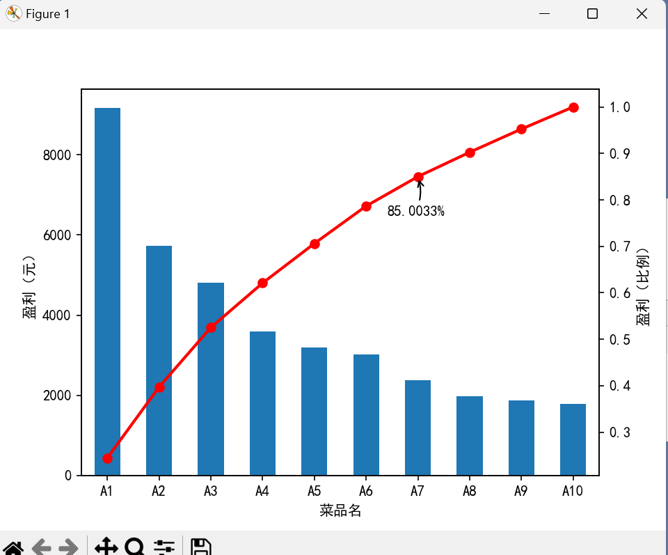
带箭头
数据
菜品名
A1     9173
A2     5729
A3     4811
A4     3594
A5     3195
A6     3026
A7     2378
A8     1970
A9     1877
A10    1782
Name: 盈利, dtype: int64
dish_profit = '../data/catering_dish_profit.xls'  # 餐饮菜品盈利数据
data = pd.read_excel(dish_profit, index_col = u'菜品名')
data = data[u'盈利'].copy()
data.sort_values(ascending = False)
print(data)
import matplotlib.pyplot as plt  # 导入图像库
plt.rcParams['font.sans-serif'] = ['SimHei']  # 用来正常显示中文标签
plt.rcParams['axes.unicode_minus'] = False  # 用来正常显示负号

plt.figure()
data.plot(kind='bar')
plt.ylabel(u'盈利(元)')
p = 1.0*data.cumsum()/data.sum()
p.plot(color = 'r', secondary_y = True, style = '-o',linewidth = 2)
plt.annotate(format(p[6], '.4%'), xy = (6, p[6]), xytext=(6*0.9, p[6]*0.9),
             arrowprops=dict(arrowstyle="->", connectionstyle="arc3,rad=.2"))  # 添加注释,即85%处的标记。这里包括了指定箭头样式。
plt.ylabel(u'盈利(比例)')
plt.show()
练习
绘制一条蓝色的正弦虚线
import numpy as np
import matplotlib.pyplot as plt
x = np.linspace(0,2*np.pi,50)  # x坐标输入,np.linspace主要用来创建等差数列
print(x)
y = np.sin(x)  # 计算对应x的正弦值
plt.plot(x, y, 'bp--')  # 控制图形格式为蓝色带星虚线,显示正弦曲线
plt.show()

绘制饼图
import matplotlib.pyplot as plt
# The slices will be ordered and plotted counter-clockwise.
labels = 'Frogs', 'Hogs', 'Dogs', 'Logs'  # 定义标签
sizes = [15, 30, 45, 10]  # 每一块的比例
colors = ['yellowgreen', 'gold', 'lightskyblue', 'lightcoral']  # 每一块的颜色
explode = (0.1, 0.3, 0, 0)  # 突出显示,这里仅仅突出显示第二块(即'Hogs')

plt.pie(sizes, explode=explode, labels=labels, colors=colors, autopct='%1.1f%%', shadow=True, startangle=90)
plt.axis('equal')  # 显示为圆(避免比例压缩为椭圆)
plt.show()

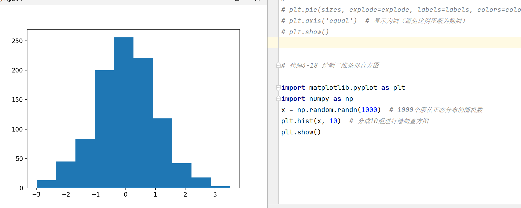
绘制二维条形直方图
import matplotlib.pyplot as plt
import numpy as np
x = np.random.randn(1000)  # 1000个服从正态分布的随机数
plt.hist(x, 10)  # 分成10组进行绘制直方图
plt.show()
绘制箱型图
import matplotlib.pyplot as plt
import numpy as np
import pandas as pd
x = np.random.randn(1000)  # 1000个服从正态分布的随机数
D = pd.DataFrame([x, x+1]).T  # 构造两列的DataFrame
D.plot(kind = 'box')  # 调用Series内置的绘图方法画图,用kind参数指定箱型图box
plt.show()

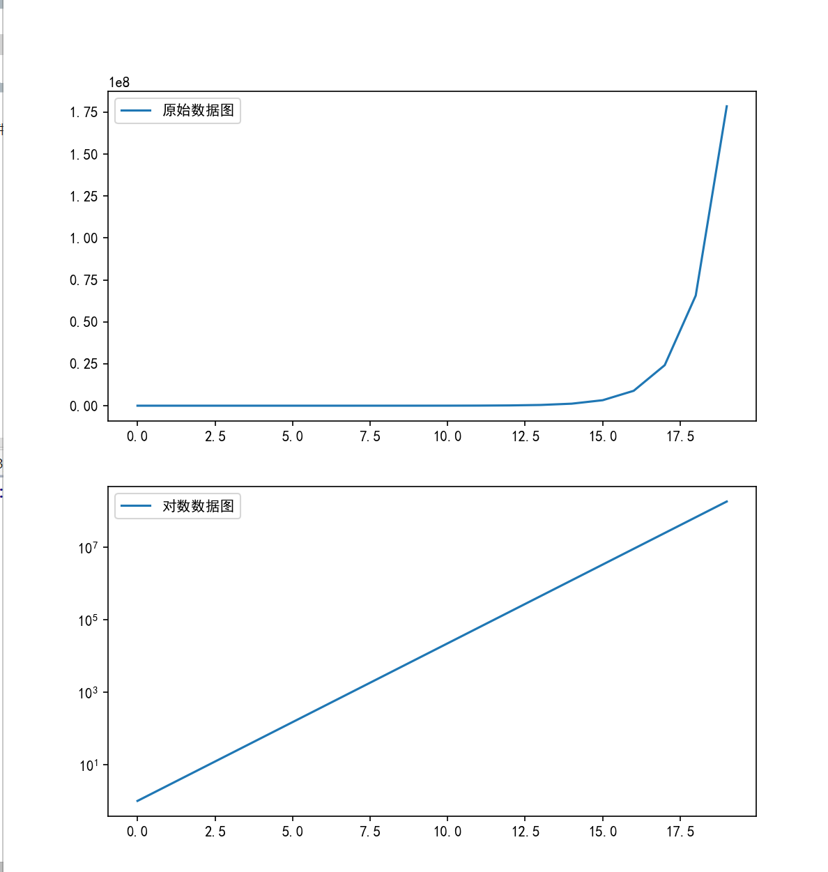
使用plot(logy = True)函数进行绘图
import matplotlib.pyplot as plt
plt.rcParams['font.sans-serif'] = ['SimHei']  # 用来正常显示中文标签
plt.rcParams['axes.unicode_minus'] = False  # 用来正常显示负号
import numpy as np
import pandas as pd

x = pd.Series(np.exp(np.arange(20)))  # 原始数据
plt.figure(figsize = (8, 9))  # 设置画布大小
ax1 = plt.subplot(2, 1, 1)# # 创建第1个子图
x.plot(label = '原始数据图', legend = True)

ax1 = plt.subplot(2, 1, 2)# 创建第二个子图
x.plot(logy = True, label = '对数数据图', legend = True)
plt.show()
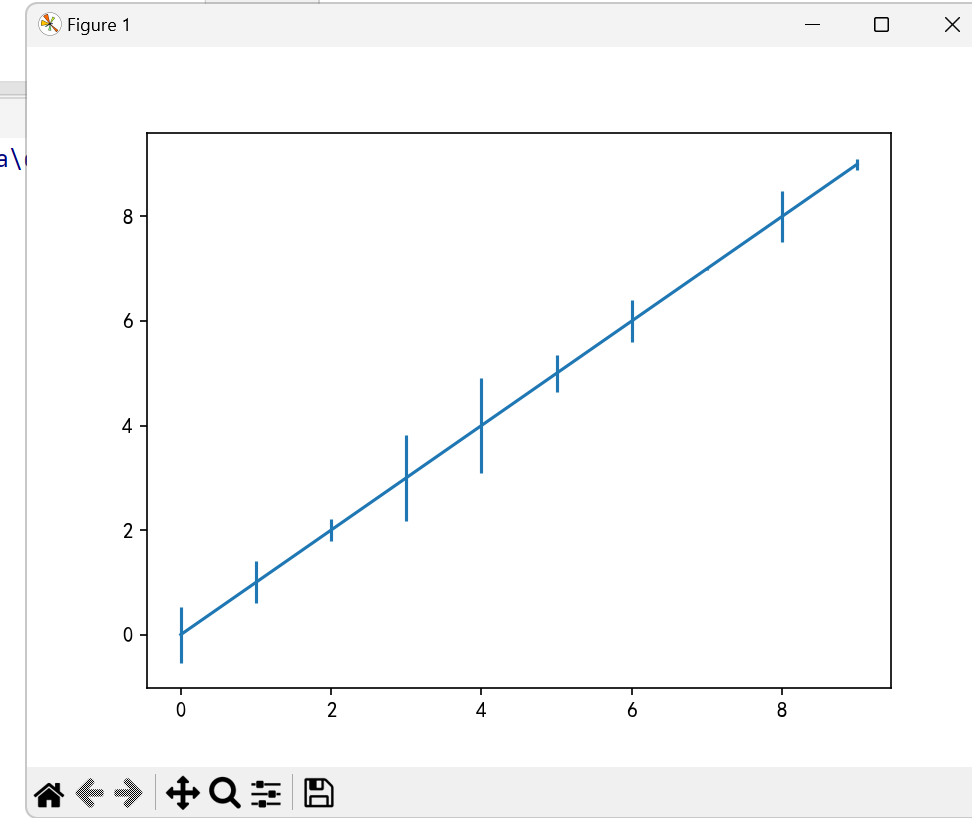
绘制误差棒图
import matplotlib.pyplot as plt
plt.rcParams['font.sans-serif'] = ['SimHei']  # 用来正常显示中文标签
plt.rcParams['axes.unicode_minus'] = False  # 用来正常显示负号
import numpy as np
import pandas as pd

error = np.random.rand(10)  # 定义误差列
y = pd.Series(np.arange(10))  # 均值数据列
y.plot(yerr = error)  # 绘制误差图
plt.show()


 浙公网安备 33010602011771号