
css基础-cnblog
1. 盒模型定义
-
css规范的一个模块
-
定义一个长方形的盒子
-
包含内外边距,边框
-
标准定义上分分类
- IE盒模型
- width=width+padding+border
- height=height+padding+border
- 标准盒模型
- width=width
- height=height
- IE盒模型
-
元素类型上分
- 块级盒子
- 内联盒子
2. BFC
-
块格式化上下文
-
BFC是一个完全独立的空间,这个空间里子元素的渲染不会影响到外面的布局
-
创建BFC为了解决的问题
-
外边距折叠
-
比如有两个box,box1,box2
-
其根标签为body,则box1和box2处于同一个BFC(body)
-
如果BOX1的下边距为60px,box2的上边距为50px,最终结果为两个盒子的上下边距为60px
-
解决方法
- 使box1和box2处于不同的BFC
- 如给box2套一层容器,容器设置样式(overflow:hidden,这个是创建一个BFC的一种方法)
-
-
父元素高度塌陷
- 外层div
- 里层div ,设置float属性,脱离了文档流,父元素的宽度不会因为里元素设置的宽度撑开
- 解决
- 父元素创建BFC
- 外层div
2.1 创建BFC的方法
-
display:table-cell
-
display:flex
-
display:inline-block
-
overflow:hidden
-
position:absolute
-
position:fixed
3. 选择器
- 选择元素来设置颜色
3.1 伪类选择器和伪元素选择器
- 伪类选择器,选择已有的dom,hover,first-child,nth-type
- 伪元素选择器:创建原本在dom树中不存在的元素,::after,::before
4. 三栏布局的实现
- 场景,左侧导航,右侧内容
4.1 浮动布局实现
<!DOCTYPE html>
<html lang="en">

<head>

  <meta charset="UTF-8">
  <meta http-equiv="X-UA-Compatible" content="IE=edge">
  <meta name="viewport" content="width=device-width, initial-scale=1.0">
  <title>CSS
    实现三栏布局
    -
    浮动布局
  </title>
  <style>
    * {
      margin:
        0px;
      padding:
        0px;
    }

    div {
      height:
        100px;
    }


    .left {
      float:
        left;
      width:
        100px;
      background:
        red;
    }

    .center {
      background:
        green;
      /* width: 100px; */
      /* text-align: center; */

      overflow: hidden;

      /* display: inline-block; */
    }

    .right {
      width:
        100px;
      float:
        right;

      background:
        blue;
    }
  </style>
</head>

<body>

  <div class="left">left</div>

  <div class="right">right</div>
  <div class="center">center</div>

</body>

</html>
注意点
- DOM树中 left 和 right 浮动盒子必须先写,center最后写,如果center写中间(disblay为block ,会占据一行,设置display:inline-block 又不会继承父元素宽度),后面的right会到下一行
- 给center设置overflow:hidden,创建BFC,使center 不完全继承父元素的宽度,而是父元素宽度-right宽度-left宽度
4.2 table 布局实现
<!DOCTYPE html>
<html lang="en">

<head>
    <meta charset="UTF-8">
    <meta http-equiv="X-UA-Compatible" content="IE=edge">
    <meta name="viewport" content="width=device-width, initial-scale=1.0">
    <title>Document</title>

    <style>
        * {
            margin: 0px;
            padding: 0px;
        }

        div {
            /* height: 100px; */
            display: table-cell;
        }

        .box {
            width: 100%;
            height: 100px;
            /* table布局 */
            display: table;
        }

        .left {
            width: 100px;
            background: red;
        }

        .center {
            background: green;
            /* width: 100px; */
            /* text-align: center; */
            /* overflow: hidden; */
            /* display: inline-block; */
        }

        .right {
            width: 100px;
            background: blue;
        }
    </style>
</head>

<body>
    <div class="box">

        <div class="left"></div>
        <div class="center"></div>
        <div class="right"></div>
    </div>
</body>

</html>
- 即父容器设置display:table
- 子元素设置table-ceil
4.3 定位布局实现
<!DOCTYPE html>
<html lang="en">

<head>
    <meta charset="UTF-8">
    <meta http-equiv="X-UA-Compatible" content="IE=edge">
    <meta name="viewport" content="width=device-width, initial-scale=1.0">
    <title>Document</title>

    <style>
        * {
            margin: 0px;
            padding: 0px;
        }

        div {
            height: 100px;
            position: absolute;
        }

        .box {
            width: 100%;
            height: 100px;
            position: relative;
        }

        .left {
            width: 100px;
            left: 0px;
            background: red;
        }

        .center {
            background: green;
            /* 拉伸 */
            left: 100px;
            right: 100px;
        }

        .right {
            width: 100px;
            right: 0px;
            background: blue;
        }
    </style>
</head>

<body>
    <div class="box">

        <div class="left"></div>
        <div class="center"></div>
        <div class="right"></div>
    </div>
</body>

</html>
- 子绝父相
- left left:0 ,right right:0,center right:100 left:100
4.4 flex布局实现
4.5 grid布局实现
<!DOCTYPE html>
<html lang="en">

<head>
    <meta charset="UTF-8">
    <meta http-equiv="X-UA-Compatible" content="IE=edge">
    <meta name="viewport" content="width=device-width, initial-scale=1.0">
    <title>Document</title>

    <style>
        * {
            margin: 0px;
            padding: 0px;
        }

        div {
            height: 100px;
        }

        .box {
            width: 100%;
            height: 100px;
            display: grid;
            /* fr代表自由(剩余空间)空间的宽度 */
            grid-template-columns: 100px 1fr 100px;
        }

        .left {
            background: red;
        }

        .center {
            background: green;
        }

        .right {
            background: blue;
        }
    </style>
</head>

<body>
    <div class="box">

        <div class="left"></div>
        <div class="center"></div>
        <div class="right"></div>
    </div>
</body>

</html>
- 父元素设置 display: grid;
/* fr代表自由(剩余空间)空间的宽度 */
grid-template-columns: 100px 1fr 100px;
5. 左边定宽,右边宽度自适应的实现
5.1 float+calc
<!DOCTYPE html>
<html lang="en">

<head>
    <meta charset="UTF-8">
    <meta http-equiv="X-UA-Compatible" content="IE=edge">
    <meta name="viewport" content="width=device-width, initial-scale=1.0">
    <title>Document</title>

    <style>
        * {
            margin: 0;
            padding: 0;
        }

        .box-wrapper {
            width: 1200px;
            height: 400px;
            border: 1px solid #000;
        }

        .left-box {
            float: left;
            width: 200px;
            height: 100%;
            background: red;
            /* display: inline-block; */
        }

        .right-box {
            float: right;
            width: calc(100% - 200px);
            height: 100%;
            background: blue;
            /* display: inline-block; */
        }
    </style>
</head>

<body>
    <div class="box-wrapper">
        <div class="left-box">
            left-box
        </div>
        <div class="right-box">
            right-box
        </div>
    </div>
</body>

</html>
- left 盒子 200px left浮动
- right 盒子 calc(100%-200px) right浮动
缺点
- 不是严格意义上的自适应
- calc(100%-200px) 注意200px写死了,如果left盒子的width200变成100,右边宽度不会发生变化
5.2 inline-block+calc
- left 和 right 盒子都display:inline-block
- right盒子 calc(100%-200px)
缺点
- 不是严格意义上的自适应
- calc(100%-200px) 注意200px写死了,如果left盒子的width200变成100,右边宽度不会发生变化
5.3 position +padding
- 父元素 relative
- left盒子 absloute width:200px
- right盒子 padding-left:200px(标准盒模型,padding会计算)
- 因为定位盒子的层级较高,所以出现left定宽,right自适应的效果
5.4 flex
5.5 table
- 父元素display:table
- left盒子 width:200px display:table-ceil
- right盒子,不设置宽度,display:table-ceil
5.6 grid
- 父元素 display:grid grid-template-columns:200px auto(1fr)
6.绝对居中
场景
-
登录框
-
定宽高
- 子绝父相+负margin
- 子盒子 left:50% top:50% margin-left:-自身width一半,margin-top:- 自身height 一半
- 子绝父相+margin:auto
- 子盒子 left:0 right:0 top:0 bottom:0 , margin:auto
- 子绝父相+负margin
-
不定宽高
-
绝对定位+translation
-
table-ceil
-
父元素
-
display: table-cell;
      vertical-align: middle;
      text-align: center;
-
-
子元素
-
display:inline-block
-
-
-
flex布局
-
父元素
-
/* 关键因素 */
      display: flex;
      justify-content: center;
      align-items: center;
-
-
7.清除浮动
- 场景
- 父元素高度塌陷
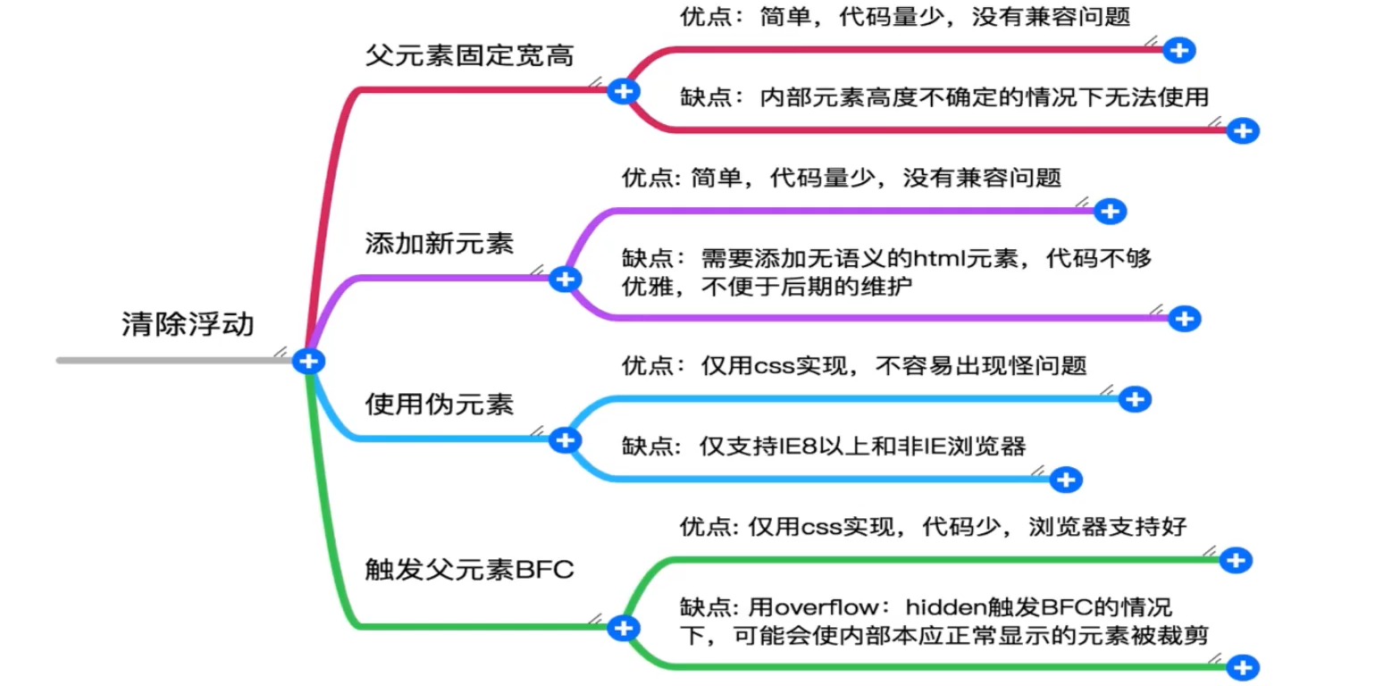
7.2 添加新元素
- 注意后方添加
<!-- 添加一个空元素,利用css提供的clear:both清除浮动 -->
        <div class="clear-element"></div>
- css
- clear:both,当前元素的左右两边的元素都看成非浮动元素,清除对自己的影响
.clear-element{
    clear:both;
}
7.3 伪元素
- 使用伪元素选择器创建新元素,添加样式,clear:both
/* 对父元素添加伪元素 */
    .box-container::after{
      content: "";
      display: block;
      height: 0;
      clear:both;
    }
7.4 双伪元素清除法
- 父元素添加clearfix
- 兼容性更好
.clearfix:before,
        .clearfix:after {
            display: table;
            content: "";
        }

        .clearfix:after {
            clear: both;
        }

        .clearfix {
            zoom: 1
        }
8.css画三角形
- 没有图片
- 盒模型没有三角形的
- 下拉菜单的箭头
<!DOCTYPE html>
<html lang="en">
<head>
  <meta charset="UTF-8">
  <meta http-equiv="X-UA-Compatible" content="IE=edge">
  <meta name="viewport" content="width=device-width, initial-scale=1.0">
  <title>Document</title>
  <style>
    .triangle {
      border: 10px solid transparent;
      border-left: 10px solid #f40;
    }
  </style>
  <div class="triangle"></div>
</body>
</html>

 浙公网安备 33010602011771号