Python学习笔记(matplotlib实战篇)--散点,条形图
Python学习笔记--散点,条形图
参靠视频:《Python数据可视化分析 matplotlib教程》链接:https://www.bilibili.com/video/av6989413/?p=6
所用的库及环境:
IDE:Pycharm
Python环境:python3.7
Matplotlib: Matplotlib 1.11
Numpy: Numpy1.15
散点,条形图
- 前言
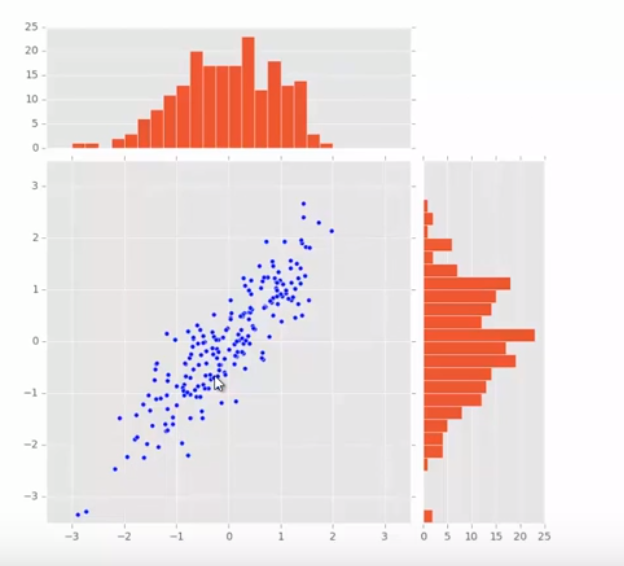
- 画出如下图形
- 第一步构造三个图的位置,确定大概构图

- 代码及效果图
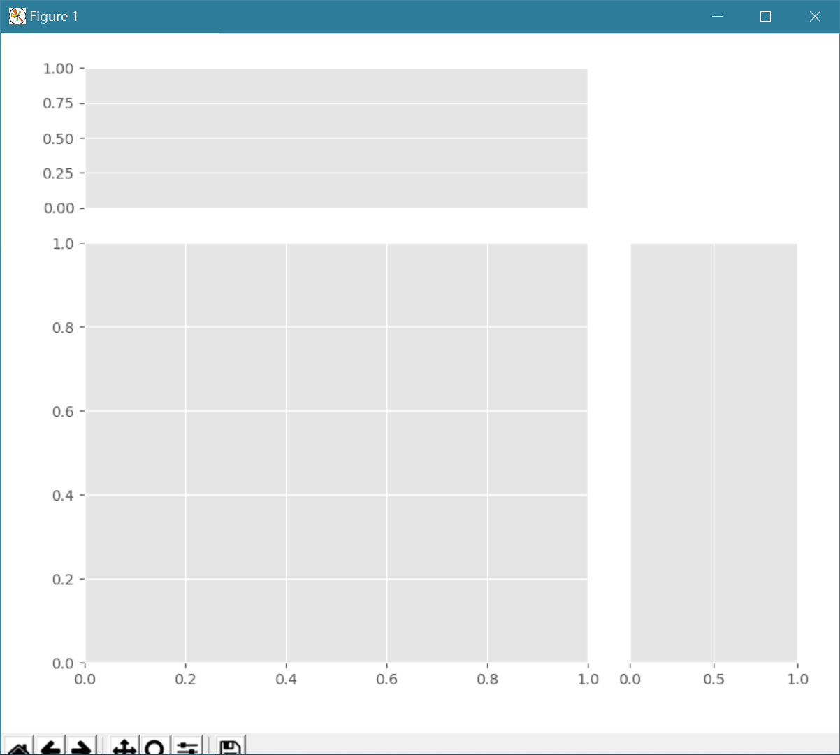
 1 import numpy as np
 2 import matplotlib.pyplot as plt
 3
 4 plt.style.use('ggplot')
 5
 6 x= np.random.rand(200)
 7 y = x+np.random.rand(200)*0.5
 8
 9 margin_border = 0.1
10 width = 0.6
11 height = 0.2
12 margin_between = 0.05
13
14 #构造左下角方形图坐标
15 left_s = margin_border
16 bottom_s = margin_border
17 height_s= width
18 width_s = width
19
20 #构造上方条形图坐标
21 left_x = margin_border
22 bottom_x =margin_border+width+margin_between
23 height_x = height
24 width_x = width
25
26 #构造右边方形的坐标
27 left_y = bottom_x
28 bottom_y = margin_border
29 height_y = width
30 width_y = height
31
32 plt.figure(1,figsize=(8,8))#把画布调整为正方形
33
34 rect_s = [left_s, bottom_s,width_s, height_s]
35 rect_x = [left_x, bottom_x,width_x, height_x]
36 rect_y = [left_y, bottom_y,width_y, height_y]
37
38 axScatter = plt.axes(rect_s)
39 axHisX = plt.axes(rect_x)
40 axHisY = plt.axes(rect_y)
41
42 axHisX.set_xticks([])
43 axHisY.set_yticks([])
44 plt.show()
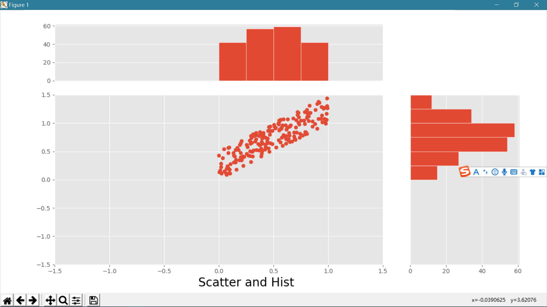
- 第二步开始绘制图形
全部代码及效果图
 1 import numpy as np
 2 import matplotlib.pyplot as plt
 3
 4 plt.style.use('ggplot')
 5
 6 x= np.random.rand(200)
 7 y = x+np.random.rand(200)*0.5
 8
 9 margin_border = 0.1
10 width = 0.6
11 height = 0.2
12 margin_between = 0.05
13
14 #构造左下角方形图坐标
15 left_s = margin_border
16 bottom_s = margin_border
17 height_s= width
18 width_s = width
19
20 #构造上方条形图坐标
21 left_x = margin_border
22 bottom_x =margin_border+width+margin_between
23 height_x = height
24 width_x = width
25
26 #构造右边方形的坐标
27 left_y = bottom_x
28 bottom_y = margin_border
29 height_y = width
30 width_y = height
31
32 plt.figure(1,figsize=(10,10))#把画布调整为正方形
33
34 rect_s = [left_s, bottom_s,width_s, height_s]
35 rect_x = [left_x, bottom_x,width_x, height_x]
36 rect_y = [left_y, bottom_y,width_y, height_y]
37
38 axScatter = plt.axes(rect_s)
39 axHisX = plt.axes(rect_x)
40 axHisY = plt.axes(rect_y)
41
42 axHisX.set_xticks([])
43 axHisY.set_yticks([])
44
45 axScatter.scatter(x,y)
46
47 bin_Width = 0.25
48
49 xymax = np.max([np.max(np.fabs(x)),np.max(np.fabs(y))])
50 lim = int(xymax/bin_Width+1)*bin_Width#得出精确的宽度值
51 axScatter.set_xlim(-lim,lim)
52 axScatter.set_ylim(-lim,lim)
53
54 bins = np.arange(-lim,lim+bin_Width,bin_Width)
55 axHisX.hist(x,bins=bins,edgecolor = 'w')
56 axHisY.hist(y,bins=bins,orientation='horizontal',edgecolor = 'w')
57
58 axHisX.set_xlim(axScatter.get_xlim())
59 axHisY.set_ylim(axScatter.get_ylim())
60
61 plt.title('Scatter and Hist',x=-1.5,y = -0.15,fontsize = 20)
62
63 plt.show()
- 具体想深入学习的请参考视频:https://www.bilibili.com/video/av6989413/?p=29(没错,就是我懒得写了)
三.结语:
感谢matplotlib,numply提供的文档,感谢麦子学院提供的视频教学

 浙公网安备 33010602011771号