Day7
一、Filter Property——过滤器属性
|
blur(x) 模糊
|
用x个像素模糊图像 |
|
brightness(x) 亮度
|
在1.0或100%以上的任何值上照亮图像。在这下面,图像将被变暗。 |
|
contrast(x) 对比度
|
在任何1.0或100%以上的值下提供与图像更多的对比度。在这个下面,图像将会变得不那么饱和。 |
|
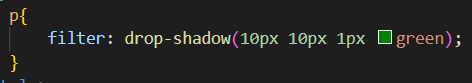
drop-shadow(h, v, x, y, z) 滴阴影(h,v,x,y,z)
|
给图像一个阴影。h和v可以有负值。x、y和z都是可选的。 |
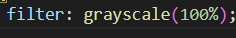
| greyscale(x) 灰度 | 以灰度显示图像,最大值为1.0或100%。 |
|
hue-rotate(x) 色调旋转(x)
|
对图像应用色调旋转。 |
| invert(x) 反转 | 在最大值为1.0或100%时反转图像的颜色 |
| opacity(x) | 设置图像的不透明/透明程度,最大值为1.0或100% |
| saturate(x) | 以1.0或100%以上的任何值饱和图像。在这下面,图像将开始去饱和。 |
| sepia(x) | 将图像转换为深褐色,最大值为1.0或100% |
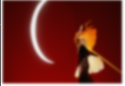
1、Blur——模糊
代码:(0——>4px——>1.5rem模糊程度越来越大)
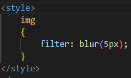
实现:
2、Drop Shadow (use box-shadow instead if possible)
代码:
实现:

3、Grayscale
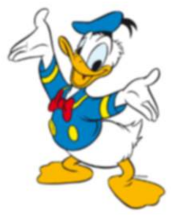
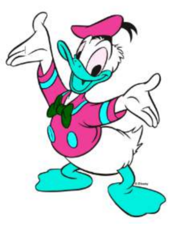
4、 Hue Rotate——色彩旋转
代码:
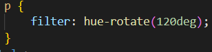
实现:
5、 Invert Color ——反转颜色
代码:
width: 100px;
height: 100px;
background-color: white;
filter: invert(100%);
实现:
白色变成了黑色
二、Box-shadow——边框阴影
|
inset
|
默认情况下,阴影被视为投影阴影。插入的关键字将绘制框架/边框内的阴影。 |
|
offffset-x 偏移-x
|
水平距离 |
|
offffset-y 偏移-y
|
垂直距离 |
|
blur-radius 模糊半径
|
默认值为0。值不能为负值。价值越大,阴影就越大、越轻。 |
|
spread-radius 扩散半径
|
默认值为0。正值将会导致阴影展开。负值将导致阴影缩小。 |
|
color
|
可以有各种符号:一个颜色关键字,十六进制,rgb(),rgba(),hsl(),hsla() |
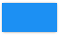
1、bottom-only drop shadow using a pseudo——只使用伪元素下阴影
<style>
       .box_shadow{
        background-color: #1C90F3;
        width: 200px;
        height: 100px;
        margin: 50px;
       }

       .box_shadow{
        counter-reset: "";
        width: 190px;
        height: 100px;
        margin-top :98px;
        margin-left: 5px;
        display: block;
        position: absolute;
        z-index: -1;
        box-shadow:0px 0px 8px 2px #444444
}
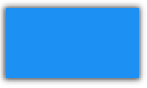
2、drop shadow——阴影
只需要将上面的代码中的box-shadow中的最后一个改为-2px阴影就消失了。
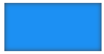
3、inner drop shadow——内落影
4、multiple shadows——多个隐形
代码:
<style>
        .box_shadow {
            width: 200px;
            height: 100px;
            margin: 50px;
            box-shadow: -52px -52px 0px 0px #f65314,
                52px -52px 0px 0px #7cbb00,
                -52px 52px 0px 0px #00a1f1,
                52px 52px 0px 0px #ffbb00;
        }
</style>
实现:
三、Shapes for Floats
1、 Shape Outside with Basic Shape – circle()
代码:
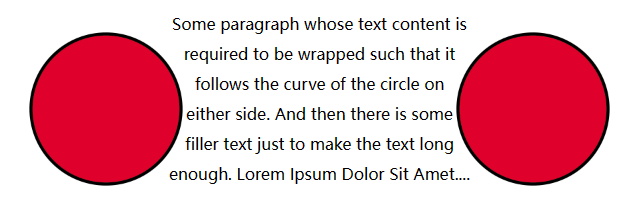
<head>
    <meta charset="utf-8">
    <style>
        img:nth-of-type(1) {
            shape-outside: circle(80px at 50% 50%);
            float: left;
            width: 200px;
        }

        img:nth-of-type(2) {
            shape-outside: circle(80px at 50% 50%);
            float: right;
            width: 200px;
        }

        p {
            text-align: center;
            line-height: 30px;
        }
    </style>
</head>

<body>
    <img src="http://images.clipartpanda.com/circle-clip-art-circlergb.jpg">
    <img src="http://images.clipartpanda.com/circle-clip-art-circlergb.jpg">
    <p>Some paragraph whose text content is required to be wrapped such that it follows the curve of
        the circle on either side. And then there is some filler text just to make the text long enough.
        Lorem Ipsum Dolor Sit Amet....</p>
</body>
实现:
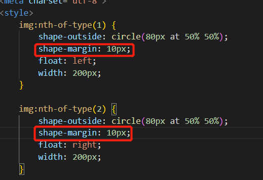
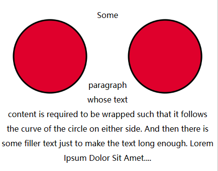
2、Shadow margin——形状边缘
代码:在上面的代码基础上增加了下面一行代码。
实现:
四、Functions——函数
1、calc() function ——计算函数
代码:
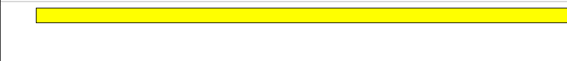
<head>
    <meta charset="utf-8">
    <style>
        #div1 {
            position: absolute;
            left: 50px;
            width: calc(100% - 100px);
            border: 1px solid black;
            background-color: yellow;
            padding: 10px;
            text-align: center;
        }
    </style>
</head>

<body>
    <div id="div1"></div>
</body>
实现:一个横跨屏幕的div,div 两边有 10px 的间隙:
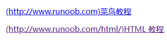
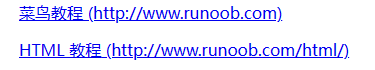
2、attr() function
这个函数的作用是返回所选元素的一个属性值
代码:
<style>
a:before {content: " (" attr(href) ")";}
</style>
</head>

<body>
<p><a href="http://www.runoob.com">菜鸟教程</a></p>
<p><a href="http://www.runoob.com/html/">HTML 教程</a></p>
</body>
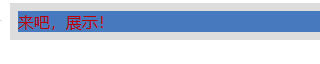
实现:当before换成after。页面展示如下图右边所示
五、Custom Properties (Variables)——自定义属性(变量)
1、 Variable Color ——可变颜色
代码:通过在root里面定义属性,然后在对应的标签里面引用定义的属性,就可以直接将自定义的属性用到上面
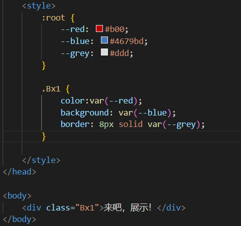
实现:
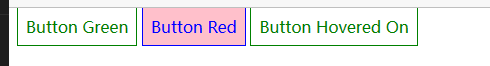
2、Variable Cascading ——可变级联
代码:在style里面有个代码是,标签后面是:hover。这个代码的意思是光标移到该布局位置才会有变化。真狗啊
<head>
    <meta charset="utf-8">
    <style>
        .button {
            --color: green;
            padding: .5rem;
            border: 1px solid var(--color);
            color: var(--color);
        }

        .button:hover{
            --color: blue;
            background-color: pink;
        }

        .button_red {
            --color: red;
        }
    </style>
</head>

<body>
    <a class="button">Button Green</a>
    <a class="button button_red">Button Red</a>
    <a class="button ">Button Hovered On</a>
</body>
实现:
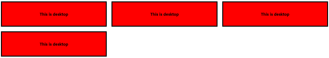
3、With media queries——与媒体查询
代码:
<head>
    <meta charset="utf-8">
    <style>
        :root {
            --width: 25%;
            --content: 'This is desktop';
        }

        @media only screen and (max-width: 767px) {
            :root {
                --width: 50%;
                --content: 'This is mobile';
            }
        }

        @media only screen and (max-width: 480px) {
            :root {
                --width: 100%;
            }
        }

        div {
            width: calc(var(--width) - 20px);
            height: 100px;
        }

        div:before {
            content: var(--content);
        }

        body {
            padding: 10px;
        }

        div {
            display: flex;
            align-items: center;
            justify-content: center;
            font-weight: bold;
            float: left;
            margin: 10px;
            border: 4px solid black;
            background: red;
        }
    </style>
</head>

<body>
    <div></div>
    <div></div>
    <div></div>
    <div></div>
</body>
实现:
六、Single Element Shapes——单个元素形状
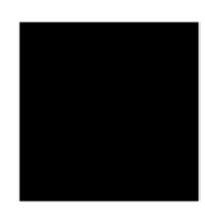
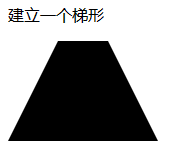
1、梯形
代码:
<head>
        <meta charset="utf-8">
        <style>
            .trapezoid{
                width: 50px;
                height: 0;
                border-left: 50px solid transparent;
                border-right:50px solid transparent;
                border-bottom: 100px solid black;
            }
        </style>
    </head>

    <body>
        <p>建立一个梯形</p>
        <div class="trapezoid"></div>
    </body>
实现:
2、三角形

代码:
<head>
    <meta charset="utf-8">
    <style>
        .trapezoid {
            width: 0;
            height: 0;
            border-left: 25px solid transparent;
            border-right: 25px solid transparent;
            border-bottom: 50px solid rgb(246, 156, 85);
        }
    </style>
</head>

<body>
    <div class="trapezoid"></div>
</body>
3、Circles and Ellipses——圆和椭圆
圆:
.circle {
 width: 50px;
 height: 50px;
 background: rgb(246, 156, 85);
 border-radius: 50%;
}
将高转换为80后,就是椭圆了。

 浙公网安备 33010602011771号