


flex布局设置主页
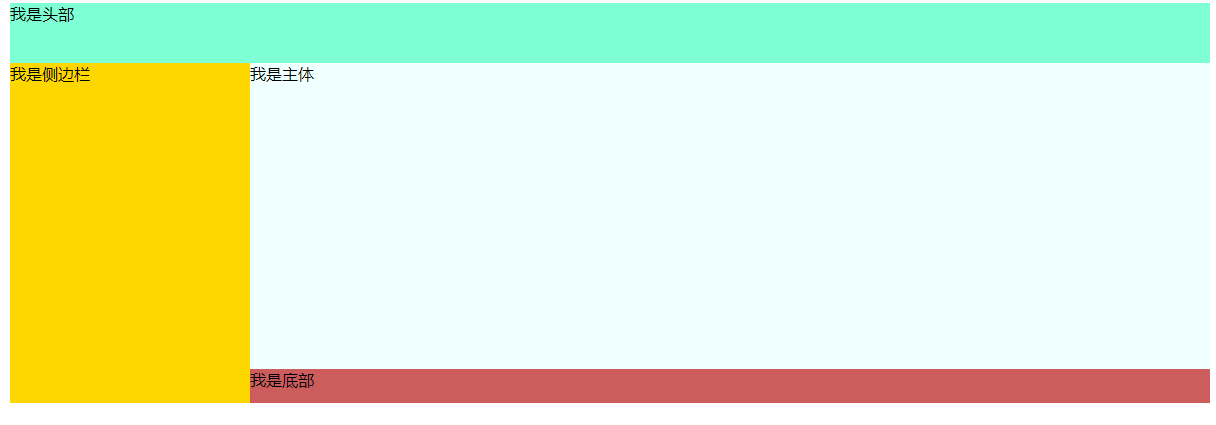
实现此类效果:(flex)
代码:
<!DOCTYPE html>
<html lang="en">
  <head>
    <meta charset="UTF-8" />
    <meta http-equiv="X-UA-Compatible" content="IE=edge" />
    <meta name="viewport" content="width=device-width, initial-scale=1.0" />
    <title>flex布局</title>
    <style>
      .content {
        display: flex;
        width: 1200px;
        background-color: pink;
        height: 400px;
        margin: auto;
        flex-direction: column;
      }
      .head {
        width: 100%;
        flex: 0 0 15%;
        background-color: aquamarine;
        align-content: flex-start;
      }
      .body1 {
        width: 100%;
        flex: 1;
        /* background-color: blue; */
        display: flex;
      }
      .aside {
        flex: 0 0 20%;
        background-color: gold;
      }
      .body2 {
        flex: 0 0 80%;
        /* background-color: blueviolet; */
        display: flex;
        flex-direction: column;
      }
      .main {
        flex: 0 0 90%;
        background-color: azure;
      }
      .footer {
        flex: 0 0 10%;
        background-color: indianred;
      }
    </style>
  </head>
  <body>
    <div class="content">
      <div class="head">我是头部</div>
      <div class="body1">
        <div class="aside">我是侧边栏</div>
        <div class="body2">
          <div class="main">我是主体</div>
          <div class="footer">我是底部</div>
        </div>
      </div>
    </div>
  </body>
</html>

 浙公网安备 33010602011771号