
利用CSS3画一个正方体
transform属性
CSS3的变形(transform)属性让元素在一个坐标系统中变形。transform属性的基本语法如下:
transform:none | <transform-function> [<transform-function>]*
2Dtransform常用的transform-function的功能:
translate():用来移动元素,可以根据X轴和Y轴坐标重新定位元素位置。在此基础上有两个扩展函数:translateX()和translateY()。
scale():用来缩小或放大元素,可以使用元素尺寸发生变化。在此基础上有两个扩展函数:scaleX()和scaleY()。
rotate():用来旋转元素。
skew():用来让元素倾斜。在此基础上有两个扩展函数:skewX()和skewY()。
matrix():定义矩阵变形,基于X轴和Y轴坐标重新定位元素位置。
3D transform常用的transform-function的功能:
translate3d():移动元素,用来指定一个3D变形移动位移量。
translatez():指定3D位移在Z轴的位移量。
scale3d():用来缩放一个元素。
scaleZ():指定Z轴的缩放向量。
rotate3d():指定元素具有一个三维旋转的角度。
rotateX()、rotateY()和rotateZ():让元素具有一个旋转角度。
perspective():指定一个透视投影矩阵。
matrix3d():定义矩阵变形。
一些重要属性:
transform-origin属性指定元素的中心点在哪。后面增加了第三个数transform-origin-z,控制元素三维空间中心点。
perspective属性相对于观众产生一个3D场景,看3D物体,眼睛到画布的距离。 它需要应用到变形元素的祖先元素上。
perspective-origin为视点的位置。
backface-visibilty属性用来设置背面的可见性。
设置transform-style的值为preserve-3d时,建立一个3D渲染环境。
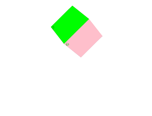
案例:利用transform来写一个正方体
/* CSS */
body {
-webkit-perspective: 500;
}

.box {
width: 100px;
height: 100px;
position: relative;
margin: 100px auto 0;
transform-style: preserve-3d;
animation: flash 3s linear infinite;
}

.box:hover > div:nth-of-type(1){
transform: translateZ(-200px);
}
.box:hover > div:nth-of-type(2){
transform: rotateX(90deg) translateZ(200px);
}
.box:hover > div:nth-of-type(3){
transform: rotateX(90deg) translateZ(-200px);
}
.box:hover > div:nth-of-type(4){
transform: rotateY(90deg) translateZ(200px);
}
.box:hover > div:nth-of-type(5){
transform: rotateY(90deg) translateZ(-200px);
}
.box:hover > div:nth-of-type(6){
transform: translateZ(200px);
}

@keyframes flash {
0%{ transform: rotateX(0) rotateX(0); }
100%{ transform: rotate(360deg) rotateX(360deg); }
}

.box>div {
width: 100px;
height: 100px;
position: absolute;
transition: all 1s;
}

.box>div:nth-of-type(1){ background: lightblue; }
.box>div:nth-of-type(2){ background: lime; }
.box>div:nth-of-type(3){ background: lightseagreen; }
.box>div:nth-of-type(4){ background: orange; }
.box>div:nth-of-type(5){ background: darkorchid; }
.box>div:nth-of-type(6){ background: pink; }

.box>div:nth-of-type(1){ transform: translateZ(-50px); }
.box>div:nth-of-type(2){ transform: rotateX(90deg) translateZ(50px); }
.box>div:nth-of-type(3){ transform: rotateX(90deg) translateZ(-50px); }
.box>div:nth-of-type(4){ transform: rotateY(90deg) translateZ(50px);}
.box>div:nth-of-type(5){ transform: rotateY(90deg) translateZ(-50px);}

.box>div:nth-of-type(6){ transform: translateZ(50px); }
<!--HTML-->
<div class="box">
<div>1</div>
<div>2</div>
<div>3</div>
<div>4</div>
<div>5</div>
<div>6</div>
</div>

 浙公网安备 33010602011771号