flex实现三栏等分布局
前言
在实际开发中,我们经常会想要实现的一种布局方式就是三栏等分布局,那么我们如何来解决这个问题呢?
解决
方法一:flex
外层容器也就是ul设置display:flex,对项目也就是li设置flex:auto,代表 flex: 1 1 auto
<style>
        * {
            list-style: none;
            border: 0;
            padding: 0;
            margin: 0
        }
        ul {
            width: 500px;
            height: 200px;
            background: red;
            display: flex;
            margin: auto;
            margin-top: 100px;
            padding: 0 10px;
            align-items: center;
        }
        li {
            background: green;
            height: 100px;
            width: 500px;
            display: inline-block;
            margin: 2px;
            line-height: 100px;
            text-align: center;
       flex: auto
        }

</style>
<body>
    <ul>
        <li>1</li>
        <li>2</li>
        <li>3</li>
    </ul>
</body>
效果图:
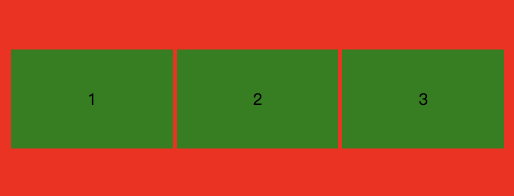
解析:我们注意到width的设置,外层ul是500,li也是500,但是实际看到的确实li平分了ul的宽度,这是因为设置了flex:auto,代表有剩余空间的话项目等分剩余空间放大,空间不足项目等比例缩小
方法二:flex
同上,只不过将flex设置为 1 1 33.33%
<style>
        * {
            list-style: none;
            border: 0;
            padding: 0;
            margin: 0
        }
        ul {
            width: 500px;
            height: 200px;
            background: red;
            display: flex;
            margin: auto;
            margin-top: 100px;
            padding: 0 10px;
            align-items: center;
        }
        li {
            background: green;
            height: 100px;
            width: 500px;
            display: inline-block;
            margin: 2px;
            line-height: 100px;
            text-align: center;
        flex: 1 1 33.33%;
        }

</style>
<body>
    <ul>
        <li>1</li>
        <li>2</li>
        <li>3</li>
    </ul>
</body>
效果图:

 浙公网安备 33010602011771号