


java:CSS(定位,组合选择符,边距,Float,Table的样式,显示和隐藏,换行,盒子模型,iframe和frameset框架)
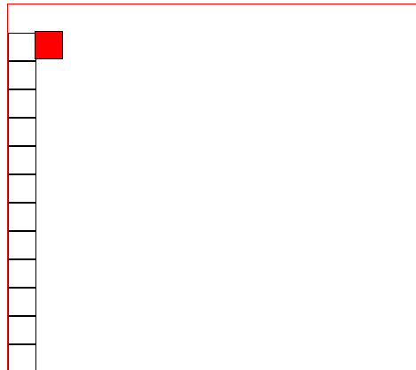
1.绝对定位,相对定位,fixed定位(指浏览器窗口定位):
<!DOCTYPE html>
<html>
    <head>
        <meta charset="UTF-8">
        <title>定位:绝对定位和相对定位</title>
        <style>
            #div1 {
                border: 1px solid black;
                width: 30px;
                height: 30px;
                /* 定位1:fixed 指定位到浏览器窗口某个位置,页面上下动,它一只存在于窗口某个位置*/
                /*position: fixed;*/
                /* 定位2:relative  相对定位,以纵向为x轴进行移动,定义到网页的某个位置不会动 */
                position: relative;
                /* 定位3:absolute  绝对定位,以网页的上下左右为原点,定位到网页的某一个地方不会动*/
                /*position: absolute;*/
                top: 30px;
                left: 30px;

                background: red;
            }
            .div2 {
                border: 1px solid black;
                width: 30px;
                height: 30px;
            }
        </style>
    </head>
    <body>
        <div style="border: 1px solid red; width: 1000px; height: 800px;">
        <div id="div1"></div>
        <div class="div2"></div>
        <div class="div2"></div>
        <div class="div2"></div>
        <div class="div2"></div>
        <div class="div2"></div>
        <div class="div2"></div>
        <div class="div2"></div>
        <div class="div2"></div>
        <div class="div2"></div>
        <div class="div2"></div>
        <div class="div2"></div>
        <div class="div2"></div>
        <div class="div2"></div>
        <div class="div2"></div>
        <div class="div2"></div>
        <div class="div2"></div>
        <div class="div2"></div>
        <div class="div2"></div>
        <div class="div2"></div>
        <div class="div2"></div>
        <div class="div2"></div>
        <div class="div2"></div>
        <div class="div2"></div>
        </div>
    </body>
</html>
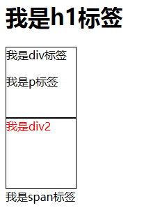
2.组合选择符(后代,子元素,兄弟,后续选择器):
<!DOCTYPE html>
<html>
    <head>
        <meta charset="UTF-8">
        <title>选择器*</title>
        <style type="text/css">
            #div1{
                border: 1px solid black;
                width: 100px;
                height: 100px;
            }
            #div2{
                border: 1px solid black;
                width: 100px;
                height: 100px;
            }

            /* 后代选择器 */
            /*div p {
                color: red;
            }*/

            /* 子选择器  > */
            /*div>p {
                color:blue;
            }*/
            /* 兄弟选择器  + 首先:两个元素必须是相邻的,然后通过上面的标签+下面的标签,反之没有效果,必须是同级标签*/
            /*#div1+#div2{
                color: red;
            }*/
            /* 后续兄弟选择器 ~:可以选中所有的兄弟元素,可以跳级,必须为同级标签 */
            h1~#div2 {
                color:red;
            }
        </style>
    </head>
    <body>

        <h1>我是h1标签</h1>
        <div id="div1">我是div标签
            <p id="p1">我是p标签</p>
        </div>
        <div id="div2">我是div2</div>
        <span>我是span标签</span>
    </body>
</html>
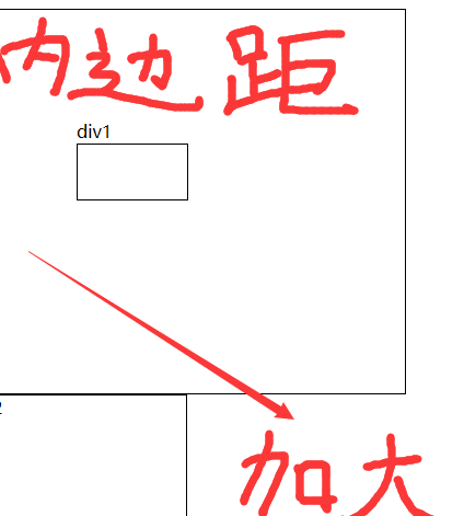
3.外边距(Margin)和内边距(Padding):
<!DOCTYPE html>
<html>
    <head>
        <meta charset="UTF-8">
        <title>padding:填充(内边距)</title>
        <style>
            /*  */
            #div1 {
                /*padding: 30px;*/
            }
            #div2 {
                padding: 100px;
                /*margin: 20px;*/
            }

        </style>
    </head>
    <body>

        <div id="div2" style="height: 150px; width: 200px; border: 1px solid black;">div1
            <div id="div1" style="height:50px; width: 100px; border: 1px solid black;"></div>
        </div>


    </body>
</html>
操作的div2:
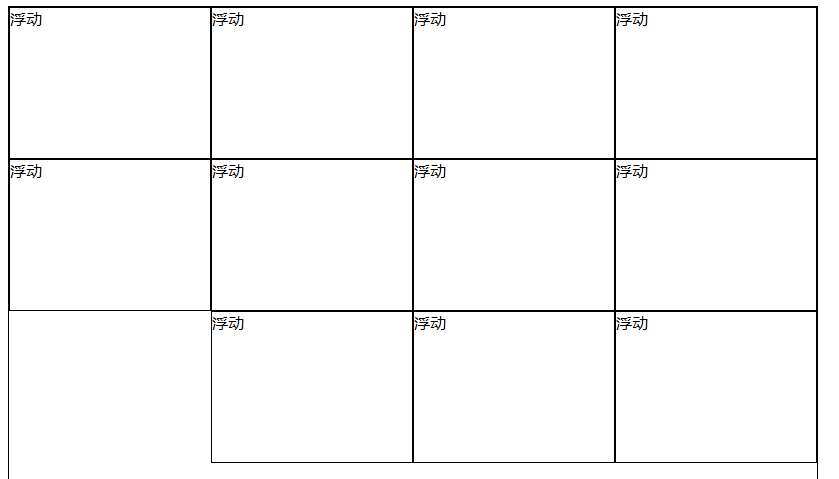
4.Float(浮动):
<!DOCTYPE html>
<html>
    <head>
        <meta charset="UTF-8">
        <title>float:浮动</title>
        <style>
            .div1 {
                width: 200px;
                height: 150px;
                border: 1px solid black;
                float: right;/* 如果一旦设置了浮动,而且浮动自动换行了,放不下了 */
            }
        </style>
    </head>
    <body>
        <div id="big_div" style="width: 808px; border: 1px solid black; height: 820px;">
            <div class="div1">浮动</div>
            <div class="div1">浮动</div>
            <div class="div1">浮动</div>
            <div class="div1">浮动</div>
            <div class="div1">浮动</div>
            <div class="div1">浮动</div>
            <div class="div1">浮动</div>
            <div class="div1">浮动</div>
            <div class="div1">浮动</div>
            <div class="div1">浮动</div>
            <div class="div1">浮动</div>
        <div>
    </body>
</html>
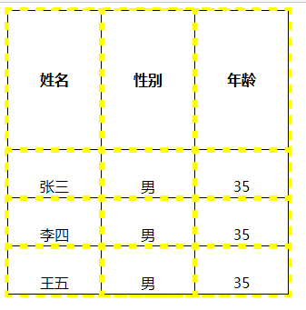
5.Table的样式:
<!DOCTYPE html>
<html>
    <head>
        <meta charset="utf-8" />
        <title>table的样式</title>
        <style>
            /*table {
                border :  black 1px solid;
            }
            th {
                border :  black 1px solid;
            }
            td {
                border:1px solid black;
            }*/
            table, th, td {
                /* border属性中: 1px代表边框的粗细,solid:代表实线,black:代表边框的颜色 */
                border:1px solid black;
                /*border-style: dashed;*/
                border-collapse: collapse;/* 折叠边框 */
                /* 轮廓 */
                outline-color: yellow;
                outline-style: dashed;/* --> outline:dashed;*/
                /*outline-width: 10px;*//* 轮廓的宽度就定义了外部轮廓粗细,并没有高度这个属性 */
                /*width: 100%;*//* 宽度 :单位可以用像素px,可以百分比(这里的百分比是相对于整个页面的)*/
                /*height: 100%;*//* 高度:单位可以用像素px,可以用百分比(这里的百分比是相对于每一行的数值) */
            }
            /* 如果单独给标题和内容设置宽度,谁设置的宽度大就以哪个为准,如果单独设置了高度,互不影响  */
            /*th {
                width: 100px;
            }
            td {
                width: 150px;
            }*/
            /* 在表格的标题和内容中,标题文字默认居中并加粗,内容默认左对齐 */
            th {
                height: 150px;
            }
            td {
                width: 100px;
                height: 50px;
                text-align: center;
                vertical-align: bottom;/* 垂直对齐 */
            }
        </style>
    </head>
    <body>


        <table>
            <thead>
                <tr>
                    <th>姓名</th>
                    <th>性别</th>
                    <th>年龄</th>
                </tr>
            </thead>

            <tbody>

                <tr>
                    <td>张三</td>
                    <td>男</td>
                    <td>35</td>
                </tr>
                <tr>
                    <td>李四</td>
                    <td>男</td>
                    <td>35</td>
                </tr>
                <tr>
                    <td>王五</td>
                    <td>男</td>
                    <td>35</td>
                </tr>
            </tbody>
        </table>
    </body>
</html>
6.显示和隐藏,以及强制不换行和强制换行:
<!DOCTYPE html>
<html>
    <head>
        <meta charset="UTF-8">
        <title>显示和隐藏,以及强制换行和强制不换行</title>
        <style>
            #div1{
                border: 1px solid black;
                width: 200px;
                height: 150px;
                /*display: none;*//* 把某个标签隐藏,并不会占据页面的位置 */
                /*visibility: hidden;*//* 把某个标签隐藏,必须在页面上占据一定的位置 */
                display: inline-block;/* 强制不换行:把需要不换行的元素都要加上这一个属性 */
            }
            #div2{
                border: 1px solid black;
                width: 200px;
                height: 150px;
                display: inline-block;
                /*display: none;*/
                /*visibility: hidden;*/
            }
            #div3{
                border: 1px solid black;
                width: 200px;
                height: 150px;
                display: inline-block;
                /*display: none;*/
                /*visibility: hidden;*/
            }
            #span1 {
                display: block;/* 强制让某个元素换行,只需要在不换行的元素中添加display:block;就可以了 */
            }
        </style>
    </head>
    <body>
        <div id="div1"></div>
        <div id="div2"></div>
        <div id="div3"></div>
        <span id="span1">我是span,我不会换行</span>
        <span id="span2">我是span,我不会换行</span>
    </body>
</html>
7.盒子模型(BoxModel):
<!DOCTYPE html>
<html>
    <head>
        <meta charset="UTF-8">
        <title>box model</title>
        <style>
            #total {
                width: 100%;
                height: 800px;
                border: 1px solid black;
            }
            #header {
                width: 100%;
                height: 200px;
                border: 1px solid black;
            }
            #content {
                width: 100%;
                height: 500px;
                border: 1px solid black;
            }
            #footer {
                width: 100%;
                height: 100px;
                border: 1px solid black;
            }
            #left_bar {
                width:10%;
                height: 500px;
                border: 1px solid black;
                display: inline-block;
            }
            #right_bar {
                width:10%;
                height: 500px;
                border: 1px solid black;
                display: inline-block;
                float: right;
            }
        </style>
    </head>
    <body>

        <div id="total"><!-- 整体的div -->
            <div id="header">这里是header<!-- 这里就是header -->

            </div>
            <div id="content"><!-- 这里放的是内容 -->
                <div id="left_bar"></div><!-- 左侧导航 -->
                <div id="right_bar"></div><!-- 右侧导航 -->
            </div>
            <div id="footer">这里是放footer</div>
        </div>

    </body>
</html>

8.iframe框架:
<!DOCTYPE html>
<html>
    <head>
        <meta charset="UTF-8">
        <title>iframe框架</title>
    </head>
    <body>
        <iframe src="header.html" width="1350px" height="50px" frameborder="no" ></iframe><!-- frameborder:把iframe框架的边框给去掉 -->
    </body>
</html>
9.frameset框架:
<!DOCTYPE html>
<html>
    <head>
        <meta charset="UTF-8">
        <title>frameset框架</title>
    </head>
    <!-- frameset框架,不需要定义<body></body>标签 -->
    <frameset rows="100,*">
        <frame src="top.html" name="top" />
        <!-- rows="100,*" 100代表的就是头部的大小(有100行的大小) -->
        <frameset cols="200,*">
            <!-- rows="100,*"这里的*代表的就是下面整个一块(frameset):*就代表了自动适应整个屏幕的大小 -->
            <frame src="left.html" name="left" />
            <frame src="right.html" name="right" />
        </frameset>
    </frameset>
</html>

<!DOCTYPE>
<html>
    <head>
        <meta charset="UTF-8"></meta>
        <title></title>
        <script>

        </script>

    </head>


        <body>
            <ul>
                <li><a href="teacherManage.html" target="right">教师管理</a></li>
                <li>学生管理</li>

            </ul>
        </body>


</html>

 浙公网安备 33010602011771号