利用Python科学计算处理物理问题(和物理告个别)
背景:
- 2019年初由于尚未学习量子力学相关知识,所以处于自学阶段。浅显的学习了曾谨言的量子力学一卷和格里菲斯编写的量子力学教材。注重将量子力学的一些基本概念了解并理解。同时老师向我们推荐了Quantum Computation and Quantum Information 这本教材,了解了量子信息相关知识。
- 2019年暑假开始量子力学课程的学习,在导师的推荐下,从APS(美国物理学会)和AIP(美国物理联合会)下载了与量子纠缠(Quantum Discord)相关的著名的文献和会议报告,了解了量子信息的发展历程和一些杰出的理论。其中Unified View of Quantum and Classical Correlations 和Quantum Discord :A Measure of Quantumness of Correlations两篇文章影响最为深刻。对量子信息领域有了初步认识。
- 我也参加了相关的量子相关的报告,譬如12月18日陆朝阳教授的量子光学与量子计算背景和进程介绍,2019年10月9日郭光灿院士的《量子之问》,这些讲座都激发了我对量子计算、量子通信的兴趣。
- 我也利用空闲时间自学了python,掌握了实验编程所需要的基本技能,强化了自己在编程方面的知识,也学会部分LATEX进行论文编写。
- 在参加项目过程中,虽然对投身于人类探索未知及其佩服,但终究自知穷极一生也极难在物理基础领域做出杰出贡献,就此转向计算机,愿尽绵薄之力,用技术为社会做一些有价值有意义之事。
科学计算,利用python进行相关图像整理。学会了基本的3d图像,numpy,matpolib绘图工具。老实说一些底层的原理并不清楚,但还是可以总结一些经验教训的。
1. 绘制圆柱体,利用小技巧q/q,看似是1,实际上是生成了1的一个数组。

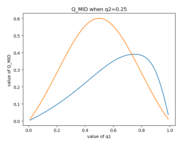
如上图,我们希望将这样的二维图像纵向拉伸变成类似于圆柱体一样的三维图像,与另外的图像进行对比,但没有找到相关方法,因为这是二维图像,想要实现三维立体图就需要有两个变量作为基底,而pAB是一个单变量函数,想要加入一个变量却不改变它最终的函数值似乎是不可能实现的。
我尝试用1去直接作为第二个变量,但执行无法通过,当时没有想明白。(后面会说明)
灵机一动,我尝试用q2的具体函数值去代替q2取遍0-1之间所有常数,直接乘个q2试试?然后就有了下图。但不行啊,想要q2取遍0-1所有值,又要q2在函数中显示,不好搞。

那,要不再除个q2试试???然后就卧槽了,成功了。???。当时就很迷惑,这个和直接乘1有什么区别? *q2/q2,不就是*1吗?然后分析发现,发现通过*q2/q2操作,实际上是生成了一个全是1的数组,这样就达到了形成二维基底的基本要求,从而画出了三维图像。
import numpy  as np
from matplotlib import pyplot  as plt
from mpl_toolkits.mplot3d import Axes3D
q1 = np.arange(0.01, 1, 0.01)
q2 = np.arange(0.01, 1 , 0.01)  //生成一位基底
q1, q2 = np.meshgrid(q1, q2)    // 混合成二维数组,形成二维基底

pCDa = (1-q1)
pCDb = (np.sqrt((1-q1)**2+q1**2)-q1)
alpha = (pCDa + pCDb) / (pCDa + 4 * pCDb)
beta = pCDb / (pCDa + 4 * pCDb)
pCDp00 = ( q1* pCDa ** 2 ) / ( pCDa*pCDa +pCDb*pCDb)
pCDp10 = ( q1* pCDb ** 2 ) / ( pCDa*pCDa +pCDb*pCDb)
pCDp01 = ( (1-q1) / 2 ) * ( pCDa + pCDb ) ** 2 / ( pCDa*pCDa +pCDb*pCDb)
pCDp11 = ( (1-q1) / 2 ) * ( pCDa - pCDb ) ** 2 / ( pCDa*pCDa +pCDb*pCDb)
s_x_pCD= -pCDp00 * np.log2(pCDp00) - pCDp01 * np.log2(pCDp01) - pCDp10 * np.log2(pCDp10) - pCDp11 * np.log2(pCDp11)
s_pCD = -q1* np.log2(q1) - (1-q1) * np.log2(1-q1)
Q_MID1 = (s_x_pCD - s_pCD) *q2 /q2        #AB或CD的关联值


fig = plt.figure()
ax = Axes3D(fig)
ax.plot_surface(q1,q2,Q_MID1)
ax.set_xlabel('value of q2')
ax.set_ylabel('value of q1')
ax.set_zlabel('the value of Q_MID1(pCD)')
plt.show()
2. 寻找图像交点,并没有使用到复杂的方法,而是简单的使用了精度为0.01周围四个点函数值相加取平均值。但数值分析里面一定说过相关的方法。
下面简单介绍下数值分析基本内容。
1、误差分析
  模型误差(理论到模型,忽略次要因素必然带来误差)
  观测误差
  截断误差(无限到有限)
  舍入误差(无理数到有理数)

2、求非线性方程组 f(x)=0的解
  x = g(x) 的迭代法(fixed point)
  牛顿-拉夫森法(Newton-Raphson)和割线法(Secant Methods)

3、求线性方程组 AX=B 的数值解法
  高斯消元法(LU分解)
  迭代法
    雅各比行列式
    高斯赛德尔

4、插值和多项式逼近
  拉格朗日逼近
  牛顿多项式
  切比雪夫多项式
  帕德逼近

5、曲线拟合
  最小二乘法拟合曲线
  样条函数插值
  贝赛尔曲线

6、数值积分
  组合梯形公式和辛普森公式
  递归公式和龙贝格积分
  高斯勒让德积分

7、微分方程求解
  欧拉方法
  休恩方法
我们希望求这个交点,算是求解非线性方程 f(x) = 0。
尝试用牛顿拉普森方法求解。(其实就是将试位法斜率用 f ' (x) 代替)

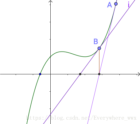

看起来还不错,我们试着放到项目上
割线法

3. 一些细节处理,比如将图像内置边框,图像标注等
plt.text(0,1,r'$max\ is\ 1.34$')  //在0,1处标注最大值是1.34

plt.ylabel('value of Q_MID ')
plt.xlabel('value of q1')               //对x,y轴进行说明

plt.title('Q_MID when q1=q2')     //标题名称

# 设置xtick和ytick的方向:in、out
plt.rcParams['xtick.direction'] = 'in'
plt.rcParams['ytick.direction'] = 'in'

#设置横纵坐标的名称以及对应字体格式
font2 =
{'family' : 'Times New Roman',
'weight' : 'normal',
'size'   : 14,
}
plt.ylabel('MID ', font2)
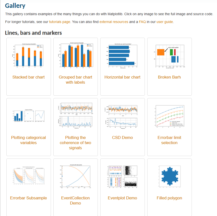
4. 然后附上一些好的资源,官网和查找过程中找到的优质资源。
https://matplotlib.org/gallery/index.html //matplotlib官网文档,有着大量实例可以参考
python绘制三维图

链接:http://www.cnblogs.com/xingshansi/p/6777945.html
然后附上搜来的许多Matplotlib图的汇总
https://mp.weixin.qq.com/s?__biz=MzU4NjIxODMyOQ==&mid=2247488568&idx=6&sn=f80d6f5c540058aa6c0d5de97e3a8f1d&chksm=fdfffa0eca887318bc426ef057707f7271624fb39a44595db8a042503a82ff638d707760ce02&mpshare=1&scene=23&srcid=&sharer_sharetime=1588477717826&sharer_shareid=aa22f4d6a3d78a43601dd5a37b40202c#rd
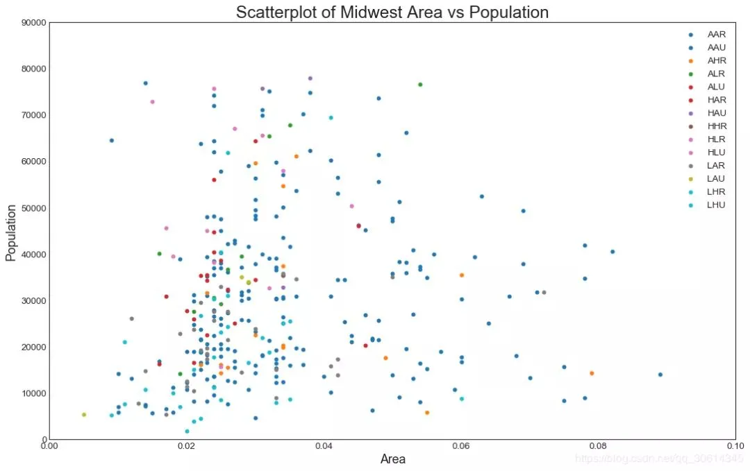
1. 散点图
Scatteplot是用于研究两个变量之间关系的经典和基本图。如果数据中有多个组,则可能需要以不同颜色可视化每个组。在Matplotlib,你可以方便地使用。

# Import dataset
midwest = pd.read_csv("https://raw.githubusercontent.com/selva86/datasets/master/midwest_filter.csv")

# Prepare Data
# Create as many colors as there are unique midwest['category']
categories = np.unique(midwest['category'])
colors = [plt.cm.tab10(i/float(len(categories)-1)) for i in range(len(categories))]

# Draw Plot for Each Category
plt.figure(figsize=(16, 10), dpi= 80, facecolor='w', edgecolor='k')

for i, category in enumerate(categories):
    plt.scatter('area', 'poptotal',
                data=midwest.loc[midwest.category==category, :],
                s=20, c=colors[i], label=str(category))

# Decorations
plt.gca().set(xlim=(0.0, 0.1), ylim=(0, 90000),
              xlabel='Area', ylabel='Population')

plt.xticks(fontsize=12); plt.yticks(fontsize=12)
plt.title("Scatterplot of Midwest Area vs Population", fontsize=22)
plt.legend(fontsize=12)
plt.show()
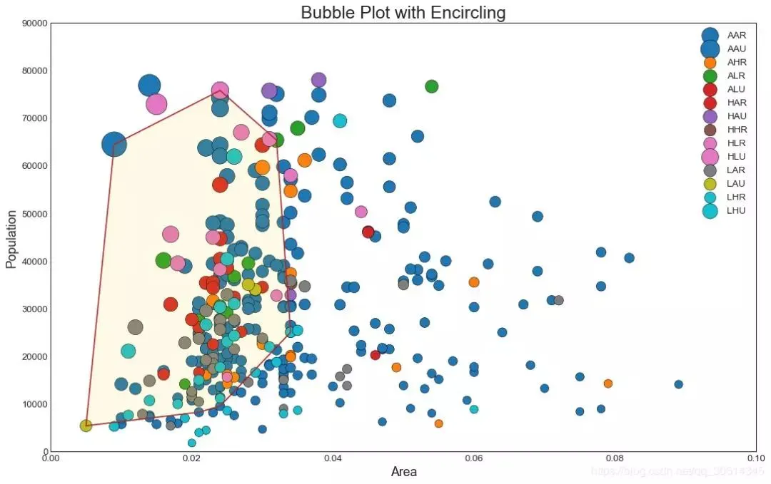
2. 带边界的气泡图
有时,您希望在边界内显示一组点以强调其重要性。在此示例中,您将从应该被环绕的数据帧中获取记录,并将其传递给下面的代码中描述的记录。encircle()

from matplotlib import patches
from scipy.spatial import ConvexHull
import warnings; warnings.simplefilter('ignore')
sns.set_style("white")

# Step 1: Prepare Data
midwest = pd.read_csv("https://raw.githubusercontent.com/selva86/datasets/master/midwest_filter.csv")

# As many colors as there are unique midwest['category']
categories = np.unique(midwest['category'])
colors = [plt.cm.tab10(i/float(len(categories)-1)) for i in range(len(categories))]

# Step 2: Draw Scatterplot with unique color for each category
fig = plt.figure(figsize=(16, 10), dpi= 80, facecolor='w', edgecolor='k')

for i, category in enumerate(categories):
    plt.scatter('area', 'poptotal', data=midwest.loc[midwest.category==category, :], s='dot_size', c=colors[i], label=str(category), edgecolors='black', linewidths=.5)

# Step 3: Encircling
# https://stackoverflow.com/questions/44575681/how-do-i-encircle-different-data-sets-in-scatter-plot
def encircle(x,y, ax=None, **kw):
    if not ax: ax=plt.gca()
    p = np.c_[x,y]
    hull = ConvexHull(p)
    poly = plt.Polygon(p[hull.vertices,:], **kw)
    ax.add_patch(poly)

# Select data to be encircled
midwest_encircle_data = midwest.loc[midwest.state=='IN', :]

# Draw polygon surrounding vertices
encircle(midwest_encircle_data.area, midwest_encircle_data.poptotal, ec="k", fc="gold", alpha=0.1)
encircle(midwest_encircle_data.area, midwest_encircle_data.poptotal, ec="firebrick", fc="none", linewidth=1.5)

# Step 4: Decorations
plt.gca().set(xlim=(0.0, 0.1), ylim=(0, 90000),
              xlabel='Area', ylabel='Population')

plt.xticks(fontsize=12); plt.yticks(fontsize=12)
plt.title("Bubble Plot with Encircling", fontsize=22)
plt.legend(fontsize=12)
plt.show()
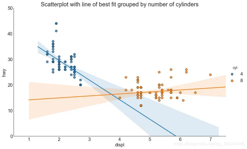
3. 带线性回归最佳拟合线的散点图
如果你想了解两个变量如何相互改变,那么最合适的线就是要走的路。下图显示了数据中各组之间最佳拟合线的差异。要禁用分组并仅为整个数据集绘制一条最佳拟合线,请从下面的调用中删除该参数。

# Import Data
df = pd.read_csv("https://raw.githubusercontent.com/selva86/datasets/master/mpg_ggplot2.csv")
df_select = df.loc[df.cyl.isin([4,8]), :]

# Plot
sns.set_style("white")
gridobj = sns.lmplot(x="displ", y="hwy", hue="cyl", data=df_select,
                     height=7, aspect=1.6, robust=True, palette='tab10',
                     scatter_kws=dict(s=60, linewidths=.7, edgecolors='black'))

# Decorations
gridobj.set(xlim=(0.5, 7.5), ylim=(0, 50))
plt.title("Scatterplot with line of best fit grouped by number of cylinders",
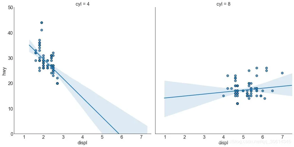
每个回归线都在自己的列中
或者,您可以在其自己的列中显示每个组的最佳拟合线。你可以通过在里面设置参数来实现这一点。

# Import Data
df = pd.read_csv("https://raw.githubusercontent.com/selva86/datasets/master/mpg_ggplot2.csv")
df_select = df.loc[df.cyl.isin([4,8]), :]

# Each line in its own column
sns.set_style("white")
gridobj = sns.lmplot(x="displ", y="hwy",
                     data=df_select,
                     height=7,
                     robust=True,
                     palette='Set1',
                     col="cyl",
                     scatter_kws=dict(s=60, linewidths=.7, edgecolors='black'))

# Decorations
gridobj.set(xlim=(0.5, 7.5), ylim=(0, 50))
plt.show()
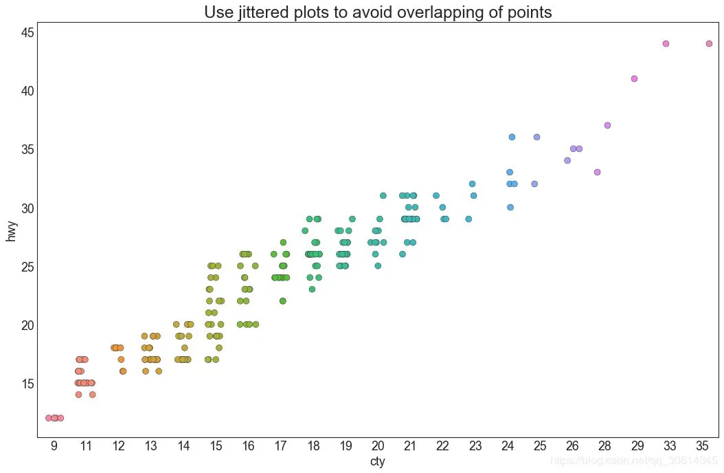
4. 抖动图
通常,多个数据点具有完全相同的X和Y值。结果,多个点相互绘制并隐藏。为避免这种情况,请稍微抖动点,以便您可以直观地看到它们。这很方便使用

# Import Data
df = pd.read_csv("https://raw.githubusercontent.com/selva86/datasets/master/mpg_ggplot2.csv")

# Draw Stripplot
fig, ax = plt.subplots(figsize=(16,10), dpi= 80)
sns.stripplot(df.cty, df.hwy, jitter=0.25, size=8, ax=ax, linewidth=.5)

# Decorations
plt.title('Use jittered plots to avoid overlapping of points', fontsize=22)
plt.show()
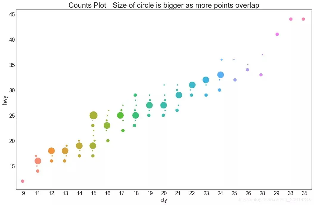
5. 计数图
避免点重叠问题的另一个选择是增加点的大小,这取决于该点中有多少点。因此,点的大小越大,周围的点的集中度就越大。

# Import Data
df = pd.read_csv("https://raw.githubusercontent.com/selva86/datasets/master/mpg_ggplot2.csv")
df_counts = df.groupby(['hwy', 'cty']).size().reset_index(name='counts')

# Draw Stripplot
fig, ax = plt.subplots(figsize=(16,10), dpi= 80)
sns.stripplot(df_counts.cty, df_counts.hwy, size=df_counts.counts*2, ax=ax)

# Decorations
plt.title('Counts Plot - Size of circle is bigger as more points overlap', fontsize=22)
plt.show()
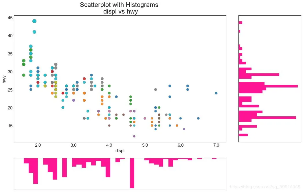
6. 边缘直方图
边缘直方图具有沿X和Y轴变量的直方图。这用于可视化X和Y之间的关系以及单独的X和Y的单变量分布。该图如果经常用于探索性数据分析(EDA)。

# Import Data
df = pd.read_csv("https://raw.githubusercontent.com/selva86/datasets/master/mpg_ggplot2.csv")

# Create Fig and gridspec
fig = plt.figure(figsize=(16, 10), dpi= 80)
grid = plt.GridSpec(4, 4, hspace=0.5, wspace=0.2)

# Define the axes
ax_main = fig.add_subplot(grid[:-1, :-1])
ax_right = fig.add_subplot(grid[:-1, -1], xticklabels=[], yticklabels=[])
ax_bottom = fig.add_subplot(grid[-1, 0:-1], xticklabels=[], yticklabels=[])

# Scatterplot on main ax
ax_main.scatter('displ', 'hwy', s=df.cty*4, c=df.manufacturer.astype('category').cat.codes, alpha=.9, data=df, cmap="tab10", edgecolors='gray', linewidths=.5)

# histogram on the right
ax_bottom.hist(df.displ, 40, histtype='stepfilled', orientation='vertical', color='deeppink')
ax_bottom.invert_yaxis()

# histogram in the bottom
ax_right.hist(df.hwy, 40, histtype='stepfilled', orientation='horizontal', color='deeppink')

# Decorations
ax_main.set(title='Scatterplot with Histograms  displ vs hwy', xlabel='displ', ylabel='hwy')
ax_main.title.set_fontsize(20)
for item in ([ax_main.xaxis.label, ax_main.yaxis.label] + ax_main.get_xticklabels() + ax_main.get_yticklabels()):
    item.set_fontsize(14)

xlabels = ax_main.get_xticks().tolist()
ax_main.set_xticklabels(xlabels)
plt.show()
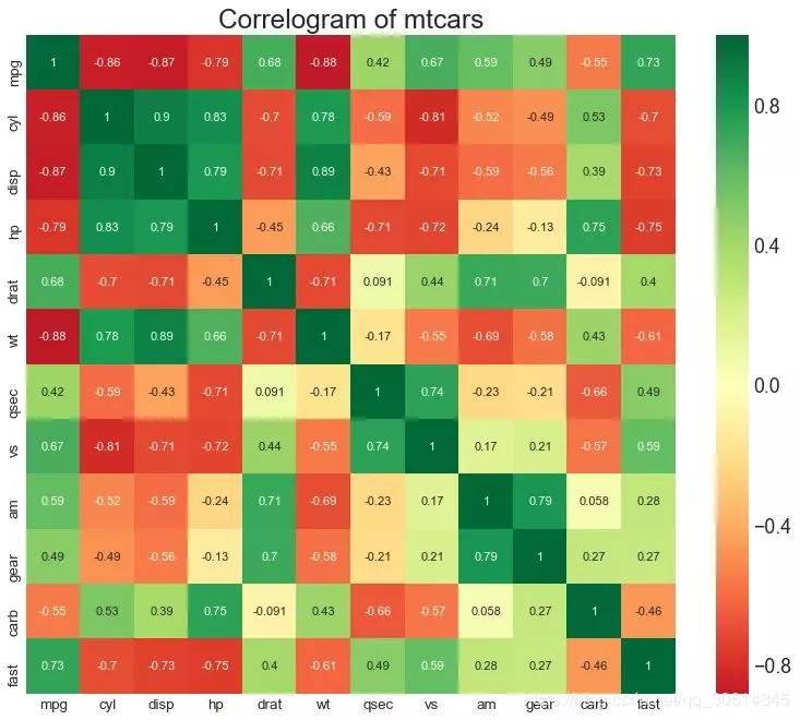
相关图
Correlogram用于直观地查看给定数据帧(或2D数组)中所有可能的数值变量对之间的相关度量。

# Import Dataset
df = pd.read_csv("https://github.com/selva86/datasets/raw/master/mtcars.csv")

# Plot
plt.figure(figsize=(12,10), dpi= 80)
sns.heatmap(df.corr(), xticklabels=df.corr().columns, yticklabels=df.corr().columns, cmap='RdYlGn', center=0, annot=True)

# Decorations
plt.title('Correlogram of mtcars', fontsize=22)
plt.xticks(fontsize=12)
plt.yticks(fontsize=12)
plt.show()
9. 矩阵图
成对图是探索性分析中的最爱,以理解所有可能的数字变量对之间的关系。它是双变量分析的必备工具。

# Load Dataset
df = sns.load_dataset('iris')

# Plot
plt.figure(figsize=(10,8), dpi= 80)
sns.pairplot(df, kind="scatter", hue="species", plot_kws=dict(s=80, edgecolor="white", linewidth=2.5))
plt.show()

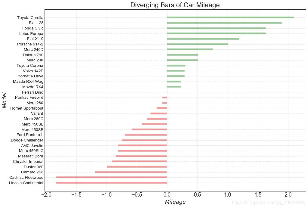
# Prepare Data
df = pd.read_csv("https://github.com/selva86/datasets/raw/master/mtcars.csv")
x = df.loc[:, ['mpg']]
df['mpg_z'] = (x - x.mean())/x.std()
df['colors'] = ['red' if x < 0 else 'green' for x in df['mpg_z']]
df.sort_values('mpg_z', inplace=True)
df.reset_index(inplace=True)

# Draw plot
plt.figure(figsize=(14,10), dpi= 80)
plt.hlines(y=df.index, xmin=0, xmax=df.mpg_z, color=df.colors, alpha=0.4, linewidth=5)

# Decorations
plt.gca().set(ylabel='$Model$', xlabel='$Mileage$')
plt.yticks(df.index, df.cars, fontsize=12)
plt.title('Diverging Bars of Car Mileage', fontdict={'size':20})
plt.grid(linestyle='--', alpha=0.5)
plt.show()
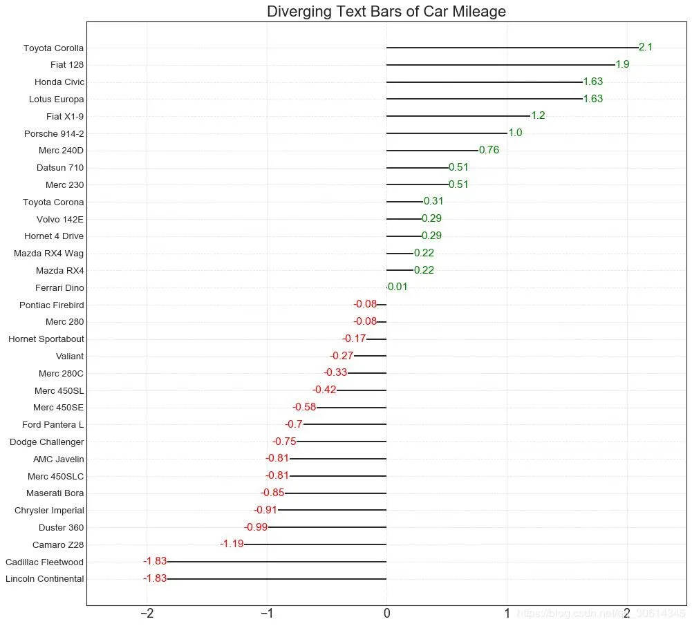
发散型文本

分散的文本类似于发散条,如果你想以一种漂亮和可呈现的方式显示图表中每个项目的价值,它更喜欢。


# Prepare Data
df = pd.read_csv("https://github.com/selva86/datasets/raw/master/mtcars.csv")
x = df.loc[:, ['mpg']]
df['mpg_z'] = (x - x.mean())/x.std()
df['colors'] = ['red' if x < 0 else 'green' for x in df['mpg_z']]
df.sort_values('mpg_z', inplace=True)
df.reset_index(inplace=True)

# Draw plot
plt.figure(figsize=(14,14), dpi= 80)
plt.hlines(y=df.index, xmin=0, xmax=df.mpg_z)
for x, y, tex in zip(df.mpg_z, df.index, df.mpg_z):
    t = plt.text(x, y, round(tex, 2), horizontalalignment='right' if x < 0 else 'left',
                 verticalalignment='center', fontdict={'color':'red' if x < 0 else 'green', 'size':14})

# Decorations
plt.yticks(df.index, df.cars, fontsize=12)
plt.title('Diverging Text Bars of Car Mileage', fontdict={'size':20})
plt.grid(linestyle='--', alpha=0.5)
plt.xlim(-2.5, 2.5)
plt.show()
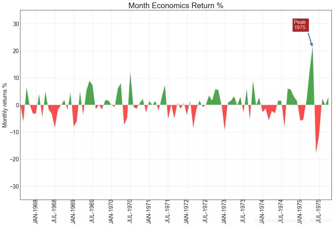
面积图

通过对轴和线之间的区域进行着色,区域图不仅强调峰值和低谷,而且还强调高点和低点的持续时间。高点持续时间越长,线下面积越大。

import numpy as np
import pandas as pd

# Prepare Data
df = pd.read_csv("https://github.com/selva86/datasets/raw/master/economics.csv", parse_dates=['date']).head(100)
x = np.arange(df.shape[0])
y_returns = (df.psavert.diff().fillna(0)/df.psavert.shift(1)).fillna(0) * 100

# Plot
plt.figure(figsize=(16,10), dpi= 80)
plt.fill_between(x[1:], y_returns[1:], 0, where=y_returns[1:] >= 0, facecolor='green', interpolate=True, alpha=0.7)
plt.fill_between(x[1:], y_returns[1:], 0, where=y_returns[1:] <= 0, facecolor='red', interpolate=True, alpha=0.7)

# Annotate
plt.annotate('Peak 1975', xy=(94.0, 21.0), xytext=(88.0, 28),
             bbox=dict(boxstyle='square', fc='firebrick'),
             arrowprops=dict(facecolor='steelblue', shrink=0.05), fontsize=15, color='white')


# Decorations
xtickvals = [str(m)[:3].upper()+"-"+str(y) for y,m in zip(df.date.dt.year, df.date.dt.month_name())]
plt.gca().set_xticks(x[::6])
plt.gca().set_xticklabels(xtickvals[::6], rotation=90, fontdict={'horizontalalignment': 'center', 'verticalalignment': 'center_baseline'})
plt.ylim(-35,35)
plt.xlim(1,100)
plt.title("Month Economics Return %", fontsize=22)
plt.ylabel('Monthly returns %')
plt.grid(alpha=0.5)
plt.show()
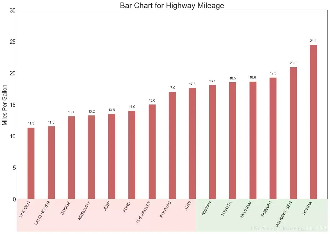
有序条形图

有序条形图有效地传达了项目的排名顺序。但是,在图表上方添加度量标准的值,用户可以从图表本身获取精确信息。

# Prepare Data
df_raw = pd.read_csv("https://github.com/selva86/datasets/raw/master/mpg_ggplot2.csv")
df = df_raw[['cty', 'manufacturer']].groupby('manufacturer').apply(lambda x: x.mean())
df.sort_values('cty', inplace=True)
df.reset_index(inplace=True)

# Draw plot
import matplotlib.patches as patches

fig, ax = plt.subplots(figsize=(16,10), facecolor='white', dpi= 80)
ax.vlines(x=df.index, ymin=0, ymax=df.cty, color='firebrick', alpha=0.7, linewidth=20)

# Annotate Text
for i, cty in enumerate(df.cty):
    ax.text(i, cty+0.5, round(cty, 1), horizontalalignment='center')


# Title, Label, Ticks and Ylim
ax.set_title('Bar Chart for Highway Mileage', fontdict={'size':22})
ax.set(ylabel='Miles Per Gallon', ylim=(0, 30))
plt.xticks(df.index, df.manufacturer.str.upper(), rotation=60, horizontalalignment='right', fontsize=12)

# Add patches to color the X axis labels
p1 = patches.Rectangle((.57, -0.005), width=.33, height=.13, alpha=.1, facecolor='green', transform=fig.transFigure)
p2 = patches.Rectangle((.124, -0.005), width=.446, height=.13, alpha=.1, facecolor='red', transform=fig.transFigure)
fig.add_artist(p1)
fig.add_artist(p2)
plt.show()
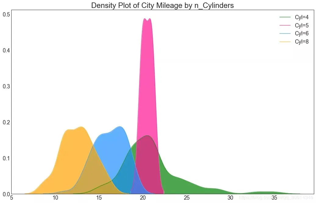
密度图

密度图是一种常用工具,可视化连续变量的分布。通过“响应”变量对它们进行分组,您可以检查X和Y之间的关系。以下情况,如果出于代表性目的来描述城市里程的分布如何随着汽缸数的变化而变化。

# Import Data
df = pd.read_csv("https://github.com/selva86/datasets/raw/master/mpg_ggplot2.csv")

# Draw Plot
plt.figure(figsize=(16,10), dpi= 80)
sns.kdeplot(df.loc[df['cyl'] == 4, "cty"], shade=True, color="g", label="Cyl=4", alpha=.7)
sns.kdeplot(df.loc[df['cyl'] == 5, "cty"], shade=True, color="deeppink", label="Cyl=5", alpha=.7)
sns.kdeplot(df.loc[df['cyl'] == 6, "cty"], shade=True, color="dodgerblue", label="Cyl=6", alpha=.7)
sns.kdeplot(df.loc[df['cyl'] == 8, "cty"], shade=True, color="orange", label="Cyl=8", alpha=.7)

# Decoration
plt.title('Density Plot of City Mileage by n_Cylinders', fontsize=22)
plt.legend()
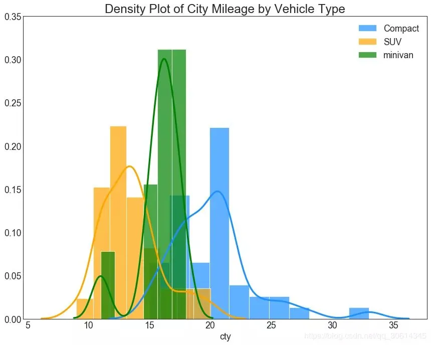
直方密度线图

带有直方图的密度曲线将两个图表传达的集体信息汇集在一起,这样您就可以将它们放在一个图形而不是两个图形中。

# Import Data
df = pd.read_csv("https://github.com/selva86/datasets/raw/master/mpg_ggplot2.csv")

# Draw Plot
plt.figure(figsize=(13,10), dpi= 80)
sns.distplot(df.loc[df['class'] == 'compact', "cty"], color="dodgerblue", label="Compact", hist_kws={'alpha':.7}, kde_kws={'linewidth':3})
sns.distplot(df.loc[df['class'] == 'suv', "cty"], color="orange", label="SUV", hist_kws={'alpha':.7}, kde_kws={'linewidth':3})
sns.distplot(df.loc[df['class'] == 'minivan', "cty"], color="g", label="minivan", hist_kws={'alpha':.7}, kde_kws={'linewidth':3})
plt.ylim(0, 0.35)

# Decoration
plt.title('Density Plot of City Mileage by Vehicle Type', fontsize=22)
plt.legend()
plt.show()
基本用法:
|
1
|
ax.plot(x,y,z,label=' ') |
code:
|
1
2
3
4
5
6
7
8
9
10
11
12
13
14
15
16
17
18
|
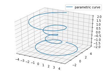
import matplotlib as mplfrom mpl_toolkits.mplot3d import Axes3Dimport numpy as npimport matplotlib.pyplot as pltmpl.rcParams['legend.fontsize'] = 10fig = plt.figure()ax = fig.gca(projection='3d')theta = np.linspace(-4 * np.pi, 4 * np.pi, 100)z = np.linspace(-2, 2, 100)r = z**2 + 1x = r * np.sin(theta)y = r * np.cos(theta)ax.plot(x, y, z, label='parametric curve')ax.legend()plt.show() |
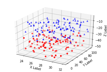
三、散点绘制(Scatter plots)
基本用法:
|
1
|
ax.scatter(xs, ys, zs, s=20, c=None, depthshade=True, *args, *kwargs) |
- xs,ys,zs:输入数据;
- s:scatter点的尺寸
- c:颜色,如c = 'r'就是红色;
- depthshase:透明化,True为透明,默认为True,False为不透明
- *args等为扩展变量,如maker = 'o',则scatter结果为’o‘的形状
code:
|
1
2
3
4
5
6
7
8
9
10
11
12
13
14
15
16
17
18
19
20
21
22
23
24
25
26
27
28
29
30
|
from mpl_toolkits.mplot3d import Axes3Dimport matplotlib.pyplot as pltimport numpy as npdef randrange(n, vmin, vmax): ''' Helper function to make an array of random numbers having shape (n, ) with each number distributed Uniform(vmin, vmax). ''' return (vmax - vmin)*np.random.rand(n) + vminfig = plt.figure()ax = fig.add_subplot(111, projection='3d')n = 100# For each set of style and range settings, plot n random points in the box# defined by x in [23, 32], y in [0, 100], z in [zlow, zhigh].for c, m, zlow, zhigh in [('r', 'o', -50, -25), ('b', '^', -30, -5)]: xs = randrange(n, 23, 32) ys = randrange(n, 0, 100) zs = randrange(n, zlow, zhigh) ax.scatter(xs, ys, zs, c=c, marker=m)ax.set_xlabel('X Label')ax.set_ylabel('Y Label')ax.set_zlabel('Z Label')plt.show() |
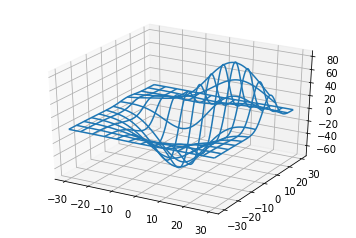
四、线框图(Wireframe plots)
基本用法:
|
1
|
ax.plot_wireframe(X, Y, Z, *args, **kwargs) |
- X,Y,Z:输入数据
- rstride:行步长
- cstride:列步长
- rcount:行数上限
- ccount:列数上限
code:
|
1
2
3
4
5
6
7
8
9
10
11
12
13
14
|
from mpl_toolkits.mplot3d import axes3dimport matplotlib.pyplot as pltfig = plt.figure()ax = fig.add_subplot(111, projection='3d')# Grab some test data.X, Y, Z = axes3d.get_test_data(0.05)# Plot a basic wireframe.ax.plot_wireframe(X, Y, Z, rstride=10, cstride=10)plt.show() |
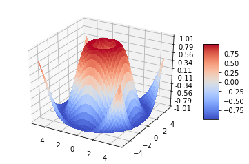
五、表面图(Surface plots)
基本用法:
|
1
|
ax.plot_surface(X, Y, Z, *args, **kwargs) |
- X,Y,Z:数据
- rstride、cstride、rcount、ccount:同Wireframe plots定义
- color:表面颜色
- cmap:图层
code:
|
1
2
3
4
5
6
7
8
9
10
11
12
13
14
15
16
17
18
19
20
21
22
23
24
25
26
27
28
29
30
|
from mpl_toolkits.mplot3d import Axes3Dimport matplotlib.pyplot as pltfrom matplotlib import cmfrom matplotlib.ticker import LinearLocator, FormatStrFormatterimport numpy as npfig = plt.figure()ax = fig.gca(projection='3d')# Make data.X = np.arange(-5, 5, 0.25)Y = np.arange(-5, 5, 0.25)X, Y = np.meshgrid(X, Y)R = np.sqrt(X**2 + Y**2)Z = np.sin(R)# Plot the surface.surf = ax.plot_surface(X, Y, Z, cmap=cm.coolwarm, linewidth=0, antialiased=False)# Customize the z axis.ax.set_zlim(-1.01, 1.01)ax.zaxis.set_major_locator(LinearLocator(10))ax.zaxis.set_major_formatter(FormatStrFormatter('%.02f'))# Add a color bar which maps values to colors.fig.colorbar(surf, shrink=0.5, aspect=5)plt.show() |
六、三角表面图(Tri-Surface plots)
基本用法:
|
1
|
ax.plot_trisurf(*args, **kwargs) |
- X,Y,Z:数据
- 其他参数类似surface-plot
code:
|
1
2
3
4
5
6
7
8
9
10
11
12
13
14
15
16
17
18
19
20
21
22
23
24
25
26
27
28
29
30
|
from mpl_toolkits.mplot3d import Axes3Dimport matplotlib.pyplot as pltimport numpy as npn_radii = 8n_angles = 36# Make radii and angles spaces (radius r=0 omitted to eliminate duplication).radii = np.linspace(0.125, 1.0, n_radii)angles = np.linspace(0, 2*np.pi, n_angles, endpoint=False)# Repeat all angles for each radius.angles = np.repeat(angles[..., np.newaxis], n_radii, axis=1)# Convert polar (radii, angles) coords to cartesian (x, y) coords.# (0, 0) is manually added at this stage, so there will be no duplicate# points in the (x, y) plane.x = np.append(0, (radii*np.cos(angles)).flatten())y = np.append(0, (radii*np.sin(angles)).flatten())# Compute z to make the pringle surface.z = np.sin(-x*y)fig = plt.figure()ax = fig.gca(projection='3d')ax.plot_trisurf(x, y, z, linewidth=0.2, antialiased=True)plt.show() |

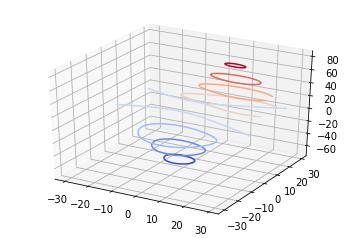
七、等高线(Contour plots)
基本用法:
|
1
|
ax.contour(X, Y, Z, *args, **kwargs) |
code:
|
1
2
3
4
5
6
7
8
9
10
11
|
from mpl_toolkits.mplot3d import axes3dimport matplotlib.pyplot as pltfrom matplotlib import cmfig = plt.figure()ax = fig.add_subplot(111, projection='3d')X, Y, Z = axes3d.get_test_data(0.05)cset = ax.contour(X, Y, Z, cmap=cm.coolwarm)ax.clabel(cset, fontsize=9, inline=1)plt.show() |
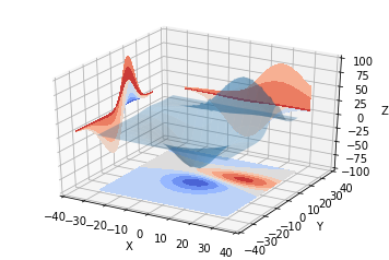
二维的等高线,同样可以配合三维表面图一起绘制:
code:
|
1
2
3
4
5
6
7
8
9
10
11
12
13
14
15
16
17
18
19
20
21
|
from mpl_toolkits.mplot3d import axes3dfrom mpl_toolkits.mplot3d import axes3dimport matplotlib.pyplot as pltfrom matplotlib import cmfig = plt.figure()ax = fig.gca(projection='3d')X, Y, Z = axes3d.get_test_data(0.05)ax.plot_surface(X, Y, Z, rstride=8, cstride=8, alpha=0.3)cset = ax.contour(X, Y, Z, zdir='z', offset=-100, cmap=cm.coolwarm)cset = ax.contour(X, Y, Z, zdir='x', offset=-40, cmap=cm.coolwarm)cset = ax.contour(X, Y, Z, zdir='y', offset=40, cmap=cm.coolwarm)ax.set_xlabel('X')ax.set_xlim(-40, 40)ax.set_ylabel('Y')ax.set_ylim(-40, 40)ax.set_zlabel('Z')ax.set_zlim(-100, 100)plt.show() |

也可以是三维等高线在二维平面的投影:
code:
|
1
2
3
4
5
6
7
8
9
10
11
12
13
14
15
16
17
18
19
20
|
from mpl_toolkits.mplot3d import axes3dimport matplotlib.pyplot as pltfrom matplotlib import cmfig = plt.figure()ax = fig.gca(projection='3d')X, Y, Z = axes3d.get_test_data(0.05)ax.plot_surface(X, Y, Z, rstride=8, cstride=8, alpha=0.3)cset = ax.contourf(X, Y, Z, zdir='z', offset=-100, cmap=cm.coolwarm)cset = ax.contourf(X, Y, Z, zdir='x', offset=-40, cmap=cm.coolwarm)cset = ax.contourf(X, Y, Z, zdir='y', offset=40, cmap=cm.coolwarm)ax.set_xlabel('X')ax.set_xlim(-40, 40)ax.set_ylabel('Y')ax.set_ylim(-40, 40)ax.set_zlabel('Z')ax.set_zlim(-100, 100)plt.show() |
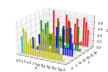
八、Bar plots(条形图)
基本用法:
|
1
|
ax.bar(left, height, zs=0, zdir='z', *args, **kwargs |
- x,y,zs = z,数据
- zdir:条形图平面化的方向,具体可以对应代码理解。
code:
|
1
2
3
4
5
6
7
8
9
10
11
12
13
14
15
16
17
18
19
20
21
|
from mpl_toolkits.mplot3d import Axes3Dimport matplotlib.pyplot as pltimport numpy as npfig = plt.figure()ax = fig.add_subplot(111, projection='3d')for c, z in zip(['r', 'g', 'b', 'y'], [30, 20, 10, 0]): xs = np.arange(20) ys = np.random.rand(20) # You can provide either a single color or an array. To demonstrate this, # the first bar of each set will be colored cyan. cs = [c] * len(xs) cs[0] = 'c' ax.bar(xs, ys, zs=z, zdir='y', color=cs, alpha=0.8)ax.set_xlabel('X')ax.set_ylabel('Y')ax.set_zlabel('Z')plt.show() |
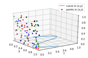
九、子图绘制(subplot)
A-不同的2-D图形,分布在3-D空间,其实就是投影空间不空,对应code:
|
1
2
3
4
5
6
7
8
9
10
11
12
13
14
15
16
17
18
19
20
21
22
23
24
25
26
27
28
29
30
31
|
from mpl_toolkits.mplot3d import Axes3Dimport numpy as npimport matplotlib.pyplot as pltfig = plt.figure()ax = fig.gca(projection='3d')# Plot a sin curve using the x and y axes.x = np.linspace(0, 1, 100)y = np.sin(x * 2 * np.pi) / 2 + 0.5ax.plot(x, y, zs=0, zdir='z', label='curve in (x,y)')# Plot scatterplot data (20 2D points per colour) on the x and z axes.colors = ('r', 'g', 'b', 'k')x = np.random.sample(20*len(colors))y = np.random.sample(20*len(colors))c_list = []for c in colors: c_list.append([c]*20)# By using zdir='y', the y value of these points is fixed to the zs value 0# and the (x,y) points are plotted on the x and z axes.ax.scatter(x, y, zs=0, zdir='y', c=c_list, label='points in (x,z)')# Make legend, set axes limits and labelsax.legend()ax.set_xlim(0, 1)ax.set_ylim(0, 1)ax.set_zlim(0, 1)ax.set_xlabel('X')ax.set_ylabel('Y')ax.set_zlabel('Z') |
B-子图Subplot用法
与MATLAB不同的是,如果一个四子图效果,如:
MATLAB:
subplot(2,2,1)subplot(2,2,2)subplot(2,2,[3,4])Python:
subplot(2,2,1)subplot(2,2,2)subplot(2,1,2)
code:
|
1
2
3
4
5
6
7
8
9
10
11
12
13
14
15
16
17
18
19
20
21
22
23
24
25
26
27
28
29
30
31
32
33
34
35
36
37
|
import matplotlib.pyplot as pltfrom mpl_toolkits.mplot3d.axes3d import Axes3D, get_test_datafrom matplotlib import cmimport numpy as np# set up a figure twice as wide as it is tallfig = plt.figure(figsize=plt.figaspect(0.5))#===============# First subplot#===============# set up the axes for the first plotax = fig.add_subplot(2, 2, 1, projection='3d')# plot a 3D surface like in the example mplot3d/surface3d_demoX = np.arange(-5, 5, 0.25)Y = np.arange(-5, 5, 0.25)X, Y = np.meshgrid(X, Y)R = np.sqrt(X**2 + Y**2)Z = np.sin(R)surf = ax.plot_surface(X, Y, Z, rstride=1, cstride=1, cmap=cm.coolwarm, linewidth=0, antialiased=False)ax.set_zlim(-1.01, 1.01)fig.colorbar(surf, shrink=0.5, aspect=10)#===============# Second subplot#===============# set up the axes for the second plotax = fig.add_subplot(2,1,2, projection='3d')# plot a 3D wireframe like in the example mplot3d/wire3d_demoX, Y, Z = get_test_data(0.05)ax.plot_wireframe(X, Y, Z, rstride=10, cstride=10)plt.show() |

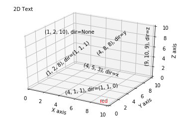
补充:
文本注释的基本用法:
code:
|
1
2
3
4
5
6
7
8
9
10
11
12
13
14
15
16
17
18
19
20
21
22
23
24
25
26
27
28
29
30
31
32
33
|
from mpl_toolkits.mplot3d import Axes3Dimport matplotlib.pyplot as pltfig = plt.figure()ax = fig.gca(projection='3d')# Demo 1: zdirzdirs = (None, 'x', 'y', 'z', (1, 1, 0), (1, 1, 1))xs = (1, 4, 4, 9, 4, 1)ys = (2, 5, 8, 10, 1, 2)zs = (10, 3, 8, 9, 1, 8)for zdir, x, y, z in zip(zdirs, xs, ys, zs): label = '(%d, %d, %d), dir=%s' % (x, y, z, zdir) ax.text(x, y, z, label, zdir)# Demo 2: colorax.text(9, 0, 0, "red", color='red')# Demo 3: text2D# Placement 0, 0 would be the bottom left, 1, 1 would be the top right.ax.text2D(0.05, 0.95, "2D Text", transform=ax.transAxes)# Tweaking display region and labelsax.set_xlim(0, 10)ax.set_ylim(0, 10)ax.set_zlim(0, 10)ax.set_xlabel('X axis')ax.set_ylabel('Y axis')ax.set_zlabel('Z axis')plt.show() |

 浙公网安备 33010602011771号