R
R
In R, both the "<-" and "=" operators can be used for assignment. However, there are some subtle differences between them:
- "<-" is the traditional assignment operator in R, while "=" is a newer alternative. However, both operators are now considered interchangeable in most cases.
- "<-" is a bit more verbose than "=", which can make code written using "=" easier to read.
- "<-" has slightly lower precedence than "=", which means that if both operators are used in the same expression, "=" will be evaluated first.
- "<-" can be used in a wider range of contexts, such as when assigning values to function arguments or when creating lists. "=" can also be used in these contexts, but is less commonly used.
Overall, both "<-" and "=" can be used to assign values to variables or objects in R, but "<-" is the preferred assignment operator.
In the rep() function in R, times and each are both parameters that control the number of times each element in a vector is repeated.
The times parameter is used to specify the number of times the entire vector should be repeated. For example, rep(c(1,2,3), times=2) would produce the vector 1 2 3 1 2 3.
The each parameter is used to specify the number of times each element in the vector should be repeated before moving on to the next element. For example, rep(c(1,2,3), each=2) would produce the vector 1 1 2 2 3 3.
v <- c( 1, 4, 3, 8, 10)
w <- 1:10
x <- 1:3
boxplot
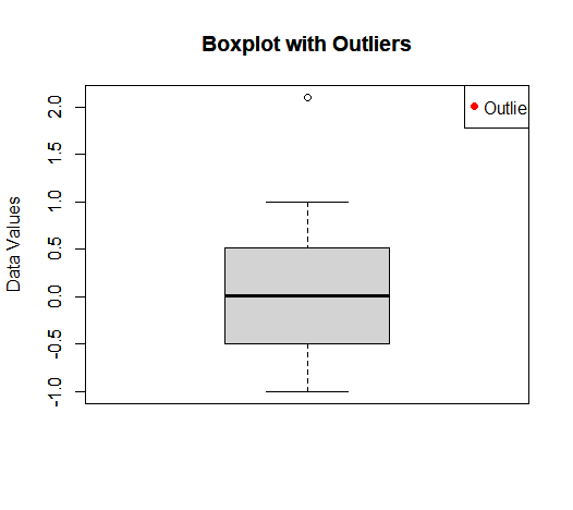
# Generate some random data with outliers
set.seed(123)
data <- c(seq(-1,1,0.01), 2.1)

# Create a boxplot of the data
boxplot(data,
        main = "Boxplot with Outliers",
        ylab = "Data Values")

# Add a title to the plot
title("Boxplot with Outliers")

# Adjust the y-axis limits to better visualize the data
ylim <- c(min(data) - 1, max(data) + 1)
ylim <- round(ylim, 1)
axis(2, ylim = ylim)

# Add a legend to the plot
legend("topright",
       legend = c("Outliers"),
       pch = 19,
       col = "red")
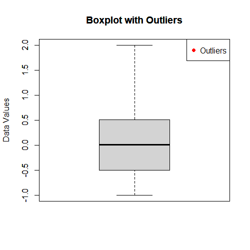
# Generate some random data with outliers
set.seed(123)
data <- c(seq(-1,1,0.01), 2)

# Create a boxplot of the data
boxplot(data,
        main = "Boxplot with Outliers",
        ylab = "Data Values")

# Add a title to the plot
title("Boxplot with Outliers")

# Adjust the y-axis limits to better visualize the data
ylim <- c(min(data) - 1, max(data) + 1)
ylim <- round(ylim, 1)
axis(2, ylim = ylim)

# Add a legend to the plot
legend("topright",
       legend = c("Outliers"),
       pch = 19,
       col = "red")
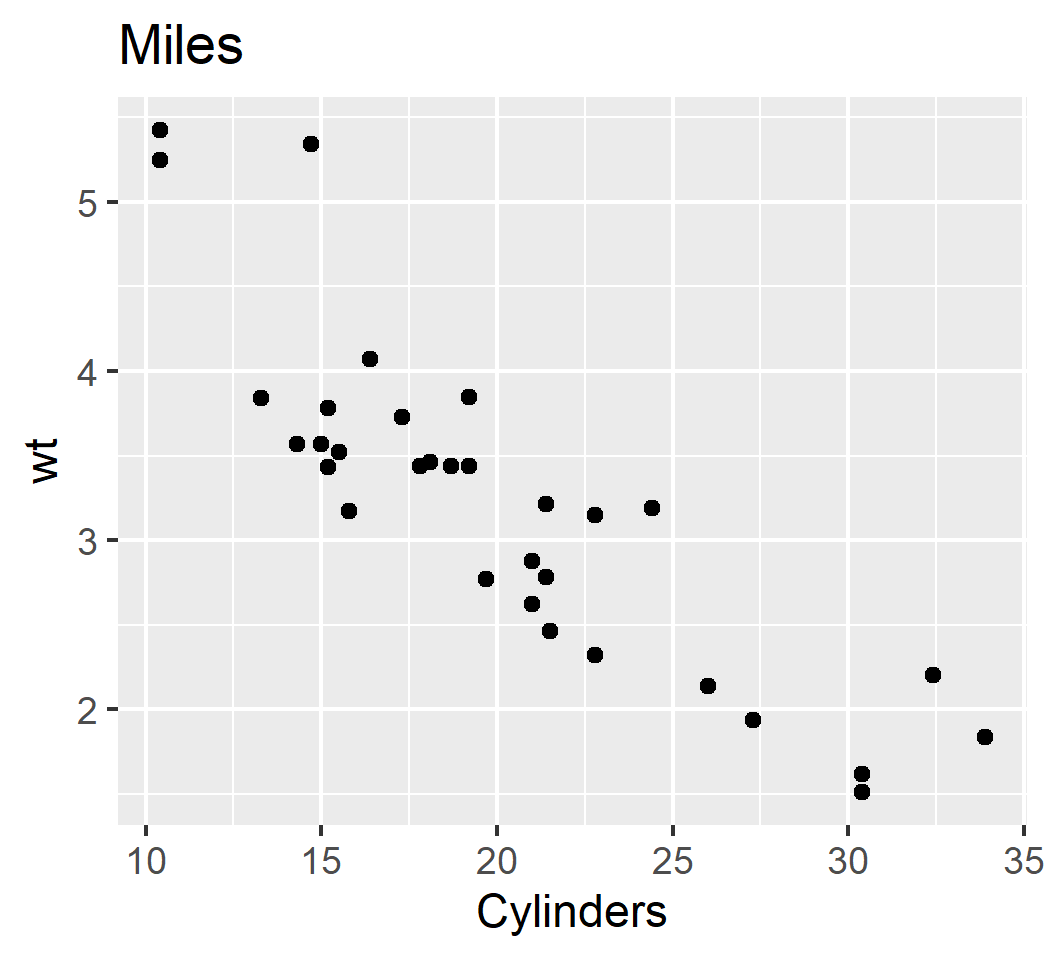
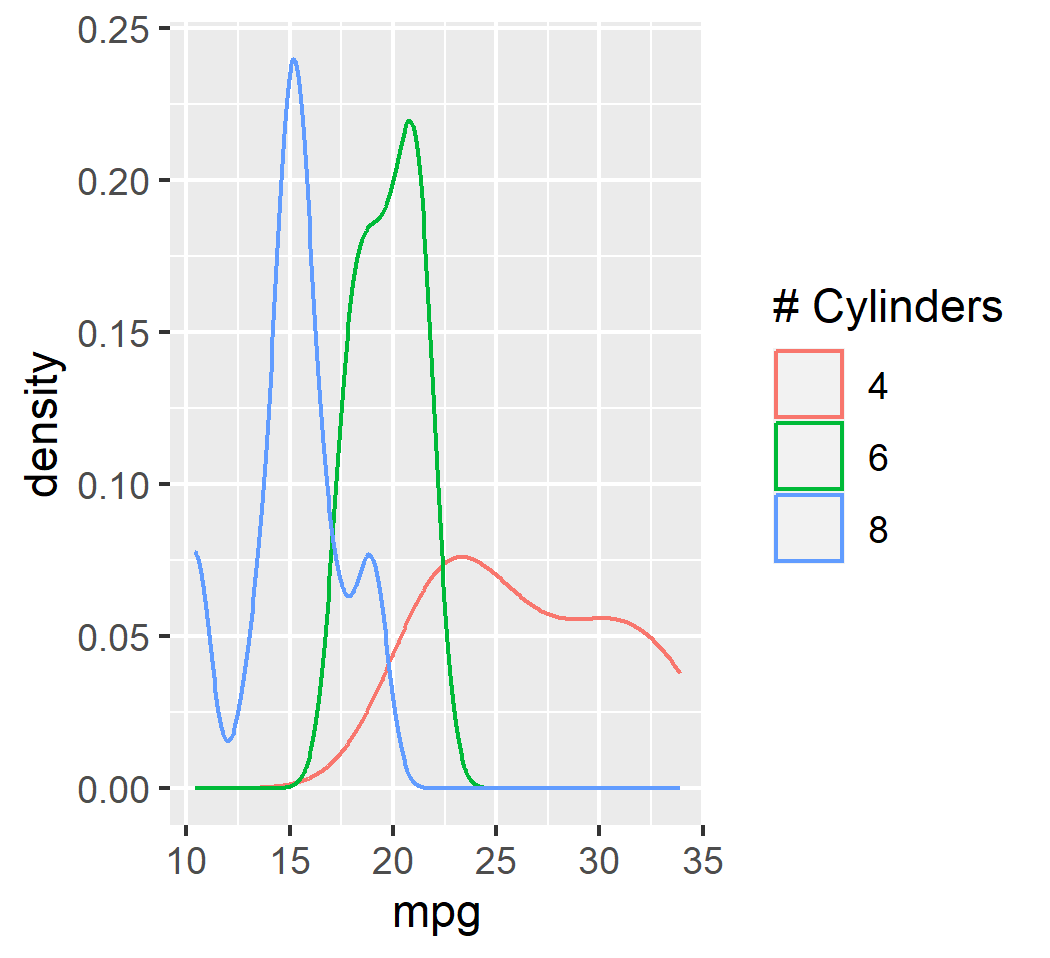
ggplot2
library("ggplot2")
ggplot(mtcars, aes(x = mpg, y = wt)) + geom_point() + xlab("Cylinders") + ggtitle("Miles")
ggsave("mtcars_geom_point.png")
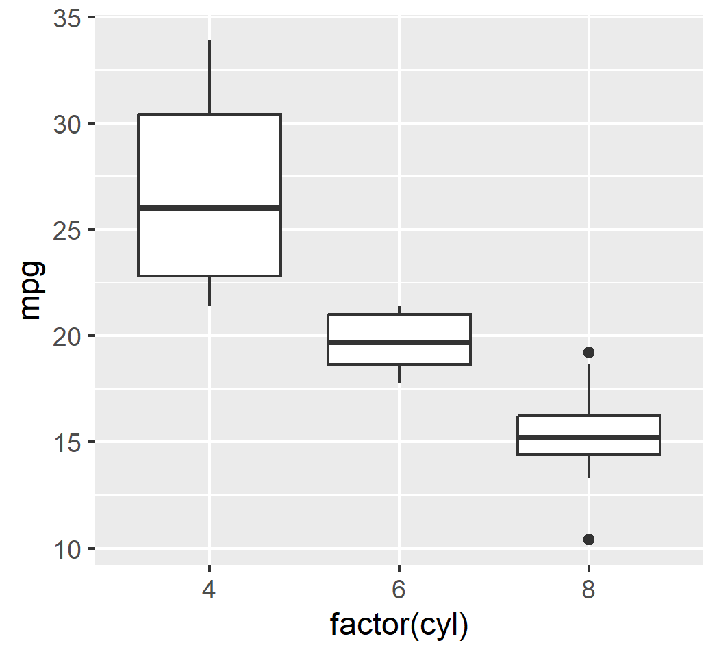
ggplot(mtcars, aes(x = factor(cyl), y = mpg)) + geom_boxplot()
ggsave("mtcars_geom_boxplot.png")
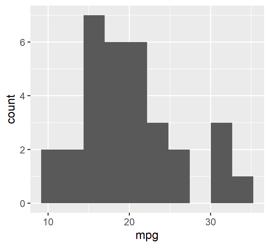
ggplot(mtcars, aes(x = mpg)) + geom_histogram(bins = 10)
ggsave("mtcars_geom_histogram.png")
ggplot(mtcars, aes(x = mpg, col = as.factor(cyl))) + geom_density() + labs(col = "# Cylinders")
ggsave("mtcars_density.png")
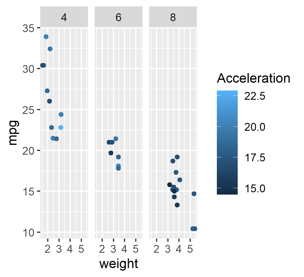
ggplot(mtcars, aes(x = wt, y = mpg, col = qsec)) + geom_point() + facet_wrap(~cyl) + labs(x = "weogjt")
ggsave("mtcars_facet_wrap.png")
本文来自博客园,作者:miyasaka,转载请注明原文链接:https://www.cnblogs.com/kion/p/17273446.html

 浙公网安备 33010602011771号