Vue整合highcharts和echarts
一、创建vue项目
通过命令
cnpm install vue

获得如图所示的结构项目
二、创建component
在components文件夹下新建hcharts.vue文件和echarts.vue

hchart.vue
<template>
  <el-col :span="24">
    <div :id="id" :option="option" style="width:100%; height:400px;"></div>
  </el-col>
</template>
<script>
import HighCharts from 'highcharts'

export default {
  // 验证类型
  props: {
    id: {
      type: String
    },
    option: {
      type: Object
    }
  },
  mounted() {
    new HighCharts.chart(this.id, this.option)
  }
}
</script>
<style>

</style>
echarts.vue
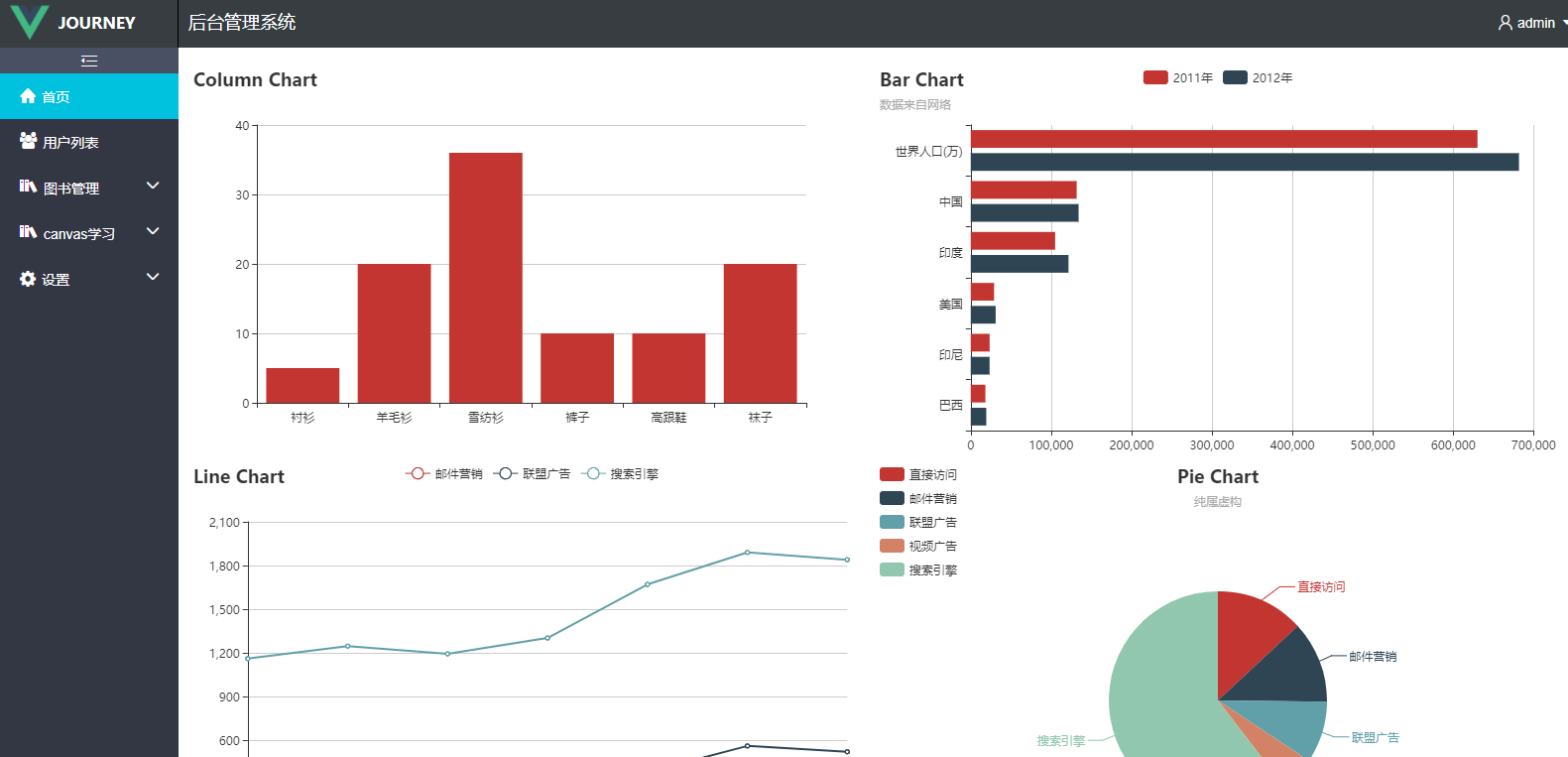
<template>
<el-row :span="24">
  <el-row :span="24">
    <el-col :span="12">
      <div id="chartColumn" style="width:100%; height:400px;"></div>
    </el-col>
    <el-col :span="12">
      <div id="chartBar" style="width:100%; height:400px;"></div>
    </el-col>
  </el-row>
  <el-row :span="24">
    <el-col :span="12">
      <div id="chartLine" style="width:100%; height:400px;"></div>
    </el-col>
    <el-col :span="12">
      <div id="chartPie" style="width:100%; height:400px;"></div>
    </el-col>
  </el-row>
</el-row>
</template>
<script>
import Echarts from 'echarts'

export default {
  data () {
    return {
      chartColumn: null,
      chartBar: null,
      chartLine: null,
      chartPie: null
    }
  },
  mounted() {
    var _this = this;
      //基于准备好的dom,初始化echarts实例
      this.chartColumn = Echarts.init(document.getElementById('chartColumn'));
      this.chartBar = Echarts.init(document.getElementById('chartBar'));
      this.chartLine = Echarts.init(document.getElementById('chartLine'));
      this.chartPie = Echarts.init(document.getElementById('chartPie'));

      this.chartColumn.setOption({
        title: { text: 'Column Chart' },
        tooltip: {},
        xAxis: {
          data: ["衬衫", "羊毛衫", "雪纺衫", "裤子", "高跟鞋", "袜子"]
        },
        yAxis: {},
        series: [{
          name: '销量',
          type: 'bar',
          data: [5, 20, 36, 10, 10, 20]
        }]
      });

      this.chartBar.setOption({
        title: {
          text: 'Bar Chart',
          subtext: '数据来自网络'
        },
        tooltip: {
          trigger: 'axis',
          axisPointer: {
            type: 'shadow'
          }
        },
        legend: {
          data: ['2011年', '2012年']
        },
        grid: {
          left: '3%',
          right: '4%',
          bottom: '3%',
          containLabel: true
        },
        xAxis: {
          type: 'value',
          boundaryGap: [0, 0.01]
        },
        yAxis: {
          type: 'category',
          data: ['巴西', '印尼', '美国', '印度', '中国', '世界人口(万)']
        },
        series: [
          {
            name: '2011年',
            type: 'bar',
            data: [18203, 23489, 29034, 104970, 131744, 630230]
          },
          {
            name: '2012年',
            type: 'bar',
            data: [19325, 23438, 31000, 121594, 134141, 681807]
          }
        ]
      });

      this.chartLine.setOption({
        title: {
          text: 'Line Chart'
        },
        tooltip: {
          trigger: 'axis'
        },
        legend: {
          data: ['邮件营销', '联盟广告', '搜索引擎']
        },
        grid: {
          left: '3%',
          right: '4%',
          bottom: '3%',
          containLabel: true
        },
        xAxis: {
          type: 'category',
          boundaryGap: false,
          data: ['周一', '周二', '周三', '周四', '周五', '周六', '周日']
        },
        yAxis: {
          type: 'value'
        },
        series: [
          {
            name: '邮件营销',
            type: 'line',
            stack: '总量',
            data: [120, 132, 101, 134, 90, 230, 210]
          },
          {
            name: '联盟广告',
            type: 'line',
            stack: '总量',
            data: [220, 182, 191, 234, 290, 330, 310]
          },
          {
            name: '搜索引擎',
            type: 'line',
            stack: '总量',
            data: [820, 932, 901, 934, 1290, 1330, 1320]
          }
        ]
      });

      this.chartPie.setOption({
        title: {
          text: 'Pie Chart',
          subtext: '纯属虚构',
          x: 'center'
        },
        tooltip: {
          trigger: 'item',
          formatter: "{a} <br/>{b} : {c} ({d}%)"
        },
        legend: {
          orient: 'vertical',
          left: 'left',
          data: ['直接访问', '邮件营销', '联盟广告', '视频广告', '搜索引擎']
        },
        series: [
          {
            name: '访问来源',
            type: 'pie',
            radius: '55%',
            center: ['50%', '60%'],
            data: [
              { value: 335, name: '直接访问' },
              { value: 310, name: '邮件营销' },
              { value: 234, name: '联盟广告' },
              { value: 135, name: '视频广告' },
              { value: 1548, name: '搜索引擎' }
            ],
            itemStyle: {
              emphasis: {
                shadowBlur: 10,
                shadowOffsetX: 0,
                shadowColor: 'rgba(0, 0, 0, 0.5)'
              }
            }
          }
        ]
      });
  }
}
</script>
<style>

</style>
三、引用
在Dashboard.vue中
使用
import 分别导入 hchart 和 echart
在src中创建data文件夹 并分别新建一个Hchartoptions.js和Echartoptions.js,目的时为了模拟一些数据进行效果的测试

Hchartoptions.js
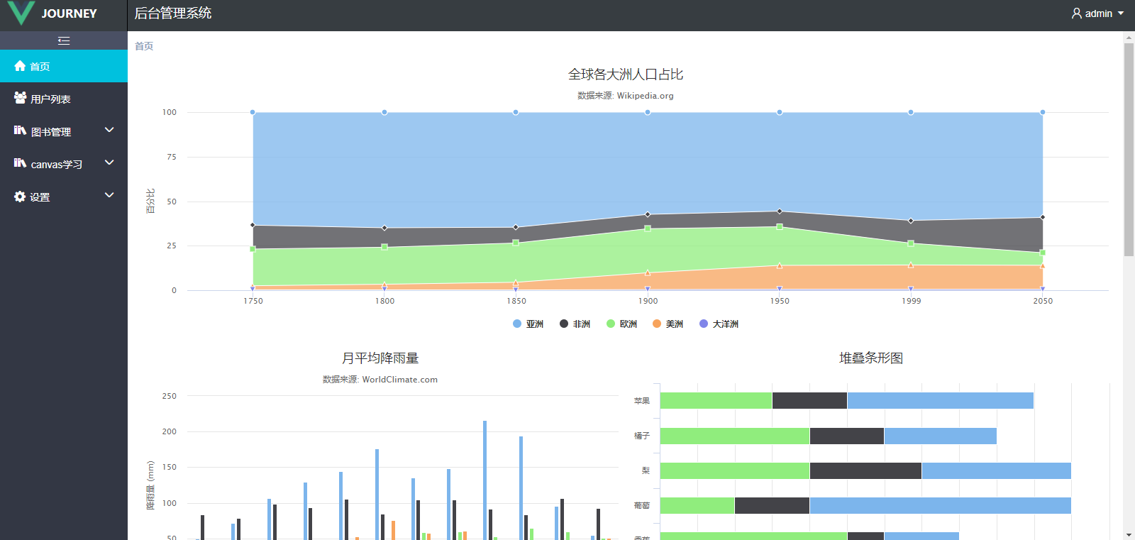
module.exports = {
  data1: {
    chart: {
      type:'area'//指定图表的类型,默认是折线图(line)
      },
      credits: {
      enabled:false
      },//去掉地址
      title: {
          text: '全球各大洲人口占比'
      },
      subtitle: {
          text: '数据来源: Wikipedia.org'
      },
      xAxis: {
          categories: ['1750', '1800', '1850', '1900', '1950', '1999', '2050'],
          tickmarkPlacement: 'on',
          title: {
              enabled: false
          }
      },
      yAxis: {
          title: {
              text: '百分比'
          }
      },
      tooltip: {
          pointFormat: '<span style="color:{series.color}">{series.name}</span>: <b>{point.percentage:.1f}%</b> ({point.y:,.0f} 百万)<br/>',
          shared: true
      },
      plotOptions: {
          area: {
              stacking: 'percent',
              lineColor: '#ffffff',
              lineWidth: 1,
              marker: {
                  lineWidth: 1,
                  lineColor: '#ffffff'
              }
          }
      },
      series: [{
          name: '亚洲',
          data: [502, 635, 809, 947, 1402, 3634, 5268]
      }, {
          name: '非洲',
          data: [106, 107, 111, 133, 221, 767, 1766]
      }, {
          name: '欧洲',
          data: [163, 203, 276, 408, 547, 729, 628]
      }, {
          name: '美洲',
          data: [18, 31, 54, 156, 339, 818, 1201]
      }, {
          name: '大洋洲',
          data: [2, 2, 2, 6, 13, 30, 46]
      }]
  },
  data2: {
      chart: {
              type:'column'//指定图表的类型,默认是折线图(line)
              },
              credits: {
                enabled:false
              },//去掉地址
              title: {
                  text: '月平均降雨量'
              },
              subtitle: {
                  text: '数据来源: WorldClimate.com'
              },
              xAxis: {
                  categories: [
                      '一月',
                      '二月',
                      '三月',
                      '四月',
                      '五月',
                      '六月',
                      '七月',
                      '八月',
                      '九月',
                      '十月',
                      '十一月',
                      '十二月'
                  ],
                  crosshair: true
              },
              yAxis: {
                  min: 0,
                  title: {
                      text: '降雨量 (mm)'
                  }
              },
              tooltip: {
                  headerFormat: '<span style="font-size:10px">{point.key}</span><table>',
                  pointFormat: '<tr><td style="color:{series.color};padding:0">{series.name}: </td>' +
                  '<td style="padding:0"><b>{point.y:.1f} mm</b></td></tr>',
                  footerFormat: '</table>',
                  shared: true,
                  useHTML: true
              },
              plotOptions: {
                  column: {
                      pointPadding: 0.2,
                      borderWidth: 0
                  }
              },
              series: [{
                  name: '东京',
                  data: [49.9, 71.5, 106.4, 129.2, 144.0, 176.0, 135.6, 148.5, 216.4, 194.1, 95.6, 54.4]
              }, {
                  name: '纽约',
                  data: [83.6, 78.8, 98.5, 93.4, 106.0, 84.5, 105.0, 104.3, 91.2, 83.5, 106.6, 92.3]
              }, {
                  name: '伦敦',
                  data: [48.9, 38.8, 39.3, 41.4, 47.0, 48.3, 59.0, 59.6, 52.4, 65.2, 59.3, 51.2]
              }, {
                  name: '柏林',
                  data: [42.4, 33.2, 34.5, 39.7, 52.6, 75.5, 57.4, 60.4, 47.6, 39.1, 46.8, 51.1]
              }]
    },
    data3: {
      chart: {
        type: 'bar'
    },
    credits: {
      enabled:false
    },//去掉地址
    title: {
        text: '堆叠条形图'
    },
    xAxis: {
        categories: ['苹果', '橘子', '梨', '葡萄', '香蕉']
    },
    yAxis: {
        min: 0,
        title: {
            text: '水果消费总量'
        }
    },
    legend: {
        reversed: true
    },
    plotOptions: {
        series: {
            stacking: 'normal'
        }
    },
    series: [{
        name: '小张',
        data: [5, 3, 4, 7, 2]
    }, {
        name: '小彭',
        data: [2, 2, 3, 2, 1]
    }, {
        name: '小潘',
        data: [3, 4, 4, 2, 5]
    }]
  }
}
Echartoptions.js
module.exports = {
  data1: {
    title: {
      text: 'Bar Chart',
      subtext: '数据来自网络'
    },
    tooltip: {
      trigger: 'axis',
      axisPointer: {
        type: 'shadow'
      }
    },
    legend: {
      data: ['2011年', '2012年']
    },
    grid: {
      left: '3%',
      right: '4%',
      bottom: '3%',
      containLabel: true
    },
    xAxis: {
      type: 'value',
      boundaryGap: [0, 0.01]
    },
    yAxis: {
      type: 'category',
      data: ['巴西', '印尼', '美国', '印度', '中国', '世界人口(万)']
    },
    series: [
      {
        name: '2011年',
        type: 'bar',
        data: [18203, 23489, 29034, 104970, 131744, 630230]
      },
      {
        name: '2012年',
        type: 'bar',
        data: [19325, 23438, 31000, 121594, 134141, 681807]
      }
    ]
  }
}
import HChart from '../hchart/hchart'
import HChartoptions from '../data/HChartoptions'

import EChart from '../echart/echart'
Dashboard.vue
<template>
<el-row class="warp">
  <el-col :span="24" class="warp-breadcrum">
    <el-breadcrumb separator="/">
      <el-breadcrumb-item :to="{ path: '/' }"><b>首页</b></el-breadcrumb-item>
    </el-breadcrumb>
  </el-col>
  <el-col :span="24" class="warp-main">
      <section class="chart-container">
        <el-row :span="24">
          <el-col>
            <h-chart :id="hchart1" :option="hoption1" style="width:100%; height:400px;"></h-chart>
          </el-col>
        </el-row>
        <el-row :span="24">
          <el-col :span="12">
            <h-chart :id="hchart2" :option="hoption2" style="width:100%; height:400px;"></h-chart>
          </el-col>
          <el-col :span="12">
            <h-chart :id="hchart3" :option="hoption3" style="width:100%; height:400px;"></h-chart>
          </el-col>
        </el-row>
        <el-row :span="24">
          <e-chart></e-chart>
        </el-row>
      </section>
  </el-col>
</el-row>
</template>
<script>
import HChart from '../hchart/hchart'
import HChartoptions from '../data/HChartoptions'

import EChart from '../echart/echart'

export default {
  data () {
    let HChartoption1 = HChartoptions.data1
    let HChartoption2 = HChartoptions.data2
    let HChartoption3 = HChartoptions.data3

    return {
      hchart1: 'asdjlangfla',
      hchart2: 'hchart2',
      hchart3: 'hchart3',
      hoption1: HChartoption1,
      hoption2: HChartoption2,
      hoption3: HChartoption3,
    }
  },
  components: {
    HChart,EChart
  }
}
</script>
<style>

</style>

 浙公网安备 33010602011771号