620 ECharts常用图表 柱状图: 标记markPoint,平均值 markLine,数值显示 label,柱宽度 barWidth,横向柱状图
3.1.图表1 柱状图
3.1.1.柱状图的实现步骤
- 步骤1 ECharts 最基本的代码结构
<!DOCTYPE html>
<html lang="en">

<head>
  <script src="js/echarts.min.js"></script>
</head>

<body>
  <div style="width: 600px;height:400px"></div>
  <script>
    var mCharts = echarts.init(document.querySelector("div"))
    var option = {}
    mCharts.setOption(option)
  </script>
</body>

</html>
此时 option 是一个空空如也的对象
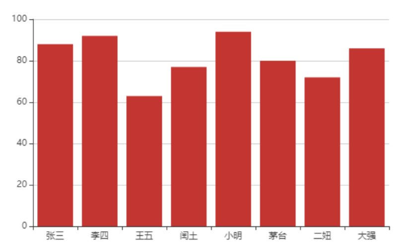
- 步骤2 准备x轴的数据
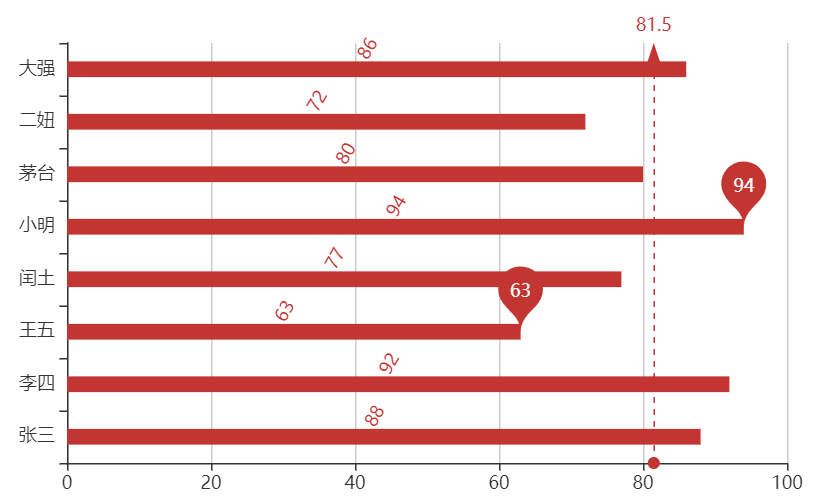
var xDataArr = ['张三', '李四', '王五', '闰土', '小明', '茅台', '二妞', '大强']
- 步骤3 准备 y 轴的数据
var yDataArr = [88, 92, 63, 77, 94, 80, 72, 86]
- 步骤4 准备 option , 将 series 中的 type 的值设置为: bar
var option = {
  xAxis: {
    type: 'category',
    data: xDataArr
  },
  yAxis: {
    type: 'value'
  },
  // 【series中的每个元素,代表一种图表】
  series: [
    {
      type: 'bar',
      data: yDataArr
    }
  ]
}
注意: 坐标轴 xAxis 或者 yAxis 中的配置, type 的值主要有两种: category 和 value , 如果 type属性的值为 category ,那么需要配置 data 数据, 代表在 x 轴的呈现. 如果 type 属性配置为 value ,那么无需配置 data , 此时 y 轴会自动去 series 下找数据进行图表的绘制
最终的效果如下图:
3.1.2.柱状图的常见效果
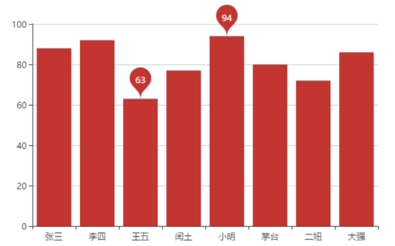
- 标记:
- 最大值\最小值 markPoint
series: [
  {
    ......
    markPoint: {
      data: [
        {
          type: 'max', name: '最大值'
        },
        {
          type: 'min', name: '最小值'
        }
      ]
    }
  }
]
- 平均值 markLine
series: [
  {
    ......
    markLine: {
      data: [
        {
          type: 'average', name: '平均值'
        }
      ]
    }
  }
]

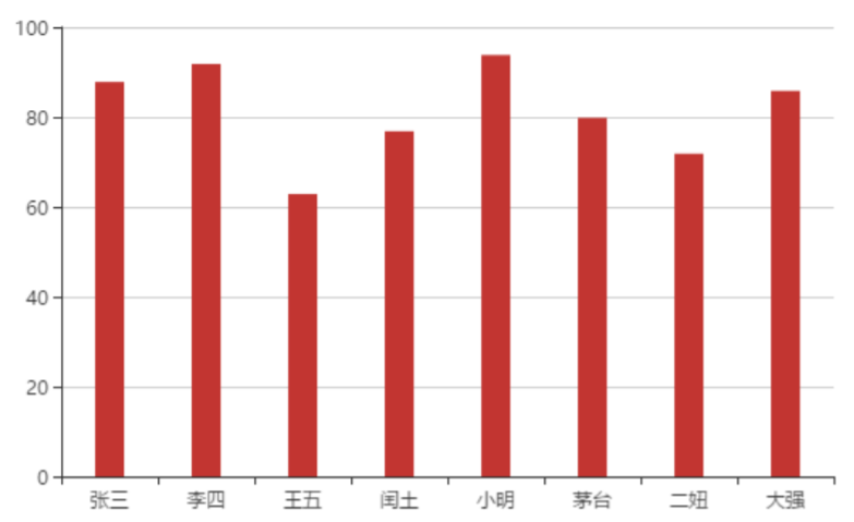
- 数值显示 label

- 柱宽度 barWidth
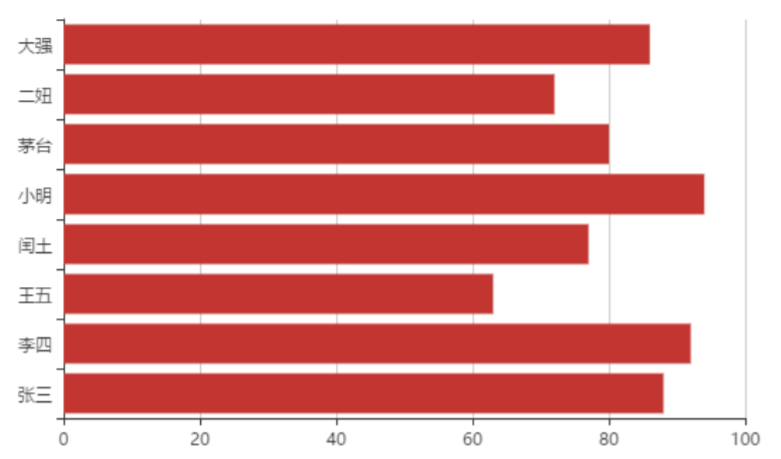
- 横向柱状图
所谓的横向柱状图, 只需要让x轴的角色和y轴的角色互换一下即可. 既 xAxis 的 type 设置为value , yAxis 的 type 设置为 category , 并且设置 data 即可
3.1.3. 柱状图特点
柱状图描述的是分类数据,呈现的是每一个分类中『有多少?』, 图表所表达出来的含义在于不同类别数据的排名\对比情况
03.柱状图的实现.html
<!DOCTYPE html>
<html lang="en">

<head>
  <meta charset="UTF-8">
  <meta name="viewport" content="width=device-width, initial-scale=1.0">
  <meta http-equiv="X-UA-Compatible" content="ie=edge">
  <title>Document</title>
  <script src="lib/echarts.min.js"></script>
</head>

<body>
  <div style="width: 600px;height:400px"></div>
  <script>
    //1. ECharts最基本的代码结构
    //2. x轴数据:['张三', '李四', '王五', '闰土', '小明', '茅台', '二妞', '大强']
    //3. y轴数据:[88, 92, 63, 77, 94, 80, 72, 86]
    //4. 将type的值设置为bar

    // 初始化echarts实例对象
    var mCharts = echarts.init(document.querySelector("div"))
    // 准备x轴数据
    var xDataArr = ['张三', '李四', '王五', '闰土', '小明', '茅台', '二妞', '大强']
    // 为x轴每一个元素指明数据
    var yDataArr = [88, 92, 63, 77, 94, 80, 72, 86]

    var option = {
      // x轴、y轴互换
      xAxis: {
        type: 'value'
      },
      yAxis: {
        type: 'category',
        data: xDataArr
      },
      series: [
        {
          name: '语文',
          type: 'bar',
          // 标记点
          markPoint: {
            data: [
              {
                type: 'max', name: '最大值'
              }, {
                type: 'min', name: '最小值'
              }
            ]
          },
          // 标记线
          markLine: {
            data: [
              {
                type: 'average', name: '平均值'
              }
            ]
          },
          label: { // 柱状图上的文字设置
            show: true, // 是否显示
            rotate: 60, // 旋转角度
            position: 'top' // 显示位置
          },
          barWidth: '30%', // 柱的宽度
          data: yDataArr
          backgroundStyle: {
            color: '#ccc' // 自定义柱状图的背景色
          },
          itemStyle: {
            color: '#6cc' // 自定义柱状图的颜色
          }
        }
      ]
    }
    mCharts.setOption(option)
  </script>
</body>

</html>
自定义柱状图的颜色、背景色
<!DOCTYPE html>
<html lang="en">

<head>
  <meta charset="UTF-8">
  <meta http-equiv="X-UA-Compatible" content="IE=edge">
  <meta name="viewport" content="width=device-width, initial-scale=1.0">
  <title>Document</title>
  <!-- <script src="./lib/echarts.min.js"></script> -->
  <script src="https://cdn.jsdelivr.net/npm/echarts@4.7.0/dist/echarts.min.js"></script>
  <style>
    section {
      border: 3px solid pink;
    }
  </style>
</head>

<body>
  <div style="width: 600px;height: 400px"></div>

  <script>
    const chartDom = document.querySelector('div')
    const chart = echarts.init(chartDom)

    var xDataArr = ['1月', '2月', '3月', '4月', '5月', '6月', '7月', '8月', '9月', '10月', '11月', '12月']
    var yDataArr = [3000, 2800, 900, 1000, 800, 700, 1400, 1300, 900, 1000, 800, 600]

    const option = {
      xAxis: {
        type: 'category',
        data: xDataArr
      },
      yAxis: {
        type: 'value'
      },
      series: [
        {
          name: 'hhaha',
          type: 'bar',
          data: yDataArr,
          markPoint: {
            data: [
              { type: 'max', name: '最大值' },
              { type: 'min', name: '最小值' }
            ]
          },
          markLine: {
            data: [
              { type: 'average', name: '平均值' }
            ]
          },
          markArea: {
            data: [
              [
                { xAxis: '1月' },
                { xAxis: '3月' }
              ],
              [
                { xAxis: '8月' },
                { xAxis: '9月' },
              ]
            ]
          },
          showBackground: true,
          backgroundStyle: {
            color: '#ccc'
          },
          itemStyle: {
            color: '#6cc'
          }
        }
      ],
      toolbox: {
        feature: {
          magicType: {
            type: ['bar', 'line']
          }
        }
      },

    }

    chart.setOption(option)

  </script>
</body>

</html>


 浙公网安备 33010602011771号