0082 rem适配方案:less+rem+媒体查询、flexible.js+rem
1、让一些不能等比自适应的元素,达到当设备尺寸发生改变的时候,等比例适配当前设备。
2、使用媒体查询根据不同设备按比例设置html的字体大小,然后页面元素使用rem做尺寸单位,当html字体大小变化,元素尺寸也会发生变化,从而达到等比缩放的适配。
技术方案:
1、less+rem+媒体查询
2、flexible.js+rem
总结: 两种方案现在都存在,方案2 更简单。
rem实际开发适配方案1
①假设设计稿是750px
②假设我们把整个屏幕划分为15等份(划分标准不一,可以是20等份,也可以是10等份)
③每一份作为html字体大小,这里就是50px
④那么在320px设备的时候,字体大小为320/15就是 21.33px
⑤用我们页面元素的大小除以不同的 html字体大小,会发现他们比例还是相同的
⑥比如我们以750为标准设计稿
⑦一个100 * 100像素的页面元素在 750屏幕下, 就是 100/ 50, 转换为rem 是 2rem * 2rem, 比例是1比1
⑧320屏幕下,html字体大小为21.33 ,则 2rem= 42.66px,此时宽和高都是 42.66,但是宽和高的比例还是 1比1。
⑨但是已经能实现不同屏幕下 ,页面元素盒子等比例缩放的效果
总结:
① 最后的公式:页面元素的rem值 = 页面元素值(px) / (屏幕宽度 / 划分的份数)。
② 屏幕宽度/划分的份数就是 htmlfont-size 的大小。
③ 或者:页面元素的rem值 = 页面元素值(px) / html font-size 字体大小。
苏宁首页
苏宁首页地址 :苏宁首页
1、 技术选型
方案:我们采取单独制作移动页面方案
技术:布局采取rem适配布局(less + rem + 媒体查询)
设计图: 本设计图采用 750px 设计尺寸
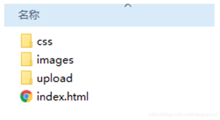
2、搭建文件结构
3、设置视口标签以及引入初始化样式
<meta name="viewport" content="width=device-width, user-scalable=no,         initial-scale=1.0, maximum-scale=1.0, minimum-scale=1.0">

<link rel="stylesheet" href="css/normalize.css">
4、设置公共common.less文件
- 新建common.less 设置好最常见的屏幕尺寸,利用媒体查询设置不同的html字体大小,因为除了首页其他页面也需要
- 我们关心的尺寸有 320px、360px、375px、384px、400px、414px、424px、480px、540px、720px、750px
- 划分的份数我们定为 15等份
- 因为我们pc端也可以打开我们苏宁移动端首页,我们默认html字体大小为 50px,注意这句话写到最上面
5、新建index.less文件
-
新建index.less 这里面写首页的样式
-
将刚才设置好的 common.less 引入到index.less里面 语法如下:
// 在 index.less 中导入 common.less 文件
@import “common”
- 生成index.css 引入到 index.html 里面
6、body样式
body {
    min-width: 320px;
    width: 15rem;
    margin: 0 auto;
    line-height: 1.5;
    font-family: Arial, Helvetica;
    background: #F2F2F2;
}
<!DOCTYPE html>
<html lang="en">

<head>
    <meta charset="UTF-8">
    <meta name="viewport" content="width=device-width, initial-scale=1.0, maximum-scale=1.0, user-scalable=0" />
    <meta http-equiv="X-UA-Compatible" content="ie=edge">
    <link rel="stylesheet" href="css/normalize.css">
    <link rel="stylesheet" href="css/index.css">
    <title>苏宁</title>
</head>

<body>
    <!-- 顶部搜索框 -->
    <div class="search-content">
        <a href="#" class="classify"></a>
        <div class="search">
            <form action="">
                <input type="search" value="厨卫保暖季 哒哒哒">
            </form>
        </div>
        <a href="#" class="login">登录</a>
    </div>
    <!-- banner部分 -->
    <div class="banner">
        <img src="upload/banner.gif" alt="">
    </div>
    <!-- 广告部分 -->
    <div class="ad">
        <a href="#"><img src="upload/ad1.gif" alt=""></a>
        <a href="#"><img src="upload/ad2.gif" alt=""></a>
        <a href="#"><img src="upload/ad3.gif" alt=""></a>
    </div>
    <!-- nav模块 -->
    <nav>
        <a href="#">
            <img src="upload/nav1.png" alt="">
            <span>爆款手机</span>
        </a>
        <a href="#">
            <img src="upload/nav1.png" alt="">
            <span>爆款手机</span>
        </a>
        <a href="#">
            <img src="upload/nav1.png" alt="">
            <span>爆款手机</span>
        </a>
        <a href="#">
            <img src="upload/nav1.png" alt="">
            <span>爆款手机</span>
        </a>
        <a href="#">
            <img src="upload/nav1.png" alt="">
            <span>爆款手机</span>
        </a>
        <a href="#">
            <img src="upload/nav1.png" alt="">
            <span>爆款手机</span>
        </a>
        <a href="#">
            <img src="upload/nav1.png" alt="">
            <span>爆款手机</span>
        </a>
        <a href="#">
            <img src="upload/nav1.png" alt="">
            <span>爆款手机</span>
        </a>
        <a href="#">
            <img src="upload/nav1.png" alt="">
            <span>爆款手机</span>
        </a>
        <a href="#">
            <img src="upload/nav1.png" alt="">
            <span>爆款手机</span>
        </a>

    </nav>
</body>

</html>
// 设置常见的屏幕尺寸 修改里面的html文字大小
a {
    text-decoration: none;
}
// 一定要写到最上面
html {
    font-size: 50px;
}
// 我们此次定义的划分的份数 为 15
@no: 15;
// 320
@media screen and (min-width: 320px) {
    html {
        font-size: 320px / @no;
    }
}
// 360
@media screen and (min-width: 360px) {
    html {
        font-size: 360px / @no;
    }
}
// 375 iphone 678
@media screen and (min-width: 375px) {
    html {
        font-size: 375px / @no;
    }
}

// 384
@media screen and (min-width: 384px) {
    html {
        font-size: 384px / @no;
    }
}

// 400
@media screen and (min-width: 400px) {
    html {
        font-size: 400px / @no;
    }
}
// 414
@media screen and (min-width: 414px) {
    html {
        font-size: 414px / @no;
    }
}
// 424
@media screen and (min-width: 424px) {
    html {
        font-size: 424px / @no;
    }
}

// 480
@media screen and (min-width: 480px) {
    html {
        font-size: 480px / @no;
    }
}

// 540
@media screen and (min-width: 540px) {
    html {
        font-size: 540px / @no;
    }
}
// 720
@media screen and (min-width: 720px) {
    html {
        font-size: 720px / @no;
    }
}

// 750
@media screen and (min-width: 750px) {
    html {
        font-size: 750px / @no;
    }
}
// 首页的样式less文件
// @import 导入的意思 可以把一个样式文件导入到另外一个样式文件里面
// link 是把一个 样式文件引入到 html页面里面
@import "common";

// 页面元素rem计算公式: 页面元素的px / html 字体大小 50
@baseFont: 50;

* {
    margin: 0;
    padding: 0;
}

body {
    min-width: 320px;
    width: 15rem;
    margin: 0 auto;
    line-height: 1.5;
    font-family: Arial,Helvetica;
    background: #F2F2F2;
}


.search-content {
    display: flex;
    position: fixed;
    top: 0;
    left: 50%;
    transform: translateX(-50%);
    width: 15rem;
    height: 88rem / @baseFont;
    background-color:#FFC001;
    .classify {
        width: 44rem / @baseFont;
        height: 70rem / @baseFont;
        margin: 11rem / @baseFont 25rem / @baseFont 7rem / @baseFont 24rem / @baseFont;
        background: url(../images/classify.png) no-repeat;
        // 背景缩放 【想和父元素一样,直接100%即可】
        background-size: 44rem / @baseFont 70rem / @baseFont;
    }
    .search {
        flex: 1;
        input {
            outline: none;
            width: 100%;
            border: 0;
            height: 66rem / @baseFont;
            border-radius: 33rem / @baseFont;
            background-color:#FFF2CC;
            margin-top: 12rem / @baseFont;
            font-size: 25rem / @baseFont;
            padding-left: 55rem / @baseFont;
            color: #757575;
        }
    }
    .login {
        width: 75rem / @baseFont;
        height: 70rem / @baseFont;
        line-height: 70rem / @baseFont;
        margin: 10rem / @baseFont;
        font-size: 25rem / @baseFont;
        text-align: center;
        color: #fff;

    }
}

// banner
.banner {
    width: 750rem / @baseFont;
    height: 368rem / @baseFont;
    img {
        width: 100%;
        height: 100%;
    }
}
// ad
.ad {
    display: flex;
    a {
        flex: 1;
        img {
            width: 100%;
        }
    }
}
// nav
nav {
    width: 750rem / @baseFont;
    a {
        float: left;
        width: 150rem / @baseFont;
        height: 140rem / @baseFont;
        text-align: center;
        img {
            display: block;
            width: 82rem / @baseFont;
            height: 82rem / @baseFont;
            margin: 10rem / @baseFont auto 0;
        }
        span {
            font-size: 25rem / @baseFont;
            color: #333;
        }
    }
}
rem 适配方案2
手机淘宝团队出的简洁高效 移动端适配库
我们再也不需要在写不同屏幕的媒体查询,因为里面js做了处理
它的原理是把当前设备划分为10等份,但是不同设备下,比例还是一致的。
我们要做的,就是确定好我们当前设备的html 文字大小就可以了
比如当前设计稿是 750px, 那么我们只需要把 html 文字大小设置为 75px(750px / 10) 就可以
里面页面元素rem值: 页面元素的px 值 / 75
剩余的,让flexible.js来去算
github地址:https://github.com/amfe/lib-flexible
总结:
因为flexible是默认将屏幕分为10等分
但是当屏幕大于750的时候希望不要再去重置html字体了
所以要自己通过媒体查询设置一下
并且要把权重提到最高
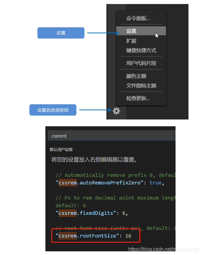
VSCode px 转换rem 插件 cssrem
因为cssrem中css自动转化为rem是参照默认插件的16转换的所以需要自己配置
<!DOCTYPE html>
<html lang="en">

<head>
    <meta charset="UTF-8">
    <meta name="viewport" content="width=device-width, user-scalable=no,initial-scale=1.0, maximum-scale=1.0, minimum-scale=1.0">

    <meta http-equiv="X-UA-Compatible" content="ie=edge">
    <link rel="stylesheet" href="css/normalize.css">
    <link rel="stylesheet" href="css/index.css">
    <!-- 引入我们的flexible.js 文件 -->
    <script src="js/flexible.js"></script>
    <title>Document</title>
</head>

<body>
    <div class="search-content">
        <a href="#" class="classify"></a>
        <div class="search">
            <form action="">
                <input type="search" value="rem适配方案2很开心哦">
            </form>
        </div>
        <a href="#" class="login">登录</a>
    </div>
</body>

</html>
/* cssrem这个插件默认的html文字大小 cssroot  16px */

body {
    min-width: 320px;
    max-width: 750px;
    /* flexible 给我们划分了 10 等份 */
    width: 10rem;
    margin: 0 auto;
    line-height: 1.5;
    font-family: Arial, Helvetica;
    background: #f2f2f2;
}

a {
    text-decoration: none;
    font-size: .333333rem;
}

/*
img {
    width: 5.125rem;
    height: 4rem;
    width: 1rem;
    width: 1.093333rem;
    height: 1rem;
} */


/* 如果我们的屏幕超过了 750px  那么我们就按照 750设计稿来走 不会让我们页面超过750px */
@media screen and (min-width: 750px) {
    html {
        /* 这里的75px不能写成1rem,否则设置元素的大小失效 */
        /* 【因为1rem是html字体大小,html字体大小默认是16px,设置html字体大小时,用1rem,就是16px。】 */
        /* 【能写固定值,就写固定值。】 */
        font-size: 75px!important;
    }
}

/* search-content */
.search-content {
    display: flex;
    position: fixed;
    top: 0;
    left: 50%;
    transform: translateX(-50%);
    width: 10rem;
    height: 1.173333rem;
    background-color: #FFC001;
}

.classify {
    width: .586667rem;
    height: .933333rem;
    margin: .146667rem .333333rem .133333rem;
    background: url(../images/classify.png) no-repeat;
    background-size: .586667rem .933333rem;
}

.search {
    flex: 1;
}

.search input {
    outline: none;
    border: 0;
    width: 100%;
    height: .88rem;
    font-size: .333333rem;
    background-color: #FFF2CC;
    margin-top: .133333rem;
    border-radius: .44rem;
    color: #757575;
    padding-left: .733333rem;
}

.login {
    width: 1rem;
    height: .933333rem;
    margin: .133333rem;
    color: #fff;
    text-align: center;
    line-height: .933333rem;
    font-size: .333333rem;
}

 浙公网安备 33010602011771号