[UI] 02 - Layout & CSS3
开胃小菜
一、纯CSS布局
- UI效果
From: 创建一个没有表格的网页
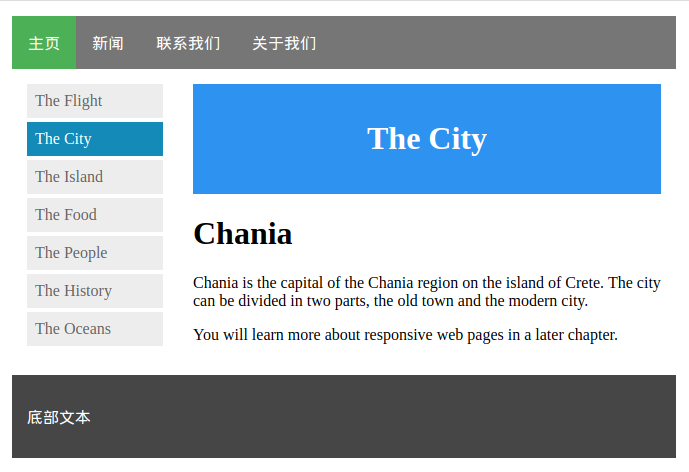
- 代码详情
<!DOCTYPE html>
<html>
<head>
<meta charset="utf-8">
<title>菜鸟教程(runoob.com)</title>
<style>


* {
    box-sizing: border-box;
}
body {
    margin: 0;
}
.header {
    background-color: #2196F3;
    color: white;
    text-align: center;
    padding: 15px;
}
.footer {
    background-color: #444;
    color: white;
    padding: 15px;
}
.topmenu {
    list-style-type: none;
    margin: 0;
    padding: 0;
    overflow: hidden;
    background-color: #777;
}
.topmenu li {
    float: left;
}
.topmenu li a {
    display: inline-block;
    color: white;
    text-align: center;
    padding: 16px;
    text-decoration: none;
}
.topmenu li a:hover {
    background-color: #222;
}
.topmenu li a.active {
    color: white;
    background-color: #4CAF50;
}
.column {
    float: left;
    padding: 15px;
}
.clearfix::after {
    content: "";
    clear: both;
    display: table;
}
.sidemenu {
    width: 25%;
}
.content {
    width: 75%;
}
.sidemenu ul {
    list-style-type: none;
    margin: 0;
    padding: 0;
}
.sidemenu li a {
    margin-bottom: 4px;
    display: block;
    padding: 8px;
    background-color: #eee;
    text-decoration: none;
    color: #666;
}
.sidemenu li a:hover {
    background-color: #555;
    color: white;
}
.sidemenu li a.active {
    background-color: #008CBA;
    color: white;
}
</style>
</head>

<body>
<ul class="topmenu">
  <li><a href="#home" class="active">主页</a></li>
  <li><a href="#news">新闻</a></li>
  <li><a href="#contact">联系我们</a></li>
  <li><a href="#about">关于我们</a></li>
</ul>

<div class="clearfix">

  <div class="column sidemenu">
    <ul>
      <li><a href="#flight">The Flight</a></li>
      <li><a href="#city" class="active">The City</a></li>
      <li><a href="#island">The Island</a></li>
      <li><a href="#food">The Food</a></li>
      <li><a href="#people">The People</a></li>
      <li><a href="#history">The History</a></li>
      <li><a href="#oceans">The Oceans</a></li>
    </ul>
  </div>

  <div class="column content">
    <div class="header">
      <h1>The City</h1>
    </div>
    <h1>Chania</h1>
    <p>Chania is the capital of the Chania region on the island of Crete. The city can be divided in two parts, the old town and the modern city.</p>
    <p>You will learn more about responsive web pages in a later chapter.</p>
  </div>
</div>

<div class="footer">
  <p>底部文本</p>
</div>
</body>
</html>
重要组件
一、基本组件
二、CSS 实例
Goto: http://www.runoob.com/css/css-examples.html【查询实例】
CSS3新特性
一、边框
CSS3 圆角,也可详见:http://www.runoob.com/css3/css3-border-radius.html
CSS3 盒阴影
边界图片
框大小,详见:http://www.runoob.com/css3/css3-box-sizing.html
二、背景
三、渐变
四、文本效果、字体
五、2D/3D 转换
六、过渡、动画
七、多列布局
八、用户界面
resize
box-sizing
outline-offset
九、图片
十、按钮
十一、分页
十二、弹性盒子
十三、多媒体查询
Ref: CSS3 多媒体查询实例
以上仅仅记录个别要点。
日后慢慢补充。

 浙公网安备 33010602011771号