css-inline-block和float的布局二者择其一?
几个月前,带着不甘和忐忑毅然决然的在亚马逊离职了,当时不知道对我来说是好是坏,现在看来,当初的选择还是蛮不错的。感觉在亚马逊的几个月貌似接触最多的就是wiki和tt了,怀着对技术热忱离开,拒绝了腾讯,搜狐和凤凰网,最后来到了经纬系下的一家创业公司,开启了创业潮!个人在title和technology两方面对比还是更喜欢后者吧,反正还没毕业,路还长着呢,好了言归正传!!!
inline-block属性:
最近和boss直聘的前端leader吃饭,说到了布局的问题,其实css布局还是挺容易让人入坑的,因为很多页面的html/css的布局不合理就回导致整个页面要用很多js来弥补你样式的坑,并且很可能在不通设备下样式直接乱掉。而一般前端工程师最常用的布局是float布局,聊到这里,基本上我们意见一致,那就是能用inline-block就尽量少用float或position!!!原因很简单,就是float高度塌陷有的时候会致命!!!
下面我们来说一下inline-block的那些坑:
我们来先写这样一段代码
<!DOCTYPE html>
<html lang="en">
<head>
    <meta charset="utf-8">
    <link rel="stylesheet" href="css/hjk.css">
    <style>
        .inlineBlock{
            display: inline-block;
            width: 200px;
            height: 200px;
            background: red;
            border:1px solid #666;
        }
    </style>
</head>
<body>
    <div class='inlineBlock'></div>
    <div class='inlineBlock'></div>
</body>
<script>
</script>
</html>
我们来看一下效果:
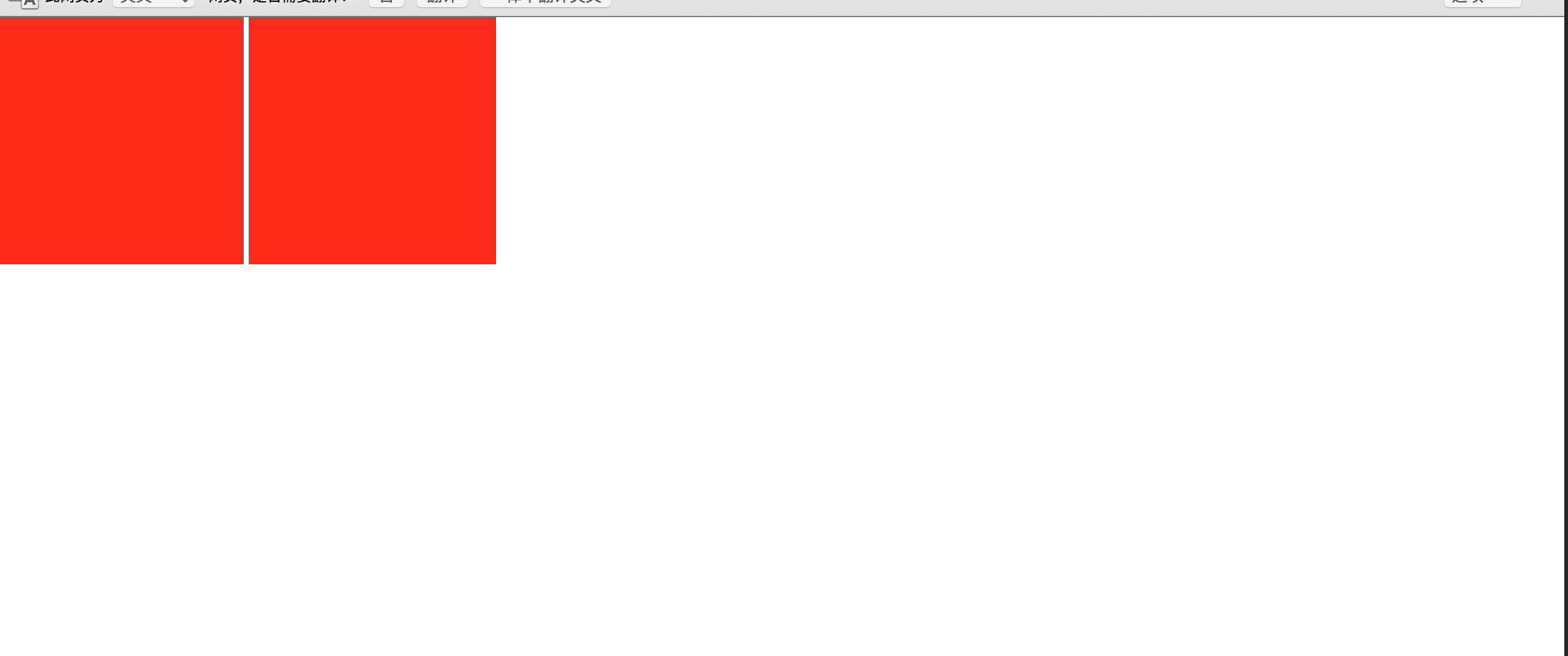
我勒个去,中间的哪个间距是什么鬼?
我们知道inline-block元素其实是一个具有区块元素,又具有内敛元素的一个元素!!
好绕:其实inline-block就是不占据一行的块状元素!
那么我们怎么去解决呢?其实解决的方法挺多,知道的空白的元素是inline-block默认的空格符,那么我们可以这样解决
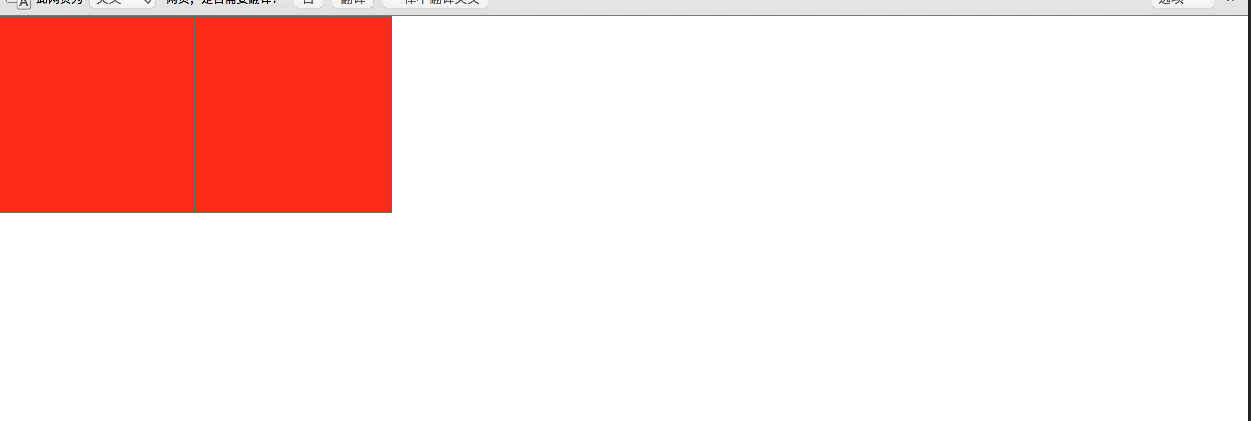
<!DOCTYPE html>
<html lang="en">
<head>
    <meta charset="utf-8">
    <link rel="stylesheet" href="css/hjk.css">
    <style>
        .inlineBlock{
            display: inline-block;
            width: 200px;
            height: 200px;
            background: red;
            border:1px solid #666;
        }
    </style>
</head>
<body>
    <div class='inlineBlock'></div><div class='inlineBlock'></div>
</body>
<script>
</script>
</html>
看一下样式:
好了这个问题就解决了,其实还有别的写法比如说:
  <div class='inlineBlock'></div><!--
     --><div class='inlineBlock'></div>
或者说:
<div class='inlineBlock'>
    我是内容</div><div class='inlineBlock'>
    我是内容</div>
但是这种方法总是让人看着头疼,因为这个不符合正常html代码的书写,那么我们可能从css上面来决解这种问题么?
首先我们想到的肯定是给第二个元素添加margin负,代码如下:
<!DOCTYPE html>
<html lang="en">
<head>
    <meta charset="utf-8">
    <link rel="stylesheet" href="css/hjk.css">
    <style>
        .inlineBlock{
            display: inline-block;
            width: 200px;
            height: 200px;
            background: red;
            border:1px solid #666;
        }
        .div2{
            margin-left: -4px;
        }
    </style>
</head>
<body>
    <div class='inlineBlock div1'></div>
    <div class='inlineBlock div2'></div>
</body>
<script>
</script>
</html>
运行结果:
但是这种方法存在问题:
1.我们布局肯定很多元素,不可能每个都添加margin负这样维护成本太大了
2.我们线上代码如果压缩,那么我们就不存在哪个4px的问题了,那么我们的margin负就回造成布局混乱!
哪么难道不能用css来解决这个问题么?
还有一种方法还是这种方法也有缺点
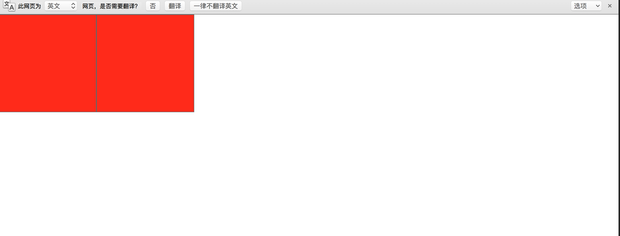
我们给元素加一个container然后设置font-size为0就能解决这个问题,然后根据我们每个布局模块想要的font-size在自己添加font-size
<!DOCTYPE html>
<html lang="en">
<head>
    <meta charset="utf-8">
    <link rel="stylesheet" href="css/hjk.css">
    <style>
        .container{
            font-size: 0;
        }
        .inlineBlock{
            display: inline-block;
            width: 200px;
            height: 200px;
            background: red;
            border:1px solid #666;
            font-size: 12px;
        }
    </style>
</head>
<body>
    <div class="container">
        <div class='inlineBlock div1'></div>
        <div class='inlineBlock div2'></div>
    </div>
</body>
<script>
</script>
</html>
这样子我们也能得到我们想要的结果,但是其中利弊自己体会!
所以每一种方法都有优缺利弊,个人还是喜欢注释法,压缩上线也不会有问题,也比较推荐这个!
好了我们继续,下面如果我们给div内部加文字会怎么样呢?
<!DOCTYPE html>
<html lang="en">
<head>
    <meta charset="utf-8">
    <link rel="stylesheet" href="css/hjk.css">
    <style>
        .container{
            font-size: 0;
        }
        .inlineBlock{
            display: inline-block;
            width: 200px;
            height: 200px;
            background: red;
            border:1px solid #666;
            font-size: 12px;
        }
    </style>
</head>
<body>
    <div class="container">
        <div class='inlineBlock div1'></div>
        <div class='inlineBlock div2'>我是内容</div>
    </div>
</body>
<script>
</script>
</html>
效果如下:
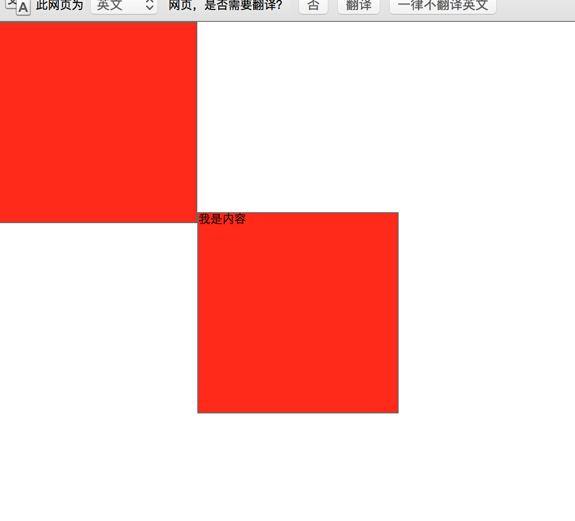
我勒个擦,我就加了个文字,这是什么鬼——,怎么莫名其表的还掉下来了?
其实这个问题主要的原因是因为我们默认的文字对齐是baseline,基线对齐,所以我们的inline-block元素就会出现这样的问题!
我们改一下html代码:
<!DOCTYPE html>
<html lang="en">
<head>
    <meta charset="utf-8">
    <link rel="stylesheet" href="css/hjk.css">
    <style>
        .inlineBlock{
            display: inline-block;
            width: 200px;
            height: 200px;
            background: red;
            border:1px solid #666;
            font-size: 12px;
        }
    </style>
</head>
<body>
    <div>
        我是container内容
        <div class='inlineBlock div1'></div><!--
         --><div class='inlineBlock div2'>我是div2内容</div>
    </div>
</body>
<script>
</script>
</html>
效果如下:
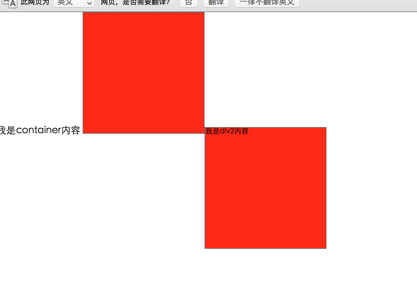
也就是说我们现在所有inline内容都是跟container的基线对齐的因为div2内部加入了inline,所以整个元素都掉了下来基线对齐!但是为什么并不是完全的对齐呢?我们现在来加入这样一行代码:
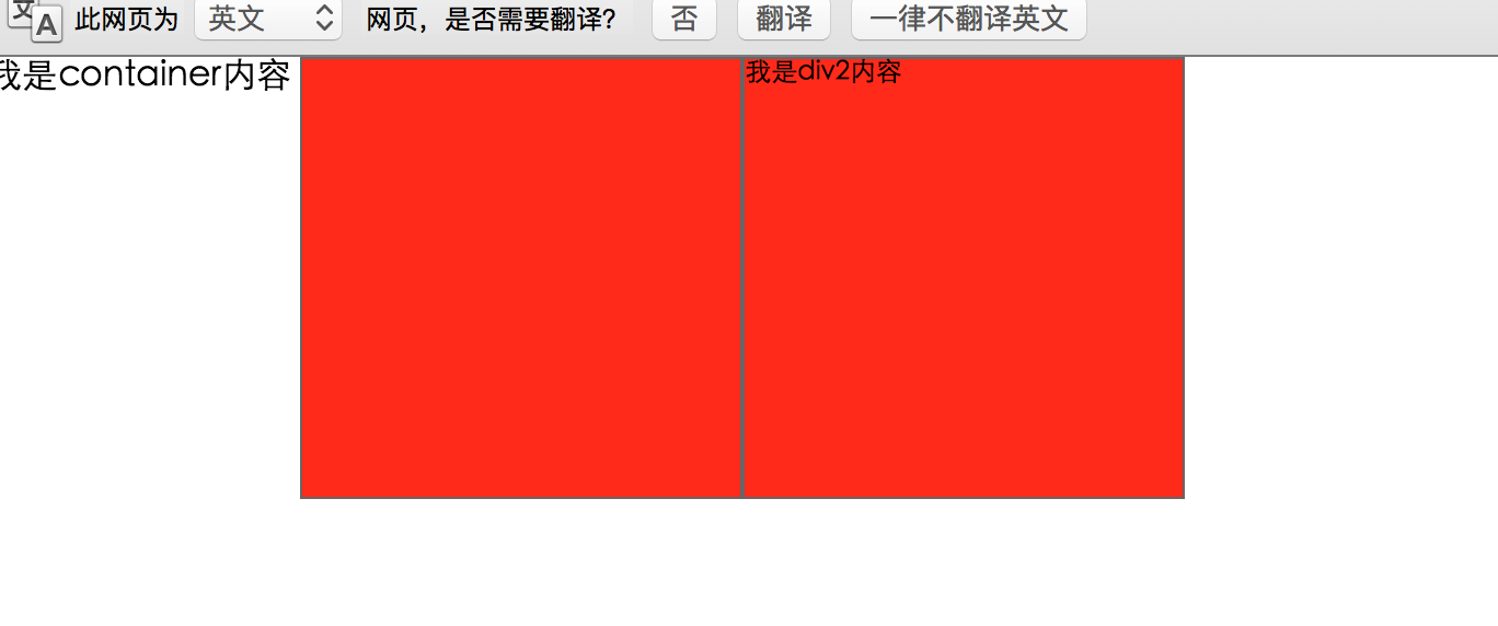
     .inlineBlock{
            line-height: 0;
        }
效果如下:
看到这里你应该明白了吧,inline-block的元素,受line-height和vertical-align两个元素的影响!(不明白vertical-align或两者的关系的同学,建议先去学习一下)
那么到这里我们的问题就好解决了
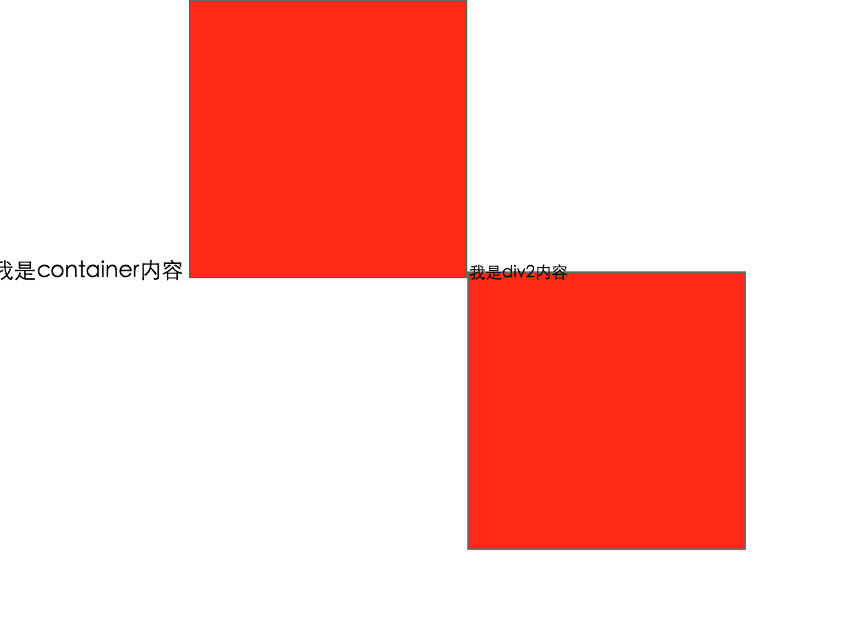
<!DOCTYPE html>
<html lang="en">
<head>
    <meta charset="utf-8">
    <link rel="stylesheet" href="css/hjk.css">
    <style>
        .inlineBlock{
            display: inline-block;
            width: 200px;
            height: 200px;
            background: red;
            border:1px solid #666;
            font-size: 12px;
            vertical-align: top;
        }
    </style>
</head>
<body>
    <div>
        我是container内容
        <div class='inlineBlock div1'></div><!--
         --><div class='inlineBlock div2'>我是div2内容</div>
    </div>
</body>
<script>
</script>
</html>
效果如下:
这样我们就实现了top线对齐,问题圆满解决!
其实还有个容易的方法,只需要添加float,所有问题迎刃而解:
<!DOCTYPE html>
<html lang="en">
<head>
    <meta charset="utf-8">
    <link rel="stylesheet" href="css/hjk.css">
    <style>
        .inlineBlock{
            display: inline-block;
            width: 200px;
            height: 200px;
            background: red;
            border:1px solid #666;
            font-size: 12px;
            float: left;
        }
    </style>
</head>
<body>
    <div>
        <div class='inlineBlock div1'></div>
        <div class='inlineBlock div2'>我是div2内容</div>
    </div>
</body>
<script>
</script>
</html>
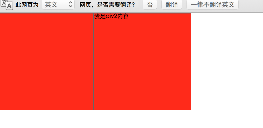
你看他俩靠的多近啊,还没有掉落的问题,但是因为float的高度塌陷问题又来了,刻刻~~~自己慢慢领悟!!
float布局
接下来我们来看看float的问题,这里我们用到了盒模型,建议基础不好的小伙伴学一学盒模型
其实float最开始出现就是为了实现文字环绕效果,float之后高度塌陷,所以文字会环绕这你float的元素!注意是文字环绕,不是元素环绕!但是因为float元素的出现我们大多数都比较喜欢用float布局,float属性就这样子被滥用了,当然我也是其中的一员。虽然高度塌陷这个问题(不是bug)比较让人头疼,但是比起inline-block元素来说,我还是更喜欢float的布局方式!
首先我们来说一下一种整体的warp布局(这个和float无关),就拿我们学校的官网举例- -:

这种布局(比如背景颜色想要#eee),首先的第一种想法肯定是我先外层一个div,width为100%,然后内部div设置class为wrap,然后我给wrap一个固定的width,之后margin负居中,这种是人们最常见的,也是最常用的。但是这种方式我并不接受,第一外层div并没有用出了设置了背景颜色,第二就是我们margin负就必须要根据计算而来的margin负,如果改动width那么margin负也要跟着改!
我个人比较推崇padding方式来实现这个布局,既能减少不必要的dom元素,也能避免margin带来的问题!
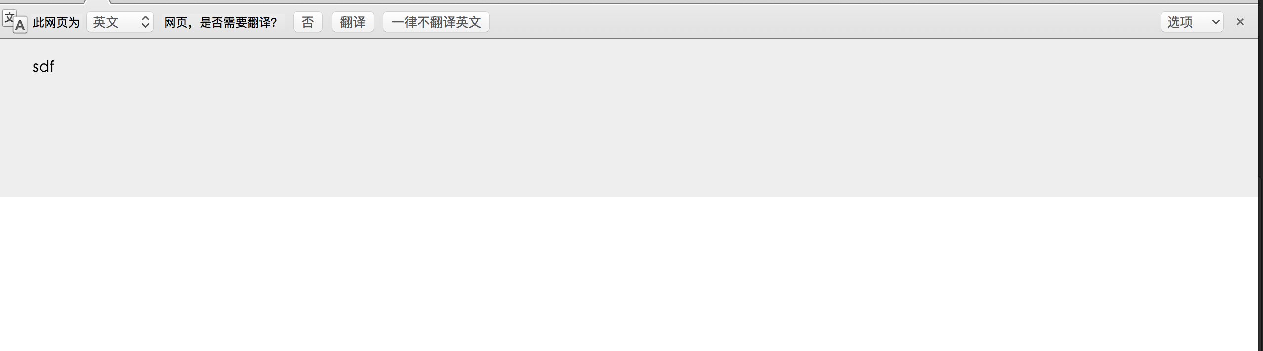
代码如下:
<!DOCTYPE html>
<html lang="en">
<head>
    <meta charset="UTF-8">
    <title>Document</title>
    <style>
        *{
            padding: 0;
            margin: 0;
        }
        .container{
            padding: 20px 40px 40px;
            height: 100px;
            background: #eee;
        }
    </style>
</head>
<body>
    <div class='container'>
        sdf
    </div>
</body>
</html>
效果如下:
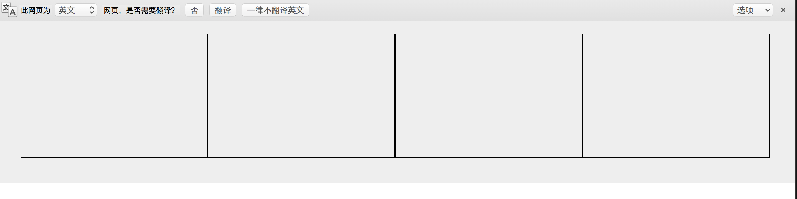
我们用padding来单体了之前的warp布局,之后我们给container内部添加一下浮动元素
css:
     .fBox{
            width: 25%;
            height: 200px;
            float: left;
            box-sizing: border-box;
            border:1px solid #000;
        }
dom:把container替换成
  <div class='container'>
        <div class="fBox"></div>
        <div class="fBox"></div>
        <div class="fBox"></div>
        <div class="fBox"></div>
        <div class="fBoxc"></div>
    </div>
效果如下:
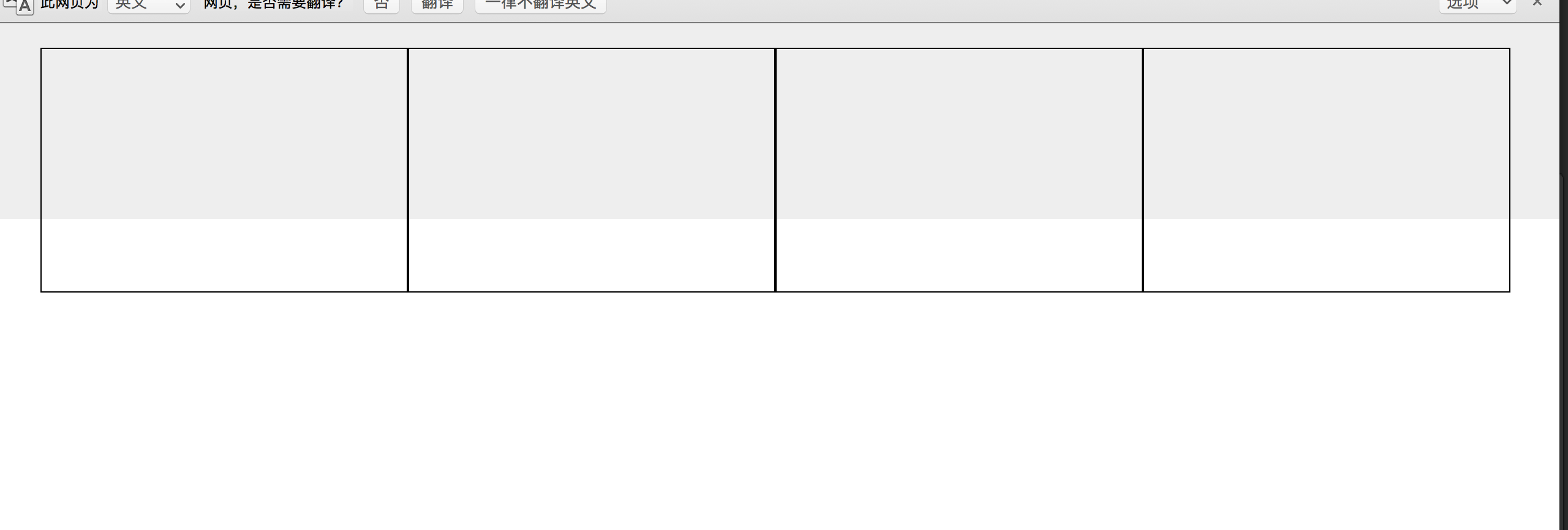
因为内部高度塌陷,所以float的元素并没有撑开整个container,怎么解决这个问题呢?我们首先想到的肯定是clear:both;清除浮动
代码如下:
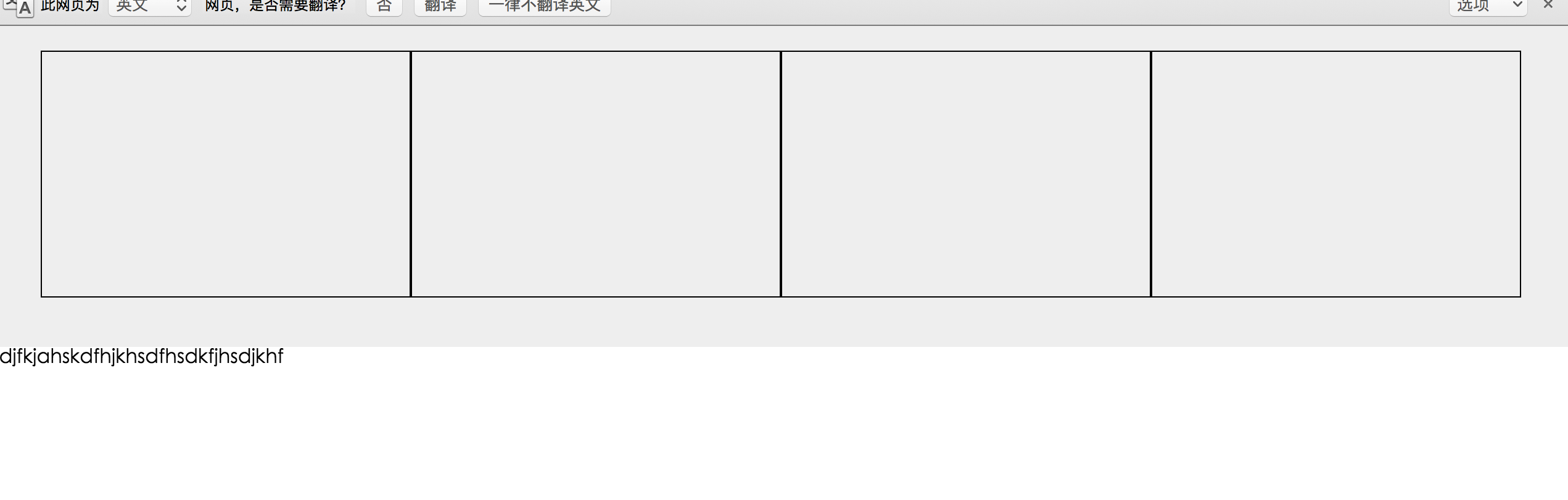
  <div class='container'>
        <div class="fBox"></div>
        <div class="fBox"></div>
        <div class="fBox"></div>
        <div class="fBox"></div>
        <div class="fBoxc"></div>
        <div style='clear: both;'></div>
    </div>
效果如下:
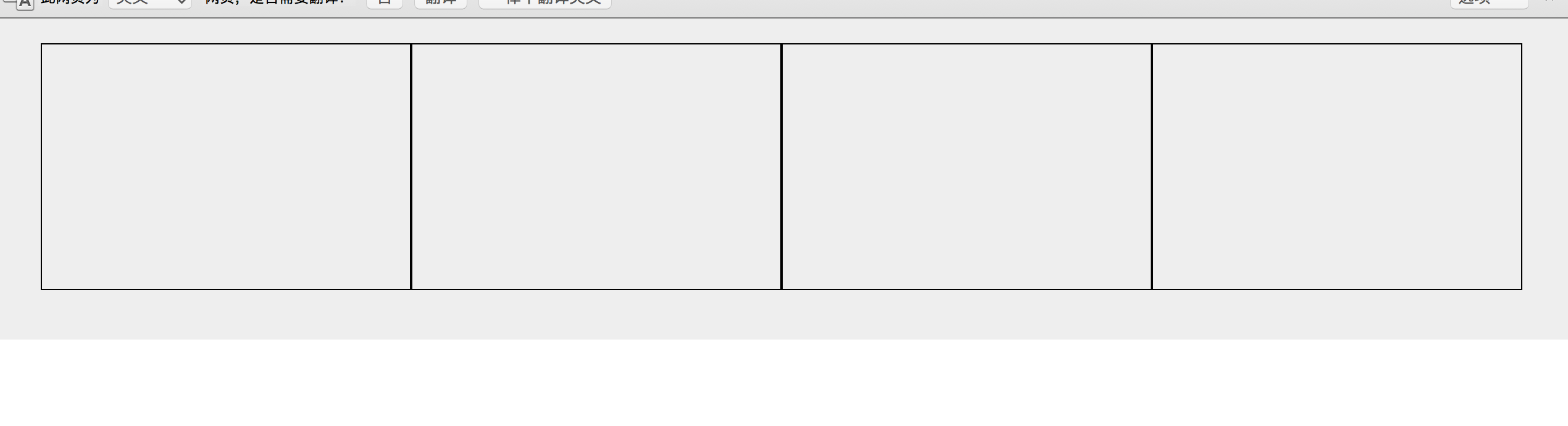
这个问题虽然解决了,但是存在很多问题。
首先从html的原则来说我们新增了一个空白div元素,这就违背了我们坚守无用dom元素的原则了,其次我们如果很多个浮动,那么我们需要给很多container内部最后一行清除浮动,这样子整个页面代码会很混乱。
下面我们来介绍第二种方法:
我们去掉container的height高度添加overflow:hidden;
代码如下:
     .container{
            padding: 20px 40px 40px;
            background: #eee;
            overflow: hidden;
        }
html:
       <div class='container'>
        <div class="fBox"></div>
        <div class="fBox"></div>
        <div class="fBox"></div>
        <div class="fBox"></div>
        <div class="fBoxc"></div>
    </div>
效果如下:
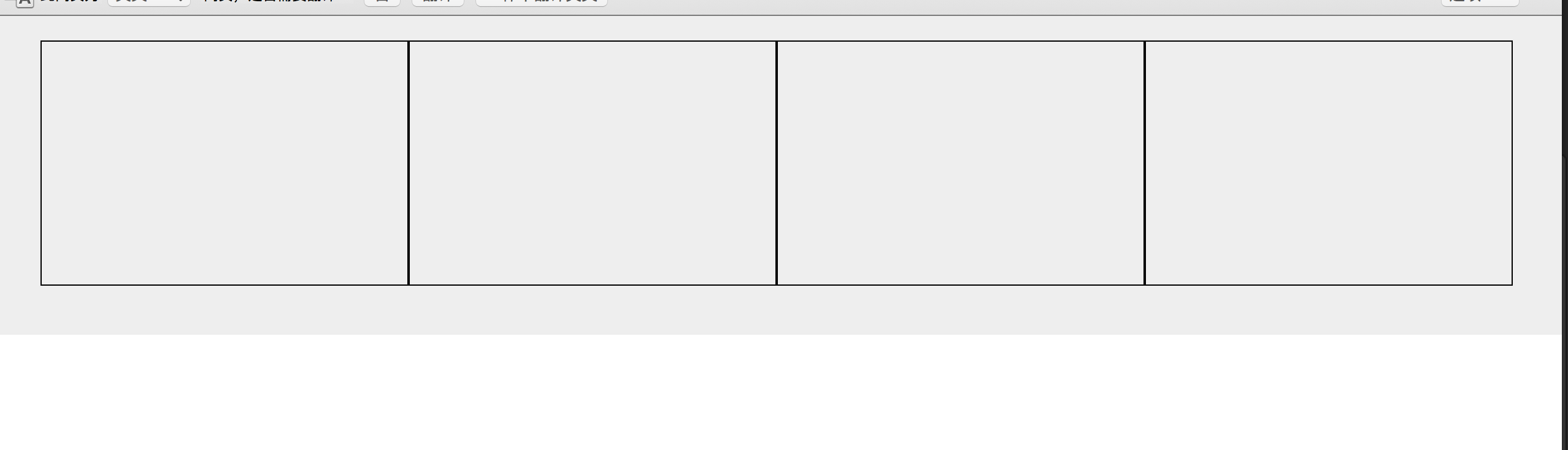
这个兼容性非常的好,而且确实能够撑起来整个container,但是存在很大的问题(本人就在这个属性栽倒过)
1.不能使用position超出尺寸的会被隐藏
2.如果布局已经内部float并不知道height有多大,千万不要使用,因为如果height比你的设备的height还要大的时候,每次滑动页面之前都会计算container的高度,所以也就是说滑动之前你需要点一下屏幕,他计算的事件虽然很多很短但是这个问题特别影响用户体验!
我曾经在学校给一家公司做活动需求,当时为了方便用的这个属性来兼容自动撑开container,当时也没有自己的手机做一下测试,因为项目赶的比较急,然后在chrome上面测了一下没问题就直接提交到git上了,结果当天晚上12点之前上线,公司测试并没有测出我们个overflow的问题,后来临近12点的时候在线下突然测出了这个问题,之后为了兼容这个问题,我整个页面的布局全部大改,因为当时css比较渣,页面混用了float和position,然后overflow自适应,再加上页面比较复杂,所以我改页面改到凌晨2点办才修复这个bug,再加上当时ui那面也出了一点问题,所以整个活动延迟到第二天中午12点上的线。沉痛的教训!!!
下面我说一下我最推荐的一种方式,也是现在最主流的方式,京东淘宝都在用这个来决解浮动问题!就是通过委元素来清除浮动
代码如下:
<!DOCTYPE html>
<html lang="en">
<head>
    <meta charset="UTF-8">
    <title>Document</title>
    <style>
        *{
            padding: 0;
            margin: 0;
        }
        .fBox{
            width: 25%;
            height: 200px;
            float: left;
            box-sizing: border-box;
            border:1px solid #000;
        }
        .container{
            padding: 20px 40px 40px;
            background: #eee;
        }
        .clearFix:after{
            content:'';
            clear: both;
            display: table;
        }
    </style>
</head>
<body>
    <div class='clearFix container'>
        <div class="fBox"></div>
        <div class="fBox"></div>
        <div class="fBox"></div>
        <div class="fBox"></div>
        <div class="fBoxc"></div>
    </div>
</body>
</html>
效果如下:
这样我们就解决了浮动的问题,接下来我们尝试一下根据不同屏幕的尺寸来改变每个li的width来实现移动端的自适应
<!DOCTYPE html>
<html lang="en">
<head>
    <meta charset="UTF-8">
    <title>Document</title>
    <style>
        *{
            padding: 0;
            margin: 0;
        }
        .fBox{
            width: 50%;
            height: 200px;
            float: left;
            box-sizing: border-box;
            border:1px solid #000;
        }
        @media (min-width: 992px){
            .fBox{
                width: 25%;
            }
        }
        @media (max-width: 750px){
            .fBox{
                width: 100%;
            }
        }
        .container{
            padding: 20px 40px 40px;
            background: #eee;
        }
        .clearFix:after{
            content:'';
            clear: both;
            display: table;
        }
    </style>
</head>
<body>
    <div class='clearFix container'>
        <div class="fBox"></div>
        <div class="fBox"></div>
        <div class="fBox"></div>
        <div class="fBox"></div>
        <div class="fBoxc"></div>
    </div>
    <p>sdjfkjahskdfhjkhsdfhsdkfjhsdjkhf</p>
</body>
</html>
效果如下:
width:1200px
width:750px
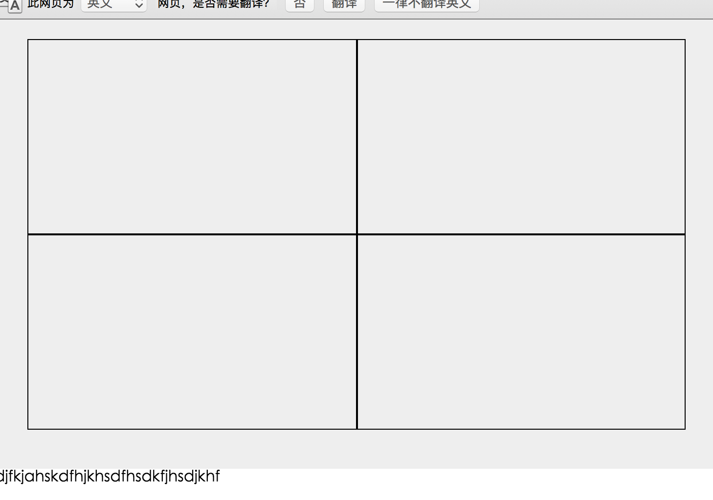
width:600px

看到这个我们可能给不同的media里面添加不用的class设置不同的width百分比,这样我们只需要给一个元素添加这三个class就能够实现不用width尺寸的屏幕显示不用的布局!看到这里你有没有恍然大悟,没错bootstrap3的基本布局原理与不同设备的class实现原理就是这样子设计的!

 浙公网安备 33010602011771号