
3D效果 + 布局模式1
1、透视、视距
透视属性
perspective: 300px; 这种方法添加在父元素身上
灭点位置(看图的位置)
perspective-origin: right bottom;
透视属性添加在子元素身上
transform:perspective(500px);
2、3D模型(使用3D)
transform-style: preserve-3d; 在父元素添加该属性启用3D动画
3、背面是否可见
backface-visibility: visible; 可见
backface-visibility: hidden; 不可见,隐藏
4、3D可使用属性
1)前后移动
transform: translateZ(400px); 向前移动
transform: translateZ(-400px); 向后移动
2)旋转
rotateZ(deg) 单位deg
5、常见布局模式
1)响应式布局 (@media screen)
1、@media screen and (min-width:750px) and (max-width:960px){
} 最小尺寸 最大尺寸
注意 : and 左右两边一定要有空格
2、overflow-x:hidden;
在使用 @media screen 时,在一些尺寸设定不是很完美时,就要使用 overflow-x:hidden; 去除浏览器下方的滚动条
3、横竖屏模拟 (下方代码时在竖屏时 使用背景红色 ,当横屏时,使用绿色)
    <style>
        .box{
            height: 800px;
            background-color: red;
        }
        @media  screen and (orientation: landscape) {
            .box{
                background-color: green;
            }
        }
    </style>
</head>
<body>
    <div class="box"></div>
</body>
2、百分比布局 %
全局所有元素在定义宽高时使用 %
3、一边固定一边自适应
1)calc 计算 + 浮动 (下方代码:大盒子 box 使用百分比布局,left 固定宽,right 自适应)
<style>
        .box{
            width: 80%;
            margin: 0 auto;
            background-color: rgb(144,144,144);
        }
        .left{
            width: 200px;
            height: 800px;
            background-color: red;
            float: left;
        }
        .right{
            width: calc(100% - 200px);
            height: 800px;
            background-color: pink;
            float: left;
        }
    </style>
</head>
<body>
    <div class="all">
        <div class="box">
            <div class="left">left</div>
            <div class="right">right</div>
        </div>
    </div>
</body>
2)使用浮动 (上面代码中使用了浮动 ,下面代码纯使用浮动需要添加 overflow:hidden (这是超出部分隐藏))
<style>
        .box{
            width: 80%;
            margin: 0 auto;
            /* background-color: rgb(144,144,144); */
        }
        .left{
            width: 200px;
            height: 800px;
            background-color: red;
            float: left;
            opacity: 0.3;    /* 这是使该元素透明 */
        }
        .right{
            /* width: calc(100% - 200px);  这行代码可以去除 */
            height: 800px;
            background-color: green;
            overflow: hidden;
            /*
            1. 给固定宽度的元素添加浮动
            2. 给自适应宽度的元素添加清除浮动的影响
                overflow: hidden;
            3. 固定宽度的元素 和 自适应宽度的元素 要是兄弟关系
            */
        }
    </style>
3)弹性盒子 display:flex;
    <style>
        .box{
            width: 80%;
            margin: 0 auto;
            background-color: rgb(144,144,144);
            /* 1. 父元素为弹性盒子 */
            display: flex;
        }
        .left{
            width: 200px;
            height: 800px;
            background-color: red;
        }
        .right{
            width: 100%;
            /* 2. 自适应的子元素要设置为flex:1 */
            flex:1;
            height: 800px;
            background-color: pink;
        }
    </style>
4)使用 定位 position
<style>
.box{
width: 80%;
margin: 0 auto;
background-color: rgb(144,144,144);
position: relative;
}
.left{
width: 200px;
height: 800px;
background-color: red;
position: absolute;
top: 0;
left: 0;
}
.right{
height: 800px;
background-color: pink;
margin-left: 200px;
/* padding-left:200px; */
/*
1. 给父元素添加定位
2. 固定的子元素,相对于父元素进行定位
3. 自适应的子元素,宽度不设置,添加margin-left或者padding-left即可
*/
}
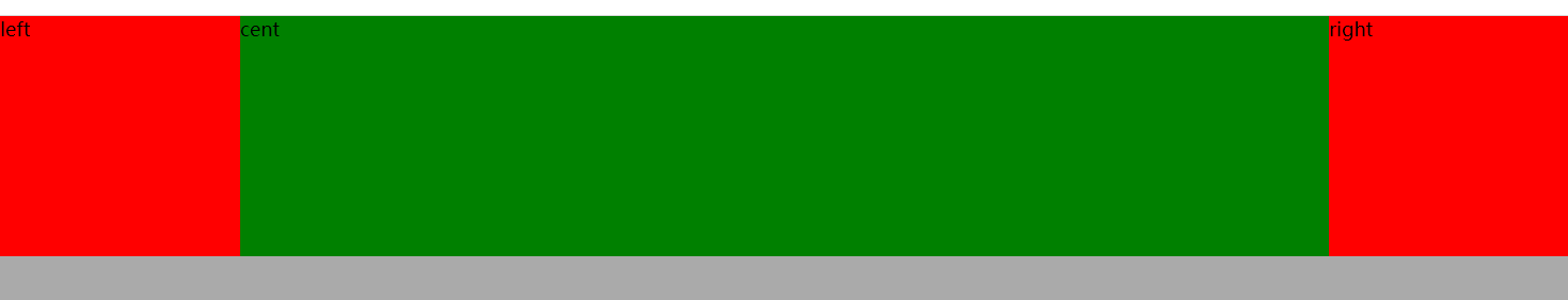
</style> 4、圣杯布局
有 flex 方式 、定位方式 、浮动方式 (实现上面目标)
    <title>圣杯布局</title>
    <style>
        *{
            margin: 0;
        }
        .content{
            height: 100vh;
            background-color: #aaa;
            display: flex;
        }
        .left{
            width:200px;
            height: 200px;
            background-color: red;
        }
        .right{
            width:200px;
            height: 200px;
            background-color: red;
        }
        .cent{
            min-width: 500px;
            height: 200px;
            width: 100%;
            flex: 1;
            background-color: green;
        }
    </style>
</head>
<body>
    <div class="content">
        <div class="left">left</div>
        <div class="cent">cent</div>
        <div class="right">right</div>
    </div>
</body>
</html>
5、居中布局 (在使用的弹窗时让元素出现在浏览器窗口中心)
1)定位 + 外边距的方式
<style>
        body{
            margin: 0;
        }
        .box{
            width: 500px;
            height: 300px;
            background-color: red;
            border-radius: 10px;
            text-align: center;
            font-size: 50px;
            line-height: 300px;
            position: absolute;  /* 绝对定位 */
            top: 0;
            left: 0;
            right: 0;
            bottom: 0;
            margin: auto;
        }
    /* 在使用该方式的情况下,定位的四个方向必须加上,这样外边距才能生效 */
    </style>
</head>
<body>
    <div class="box">居中显示</div>
</body>
</html>
2)定位 + 百分比的方式
<style>
        *{
            padding: 0;
            margin: 0;
        }
        .box{
            width: 500px;
            height: 300px;
            background-color: red;
            border-radius: 10px;
            text-align: center;
            font-size: 50px;
            line-height: 300px;
            position: absolute;
            top: 50%;
            left: 50%;
            transform: translate(-50%,-50%);   /* 相对于自身的宽高移动 50% */
        }
    </style>
</head>
<body>
    <div class="box">居中显示</div>
</body>
</html>
6、多列布局
1)依列宽 column-width: 300px;
2)依列数 column-count: 3;
3)列与列的间距 column-gap: 30px;
4)列与列的边框 column-rule: 6px double red;
5)跨列(可使标题之类的元素跨列居中显示) column-span: all;
<style>
.all{
/* 列宽 */
/* column-width: 300px; */
/* 注意:列宽与列数之间只容一个 */
/* 列数 */
column-count: 3;
/* 列和列之间的间距 */
column-gap: 30px;
/* 列之间的边框-border */
column-rule: 6px double red;
/* 改变排列方式 */
/* column-fill:auto; */
}
.p1{
/* all 跨所有的列,默认值为1,跨1列 */
column-span: all;
text-align: center;
}
</style>
</head>
<body>
<div class="all">
<p class="p1">这是一个标题</p>
<h3>第一段</h3>
<p>标签限定了文档的开始点和结束点,在它们之间是文档的头部和主体。正如您所了解的那样,文档的头部由 <head> 标签定义,而主体由 <;body> 标签定义。</p>
<h3>第一段</h3>
<p>xmlns 属性在 XHTML 中是必需的,但在 HTML 中不是。不过,即使 XHTML 文档中的 <html> 没有使用此属性,W3C 的验证器也不会报错。这是因为 "xmlns=http://www.w3.org/1999/xhtml" 是一个固定值,即使您没有包含它,此值也会被添加到 <html> 标签中。</p>
<h3>第一段</h3>
<p>注释:即使 html 元素是文档的根元素,它也不包含 doctype 元素。doctype 元素必须位于 html 元素之前。</p>
<h3>第一段</h3>
<p>这个例子是一个很简单的 HTML 文件,使用了尽量少的 HTML 标签。它向您演示了 body 元素中的内容是如何被浏览器显示的。</p>
</div>
</body>
</html>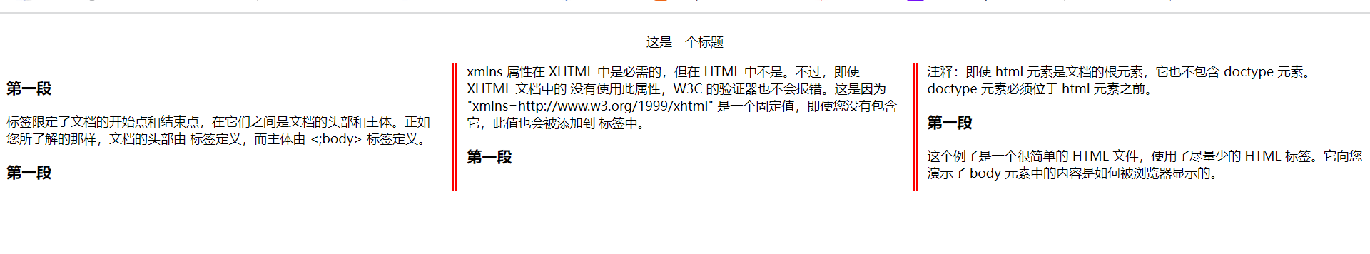

 浙公网安备 33010602011771号