
带尖角的边框(方法一)
<!DOCTYPE html>
<html lang="en">
<head>
<meta charset="UTF-8">
<title>带尖角的边框</title>
<style>
#first {
position: relative;
width: 200px;
height: 100px;
border: 1px solid;
/* display: none;//不占用原来位置*/
visibility: hidden;
/* visibility: hidden占用原来位置*/
}
#one {
position: absolute;
top: 100px;
left: 20px;
width: 0;
height: 0;
border: 10px solid transparent;
border-top-color: black;
}//黑色的小尖角
#two {
position: absolute;
top: 100px;
left: 21px;
width: 0;
height: 0;
border: 9px solid transparent;
border-top-color: white;
}//白色的小尖角
#test:hover #first{
/* display: block;*/
visibility: visible;
}
</style>
</head>
<body>
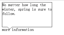
<div id="test">
<div id="first">
No matter how long the winter, spring is sure to follow.
<div id="one"></div>
<div id="two"></div>
</div>
<div id="second">more information</div>
</div>
</body>
</html>

