CSS学习笔记(一)-16.盒子模型-盒子阴影

demo:


 1 <!--
 2  * @Author: invoker
 3  * @Github: https://github.com/invoker2021
 4  * @Date: 2021-07-13 16:04:48
 5  * @LastEditors: invoker
 6  * @LastEditTime: 2021-07-13 16:08:37
 7  * @Description:
 8  * @FilePath: \css\盒子阴影.html
 9 -->
10 <!DOCTYPE html>
11 <html lang="en">
12
13 <head>
14     <meta charset="UTF-8">
15     <meta http-equiv="X-UA-Compatible" content="IE=edge">
16     <meta name="viewport" content="width=device-width, initial-scale=1.0">
17     <title>盒子阴影</title>
18     <style>
19         .box {
20             background-color: pink;
21             width: 300px;
22             height: 250px;
23             margin: 100px auto;
24             box-shadow: 10px 10px 15px 10px rgba(0, 0, 0, .3);
25         }
26     </style>
27 </head>
28
29 <body>
30     <div class="box">
31
32     </div>
33 </body>
34
35 </html>
盒子阴影不影响盒子的空间,不会影响盒子的排列。
鼠标经过时,阴影的效果
 1 <!--
 2  * @Author: invoker
 3  * @Github: https://github.com/invoker2021
 4  * @Date: 2021-07-13 16:04:48
 5  * @LastEditors: invoker
 6  * @LastEditTime: 2021-07-13 16:12:38
 7  * @Description:
 8  * @FilePath: \css\盒子阴影.html
 9 -->
10 <!DOCTYPE html>
11 <html lang="en">
12
13 <head>
14     <meta charset="UTF-8">
15     <meta http-equiv="X-UA-Compatible" content="IE=edge">
16     <meta name="viewport" content="width=device-width, initial-scale=1.0">
17     <title>盒子阴影</title>
18     <style>
19         .box {
20             background-color: pink;
21             width: 300px;
22             height: 250px;
23             margin: 100px auto;
24         }
25
26         .box:hover {
27             box-shadow: 10px 10px 15px 10px rgba(0, 0, 0, .3);
28         }
29     </style>
30 </head>
31
32 <body>
33     <div class="box">
34
35     </div>
36 </body>
37
38 </html>
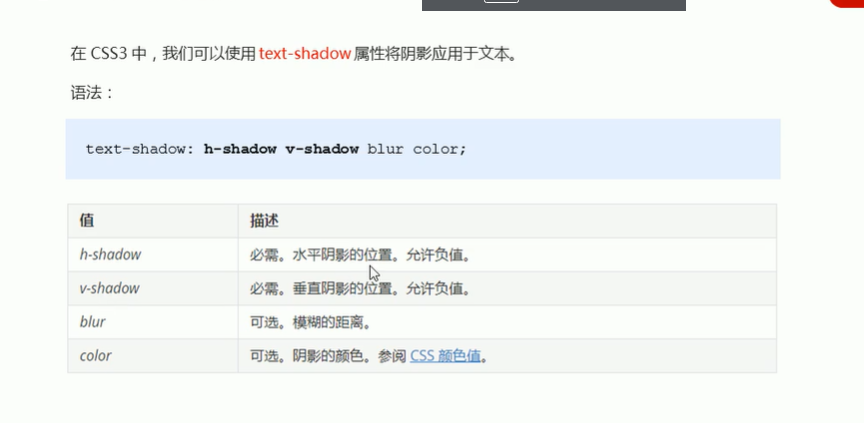
text-shadow: 5px 5px 6px rgba(0,0,0,.3)
本文来自博客园,作者:kaer_invoker,转载请注明原文链接:https://www.cnblogs.com/invoker2021/p/15006912.html

 浙公网安备 33010602011771号