
Flutter不常用组件(三)
IntrinsicHeight
创建一个将其子级大小调整为子级固有高度的小部件。
它有以下几个属性:
Key? key:标识键Widget? child:子组件
如果我们有以下布局界面:
Card(
  child: Row(
    children: [
      SizedBox(
        width: 120,
        child: Image.asset(
          "assets/images/hmbb.png",
          fit: BoxFit.cover,
        ),
      ),
      Expanded(
        child: Padding(
          padding: const EdgeInsets.all(8.0),
          child: Text("Hello World" * 40, maxLines: 10),
        ),
      ),
    ],
  ),
)
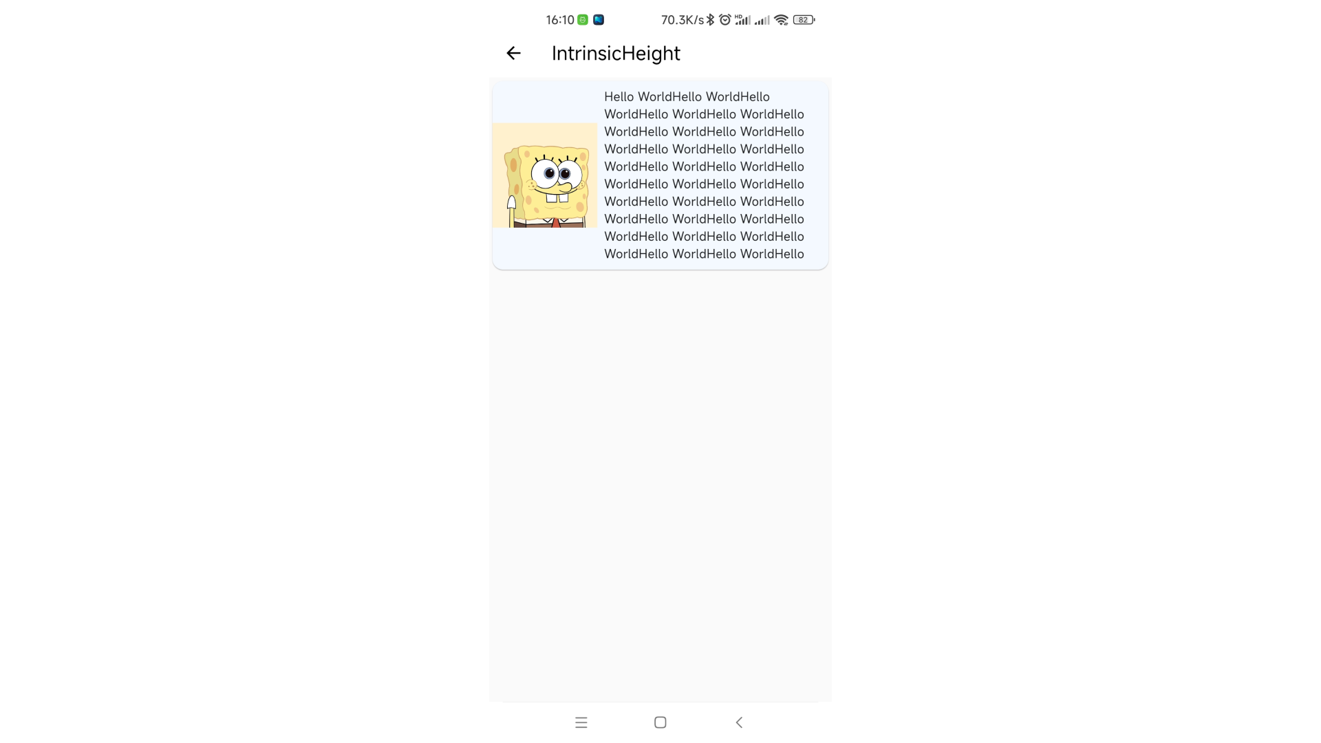
在我们的预想中,左边的图片应该要充满左边,但是我们又没有给这个组件设置高度,所以它无法充满。有两种方法可以实现,一是设置固定高度,二是使用IntrinsicHeight。
Card(
  child: IntrinsicHeight(
    child: Row(
      crossAxisAlignment: CrossAxisAlignment.stretch,
      children: [
        SizedBox(
          width: 120,
          child: Image.asset(
            "assets/images/hmbb.png",
            fit: BoxFit.cover,
          ),
        ),
        Expanded(
          child: Padding(
            padding: const EdgeInsets.all(8.0),
            child: Text("Hello World" * 40, maxLines: 10),
          ),
        ),
      ],
    ),
  ),
)
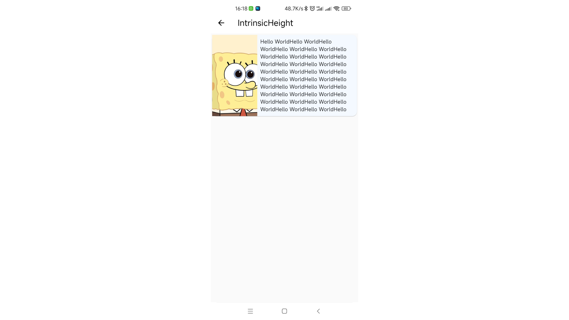
它可以让Row中所有子组件的高度都设置为其中最大的一个值。虽然这个组件效果很不错,但是劲量避免使用。
IntrinsicWidth
创建一个将其子级调整为子级固有宽度的小部件。功能和IntrinsicHeight一个样。
它有以下几个属性:
Key? key:标识键double? stepWidth:限制子组件的宽度为该值的倍数double? stepHeight:限制子组件的高度为该值的倍数Widget? child:子组件
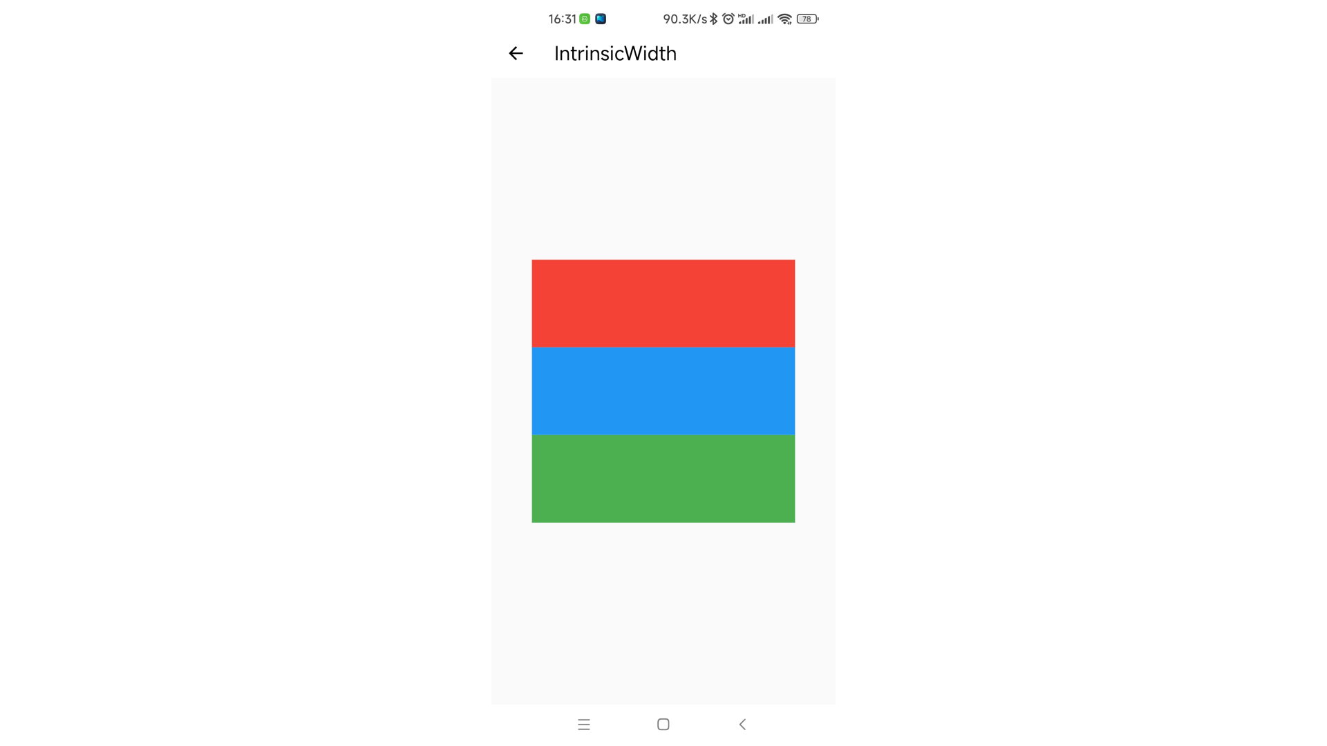
Center(
  child: IntrinsicWidth(
    stepHeight: 100,
    stepWidth: 100,
    child: Column(
      mainAxisAlignment: MainAxisAlignment.center,
      crossAxisAlignment: CrossAxisAlignment.stretch,
      children: [
        Container(height: 100, width: 200, color: Colors.red),
        Container(height: 100, width: 300, color: Colors.blue),
        Container(height: 100, width: 200, color: Colors.green),
      ],
    ),
  ),
)
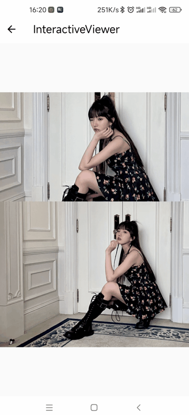
InteractiveViewer
支持平移和缩放与其子组件交互的小部件。
有以下几个属性:
Key? key:标识键Clip clipBehavior:裁剪方案。默认为Clip.hardEdgebool alignPanAxis:如果为true则不允许对角平移。默认为falseEdgeInsets boundaryMargin:边距。默认为EdgeInsets.zerobool constrained:小部件树中此时的正常大小约束是否应用于子级。默认为truedouble maxScale:最大的缩放倍数。默认为2.5double minScale:最小的缩放倍数。默认为为0.8void Function(ScaleEndDetails)? onInteractionEnd:当用户在小部件上结束平移或缩放手势时调用void Function(ScaleStartDetails)? onInteractionStart:当用户在小部件上开始平移或缩放手势时调用void Function(ScaleUpdateDetails)? onInteractionUpdate:当用户更新小部件上的平移或缩放手势时调用bool panEnabled:是否允许偏移。默认为truebool scaleEnabled:是否允许缩放。默认为truedouble scaleFactor:确定每次指针滚动要执行的缩放量。默认为200TransformationController? transformationController:TransformationController对象required Widget child:子组件
Center(
  child: InteractiveViewer(
    clipBehavior: Clip.hardEdge,
    alignPanAxis: false,
    boundaryMargin: EdgeInsets.zero,
    constrained: true,
    maxScale: 2.5,
    minScale: .5,
    onInteractionEnd: (detail) {
      print("End: $detail");
    },
    onInteractionStart: (detail) {
      print("Start: $detail");
    },
    onInteractionUpdate: (detail) {
      print("Update: $detail");
    },
    panEnabled: true,
    scaleEnabled: true,
    scaleFactor: 200.0,
    transformationController: TransformationController(),
    child: SizedBox.expand(child: Image.asset("assets/images/iv.jpg")),
  ),
)
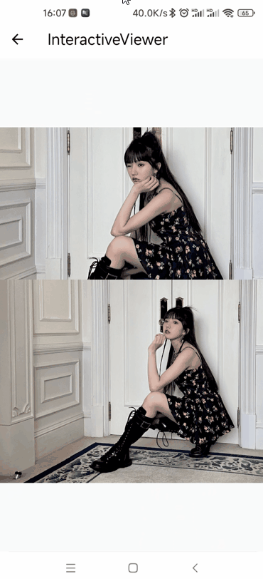
需要注意的是,即使我们设置了minScale: .5和scaleEnabled: true这两属性,我们依然无法缩小我们的子组件。我们需要将boundaryMargin设置为EdgeInsets.all(double.infinity)(当然,只要设置了数值就行。如果没太多要求,double.infinity是最好的值)。
现在我们就可以愉快的缩小我们的子组件了:
MergeableMaterial
ExpansionPanelList是使用该组件实现的,关于该组件的介绍请查看文章Flutter 系统是如何实现ExpansionPanelList的
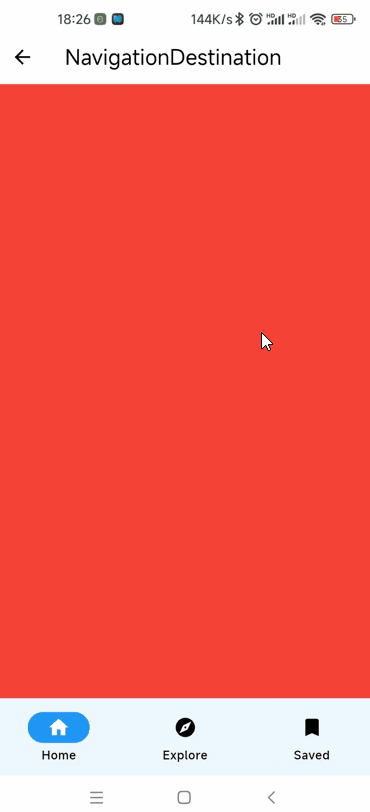
NavigationBar和NavigationDestination
该组件和BottomNavigationBar一样用来创建底部导航栏。
该组件有以下几个属性:
Key? key:标识键Duration? animationDuration:动画持续事件int selectedIndex:当前索引。默认为0List<Widget> destinations:底部选项组件,一般为NavigationDestinationvoid Function(int)? onDestinationSelected:destinations选择事件Color? backgroundColor:背景颜色double? elevation:海拔高度,轨道的标高或 z 坐标double? height:导航栏的高度NavigationDestinationLabelBehavior? labelBehavior:定义destinations的标签将如何布局以及何时显示
Scaffold(
  appBar: AppBar(title: const Text("NavigationDestination")),
  bottomNavigationBar: NavigationBar(
    animationDuration: null,
    selectedIndex: _index,
    destinations: const [
      NavigationDestination(
        icon: Icon(Icons.home),
        label: 'Home',
      ),
      NavigationDestination(
        icon: Icon(Icons.explore),
        label: 'Explore',
      ),
      NavigationDestination(
        selectedIcon: Icon(Icons.bookmark),
        icon: Icon(Icons.bookmark),
        label: 'Saved',
      ),
    ],
    onDestinationSelected: (index) {
      _index = index;
      _controller.jumpToPage(index);
      setState(() {});
    },
    backgroundColor: null,
    elevation: null,
    height: null,
    labelBehavior: null,
  ),
  body: PageView.builder(
    controller: _controller,
    onPageChanged: (index) {
      _index = index;
      setState(() {});
    },
    itemBuilder: (context, index) => ColoredBox(
      color: Colors.primaries[index % Colors.primaries.length],
    ),
  ),
)
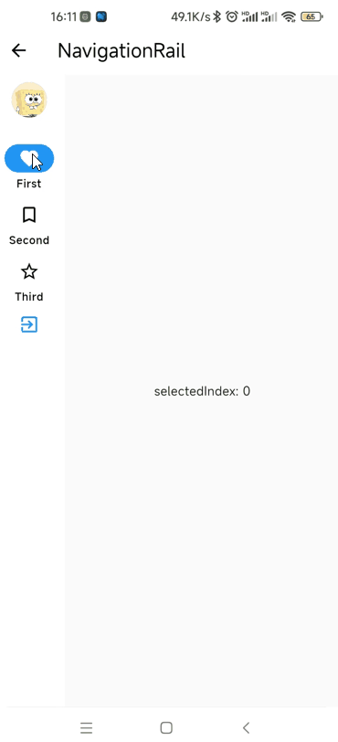
NavigationRail 和 NavigationRailDestination
用在侧边的导航栏。
该组件有以下几个属性:
Key? key:标识键Color? backgroundColor:背景色bool extended:NavigationRail是否应处于扩展状态。默认为falseWidget? leading:排在最前面的组件Widget? trailing:排在最后面的组件List<NavigationRailDestination> destinations:NavigationRailDestination对象组int? selectedIndex:当前选择的索引void Function(int)? onDestinationSelected:选择事件double? elevation:海拔高度,轨道的标高或 z 坐标double? groupAlignment:轨道内destinations组的垂直对齐方式。值在 -1.0 和 1.0 之间,0 中心对齐NavigationRailLabelType? labelType:为默认的、未扩展的NavigationRail定义标签的布局和行为TextStyle? unselectedLabelTextStyle:未选中标签的文本样式TextStyle? selectedLabelTextStyle:选中的标签的文本样式IconThemeData? unselectedIconTheme:未选中标签的图标主题IconThemeData? selectedIconTheme:选中的标签的图标主题double? minWidth:最小宽度double? minExtendedWidth:当extended为true时的最小宽度bool? useIndicator:是否使用指示器。默认为trueColor? indicatorColor:指示器的颜色
Row(
  children: <Widget>[
    NavigationRail(
      backgroundColor: null,
      extended: false,
      leading: const CircleAvatar(
        backgroundImage: AssetImage("assets/images/hmbb.png"),
      ),
      trailing: const Icon(Icons.exit_to_app, color: Colors.blue),
      selectedIndex: _selectedIndex,
      onDestinationSelected: (int index) {
        setState(() {
          _selectedIndex = index;
        });
      },
      elevation: 4,
      groupAlignment: -.9,
      labelType: NavigationRailLabelType.all,
      destinations: const <NavigationRailDestination>[
        NavigationRailDestination(
          icon: Icon(Icons.favorite_border),
          selectedIcon: Icon(Icons.favorite),
          label: Text('First'),
        ),
        NavigationRailDestination(
          icon: Icon(Icons.bookmark_border),
          selectedIcon: Icon(Icons.book),
          label: Text('Second'),
        ),
        NavigationRailDestination(
          icon: Icon(Icons.star_border),
          selectedIcon: Icon(Icons.star),
          label: Text('Third'),
        ),
      ],
    ),
    Expanded(
      child: Center(
        child: Text('selectedIndex: $_selectedIndex'),
      ),
    )
  ],
),
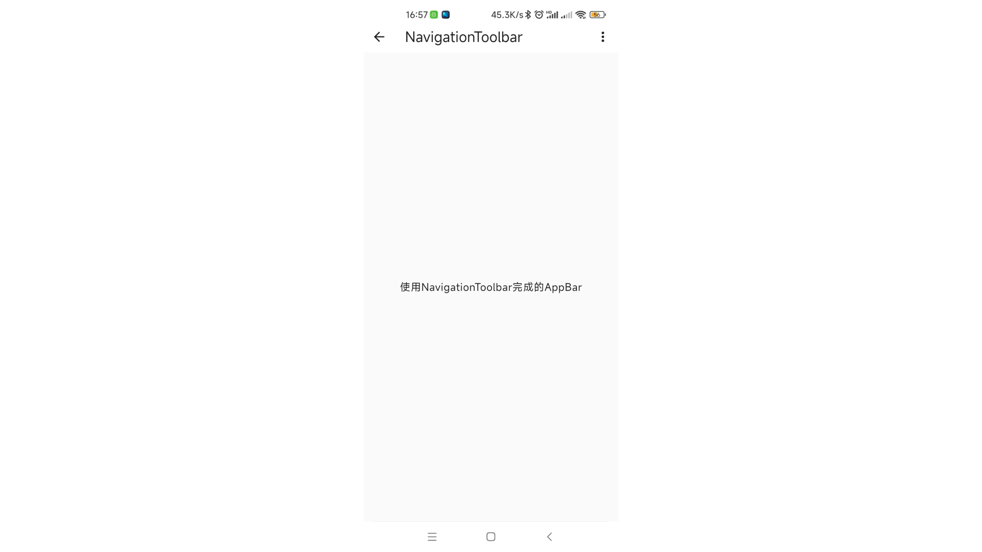
NavigationToolbar
创建一个以适合工具栏的方式布置其子项的小部件。相当于Row组件有3个子组件,中间的子组件使用了Expanded
该组件有以下几个属性:
Key? key:标识键Widget? leading:最前面的组件Widget? middle:中间的组件Widget? trailing:最后面的组件bool centerMiddle:middle组件是否居中。默认为truedouble middleSpacing:水平轴上middle组件周围的间距。默认为16.0
SafeArea(
  child: Column(
    children: [
      Container(
        width: double.infinity,
        height: kTextTabBarHeight,
        color: Colors.white,
        child: NavigationToolbar(
          leading: const BackButton(),
          middle: Text(
            "NavigationToolbar",
            style: Theme.of(context).textTheme.titleLarge,
          ),
          trailing: IconButton(
            icon: const Icon(Icons.more_vert),
            onPressed: () {},
          ),
          centerMiddle: false,
          middleSpacing: 16.0,
        ),
      ),
      Expanded(
        child: Center(
          child: Text(
            "使用NavigationToolbar完成的APPBar",
            style: Theme.of(context).textTheme.bodyLarge,
          ),
        ),
      ),
    ],
  ),
)

 浙公网安备 33010602011771号