
一 pandas读取excle数据
1 读取
import pandas as pd

#读取文件
df = pd.read_excel('D:/mp3/output.xlsx',index_col='id')
# df = pd.read_excel('D:/mp3/output.xlsx') # 如果这样直接读取,然后保存会多出来index
df.to_excel('D:/mp3/output2.xlsx')
print('done')
print(df.head())
结果如下图:

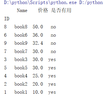
2 排序
import pandas as pd
# 排序
products = pd.read_excel('D:/mp3/test.xlsx', index_col='ID')
# products.sort_values(by=['价格'],ascending=False,inplace=True) # ascending false代表从大到小排序
products.sort_values(by=['是否有用','价格'],inplace=True,ascending=[True,False]) # 按照两个选项去排序
print(products)
结果如图:
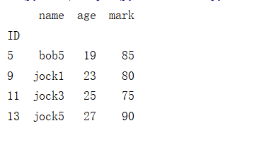
3 排序
import pandas as pd
# 过滤数据,按照年龄和分数去过滤数据用到loc和apply
student=pd.read_excel("D:/mp3/student1.xlsx",index_col='ID')
# student=student.loc[student.age.apply(lambda a:18<+a<30)].loc[student.mark.apply(lambda s:70<+s<=100)] # 第一种写法
student=student.loc[student['age'].apply(lambda a:18<+a<30)].loc[student['mark'].apply(lambda s:70<+s<=100)] # 第二种写法
print(student)
效果如图
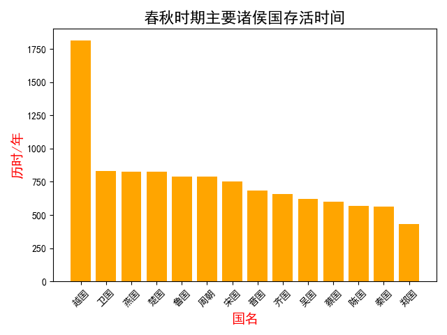
4 画柱状图
import pandas as pd
import matplotlib.pyplot as plt
plt.rcParams['font.sans-serif']=['SimHei']
# 柱状图,需要先安装matplotlib
country=pd.read_excel("D:/mp3/country.xlsx")
country.sort_values(by='历时',inplace=True,ascending=False)
# country.plot.bar(x='国名',y='历时',color='red',title="春秋时期诸侯国存活时间") # 用pandan自带画图

plt.bar(country.国名,country.历时,color='orange')
plt.xticks(country.国名,rotation='45')
plt.xlabel('国名',fontweight='bold',fontsize=14,color='red')
plt.ylabel('历时/年',fontweight='bold',fontsize=14,color='red')
plt.title('春秋时期主要诸侯国存活时间',fontsize=16)


plt.tight_layout()
plt.show()
效果如图
5两组数据对比-柱状图
import pandas as pd
import matplotlib.pyplot as plt
# 两组数据对比
plt.rcParams['font.sans-serif']=['SimHei'] #支持中文
people=pd.read_excel("D:/mp3/people.xlsx")
people.sort_values(by=2018,inplace=True,ascending=False)
people.plot.bar(x='国家',y=[1950,2018],color=['orange','red'])
plt.title('世界主要国家人口增长对比',fontsize=16,fontweight="bold")
plt.xlabel('国家',fontweight="bold",color='red')
plt.ylabel('人口/单位为:10亿',fontweight="bold",color='red')
# plt.ylim(80000000,100000000)
ax=plt.gca()
ax.set_xticklabels(people['国家'],rotation=45,ha='right')
f=plt.gcf()
plt.tight_layout()
plt.show()
效果如图:

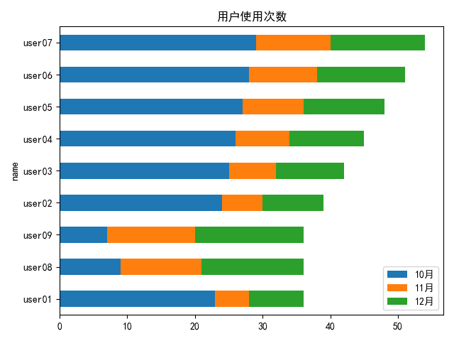
6 叠加柱状图
import pandas as pd
import matplotlib.pyplot as plt

# 叠加柱状图
plt.rcParams['font.sans-serif'] = ['SimHei']  # 支持中文
user = pd.read_excel("D:/mp3/djt.xlsx")
user['total'] = user['10月'] + user['11月'] + user['12月']
user.sort_values(by='total', inplace=True)  # 排序按照总数
user.plot.barh(x='name', y=['10月', '11月', '12月'],\
               stacked=True,title="用户使用次数")  # 画图,stacked=True话叠加的柱状图
# plt.tight_layout()
plt.show()
如图所示
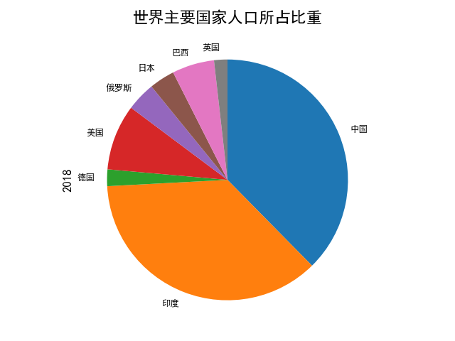
7饼图
import pandas as pd
import matplotlib.pyplot as plt
plt.rcParams['font.sans-serif'] = ['SimHei']  # 支持中文
# 绘制饼图
people=pd.read_excel("D:/mp3/people.xlsx",index_col='国家') # index_col设置饼图显示的文字
people[2018].plot.pie(fontsize=9,counterclock=False,startangle=-270)
# counterclock反向排序,startangle是从右上角开始
plt.title('世界主要国家人口所占比重',fontsize=16,fontweight='bold')
plt.ylabel('2018',fontsize=12,fontweight='bold')
plt.show()
如下所示
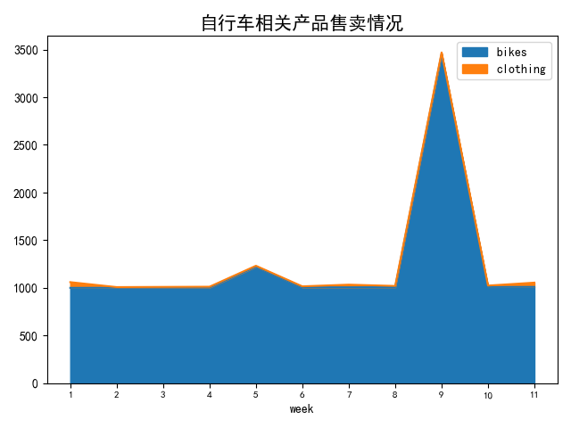
8 叠加曲线图
import pandas as pd
import matplotlib.pyplot as plt
plt.rcParams['font.sans-serif'] = ['SimHei']  # 支持中文
# 折线图,叠加曲线图
gdp=pd.read_excel("D:/mp3/gdp.xlsx",index_col='week')
print(gdp.columns)
print(gdp)
# gdp.plot(y=['bikes','clothing']) #曲线图
gdp.plot.area(y=['bikes','clothing']) # 叠加曲线图
#

plt.title("自行车相关产品售卖情况",fontsize=15,fontweight='bold')

plt.xticks(gdp.index,fontsize=8)
plt.show()
如图所示
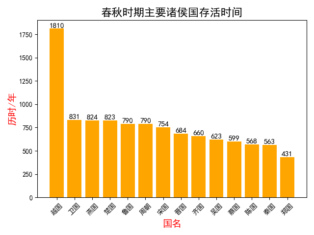
9 柱状图上添加数字
import matplotlib.pyplot as plt
import pandas as pd

plt.rcParams['font.sans-serif'] = ['SimHei']
# 柱状图并且可以加数字,需要先安装matplotlib
country = pd.read_excel("D:/mp3/country.xlsx")
country.sort_values(by='历时', inplace=True, ascending=False)

num=[1810,831, 824, 823, 790,790,754, 684,660,623,599, 568,563,431] #数字必须先排序

plt.bar(country.国名,country.历时,color='orange')
plt.xticks(country.国名,rotation='45')
plt.xlabel('国名',fontweight='bold',fontsize=14,color='red')
plt.ylabel('历时/年',fontweight='bold',fontsize=14,color='red')
plt.title('春秋时期主要诸侯国存活时间',fontsize=16)
for a, b in zip(country.国名, num):
    plt.text(a, b, '%.0f' % b, ha='center', va='bottom', fontsize=11)

plt.show()
如图所示
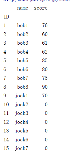
10 多表查询数据
import pandas as pd
# 一个表里两个sheet,查出数据合并
student=pd.read_excel("D:/mp3/student.xlsx",sheet_name='student',index_col="ID")
scores=pd.read_excel("D:/mp3/student.xlsx",sheet_name='score',index_col="ID")
# print(student,scores)
# table=student.merge(scores,on="ID")
# table=student.merge(scores,how='left',on="ID").fillna(0) # merge
table=student.join(scores,how='left',on="ID").fillna(0) # join
# 显示左边完整的表内容,on这里也可以写left_on或者right_on


table.score=table.score.astype(int) # 把 0.0换成0
print(table)
如下所示
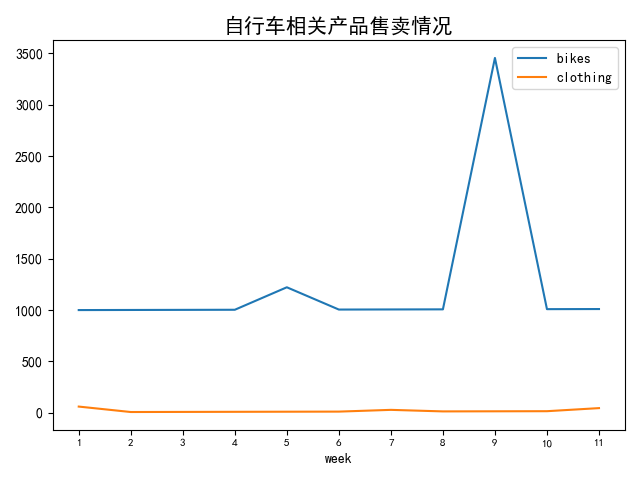
11 曲线图
import pandas as pd
import matplotlib.pyplot as plt
plt.rcParams['font.sans-serif'] = ['SimHei']  # 支持中文
# 折线图,叠加曲线图
gdp=pd.read_excel("D:/mp3/gdp.xlsx",index_col='week')
print(gdp.columns)
print(gdp)
gdp.plot(y=['bikes','clothing']) #曲线图
# gdp.plot.area(y=['bikes','clothing']) # 叠加曲线图
#

plt.title("自行车相关产品售卖情况",fontsize=15,fontweight='bold')

plt.xticks(gdp.index,fontsize=8)
plt.show()
如图所示


 浙公网安备 33010602011771号