

flexbox的学习,display:flex display:box 淘宝触屏版、饿了么网布局分析分析
Flex 布局教程:语法篇
http://www.ruanyifeng.com/blog/2015/07/flex-grammar.html
父:
display:flex;
父属性设置
- flex-direction:
row | row-reverse | column | column-reverse; - flex-wrap:nowrap | wrap | wrap-reverse;
- flex-flow: <flex-direction> || <flex-wrap>;
- justify-content:
flex-start | flex-end | center | space-between | space-around; - align-items:
flex-start | flex-end | center | baseline | stretch; - align-content:
flex-start | flex-end | center | space-between | space-around | stretch;
子属性设置
order:number 越小越前flex-grow :0 无变化 剩余长度按比例分配flex-shrink:0 无变化 按比例缩小flex-basis :auto /固定的值flex:nonealign-self:auto | flex-start | flex-end | center | baseline | stretch;子元素上下的对其方式
https://www.cnblogs.com/whiteMu/p/5378747.html
一、display:box;
在元素上设置该属性,可使其子代排列在同一水平上,类似display:inline-block;。
二、可在其子代设置如下属性
前提:使用如下属性,必须在父代设置display:box;
1.box-flex:number;
1)占父级元素宽度的number份
2)若子元素设置固定宽度,则该子元素应用固定宽度,其他未设置固定宽度的字元素将余下的父级宽度(父级-已设置固定宽度的子代元素的总宽度按 number占份数
3)若子元素有margin值,则按余下(父级宽度-子代固定总宽度-总margin值)宽度占number份
2.box-orient:horizontal/vertical
在父级上设置该属性,则子代按水平排列或竖直排列。
注:所有主流浏览器不支持该属性,必须加上前缀。
1)horizontal 水平排列,子代总width=父级width。若父级固定宽度,则子代设置的width无效,子代会撑满父级宽度。
2)vertical 垂直排列,子代总height=父级height。若父级固定高度,则子代设置的height无效,子代会撑满父级高度。
3.box-direction:normal/reverse
在父级上设置该属性,确认子代的排列顺序。
1)normal 默认值,子代按html顺序排列
2)reverse 反序
4.box-align:start/end/center/stretch
在父级设置,子代的垂直对齐方式。
1)start 垂直顶部对齐
2)end 垂直底部对齐
3)center 垂直居中对齐
4)stretch 拉伸子代的高度,与父级设置的高度一致。子代height无效。
5.box-pack:start/end/center
在父级设置,子代的水平对齐方式。
1)start 水平左对齐
2)end 水平右对齐
3)center 水平居中对齐
display:-ms-flexbox https://msdn.microsoft.com/en-us/library/hh673531(v=vs.85).aspx
-ms-flex-direction: row|row-reverse|column|column-reverse
-ms-flex-align:start|end|center|stretch|baseline =flex的align-items
-ms-flex-pack:start|end|cener|justify =flex的justify-content
-ms-flex-wrap:nowrap|wrap|wrap-reverse
-ms-flex:<positive-flex> <negative-flex> <preferred-size> =flex的flex
-ms-flex-order: =flex的order
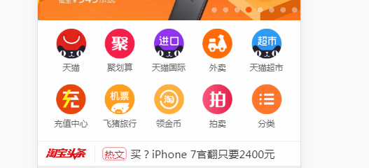
1、实现淘宝中这些条目的布局
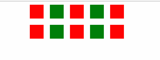
类似实现的代码:
<!DOCTYPE html>
<html lang="en">
<head>
    <meta charset="UTF-8">
    <title>Title</title>
    <style>
        *{
            margin:0;padding:0;
        }
        html{font-size:32px;}
        .item-content{
            display: -webkit-box;
            display: -moz-box;
            display: -ms-flexbox;
            display: -webkit-flex;
            display: flex;
            -webkit-box-orient: vertical;
            -webkit-box-direction: normal;
            -moz-box-orient: vertical;
            -moz-box-direction: normal;
            -webkit-flex-direction: column;
            -ms-flex-direction: column;
            flex-direction: column;
            box-sizing: border-box;
            line-height: 0;
            width: 10rem;
            height: 4.594rem;
            background-color: rgb(255, 255, 255);
            margin:0 auto;
        }
        .item-small{
            display: -webkit-box;
            display: -moz-box;
            display: -ms-flexbox;
            display: -webkit-flex;
            display: flex;
            -webkit-box-orient: horizontal;
            -webkit-box-direction: normal;
            -moz-box-orient: horizontal;
            -moz-box-direction: normal;
            -webkit-flex-direction: row;
            -ms-flex-direction: row;
            flex-direction: row;
            box-sizing: border-box;
            line-height: 0;
            width:10rem;
            height:2rem;
            background-color: green;
        }
        .item{
            width:2rem;
            height:2rem;
            box-sizing: border-box;
            border:10px solid #fff;
        }
        .item:nth-child(odd){
            background-color:red;
        }
        .item:nth-child(even){
            background-color:green;
        }
    </style>
</head>
<body>
<div class="item-content">
    <div class="item-small">
        <div class="item"></div>
        <div class="item"></div>
        <div class="item"></div>
        <div class="item"></div>
        <div class="item"></div>
    </div>
    <div class="item-small">
        <div class="item"></div>
        <div class="item"></div>
        <div class="item"></div>
        <div class="item"></div>
        <div class="item"></div>
    </div>
</div>
</body>
</html>
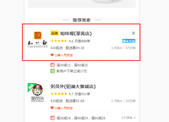
饿了么的商家列表
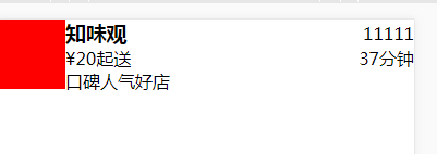
<!doctype html>
<html lang="en">
<head>
    <meta charset="UTF-8">
    <meta name="viewport"
          content="width=device-width, user-scalable=no, initial-scale=1.0, maximum-scale=1.0, minimum-scale=1.0">
    <meta http-equiv="X-UA-Compatible" content="ie=edge">
    <title>Document</title>
    <style>
        *{
            margin:0;
            padding:0;
        }
        .item-content{
            width:100%;
            display: -webkit-flex;
            display: -webkit-box;
            display: -ms-flexbox;
            display: flex;
            -webkit-justify-content: flex-start;
            -webkit-box-pack: start;
            -ms-flex-pack: start;
            justify-content: flex-start;
            -webkit-align-items: stretch;
            -webkit-box-align: stretch;
            -ms-flex-align: stretch;
            align-items: stretch;
        }
        .fixedwidthitem{
            position: relative;
            -webkit-flex: 0 0 auto;
            /* -webkit-box-flex: 1; */
            -ms-flex: none;
            /* flex: none; */
        }
        .imgcontent{
            width:64px;
            height:64px;
            background-color:red;
        }
        .flexwidth{
            -webkit-flex-grow: 1;
            -webkit-box-flex: 1;
            -ms-flex-positive: 1;
            flex-grow: 1;
            -webkit-flex-direction: column;
            -webkit-box-orient: vertical;
            -webkit-box-direction: normal;
            -ms-flex-direction: column;
            flex-direction: column;
            -webkit-user-select: none;
            -moz-user-select: none;
            -ms-user-select: none;
            user-select: none;
            display: -webkit-flex;
            display: -webkit-box;
            display: -ms-flexbox;
            display: flex;
            -webkit-justify-content: space-between;
            -webkit-box-pack: justify;
            -ms-flex-pack: justify;
            justify-content: space-between;
             overflow: hidden;
        }
        .index-line_2-iYR1A{
            display: -webkit-flex;
            display: -webkit-box;
            display: -ms-flexbox;
            display: flex;
            -webkit-justify-content: space-between;
            -webkit-box-pack: justify;
            -ms-flex-pack: justify;
            /* justify-content: space-between; */
            /* overflow: hidden; */
            -webkit-align-items: center;
            -webkit-box-align: center;
            -ms-flex-align: center;
            align-items: center;
        }

    </style>
</head>
<body>
<div class="item-content">
    <div class="fixedwidthitem">
        <div class="imgcontent"></div>
    </div>
    <div class="flexwidth">
        <div class="index-line_2-iYR1A">
            <h3>知味观</h3>
            <span>11111</span>
        </div>
        <div class="index-line_2-iYR1A">
            <div>¥20起送</div>
            <span>37分钟</span>
        </div>
        <div class="index-line_2-iYR1A">
            <span>口碑人气好店</span>
        </div>
    </div>
</div>
</body>
</html>
实际效果:

 浙公网安备 33010602011771号