元素水平居中和垂直居中各方案总结
水平居中
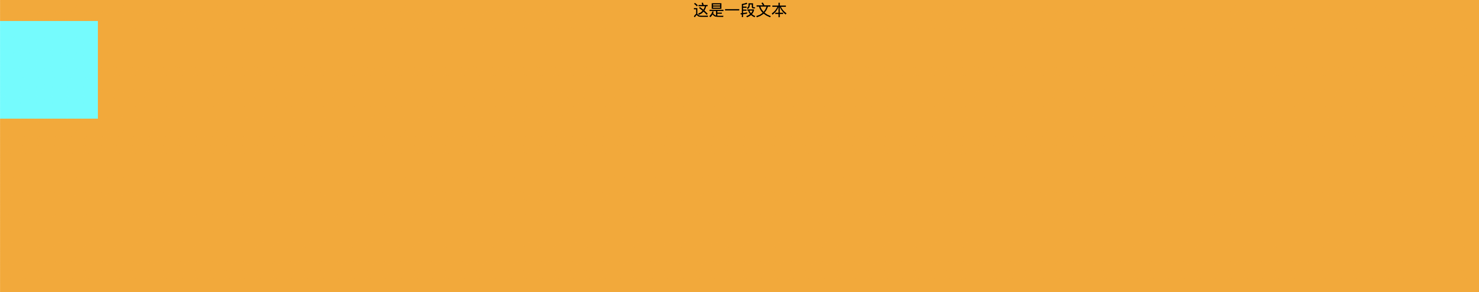
行内元素水平居中
实现方式:设置父元素的 text-align: center;
注意:此方式只对行内级元素生效。
<!DOCTYPE html>
<html lang="en">
<head>
  <style>
    .container {
      height: 300px;
      background-color: orange;
      text-align: center;
    }
  </style>
</head>
<body>
  <div class="container">
    <a class="text">这是一段文本</a>
  </div>
</body>
</html>
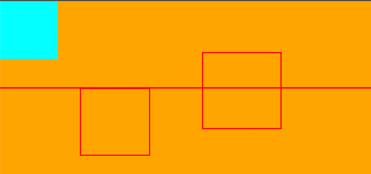
效果:
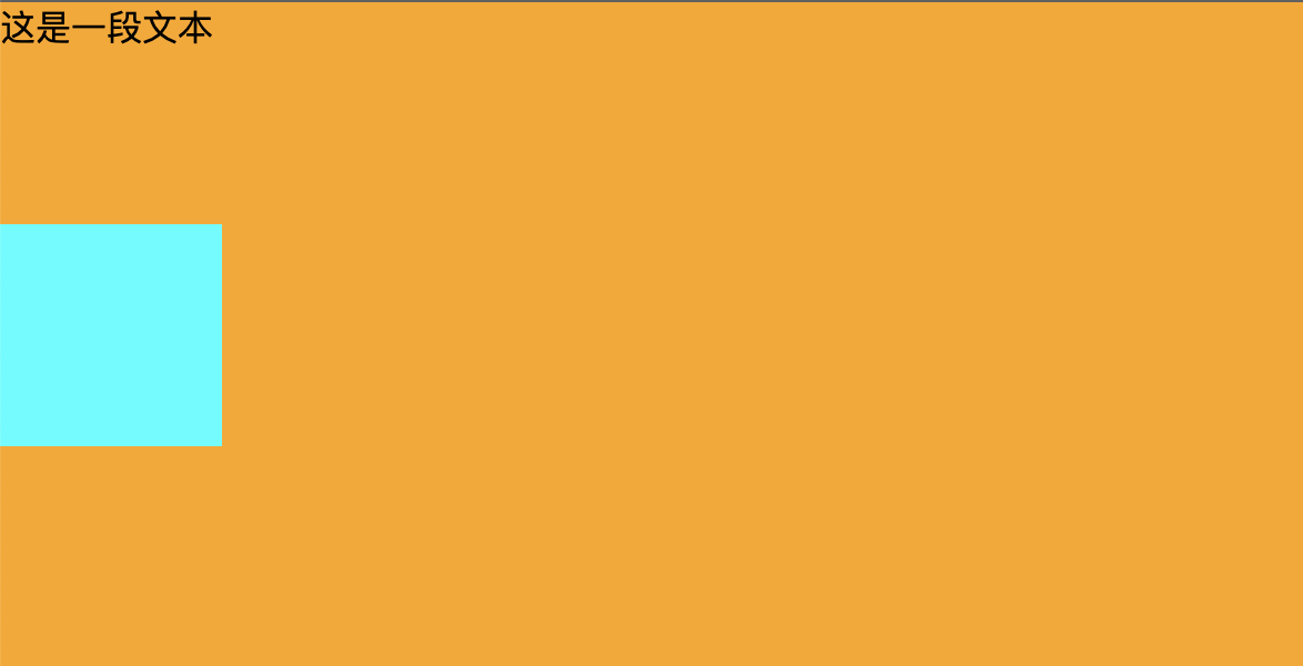
块级元素水平居中
实现方式:元素拥有宽度的情况下,margin 0 auto;
<!DOCTYPE html>
<html lang="en">
<head>
  <style>
    .container {
      height: 300px;
      background-color: orange;
    }

    .box{
      width: 100px;
      height: 100px;
      background-color: aqua;
      margin: 0 auto;
    }
  </style>
</head>
<body>
  <div class="container">
    <div class="box"></div>
  </div>
</body>
</html>
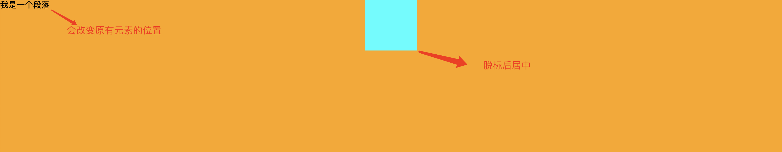
使用绝对定位实现水平居中
实现方式:元素拥有宽度的情况下,left0/right0/margin 0 auto;
注意:绝对定位会让元素脱离标准流,会改变原有的结构
<!DOCTYPE html>
<html lang="en">
<head>
  <style>
    .container {
      height: 300px;
      background-color: orange;
    }

    .box{
      dispaly: inline-block;
      width: 100px;
      height: 100px;
      background-color: aqua;
      position: absolute;
      left: 0;
      right: 0;
      margin: 0 auto;
    }
  </style>
</head>
<body>
  <div class="container">
    <div class="box"></div>
  </div>
</body>
</html>
效果:
使用 flex 布局实现水平居中
实现方式:justify-content: center;
<!DOCTYPE html>
<html lang="en">
<head>
  <style>
    .container {
      height: 300px;
      background-color: orange;
      display: flex;
      justify-content: center;
    }

    .box{
      width: 100px;
      height: 100px;
      background-color: aqua;
    }
  </style>
</head>
<body>
  <div class="container">
    <div class="box"></div>
  </div>
</body>
</html>
垂直居中
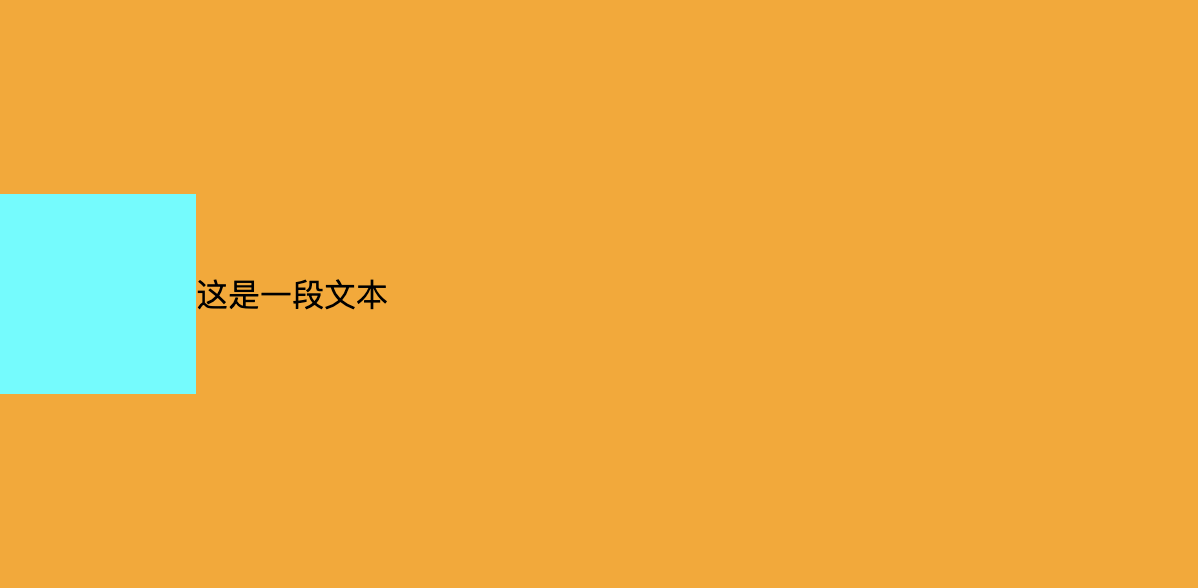
使用固定定位实现垂直居中
实现方式:元素有高度的情况下,top0/bottom0/margin auto 0
存在的弊端:
- 元素会脱离标准流
- 元素必须拥有高度
- 行内级非替换元素,使用此方法无法实现居中
<!DOCTYPE html>
<html lang="en">
<head>
  <style>
    .container {
      height: 300px;
      background-color: orange;
      position: relative;
    }

    .box{
      width: 100px;
      height: 100px;
      background-color: aqua;

      position: absolute;
      top: 0;
      bottom: 0;
      margin: auto 0;
    }
  </style>
</head>
<body>
  <div class="container">
    <div class="box"></div>
    <a>这是一段文本</a>
  </div>
</body>
</html>
效果:
使用 flex 布局实现垂直居中
实现方式:align-items: center;
注意:
- 此方法会让 flex-container 中的所有元素都垂直居中
- 如果要对单独的元素设置居中,可以给 flex-item 单独设置 align-item: center
<!DOCTYPE html>
<html lang="en">
<head>
  <style>
    *{
      margin: 0;
      padding: 0;
    }
    .container {
      height: 300px;
      background-color: orange;
      display: flex;
      align-items: center;
    }

    .box{
      width: 100px;
      height: 100px;
      background-color: aqua;
    }
  </style>
</head>
<body>
  <div class="container">
    <div class="box"></div>
    <a>这是一段文本</a>
  </div>
</body>
</html>
效果
使用 translate 实现垂直居中
可以对元素单独设置,也不会脱离文档流,还可以设配到IE9,是目前方案中的最佳办法
实现原理:
- 将元素向下移动父元素的 50%
- 再将元素向上移动自身的 50%
实现方式:使用相对定位,top50%/transtantY(-50%)
<!DOCTYPE html>
<html lang="en">
<head>
  <style>
    .container {
      height: 300px;
      background-color: orange;
    }

    .box{
      width: 100px;
      height: 100px;
      background-color: aqua;
      position: relative;
      top: 50%;
      transform: translateY(-50%);
    }
  </style>
</head>
<body>
  <div class="container">
    <div class="box"></div>
  </div>
</body>
</html>
效果:


 浙公网安备 33010602011771号