

flex弹性盒
MDN:https://developer.mozilla.org/zh-CN/docs/Web/CSS/flex
flex-basis
flex-basis指定了 flex 元素在主轴方向上的初始大小。

flex-grow
flex-grow定义弹性盒子项(flex item)的拉伸因子。
flex-shrink
flex-shrink指定了 flex 元素的收缩规则。flex 元素仅在默认宽度之和大于容器的时候才会发生收缩,其收缩的大小是依据 flex-shrink 的值。
flex
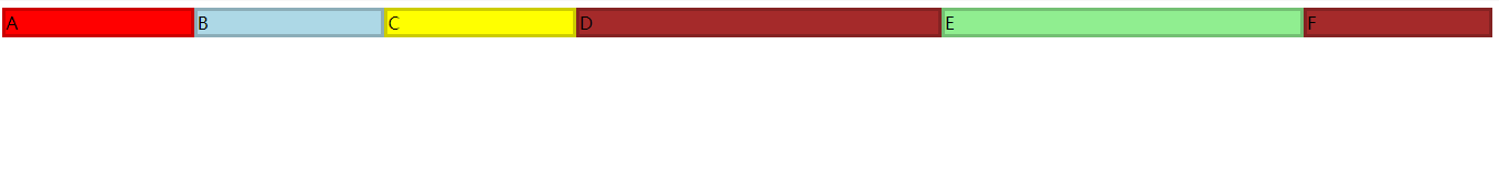
flex规定了弹性元素如何伸长或缩短以适应flex容器中的可用空间。
这是一个简写属性,就是上面是三个属性的简写形式:flex-basis flex-grow flex-shrink。
/* Basic values */
flex: auto;
flex: initial;
flex: none;
flex: 2;

/* One value, unitless number: flex-grow */
flex: 2;

/* One value, width/height: flex-basis */
flex: 10em;
flex: 30px;

/* Two values: flex-grow | flex-basis */
flex: 1 30px;

/* Two values: flex-grow | flex-shrink */
flex: 2 2;

/* Three values: flex-grow | flex-shrink | flex-basis */
flex: 2 2 10%;

/* Global values */
flex: inherit;
flex: initial;
flex: unset;
flex的初始值:flex-grow:0; flex-shrink:1; flex-basis:auto;
flex-wrap
此属性定义在flex父元素上,指定 flex 元素单行显示还是多行显示 。
flex-wrap: nowrap;
flex-wrap: wrap;
flex-wrap: wrap-reverse;

/* Global values */
flex-wrap: inherit;
flex-wrap: initial;
flex-wrap: unset;
flex-direction
flex-direction属性指定了内部元素是如何在 flex 容器中布局的,定义了主轴的方向(正方向或反方向)。
/* The direction text is laid out in a line */
flex-direction: row;

/* Like <row>, but reversed */
flex-direction: row-reverse;

/* The direction in which lines of text are stacked */
flex-direction: column;

/* Like <column>, but reversed */
flex-direction: column-reverse;

/* Global values */
flex-direction: inherit;
flex-direction: initial;
flex-direction: unset;
flex-flow
flex-flow是flex-direction和flex-wrap的缩写。
默认值是flex-direction:row; flex-wrap:nowrap;
element {
  /* Main-axis is the block direction with reversed main-start and main-end. Flex items are laid out in multiple lines */
  flex-flow: column-reverse wrap;
}
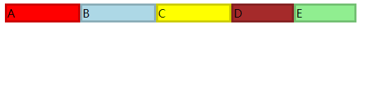
justify-content
justify-content属性定义了浏览器如何分配顺着父容器主轴的弹性元素之间及其周围的空间。
/* Positional alignment */
justify-content: center;     /* 居中排列 */
justify-content: start;      /* Pack items from the start */
justify-content: end;        /* Pack items from the end */
justify-content: flex-start; /* 从行首起始位置开始排列 */
justify-content: flex-end;   /* 从行尾位置开始排列 */
justify-content: left;       /* Pack items from the left */
justify-content: right;      /* Pack items from the right */

/* Baseline alignment */
justify-content: baseline;
justify-content: first baseline;
justify-content: last baseline;

/* Distributed alignment */
justify-content: space-between;  /* 均匀排列每个元素
                                   首个元素放置于起点,末尾元素放置于终点 */
justify-content: space-around;  /* 均匀排列每个元素
                                   每个元素周围分配相同的空间 */
justify-content: space-evenly;  /* 均匀排列每个元素
                                   每个元素之间的间隔相等 */
justify-content: stretch;       /* Distribute items evenly
                                   Stretch 'auto'-sized items to fit
                                   the container */

/* Overflow alignment */
justify-content: safe center;
justify-content: unsafe center;

/* Global values */
justify-content: inherit;
justify-content: initial;
justify-content: unset;
下面是效果图
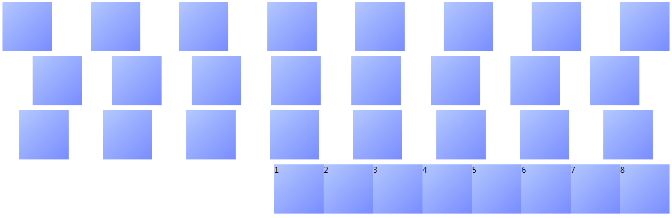
align-content 和 align-item
align-content会指定 行 对齐的方式,也就是多行的时候的行,align-item用于弹性项目自身的对齐。
用于在侧轴方向给弹性项目分配空间。
/* Positional alignment */
align-content: center;     /* Pack items around the center */
align-content: start;      /* Pack items from the start */
align-content: end;        /* Pack items from the end */
align-content: flex-start; /* Pack flex items from the start */
align-content: flex-end;   /* Pack flex items from the end */
align-content: left;       /* Pack items from the left */
align-content: right;      /* Pack items from the right */

/* Baseline alignment */
align-content: baseline;
align-content: first baseline;
align-content: last baseline;

/* Distributed alignment */
align-content: space-between; /* Distribute items evenly
                                 The first item is flush with the start,
                                 the last is flush with the end */
align-content: space-around;  /* Distribute items evenly
                                 Items have a half-size space
                                 on either end */
align-content: space-evenly;  /* Distribute items evenly
                                 Items have equal space around them */
align-content: stretch;       /* Distribute items evently
                                 Stretch 'auto'-sized items to fit
                                 the container */

/* Overflow alignment */
align-content: safe center;
align-content: unsafe center;

 /* Global values */
align-content: inherit;
align-content: initial;
align-content: unset;
下面是align-items的取值
/* Basic keywords */
align-items: normal;
align-items: stretch;

/* Positional alignment */
align-items: center; /* Pack items around the center */
align-items: start; /* Pack items from the start */
align-items: end; /* Pack items from the end */
align-items: flex-start; /* Pack flex items from the start */
align-items: flex-end; /* Pack flex items from the end */
align-items: self-start;
align-items: self-end;
align-items: left; /* Pack items from the left */
align-items: right; /* Pack items from the right */

/* Baseline alignment */ justify-items: baseline;
align-items: first baseline;
align-items: last baseline; /* Overflow alignment (for positional alignment only) */
align-items: safe center;
align-items: unsafe center;

/* Global values */
align-items: inherit;
align-items: initial;
align-items: unset;
order
order属性规定了弹性容器中的可伸缩项目在布局时的顺序。元素按照order属性的值的增序进行布局。拥有相同order属性值的元素按照它们在源代码中出现的顺序进行布局。
/* Numerical value including negative numbers */
order: 5;
order: -5;

/* Global values */
order: inherit;
order: initial;
order: unset;

 浙公网安备 33010602011771号