echarts使用记录(三):x/y轴数据和刻度显示及坐标中网格显示、格式化x/y轴数据、echarts 图例显示到右边、折线图平滑曲线、echarts图例不显示问题、让x轴刻度居中、柱状图显示背景色
1、去掉坐标轴刻度线,刻度数据,坐标轴网格,以Y轴为例,同理X轴
xAxis: [{
    type: 'category',
    axisTick: {//决定是否显示坐标刻度
        alignWithLabel: true,
        show:false
    },
    axisLabel:{  //决定是否显示数据
        show:false
    }
}],
yAxis: [{
    type: 'value',
    axisTick: {
        show: false
    },
    splitLine:{  //决定是否显示坐标中网格
        show:true
    }
}],
2、xAxis.axisLabel.formatter string, Function
[ default: null ]
刻度标签的内容格式器,支持字符串模板和回调函数两种形式。
// 使用字符串模板,模板变量为刻度默认标签 {value}
formatter: '{value} kg'

// 使用函数模板,函数参数分别为刻度数值(类目),刻度的索引
formatter: function (value, index) {
    // 格式化成月/日,只在第一个刻度显示年份
    var date = new Date(value);
    var texts = [(date.getMonth() + 1), date.getDate()];
    if (index === 0) {
        texts.unshift(date.getYear());
    }
    return texts.join('/');
}
axisLabel:{
    show:true,
    formatter: function (value, index) {//value当前值,index当前索引
        return value.split(' ')[1];
    }
}
3、echarts 图例显示到右边
legend: {
    data:['同龄普通孩子','已具备技能','已泛化技能','已掌握技能','学习中'],
    orient: 'vertical',  //垂直显示
    y: 'center',    //延Y轴居中
    x: 'right' //居右显示
 },
4、折线图平滑曲线
series : [
    {
        symbol:'none', //去掉折线图中的节点
        smooth: false  //true 为平滑曲线,false为直线
    }
]
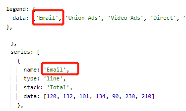
5、echarts 图例不显示问题:这两个名字要保持一致
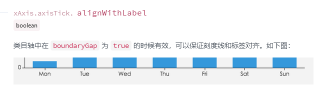
6、如何让 x 轴刻度线居中:下面这个配置
xAxis: {
  type: 'category',
  data: this.xAxis,
  axisTick: {
    alignWithLabel: true
  }
},
7、柱状图显示背景色
  series: [
    {
      data: [120, 200, 150, 80, 70, 110, 130],
      type: 'bar',
      showBackground: true,
      backgroundStyle: {
        color: 'rgba(180, 180, 180, 0.2)'
      }
    }
  ]

 浙公网安备 33010602011771号