button (2)
词源:
- c. 1300, "knob or ball attached to another body," especially as used to hold together different parts of a garment by being passed through a slit or loop (surname Botouner "button-maker" attested from mid-13c.)
- A button as a round protuberance [突出物] you depress to create an effect by closing an (electrical) circuit is attested from 1840s.
- Button-pusher as "deliberately annoying or provocative person" is attested by 1990 (in reference to Bill Gates, in "InfoWorld" magazine, Nov. 19).
- In the 1980s it meant "photographer."
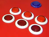
A push-button (also spelled pushbutton) or simply button is a simple switch mechanism to control some aspect of a machine or a process. Buttons are typically made out of hard material, usually plastic or metal. The surface is usually flat or shaped to accommodate the human finger or hand, so as to be easily depressed or pushed. Buttons are most often biased switches, although many un-biased buttons (due to their physical nature) still require a spring to return to their un-pushed state. Terms for the "pushing" of a button include pressing, depressing, mashing, slapping, hitting, and punching. Generic arcade game [街机游戏] buttons:
Akin to fire alarm switches, some big red buttons, when deployed with suitable visual and audible warnings such as flashing lights and sirens for extreme exigent emergencies, are known as "scram switches" (from the slang term scram, "get out of here"). Generally, such buttons are connected to large scale functions, beyond a regular fire alarm, such as automated shutdown procedures, complete facility power cut, fire suppression like halon release, etc.
In computing, the term button (sometimes known as a command button or push button) refers to any graphical control element that provides the user a simple way to trigger an event, like searching for a query at a search engine, or to interact with dialog boxes, like confirming an action.
A typical button is a rectangle or rounded rectangle, wider than it is tall, with a descriptive caption in its center. The most common method of pressing a button is clicking it with a pointer controlled by a mouse, but other input such as keystrokes can be used to execute the command of a button. A button is not however always restricted to a rectangular shape. The sole requirement of button interaction is that the user can execute a command by a click action. Thus pictures and background areas can be programmed as buttons. When pressed, in addition to performing a predetermined task, buttons often undergo a graphical change to mimic a mechanical button being depressed.
Depending on the circumstance, buttons may be designated to be pushed only once and execute a command, while others may be used to receive instant feed back and may require the user to click more than once to receive the desired result. Other buttons are designed to toggle behavior on and off like a check box. These buttons will show a graphical clue (such as staying depressed after the mouse is released) to indicate the state of the option.
A button often displays a tooltip when a user moves the pointer over it. The tooltip serves as built-in documentation that briefly explains the purpose of the button.
The appearance and behavior of buttons in Linux and other Unix-like operating systems is defined primarily by which widget toolkit is being employed, the most popular being GTK+ and Qt, though other toolkits are used as well. The use of multiple toolkits can lead to less uniform look and feel across applications. Most widget toolkits also have theming capabilities, so there is no single standard appearance as there is with Mac OS and Windows.
Buttons appear as elements of HTML forms to carry out actions such as clearing user input or submitting the form contents to the server. Buttons specified in HTML may be rendered by web browsers in different ways, typically either using the native button appearance of the underlying OS, or by using a button definition from within the browser. Buttons may also be styled by the developer of the web site the form appears on by using cascading style sheets.
HTML links are sometimes represented by a graphic closely resembling a button. Sometimes this type of link is used in advertisements to induce the user to click the ad and visit the advertiser's site.
Web buttons, badges or stickers are small images in some World Wide Web pages which are typically used to promote programs that were used to create or host the site (for example, MediaWiki sites often have a "Powered by Mediawiki" button on the bottom right corner of the page). They may also be used to promote compliance with web standards such as passing World Wide Web Consortium (W3C) HTML validation or to comply with an application's terms of service. These were first popularized as "Best viewed in..." buttons by Netscape and Microsoft during the browser wars.

六级/考研单词: knob, garment, loop, surname, depress, deliberate, provoke, accommodate, fingerprint, seldom, bias, physics, punch, akin, deploy, regulate, automate, suppress, compute, trigger, query, interact, dialog, caption, execute, thereby, undergo, designate, desire, multiple, render, web, indigenous, underlie, browse, resemble, induce, badge, valid, comply

 浙公网安备 33010602011771号