vue echarts 柱状图+折线图,根据预测值,如果预测值的type值为1,则柱子变虚线框,折线只留实心点,不显示两端线段。
因为echarts不允许在同一个折线图上,修改操作不同数据的线段,因此要曲线求国
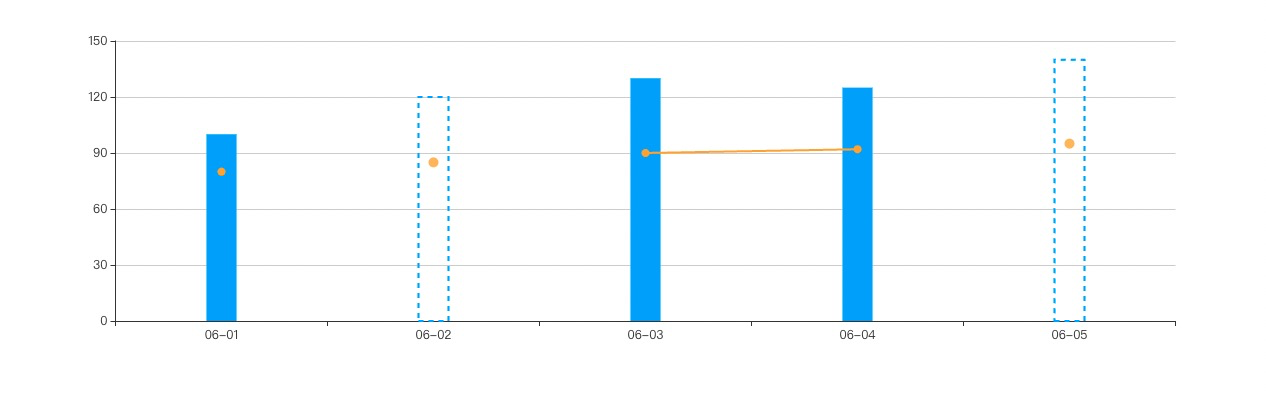
✅ 实现策略:
1. 柱状图部分:
使用 itemStyle 设置:
type == 1 → color: transparent(透明填充)+ borderColor: 'blue'(虚线框)+ borderType: 'dashed'
其他正常填充颜色。
2. 折线图部分:
折线图数据中 type == 1 的点设置为 null,让主折线断开;
然后用一个额外的 scatter 系列,把 type == 1 的圆点补上。
效果如图所示:
<template>
  <div>
    <div id="chart" style="width: 100%; height: 400px;"></div>
  </div>
</template>

<script>
import * as echarts from 'echarts';

export default {
  data() {
    return {
      rawData: [
        { x: '06-01', y1: 100, y2: 80, type: 0 },
        { x: '06-02', y1: 120, y2: 85, type: 1},// 预测值
        { x: '06-03', y1: 130, y2: 90, type: 0 }, // 预测值
        { x: '06-04', y1: 125, y2: 92, type: 0},
        { x: '06-05', y1: 140, y2: 95, type: 1 }
      ]
    };
  },
  mounted() {
    this.initChart();
  },
  methods: {
    initChart() {
      const chart = echarts.init(document.getElementById('chart'));
      const xAxisData = this.rawData.map(d => d.x);

      // 柱状图数据(主值)
      const barData = this.rawData.map(d => ({
        value: d.y1,
        itemStyle: d.type === 1
          ? {
              color: 'transparent',
              borderColor: '#3399ff',
              borderWidth: 2,
              borderType: 'dashed'
            }
          : {
              color: '#3399ff'
            }
      }));

      // 折线图数据(正常点)
      const lineData = this.rawData.map(d => d.type === 1 ? null : d.y2);

      // 折线图绿色点(仅预测值)
      const predictPoints = this.rawData.map(d => d.type === 1 ? d.y2 : null);

      chart.setOption({
        tooltip: {
          trigger: 'axis',
          formatter: (params) => {
            const dataIndex = params[0].dataIndex;
            const currentData = this.rawData[dataIndex];
            const isType1 = currentData.type === 1;

            let tooltipHtml = `<div>${currentData.x}</div>`;

            // 始终显示柱状图
            tooltipHtml += `
              <div style="display: flex; align-items: center; margin: 5px 0;">
                <span style="width: 10px; height: 10px; background: #3399ff; display: inline-block; margin-right: 5px;"></span>
                <span>柱状图: ${currentData.y1}</span>
              </div>
            `;

            // 根据type值决定显示哪个折线图
            if (isType1) {
              // type为1时,显示折线图2(预测点)
              tooltipHtml += `
                <div style="display: flex; align-items: center; margin: 5px 0;">
                  <span style="width: 10px; height: 10px; background: orange; display: inline-block; margin-right: 5px;"></span>
                  <span>折线图: ${currentData.y2}</span>
                </div>
              `;
            } else {
              // type为0时,显示折线图1(正常点)
              tooltipHtml += `
                <div style="display: flex; align-items: center; margin: 5px 0;">
                  <span style="width: 10px; height: 10px; background: orange; display: inline-block; margin-right: 5px;"></span>
                  <span>折线图: ${currentData.y2}</span>
                </div>
              `;
            }

            return tooltipHtml;
          }
        },
        xAxis: {
          type: 'category',
          data: xAxisData
        },
        yAxis: {
          type: 'value'
        },
        series: [
          {
            name: '柱状图',
            type: 'bar',
            barWidth: 30,
            data: barData
          },
          {
            name: '折线图1',
            type: 'line',
            data: lineData,
            symbol: 'circle',
            symbolSize: 8,
            lineStyle: { color: 'orange', width: 2 },
            itemStyle: { color: 'orange' },
            connectNulls: false
          },
          {
            name: '折线图2',
            type: 'scatter',
            data: predictPoints,
            symbolSize: 10,
            itemStyle: { color: 'orange' }
          }
        ]
      });
    }
  }
};
</script>
是我吖~

 浙公网安备 33010602011771号