

使用Duilib开发Windows软件(3)——控件的样式
摘抄下 https://www.cnblogs.com/Alberl/p/3344936.html 的一段代码
<?xml version="1.0" encoding="UTF-8"?>
<Window size="800,600" mininfo="600,400" caption="0,0,0,32" sizebox="4,4,4,4">
<VerticalLayout bkcolor="#FFF0F0F0" bkcolor2="#FFAAAAA0">
<!-- 标题栏区 -->
<HorizontalLayout height="32" bkcolor="#FFE6E6DC" bkcolor2="#FFAAAAA0">
<VerticalLayout />
<VerticalLayout width="77">
<Button name="minbtn" tooltip="最小化" float="true" pos="0,5,22,24" width="23" normalimage=" file='SysBtn\MinNormal.bmp' " hotimage=" file='SysBtn\MinFocus.bmp' " pushedimage=" file='SysBtn\MinFocus.bmp' "/>
<Button name="maxbtn" tooltip="最大化" float="true" pos="22,5,44,24" width="23" normalimage=" file='SysBtn\MaxNormal.bmp' " hotimage=" file='SysBtn\MaxFocus.bmp' " pushedimage=" file='SysBtn\MaxFocus.bmp' " />
<Button name="restorebtn" visible="false" tooltip="还原" float="true" pos="22,5,44,24" width="23" normalimage=" file='SysBtn\StoreNormal.bmp' " hotimage=" file='SysBtn\StoreFocus.bmp' " pushedimage=" file='SysBtn\StoreFocus.bmp' " />
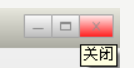
<Button name="closebtn" tooltip="关闭" float="true" pos="44,5,74,24" width="28" normalimage=" file='SysBtn\CloseNormal.bmp' " hotimage=" file='SysBtn\CloseFocus.bmp' " pushedimage=" file='SysBtn\CloseFocus.bmp' "/>
</VerticalLayout>
</HorizontalLayout>
</VerticalLayout>
</Window>
我只关心这三个按钮
在原版Duilib中设置一个按钮样式,需要赋值三个属性:normalimage、hotimage、pushedimage,这样才能获得正常状态,按下状态,鼠标覆盖状态不一样的样式。
网易版本把这个做成了一个属性:class
<Class comment="需要在Global标签或者Window标签内定义">
		<Attribute name="Class" default="" type="STRING" comment="自定义的控件样式的名字,在需要使用样式的地方直接指定这个名字,如(btn_default)"/>
		<Attribute name="Value" default="" type="STRING" comment="内置的控件属性,如(text="测试" height="12")"/>
</Class>
下面是一个button
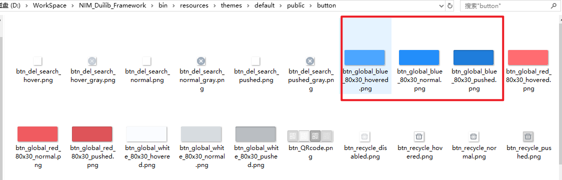
<Button class="btn_global_blue_80x30" name="button" text="我是一个按钮" halign="center"/>
btn_global_blue_80x30 实际上一组图片:
其他的样式设置 : https://github.com/feipeng8848/NIM_Duilib_Framework/blob/master/docs/GLOBAL.md
class的样式定义在bin\resources\themes\default\global.xml中定义,如下是button的定义
<!--按钮-->
<Class name="btn_global_blue_80x30" font="system_bold_14" normaltextcolor="white" normalimage="file='../public/button/btn_global_blue_80x30_normal.png'" hotimage="file='../public/button/btn_global_blue_80x30_hovered.png'" pushedimage="file='../public/button/btn_global_blue_80x30_pushed.png'" disabledimage="file='../public/button/btn_global_blue_80x30_normal.png' fade='80'"/>
<Class name="btn_global_white_80x30" font="system_bold_14" normaltextcolor="dark_gray" normalimage="file='../public/button/btn_global_white_80x30_normal.png'" hotimage="file='../public/button/btn_global_white_80x30_hovered.png'" pushedimage="file='../public/button/btn_global_white_80x30_pushed.png'" disabledimage="file='../public/button/btn_global_white_80x30_normal.png' fade='128'"/>
<Class name="btn_global_red_80x30" font="system_bold_14" normaltextcolor="white" normalimage="file='../public/button/btn_global_red_80x30_normal.png'" hotimage="file='../public/button/btn_global_red_80x30_hovered.png'" pushedimage="file='../public/button/btn_global_red_80x30_pushed.png'" disabledimage="file='../public/button/btn_global_red_80x30_normal.png' fade='80'"/>
<Class name="btn_menu" value="width="auto" height="auto" normalimage="file='../public/button/btn_menu.png' dest='0,0,32,32'" hotimage="../public/button/btn_menu_hovered.png" pushedimage="../public/button/btn_menu_pushed.png""/>
如果想自定义样式,就可以新加一项,然后找三个图片分别设置为normalimage、hotimage、pushedimage。上面的"是分号的意思。dest是图片的偏移量,0,0,32,32分别代表左起点0,上起点0,右终点32,下终点32.
上面的btn_menu就是我自定义的样式,class 的 name就是btn_menu,在使用的时候<Button class="btn_menu"></Button>就可以了

 浙公网安备 33010602011771号